Flutter IndexedStack Tutorial with Examples
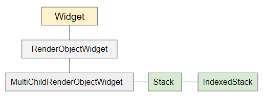
1. IndexedStack
IndexedStack is a subclass of Stack. Unlike Stack, IndexedStack only displays at most one widget at a time, and hide other widgets. You can specify which child widget to be displayed through index property. If the index is null, no child widgets will be displayed.
IndexedStack constructor
IndexedStack(
{Key key,
AlignmentGeometry alignment: AlignmentDirectional.topStart,
TextDirection textDirection,
StackFit sizing: StackFit.loose,
int index: 0,
List<Widget> children: const <Widget>[]}
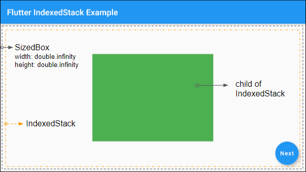
)Basically, IndexedStack's size is as small as possible, and tries to be larger than all its children (Except for the Positioned or Transform ones).
You can control the size of IndexedStack by placing it in a SizedBox.
2. Examples
A simple example of IndexedStack:
main.dart (ex1)
import 'package:flutter/material.dart';
void main() {
runApp(MyApp());
}
class MyApp extends StatelessWidget {
@override
Widget build(BuildContext context) {
return MaterialApp(
title: 'o7planning.org',
debugShowCheckedModeBanner: false,
theme: ThemeData(
primarySwatch: Colors.blue,
visualDensity: VisualDensity.adaptivePlatformDensity,
),
home: MyHomePage(),
);
}
}
class MyHomePage extends StatefulWidget {
@override
State<StatefulWidget> createState() {
return _MyHomePageState();
}
}
class _MyHomePageState extends State<MyHomePage> {
int selectedIndex = 1;
@override
Widget build(BuildContext context) {
return Scaffold(
appBar: AppBar(
title: Text("Flutter IndexedStack Example")
),
body: SizedBox (
width: double.infinity,
height: double.infinity,
child: IndexedStack (
alignment: Alignment.center,
index: this.selectedIndex,
children: <Widget>[
Container(
width: 290,
height: 210,
color: Colors.green,
),
Container(
width: 250,
height: 170,
color: Colors.red,
),
Container(
width: 220,
height: 150,
color: Colors.yellow,
),
]
),
),
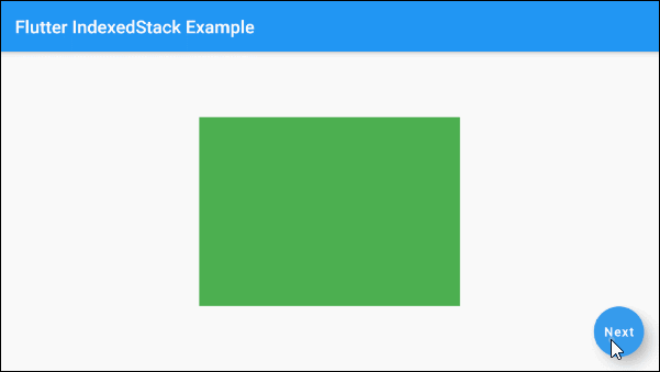
floatingActionButton: FloatingActionButton(
child: Text("Next"),
onPressed: () {
setState(() {
if(this.selectedIndex < 2) {
this.selectedIndex++;
} else {
this.selectedIndex = 0;
}
});
},
),
);
}
}3. children
children - is a list of child widgets of IndexedStack.
List<Widget> children: const <Widget>[]}4. index
index: Index of the child widget will be displayed, its default value is 0. If the index is null, no child widgets will be displayed.
int index: 05. fit (sizing)
sizing parameter in the IndexedStack's constructor will assign a value to fit property. It shows "How to size for child widgets other than Positioned of IndexedStack". The default value of fit property is StackFit.loose.
StackFit sizing: StackFit.loose

// Enum:
 StackFit.expand
 StackFit.loose
StackFit.passthrough- Flutter StackFit
6. textDirection
textDirection property is used to set text's direction. Its value affects behavior of alignment property.
TextDirection textDirectionFlutter Programming Tutorials
- Flutter Column Tutorial with Examples
- Flutter Stack Tutorial with Examples
- Flutter IndexedStack Tutorial with Examples
- Flutter Spacer Tutorial with Examples
- Flutter Expanded Tutorial with Examples
- Flutter SizedBox Tutorial with Examples
- Flutter Tween Tutorial with Examples
- Install Flutter SDK on Windows
- Install Flutter Plugin for Android Studio
- Create your first Flutter app - Hello Flutter
- Flutter Scaffold Tutorial with Examples
- Flutter AppBar Tutorial with Examples
- Flutter BottomAppBar Tutorial with Examples
- Flutter TextButton Tutorial with Examples
- Flutter ElevatedButton Tutorial with Examples
- Flutter EdgeInsetsGeometry Tutorial with Examples
- Flutter EdgeInsets Tutorial with Examples
- Flutter CircularProgressIndicator Tutorial with Examples
- Flutter LinearProgressIndicator Tutorial with Examples
- Flutter Center Tutorial with Examples
- Flutter Align Tutorial with Examples
- Flutter Row Tutorial with Examples
- Flutter SplashScreen Tutorial with Examples
- Flutter Alignment Tutorial with Examples
- Flutter Positioned Tutorial with Examples
- Flutter SimpleDialog Tutorial with Examples
- Flutter AlertDialog Tutorial with Examples
- Flutter Navigation and Routing Tutorial with Examples
- Flutter TabBar Tutorial with Examples
- Flutter Banner Tutorial with Examples
- Flutter BottomNavigationBar Tutorial with Examples
- Flutter FancyBottomNavigation Tutorial with Examples
- Flutter Card Tutorial with Examples
- Flutter Border Tutorial with Examples
- Flutter ContinuousRectangleBorder Tutorial with Examples
- Flutter RoundedRectangleBorder Tutorial with Examples
- Flutter CircleBorder Tutorial with Examples
- Flutter StadiumBorder Tutorial with Examples
- Flutter Container Tutorial with Examples
- Flutter RotatedBox Tutorial with Examples
- Flutter CircleAvatar Tutorial with Examples
- Flutter IconButton Tutorial with Examples
- Flutter FlatButton Tutorial with Examples
- Flutter SnackBar Tutorial with Examples
Show More