Flutter Stack Tutorial with Examples
1. Stack
In Flutter, Stack is a container that allows placing its child widget on top of each other, the first child widget will be placed in the bottom. Stack is a solution to save space of the application. You can change the order of the child widgets to create a simple animation.
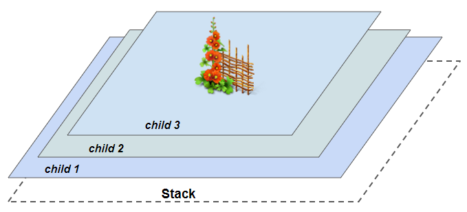
Stack stacks its children according to the principle: the first child widget will be placed on the bottom, the newest child widget will be placed on the top. When you change order of the child widgets, Stack will be redrawn. If the number and order of child widgets changes continuously, each child widget needs to be provided with a specific and unique Key value, helping Stack to efficiently manage child widgets.
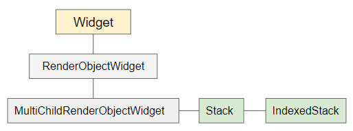
IndexedStack is a subclass of Stack. Unlike Stack, IndexedStack only displays at most one widget at a time, and other widgets will be hidden. You can specify which child widget will be displayed through the property index, if the value of index is null, no child widget will be displayed.
Stack Constructor
Stack(
{Key key,
List<Widget> children: const <Widget>[],
AlignmentGeometry alignment: AlignmentDirectional.topStart,
TextDirection textDirection,
StackFit fit: StackFit.loose,
Overflow overflow: Overflow.clip,
Clip clipBehavior: Clip.hardEdge
}
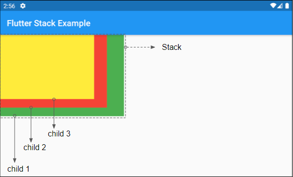
)Here is a simple example, a Stack with 3 child widgets, by default they are located at the top right corner of the Stack, you can see them overlap each other:
(ex1)
Stack(
  children: <Widget>[
    Container(
      width: 290,
      height: 190,
      color: Colors.green,
    ),
    Container(
      width: 250,
      height: 170,
      color: Colors.red,
    ),
    Container(
      width: 220,
      height: 150,
      color: Colors.yellow,
    ),
  ],
)
Basically, Stack size is as small as possible, and try to be larger than all of its child widgets (Except child widgets such as Positioned or Transform, see more overflow property).
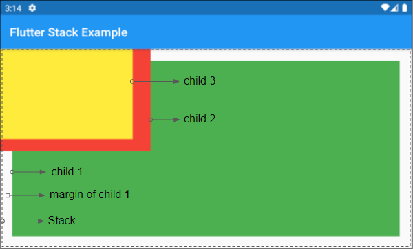
Let's see an example: A Stack with a child widget of maximum size.
(ex2)
Stack(
children: <Widget>[
Container( // First child (child 1)
width: double.infinity,
height: double.infinity,
color: Colors.green,
margin: EdgeInsets.all(20)
),
Container(
width: 250,
height: 170,
color: Colors.red,
),
Container(
width: 220,
height: 150,
color: Colors.yellow,
),
],
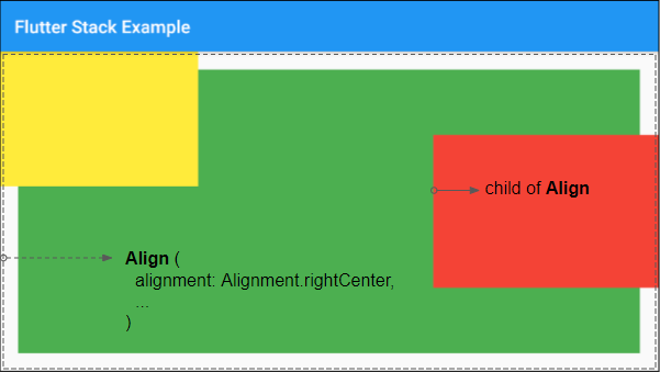
)If you want to align position of a child widget (of Stack), put it in a Align.
Note: When widthFactor and heightFactor are not specified, but the child is specified, Align will be as large as possible.
(ex3)
Stack(
  children: <Widget>[
    Container(
        width: double.infinity,
        height: double.infinity,
        color: Colors.green,
        margin: EdgeInsets.all(20)
    ),
    Align (
      alignment: Alignment.centerRight,
      child: Container(
        width: 250,
        height: 170,
        color: Colors.red,
      ),
    ),
    Container(
      width: 220,
      height: 150,
      color: Colors.yellow,
    ),
  ],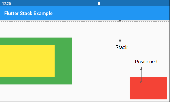
)You can also align the position of a child widget (of Stack) by placing it in a Positioned.
3. alignment
alignment property is used to align child widgets other than Positioned. Its default value is AlignmentDirectional.topStart.
AlignmentGeometry alignment: AlignmentDirectional.topStart- Flutter AlignmentDirectional
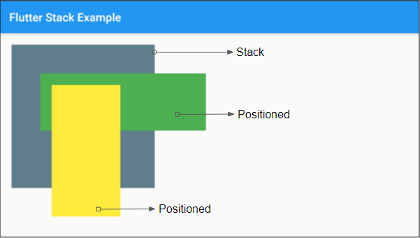
Example below shows alignment property of Stack has no effect on the child widget which is Positioned.
SizedBox (
   width: double.infinity,
   height: double.infinity,
   child: Stack(
     alignment: Alignment.centerLeft,
     children: <Widget>[
       Container(
         width: 290,
         height: 190,
         color: Colors.green,
       ),
       Container(
         width: 220,
         height: 130,
         color: Colors.yellow,
       ),
       Positioned (
         bottom: 10,
         right: 10,
         child: Container(
           width: 150,
           height: 90,
           color: Colors.red,
         ),
       ),
     ],
   )
)
4. textDirection
textDirection property is used to set text direction. Its value affects behavior of alignment property.
TextDirection textDirection5. fit
fit property shows "How to define size non-Positioned child widgets of IndexedStack". Its default value is StackFit.loose.
StackFit fit: StackFit.loose

// Enum:
 StackFit.expand
 StackFit.loose
StackFit.passthrough- Flutter StackFit
6. overflow
overflow property is used to specify how Stack treats those child widgets that overflow from it. The treatment could be to clip the overflow, or allow the overflow to show. Default value of overflow is Overflow.clip.
Overflow overflow: Overflow.clip

// Enum:
Overflow.clip
Overflow.visible
Test results show that overflow:Overflow.visible only works with some types of widget (eg Positioned or Transform).
- Flutter Positioned
- Flutter Transform
Example:
overflow (ex1)
Container (
    width: 250,
    height: 250,
    color: Colors.blueGrey,
    margin: EdgeInsets.all(20),
    child: Stack (
      overflow: Overflow.visible,
      children: <Widget>[
        Positioned(
          top: 50,
          left: 50,
          child: Container(
            width: 290,
            height: 100,
            color: Colors.green,
          ),
        ),
        Positioned(
          top: 70,
          left: 70,
          child: Container(
            width: 120,
            height: 230,
            color: Colors.yellow,
          ),
        )
      ],
    )
)
Example: A Transform is skewed along Y axis, it can be overflow from Stack. The overflow along Y axis will be displayed, while that of X axis will be clipped.
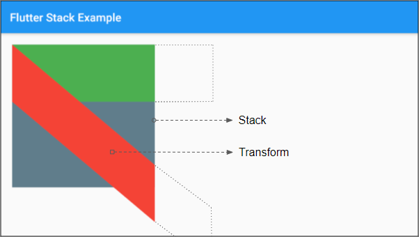
overflow (ex2)
Container (
    width: 250,
    height: 250,
    margin: EdgeInsets.all(20),
    color: Colors.blueGrey,
    child: Stack (
      overflow: Overflow.visible,
      children: <Widget>[
        Container(
          height: 100,
          width: 300,
          color: Colors.green,
        ),
        Transform(
          alignment: FractionalOffset.topLeft,
          transform: Matrix4.skewY(0.7), // skew will not go out of y bounds
          child: Container(
            height: 100,
            width: 300,
            color: Colors.red,
          ),
        ),
      ],
    )
)- Flutter Transform
Flutter Programming Tutorials
- Flutter Column Tutorial with Examples
- Flutter Stack Tutorial with Examples
- Flutter IndexedStack Tutorial with Examples
- Flutter Spacer Tutorial with Examples
- Flutter Expanded Tutorial with Examples
- Flutter SizedBox Tutorial with Examples
- Flutter Tween Tutorial with Examples
- Install Flutter SDK on Windows
- Install Flutter Plugin for Android Studio
- Create your first Flutter app - Hello Flutter
- Flutter Scaffold Tutorial with Examples
- Flutter AppBar Tutorial with Examples
- Flutter BottomAppBar Tutorial with Examples
- Flutter TextButton Tutorial with Examples
- Flutter ElevatedButton Tutorial with Examples
- Flutter EdgeInsetsGeometry Tutorial with Examples
- Flutter EdgeInsets Tutorial with Examples
- Flutter CircularProgressIndicator Tutorial with Examples
- Flutter LinearProgressIndicator Tutorial with Examples
- Flutter Center Tutorial with Examples
- Flutter Align Tutorial with Examples
- Flutter Row Tutorial with Examples
- Flutter SplashScreen Tutorial with Examples
- Flutter Alignment Tutorial with Examples
- Flutter Positioned Tutorial with Examples
- Flutter SimpleDialog Tutorial with Examples
- Flutter AlertDialog Tutorial with Examples
- Flutter Navigation and Routing Tutorial with Examples
- Flutter TabBar Tutorial with Examples
- Flutter Banner Tutorial with Examples
- Flutter BottomNavigationBar Tutorial with Examples
- Flutter FancyBottomNavigation Tutorial with Examples
- Flutter Card Tutorial with Examples
- Flutter Border Tutorial with Examples
- Flutter ContinuousRectangleBorder Tutorial with Examples
- Flutter RoundedRectangleBorder Tutorial with Examples
- Flutter CircleBorder Tutorial with Examples
- Flutter StadiumBorder Tutorial with Examples
- Flutter Container Tutorial with Examples
- Flutter RotatedBox Tutorial with Examples
- Flutter CircleAvatar Tutorial with Examples
- Flutter IconButton Tutorial with Examples
- Flutter FlatButton Tutorial with Examples
- Flutter SnackBar Tutorial with Examples
Show More