Flutter SnackBar Tutorial with Examples
1. SnackBar
In mobile application, SnackBar is a small interface component that provides a brief response after an user action. It appears at the bottom of the screen, and disappears automatically when time is up or when user interacts elsewhere on the screen.
SnackBar also provides a button as an option to perform an action. For example, undo an action you just performed, or retry the action you just performed if it fails.
SnackBar Constructor:
SnackBar Constructor
const SnackBar(
    {Key key,
    @required Widget content,
    Color backgroundColor,
    double elevation,
    EdgeInsetsGeometry margin,
    EdgeInsetsGeometry padding,
    double width,
    ShapeBorder shape,
    SnackBarBehavior behavior,
    SnackBarAction action,
    Duration duration: _snackBarDisplayDuration,
    Animation<double> animation,
    VoidCallback onVisible}
)
Flutter app follows Material Design consistency guidelines to ensure that when SnackBar shows up at the bottom of the screen it does not overlap with other important child widgets, such as FloatingActionButton. Therefore, SnackBar needs to be called via Scaffold.
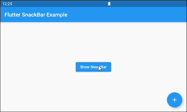
Let's see a simple example:
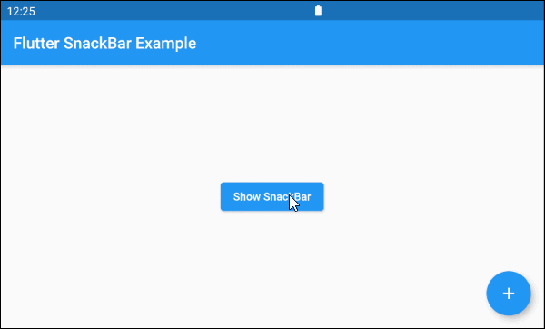
main.dart (ex1)
import 'package:flutter/material.dart';

void main() {
  runApp(MyApp());
}

class MyApp extends StatelessWidget {

  @override
  Widget build(BuildContext context) {
    return MaterialApp(
      title: 'o7planning.org',
      debugShowCheckedModeBanner: false,
      theme: ThemeData(
        primarySwatch: Colors.blue,
        visualDensity: VisualDensity.adaptivePlatformDensity,
      ),
      home: MyHomePage(),
    );
  }
}

class MyHomePage extends StatelessWidget {

  @override
  Widget build(BuildContext context) {
    return Scaffold(
      appBar: AppBar(
        title: Text('Flutter SnackBar Example'),
      ),
      floatingActionButton: FloatingActionButton(
        child: Icon(Icons.add),
        onPressed: () {},
      ),
      body: Center(
          child: Builder(
              builder: (BuildContext ctxOfScaffold)  {
                return ElevatedButton(
                    child: Text('Show SnackBar'),
                    onPressed: () {
                      this._showSnackBarMsgDeleted(ctxOfScaffold);
                    }
                );
              }
          )
      )
    );
  }

  void _showSnackBarMsgDeleted(BuildContext ctxOfScaffold) {
    // Create a SnackBar.
    final snackBar = SnackBar(
      content: Text('Message is deleted!'),
      action: SnackBarAction(
        label: 'UNDO',
        onPressed: () {
          this._showSnackBarMsgRestored(ctxOfScaffold);
        },
      ),
    );
    // Find the Scaffold in the widget tree
    // and use it to show a SnackBar.
    Scaffold.of(ctxOfScaffold).showSnackBar(snackBar);
  }

  void _showSnackBarMsgRestored(BuildContext ctxOfScaffold) {
    // Create a SnackBar.
    final snackBar = SnackBar(
      content: Text('Message is restored!')
    );
    // Find the Scaffold in the widget tree
    // and use it to show a SnackBar.
    Scaffold.of(ctxOfScaffold).showSnackBar(snackBar);
  }
}
2. content
content - The main content displayed on the SnackBar, normally a Text object.
@required Widget content4. elevation
elevation - SnackBar's Z-axis coordinates, its value affects the SnackBar's shadow size.
double elevationNote: elevation property only works for floating SnackBar (behavior: SnackBarBehavior.floating).
elevation (ex1)
final snackBar = SnackBar(
  content: Text('Message is deleted!'),
  elevation: 15,
  behavior: SnackBarBehavior.floating,
  action: SnackBarAction(
    label: 'UNDO',
    onPressed: ()  {
    },
  ),
)
5. margin
margin property is used to create an empty space around SnackBar. However, this property only works if the value of behavior is SnackBarBehavior.floating and the width is not specified. Its default value is EdgeInsets.fromLTRB(15.0, 5.0, 15.0, 10.0).
EdgeInsetsGeometry margin6. padding
padding property is used to create an empty space within SnackBar and surround content and action.
EdgeInsetsGeometry padding7. width
width property is the width of SnackBar and it only works if the behavior is SnackBarBehavior.floating. If width is specified, SnackBar will be placed in the center horizontally.
double width9. behavior
behavior property specifies SnackBar's behavior and position.
SnackBarBehavior behavior

// Enum values:
SnackBarBehavior.fixed
SnackBarBehavior.floating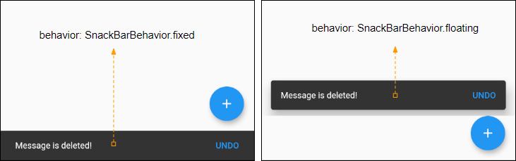
Flutter Programming Tutorials
- Flutter Column Tutorial with Examples
- Flutter Stack Tutorial with Examples
- Flutter IndexedStack Tutorial with Examples
- Flutter Spacer Tutorial with Examples
- Flutter Expanded Tutorial with Examples
- Flutter SizedBox Tutorial with Examples
- Flutter Tween Tutorial with Examples
- Install Flutter SDK on Windows
- Install Flutter Plugin for Android Studio
- Create your first Flutter app - Hello Flutter
- Flutter Scaffold Tutorial with Examples
- Flutter AppBar Tutorial with Examples
- Flutter BottomAppBar Tutorial with Examples
- Flutter TextButton Tutorial with Examples
- Flutter ElevatedButton Tutorial with Examples
- Flutter EdgeInsetsGeometry Tutorial with Examples
- Flutter EdgeInsets Tutorial with Examples
- Flutter CircularProgressIndicator Tutorial with Examples
- Flutter LinearProgressIndicator Tutorial with Examples
- Flutter Center Tutorial with Examples
- Flutter Align Tutorial with Examples
- Flutter Row Tutorial with Examples
- Flutter SplashScreen Tutorial with Examples
- Flutter Alignment Tutorial with Examples
- Flutter Positioned Tutorial with Examples
- Flutter SimpleDialog Tutorial with Examples
- Flutter AlertDialog Tutorial with Examples
- Flutter Navigation and Routing Tutorial with Examples
- Flutter TabBar Tutorial with Examples
- Flutter Banner Tutorial with Examples
- Flutter BottomNavigationBar Tutorial with Examples
- Flutter FancyBottomNavigation Tutorial with Examples
- Flutter Card Tutorial with Examples
- Flutter Border Tutorial with Examples
- Flutter ContinuousRectangleBorder Tutorial with Examples
- Flutter RoundedRectangleBorder Tutorial with Examples
- Flutter CircleBorder Tutorial with Examples
- Flutter StadiumBorder Tutorial with Examples
- Flutter Container Tutorial with Examples
- Flutter RotatedBox Tutorial with Examples
- Flutter CircleAvatar Tutorial with Examples
- Flutter IconButton Tutorial with Examples
- Flutter FlatButton Tutorial with Examples
- Flutter SnackBar Tutorial with Examples
Show More