Flutter BottomAppBar Tutorial with Examples
1. BottomAppBar
A bottom menu is a traditional style of iOS apps. In Flutter, you can do this with BottomAppBar. Besides, the BottomAppBar also has a handy feature that allows you to attach a FloatingActionButton to it.
BottomAppBar Constructor:
BottomAppBar constructor
const BottomAppBar(
    {Key key,
    Color color,
    double elevation,
    NotchedShape shape,
    Clip clipBehavior: Clip.none,
    double notchMargin: 4.0,
    Widget child}
)
The BottomAppBar is usually placed in a Scaffold through the AppBar.bottomNavigationBar property, and it will appear at the bottom of the Scaffold.
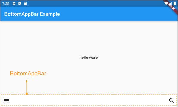
2. child
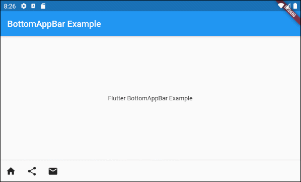
child is the most important property of the BottomAppBar. In most use cases, it will be a Row, and this Row object contains one or more child Widget(s)such as IconButton, PopupMenuButton,etc.
Widget childAn example of a BottomAppBar whose action(s) are IconButton(s) and PopupMenuButton(s).
main.dart (child - ex1)
import 'package:flutter/material.dart';
void main() {
runApp(MyApp());
}
class MyApp extends StatelessWidget {
// This widget is the root of your application.
@override
Widget build(BuildContext context) {
return MaterialApp(
title: 'Title of Application',
theme: ThemeData(
primarySwatch: Colors.blue,
visualDensity: VisualDensity.adaptivePlatformDensity,
),
home: MyHomePage(),
);
}
}
class MyHomePage extends StatelessWidget {
MyHomePage({Key key}) : super(key: key);
@override
Widget build(BuildContext context) {
return Scaffold(
appBar: AppBar(
title: Text("BottomAppBar Example"),
),
body: Center(
child: Text(
'Flutter BottomAppBar Example',
)
),
bottomNavigationBar: BottomAppBar(
child: new Row(
mainAxisSize: MainAxisSize.max,
mainAxisAlignment: MainAxisAlignment.start,
children: <Widget>[
IconButton(icon: Icon(Icons.home), onPressed: () {},),
PopupMenuButton(
icon: Icon(Icons.share),
itemBuilder: (context) => [
PopupMenuItem(
value: 1,
child: Text("Facebook"),
),
PopupMenuItem(
value: 2,
child: Text("Instagram"),
),
],
),
IconButton(icon: Icon(Icons.email), onPressed: () {},),
],
),
)
);
}
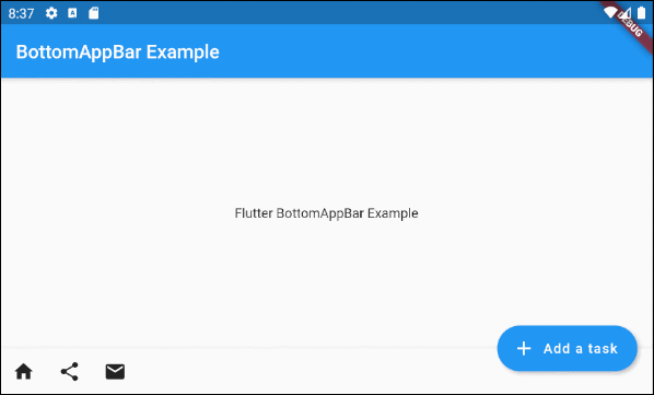
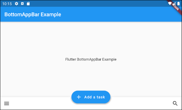
}To extend the example above, we attach a FloatingActionButton to the right side of the BottomAppBar.
main.dart (child ex2)
import 'package:flutter/material.dart';
void main() {
runApp(MyApp());
}
class MyApp extends StatelessWidget {
// This widget is the root of your application.
@override
Widget build(BuildContext context) {
return MaterialApp(
title: 'Title of Application',
theme: ThemeData(
primarySwatch: Colors.blue,
visualDensity: VisualDensity.adaptivePlatformDensity,
),
home: MyHomePage(),
);
}
}
class MyHomePage extends StatelessWidget {
MyHomePage({Key key}) : super(key: key);
@override
Widget build(BuildContext context) {
return Scaffold(
appBar: AppBar(
title: Text("BottomAppBar Example"),
),
body: Center(
child: Text(
'Flutter BottomAppBar Example',
)
),
floatingActionButton: FloatingActionButton.extended (
elevation: 4.0,
icon: const Icon(Icons.add),
label: const Text('Add a task'),
onPressed: () {},
),
floatingActionButtonLocation: FloatingActionButtonLocation.endDocked,
bottomNavigationBar: BottomAppBar(
child: new Row(
mainAxisSize: MainAxisSize.max,
mainAxisAlignment: MainAxisAlignment.start,
children: <Widget>[
IconButton(icon: Icon(Icons.home), onPressed: () {},),
PopupMenuButton(
icon: Icon(Icons.share),
itemBuilder: (context) => [
PopupMenuItem(
value: 1,
child: Text("Facebook"),
),
PopupMenuItem(
value: 2,
child: Text("Instagram"),
),
],
),
IconButton(icon: Icon(Icons.email), onPressed: () {},),
],
),
)
);
}
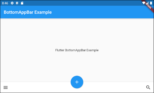
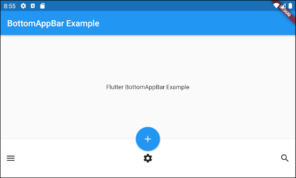
}For example: A BottomAppBar along with a FloatingActionButton is anchored in the middle.
main.dart (child ex3)
import 'package:flutter/material.dart';

void main() {
  runApp(MyApp());
}

class MyApp extends StatelessWidget {
  // This widget is the root of your application.
  @override
  Widget build(BuildContext context) {
    return MaterialApp(
      title: 'Title of Application',
      theme: ThemeData(
        primarySwatch: Colors.blue,
        visualDensity: VisualDensity.adaptivePlatformDensity,
      ),
      home: MyHomePage(),
    );
  }
}

class MyHomePage extends StatelessWidget {
  MyHomePage({Key key}) : super(key: key);

  @override
  Widget build(BuildContext context) {
    return Scaffold(
        appBar: AppBar(
          title: Text("BottomAppBar Example"),
        ),
        body: Center(
            child:  Text(
              'Flutter BottomAppBar Example',
            )
        ),
        floatingActionButton: FloatingActionButton(
          onPressed: () { },
          tooltip: 'Increment',
          child: Icon(Icons.add),
          elevation: 2.0,
        ),
        floatingActionButtonLocation: FloatingActionButtonLocation.centerDocked,
        bottomNavigationBar: BottomAppBar(
          child: new Row(
            mainAxisSize: MainAxisSize.max,
            mainAxisAlignment: MainAxisAlignment.spaceBetween,
            children: <Widget>[
              IconButton(icon: Icon(Icons.menu), onPressed: () {},),
              IconButton(icon: Icon(Icons.search), onPressed: () {},),
            ],
          ),
        )
    );
  }
}
Example: Customize the height of the BottomAppBar:
main.dart (child ex4)
import 'package:flutter/material.dart';

void main() {
  runApp(MyApp());
}

class MyApp extends StatelessWidget {
  // This widget is the root of your application.
  @override
  Widget build(BuildContext context) {
    return MaterialApp(
      title: 'Title of Application',
      theme: ThemeData(
        primarySwatch: Colors.blue,
        visualDensity: VisualDensity.adaptivePlatformDensity,
      ),
      home: MyHomePage(),
    );
  }
}

class MyHomePage extends StatelessWidget {
  MyHomePage({Key key}) : super(key: key);

  @override
  Widget build(BuildContext context) {
    return Scaffold(
        appBar: AppBar(
          title: Text("BottomAppBar Example"),
        ),
        body: Center(
            child:  Text(
              'Flutter BottomAppBar Example',
            )
        ),
        floatingActionButton: FloatingActionButton(
          onPressed: () { },
          tooltip: 'Increment',
          child: Icon(Icons.add),
          elevation: 2.0,
        ),
        floatingActionButtonLocation: FloatingActionButtonLocation.centerDocked,
        bottomNavigationBar: BottomAppBar(
          child: Container(
            height: 90.0,
            child: new Row(
              mainAxisSize: MainAxisSize.max,
              mainAxisAlignment: MainAxisAlignment.spaceBetween,
              children: <Widget>[
                IconButton(icon: Icon(Icons.menu), onPressed: () {},),
                IconButton(icon: Icon(Icons.settings), onPressed: () {},),
                IconButton(icon: Icon(Icons.search), onPressed: () {},),
              ],
            ),
          )
        )
    );
  }
}
3. shape
shape property is used to define the shape of the notch when the FloatingActionButton is placed on a BottomAppBar.
NotchedShape shapeNotchedShape is an abstract class, it has two subclasses CircularNotchedRectangle and AutomaticNotchedShape.
- The CircularNotchedRectangle class helps you create a circular notch that fit the circular FloatingActionButton(s).
- The AutomaticNotchedShape class helps you create custom notches that fit the different shapes of the FloatingActionButton.
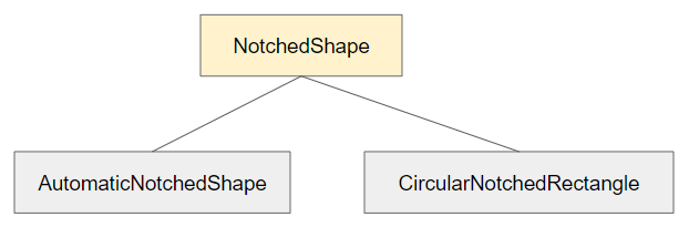
- CircularNotchedRectangle
- AutomaticNotchedShape
Now take a look at an example of using CircularNotchedRectangle to create a circular notch:

main.dart (shape ex1)
import 'package:flutter/material.dart';

void main() {
  runApp(MyApp());
}

class MyApp extends StatelessWidget {
  // This widget is the root of your application.
  @override
  Widget build(BuildContext context) {
    return MaterialApp(
      title: 'Title of Application',
      theme: ThemeData(
        primarySwatch: Colors.blue,
        visualDensity: VisualDensity.adaptivePlatformDensity,
      ),
      home: MyHomePage(),
    );
  }
}

class MyHomePage extends StatelessWidget {
  MyHomePage({Key key}) : super(key: key);

  @override
  Widget build(BuildContext context) {
    return Scaffold(
        appBar: AppBar(
          title: Text("BottomAppBar Example"),
        ),
        body: Center(
            child:  Text(
              'Flutter BottomAppBar Example',
            )
        ),
        floatingActionButton: FloatingActionButton(
          onPressed: () { },
          tooltip: 'Increment',
          child: Icon(Icons.add),
          elevation: 2.0,
        ),
        floatingActionButtonLocation: FloatingActionButtonLocation.centerDocked,
        bottomNavigationBar: BottomAppBar(
          child: Row(
            mainAxisSize: MainAxisSize.max,
            mainAxisAlignment: MainAxisAlignment.spaceBetween,
            children: <Widget>[
              IconButton(icon: Icon(Icons.menu), onPressed: () {},),
              IconButton(icon: Icon(Icons.search), onPressed: () {},),
            ],
          ),
          shape: CircularNotchedRectangle(),
        )
    );
  }
}
Note: Do not use the CircularNotchedRectangle with a FloatingActionButton which is not a circle. Otherwise, you will get a unsatisfactory result:

For example, use an AutomaticNotchedShape with a rectangular FloatingActionButton:
main.dart (shape ex3)
import 'package:flutter/material.dart';

void main() {
  runApp(MyApp());
}

class MyApp extends StatelessWidget {
  // This widget is the root of your application.
  @override
  Widget build(BuildContext context) {
    return MaterialApp(
      title: 'Title of Application',
      theme: ThemeData(
        primarySwatch: Colors.blue,
        visualDensity: VisualDensity.adaptivePlatformDensity,
      ),
      home: MyHomePage(),
    );
  }
}

class MyHomePage extends StatelessWidget {
  MyHomePage({Key key}) : super(key: key);

  @override
  Widget build(BuildContext context) {
    return Scaffold(
        appBar: AppBar(
          title: Text("BottomAppBar Example"),
        ),
        body: Center(
            child:  Text(
              'Flutter BottomAppBar Example',
            )
        ),
        floatingActionButton: FloatingActionButton.extended (
          elevation: 4.0,
          icon: const Icon(Icons.add),
          label: const Text('Add a task'),
          onPressed: () {},
        ),
        floatingActionButtonLocation: FloatingActionButtonLocation.centerDocked,
        bottomNavigationBar: BottomAppBar(
          child: Row(
            mainAxisSize: MainAxisSize.max,
            mainAxisAlignment: MainAxisAlignment.spaceBetween,
            children: <Widget>[
              IconButton(icon: Icon(Icons.menu), onPressed: () {},),
              IconButton(icon: Icon(Icons.search), onPressed: () {},),
            ],
          ),
          shape: AutomaticNotchedShape(
              RoundedRectangleBorder(),
              StadiumBorder(side: BorderSide())
          ),
        )
    );
  }
}
4. color
The color property is used to specify the color of BottomAppBar.
Color color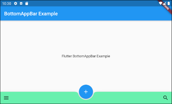
color (ex1)
BottomAppBar(
  child: Row(
    mainAxisSize: MainAxisSize.max,
    mainAxisAlignment: MainAxisAlignment.spaceBetween,
    children: <Widget>[
      IconButton(icon: Icon(Icons.menu), onPressed: () {},),
      IconButton(icon: Icon(Icons.search), onPressed: () {},),
    ],
  ),
  shape: CircularNotchedRectangle(),
  color: Colors.greenAccent
)Flutter Programming Tutorials
- Flutter Column Tutorial with Examples
- Flutter Stack Tutorial with Examples
- Flutter IndexedStack Tutorial with Examples
- Flutter Spacer Tutorial with Examples
- Flutter Expanded Tutorial with Examples
- Flutter SizedBox Tutorial with Examples
- Flutter Tween Tutorial with Examples
- Install Flutter SDK on Windows
- Install Flutter Plugin for Android Studio
- Create your first Flutter app - Hello Flutter
- Flutter Scaffold Tutorial with Examples
- Flutter AppBar Tutorial with Examples
- Flutter BottomAppBar Tutorial with Examples
- Flutter TextButton Tutorial with Examples
- Flutter ElevatedButton Tutorial with Examples
- Flutter EdgeInsetsGeometry Tutorial with Examples
- Flutter EdgeInsets Tutorial with Examples
- Flutter CircularProgressIndicator Tutorial with Examples
- Flutter LinearProgressIndicator Tutorial with Examples
- Flutter Center Tutorial with Examples
- Flutter Align Tutorial with Examples
- Flutter Row Tutorial with Examples
- Flutter SplashScreen Tutorial with Examples
- Flutter Alignment Tutorial with Examples
- Flutter Positioned Tutorial with Examples
- Flutter SimpleDialog Tutorial with Examples
- Flutter AlertDialog Tutorial with Examples
- Flutter Navigation and Routing Tutorial with Examples
- Flutter TabBar Tutorial with Examples
- Flutter Banner Tutorial with Examples
- Flutter BottomNavigationBar Tutorial with Examples
- Flutter FancyBottomNavigation Tutorial with Examples
- Flutter Card Tutorial with Examples
- Flutter Border Tutorial with Examples
- Flutter ContinuousRectangleBorder Tutorial with Examples
- Flutter RoundedRectangleBorder Tutorial with Examples
- Flutter CircleBorder Tutorial with Examples
- Flutter StadiumBorder Tutorial with Examples
- Flutter Container Tutorial with Examples
- Flutter RotatedBox Tutorial with Examples
- Flutter CircleAvatar Tutorial with Examples
- Flutter IconButton Tutorial with Examples
- Flutter FlatButton Tutorial with Examples
- Flutter SnackBar Tutorial with Examples
Show More