Flutter Scaffold Tutorial with Examples
1. Scaffold
Scaffold class is an expandable widget that fills the available space or the screen. It provides an API to display the main widgets of the application such as Drawer, SnackBar, Bottom-Sheet, FloatingActionButton, AppBar, and BottomNavigationBar, etc.
Scaffold Constructor:
Scaffold constructor
const Scaffold({
  Key key,
  PreferredSizeWidget appBar,
  Widget body,
  Widget floatingActionButton,
  FloatingActionButtonLocation floatingActionButtonLocation,
  FloatingActionButtonAnimator floatingActionButtonAnimator,
  List<Widget> persistentFooterButtons,
  Widget drawer,
  Widget endDrawer,
  Widget bottomNavigationBar,
  Widget bottomSheet,
  Color backgroundColor,
  bool resizeToAvoidBottomPadding,
  bool resizeToAvoidBottomInset,
  bool primary: true,
  DragStartBehavior drawerDragStartBehavior:   DragStartBehavior.down
})
2. Examples
main.dart (ex1)
import 'package:flutter/material.dart';

void main() {
  runApp(MyApp());
}

class MyApp extends StatelessWidget {
  // This widget is the root of your application.
  @override
  Widget build(BuildContext context) {
    return MaterialApp(
      title: 'o7planning.org',
      debugShowCheckedModeBanner: false,
      theme: ThemeData(
        primarySwatch: Colors.blue,
        visualDensity: VisualDensity.adaptivePlatformDensity,
      ),
      home: MyHomePage(title: 'Flutter Scaffold Example'),
    );
  }
}

class MyHomePage extends StatelessWidget {
  MyHomePage({Key key, this.title}) : super(key: key);
  final String title;

  @override
  Widget build(BuildContext context) {
    return Scaffold(
      appBar: AppBar(
        title: Text(this.title),
      ),
      body: Center(
          child:
          Text (
            'Hello World',
          )
      ),
    );
  }
}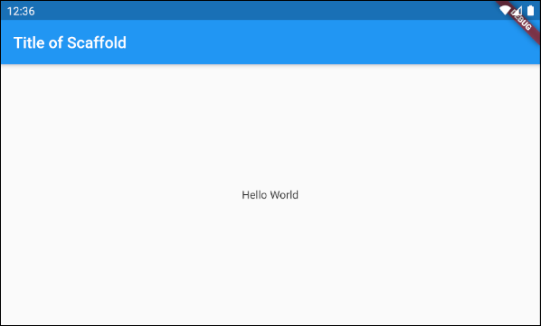
In this example, we have created a Scaffold with two parameters, appBar and body.
Scaffold (appBar + body)
// Create a Scaffold with 2 parameters: appBar, body.
Scaffold(
  appBar: AppBar(
    title: Text('Flutter Scaffold Example'),
  ),
  body: Center(
      child:
      Text(
        'Hello World',
      )
  ),
);3. floatingActionButton
floatingActionButton is a button floating to the surface of the body. By default, it will float at the bottom right corner of the screen. You can specify its location by the floatingActionButtonLocation property.
Widget floatingActionButton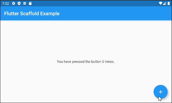
main.dart (floatingActionButton ex1)
import 'package:flutter/material.dart';

void main() => runApp(MyApp());

// This Widget is the main application widget.
class MyApp extends StatelessWidget {
  @override
  Widget build(BuildContext context) {
    return MaterialApp(
      title: "o7planning.org",
      debugShowCheckedModeBanner: false,
      theme: ThemeData(
        primarySwatch: Colors.blue,
        visualDensity: VisualDensity.adaptivePlatformDensity,
      ),
      home: MyHomePage(),
    );
  }
}

class MyHomePage extends StatefulWidget {
  MyHomePage({Key key}) : super(key: key);

  @override
  MyHomePageState createState() => MyHomePageState();
}

class MyHomePageState extends State<MyHomePage> {
  int _count = 0;

  Widget build(BuildContext context) {
    return Scaffold(
      appBar: AppBar(
        title:  Text('Flutter Scaffold Example'),
      ),
      body: Center(
          child: Text('You have pressed the button $_count times.')
      ),
      floatingActionButton: FloatingActionButton(
        onPressed: ()  {
          setState(() => this._count++);
        },
        tooltip: 'Increment Counter',
        child: const Icon(Icons.add),
      ),
    );
  }
}- Flutter FloatingActionButton
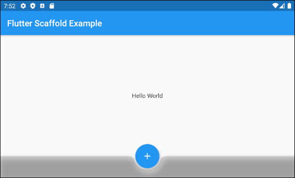
4. floatingActionButtonLocation
floatingActionButtonLocation property is used to specify the display position of the floatingActionButton. Its default value is FloatingActionButtonLocation.endFloat.
FloatingActionButtonLocation floatingActionButtonLocationFor example:
Scaffold (floatingActionButtonLocation ex1)
Scaffold(
appBar: AppBar(
title: Text('Flutter Scaffold Example'),
),
body: Center(
child: Text('Hello World')
),
bottomNavigationBar: BottomAppBar(
shape: CircularNotchedRectangle(),
color: Colors.black12,
child: Container(
height: 50.0,
),
),
floatingActionButton: FloatingActionButton(
onPressed: () {},
tooltip: 'Increment Counter',
child: Icon(Icons.add),
),
floatingActionButtonLocation: FloatingActionButtonLocation.centerDocked,
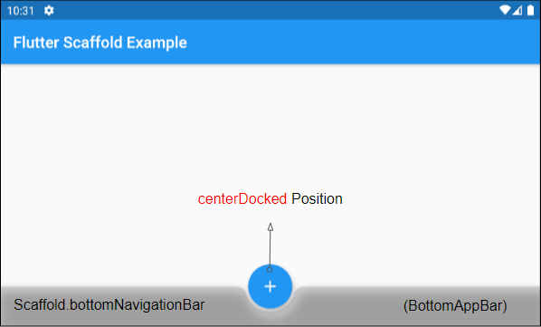
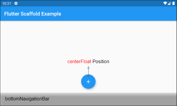
);FloatingActionButtonLocation class allows you to define the display position of the FloatingActionButton. Here are several pre-defined positions as static constants of this class:
- FloatingActionButtonLocation.centerDocked
- FloatingActionButtonLocation.centerFloat
- FloatingActionButtonLocation.centerTop
- FloatingActionButtonLocation.endDocked
- FloatingActionButtonLocation.endFloat
- FloatingActionButtonLocation.endTop
- FloatingActionButtonLocation.miniCenterDocked
- FloatingActionButtonLocation.miniCenterFloat
- FloatingActionButtonLocation.miniCenterTop
- FloatingActionButtonLocation.miniEndDocked
- FloatingActionButtonLocation.miniEndFloat
- FloatingActionButtonLocation.miniEndTo
- FloatingActionButtonLocation.miniStartDocked
- FloatingActionButtonLocation.miniStartFloat
- FloatingActionButtonLocation.miniStartTop
- FloatingActionButtonLocation.startDocked
- FloatingActionButtonLocation.startFloat
- FloatingActionButtonLocation.startTop
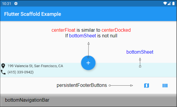
*Docked
startDocked, centerDocked, endDocked, miniStartDocked, miniCenterDocked and miniEndDocked constants allow Scaffold.floatingActionButton to be displayed on the Scaffold.body surface so that the center of the button is aligned with the top border of Scaffold.bottomSheet or Scaffold.persistentFooterButtons or Scaffold.bottomNavigationBar (In such the order of priority)
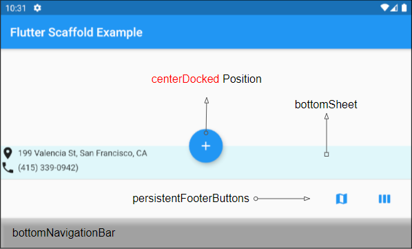
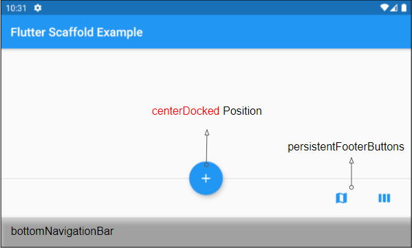
If Scaffold.bottomSheet and Scaffold.persistentFooterButtons are null, and Scaffold.bottomNavigationBar is a BottomAppBar object, Scaffold.floatingActionButton will create a notch on the surface of the Scaffold.bottomNavigationBar.
*Float
The constants startFloat, centerFloat, endFloat, miniStartFloat, miniCenterFloat and miniEndFloat permits Scaffold.floatingActionButton to be displayed above without overlapping the other two widgets, Scaffold.persistentFooterButtons and Scaffold.bottomNavigationBar.
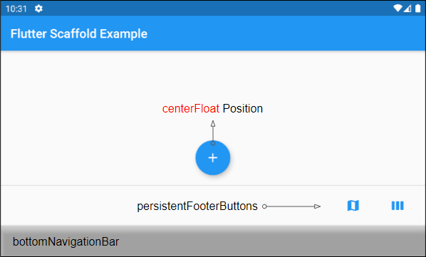
If Scaffold.bottomSheet is not null, the center of Scaffold.floatingActionButton will be aligned with the top border of Scaffold.bottomSheet.
*Top
startTop, centerTop, endTop, miniStartTop, miniCenterTop, miniEndTop constants allow Scaffold.floatingActionButton to be displayed right under the top toolbar so that the center of the button is aligned with the bottom border of the toolbar.
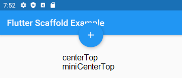
mini*
Constants with the "mini" prefix make the Scaffold.floatingActionButton a bit smaller than usual, which is equivalent to FloatingActionButton.mini = true setting.
5. floatingActionButtonAnimator
floatingActionButtonAnimator property is used to create animated effects for the FloatingActionButton.
FloatingActionButtonAnimator floatingActionButtonAnimator6. drawer
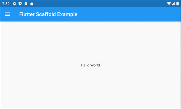
drawer is a Panel displayed on the left side of the body (If textDirection = TextDirection.ltr). It is usually hidden on mobile devices, so you need to swipe left to right to make it appear.
Widget drawerIn some situations, a button can be automatically added to AppBar.leading or AppBar.actions to help the user open the drawer quickly, which is clearly explained in the following article:
For example:
main.dart (drawer)
import 'package:flutter/material.dart';

void main() {
  runApp(MyApp());
}

class MyApp extends StatelessWidget {
  // This widget is the root of your application.
  @override
  Widget build(BuildContext context) {
    return MaterialApp(
      title: 'Title of Application',
      theme: ThemeData(
        primarySwatch: Colors.blue,
        visualDensity: VisualDensity.adaptivePlatformDensity,
      ),
      home: MyHomePage(title: 'Flutter Scaffold Example'),
    );
  }
}

class MyHomePage extends StatelessWidget {
  MyHomePage({Key key, this.title}) : super(key: key);
  final String title;

  @override
  Widget build(BuildContext context) {
    return Scaffold (
      appBar: AppBar(
        title: Text(this.title),
      ),
      body: Center(
          child:
          Text(
            'Hello World',
          )
      ),
      drawer: Drawer(
        child: ListView(
          children: const <Widget> [
            DrawerHeader(
              decoration: BoxDecoration(
                color: Colors.green,
              ),
              child: Text(
                'Hello World',
                style: TextStyle(
                  color: Colors.green,
                  fontSize: 24,
                ),
              ),
            ),
            ListTile(
              title: Text('Gallery'),
            ),
            ListTile(
              title: Text('Slideshow'),
            ),
          ],
        ),
      ),
    );
  }
}- Flutter Drawer
7. endDrawer
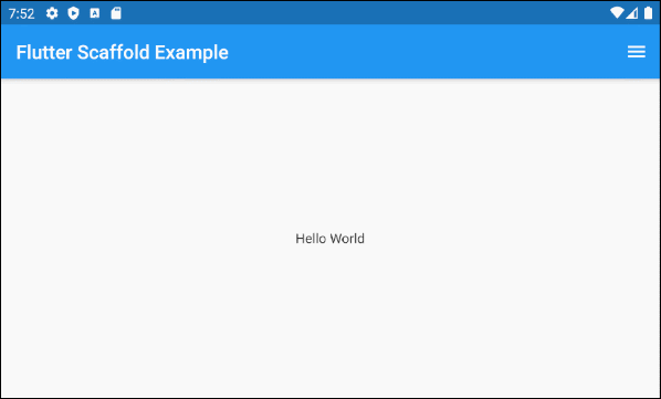
endDrawer is a Panel displayed on the right side of the body (If textDirection = TextDirection.ltr). It is usually hidden on mobile devices, so you need to swipe right to left to make it appear.
Widget endDrawerIn some situations, a button can be automatically added to AppBar.leading or AppBar.actions to help the user open the drawer quickly, which is clearly explained in the following article:
For example:
main.dart (endDrawer ex1)
import 'package:flutter/material.dart';

void main() {
  runApp(MyApp());
}

class MyApp extends StatelessWidget {
  @override
  Widget build(BuildContext context) {
    return MaterialApp(
      title: 'o7planning.org',
      debugShowCheckedModeBanner: false,
      theme: ThemeData(
        primarySwatch: Colors.blue,
        visualDensity: VisualDensity.adaptivePlatformDensity,
      ),
      home: MyHomePage(title: 'Flutter Scaffold Example'),
    );
  }
}

class MyHomePage extends StatelessWidget {
  MyHomePage({Key key, this.title}) : super(key: key);
  final String title;

  @override
  Widget build(BuildContext context) {
    return Scaffold (
      appBar: AppBar(
        title: Text(this.title),
      ),
      body: Center(
          child:
          Text(
            'Hello World',
          )
      ),
      endDrawer: Drawer(
        child: ListView(
          children: const <Widget> [
            DrawerHeader(
              decoration: BoxDecoration(
                color: Colors.green,
              ),
              child: Text(
                'Hello World',
                style: TextStyle(
                  color: Colors.green,
                  fontSize: 24,
                ),
              ),
            ),
            ListTile(
              title: Text('Gallery'),
            ),
            ListTile(
              title: Text('Slideshow'),
            ),
          ],
        ),
      ),
    );
  }
}- Flutter Drawer
9. bottomNavigationBar
bottomNavigationBar is a navigation bar displayed at the bottom of the Scaffold. In most use cases, it is an object of BottomAppBar or BottomNativationBar.
Widget bottomNavigationBar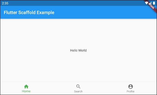
Scaffold (buttomNavigationBar)
import 'package:flutter/material.dart';

void main() {
  runApp(MyApp());
}

class MyApp extends StatelessWidget {
  // This widget is the root of your application.
  @override
  Widget build(BuildContext context) {
    return MaterialApp(
      title: 'Title of Application',
      theme: ThemeData(
        primarySwatch: Colors.blue,
        visualDensity: VisualDensity.adaptivePlatformDensity,
      ),
      home: MyHomePage(title: 'Flutter Scaffold Example'),
    );
  }
}

class MyHomePage extends StatelessWidget {
  MyHomePage({Key key, this.title}) : super(key: key);
  final String title;

  @override
  Widget build(BuildContext context) {
    return Scaffold(
      appBar: AppBar(
        title: Text(this.title),
      ),
      body: Center(
          child: Text('Hello World')
      ),
      bottomNavigationBar : BottomNavigationBar(
          currentIndex : 0,
          fixedColor  : Colors.green,
          items : [
            BottomNavigationBarItem(
              title  : Text("Home"),
              icon  : Icon(Icons.home),
            ),
            BottomNavigationBarItem(
              title : Text("Search"),
              icon  : Icon(Icons.search),
            ),
            BottomNavigationBarItem(
              title  : Text("Profile"),
              icon  : Icon(Icons.account_circle),
            ),
          ],
          onTap  : (int indexOfItem) {

          }),
    );
  }
}10. persistentFooterButtons
persistentFooterButtons is a list of buttons wrapped in a ButtonBar and displayed at the bottom of the Scaffold. They are persistently displayed even when the user scrolls the body of the Scaffold. In most use cases, they are TextButton(s).
List<Widget> persistentFooterButtonsFor example, a Scaffold with the persistentFooterButtons and without the bottomNavigationBar:
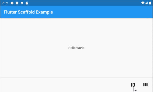
persistentFooterButtons (ex1)
Scaffold(
    appBar: AppBar(
      title:  Text('Flutter Scaffold Example'),
    ),
    body: Center(
        child: Text('Hello World')
    ),
    persistentFooterButtons :  [
      TextButton.icon(icon: Icon(Icons.map), label: Text(""), onPressed: () {}),
      TextButton.icon(icon: Icon(Icons.view_week), label: Text(""), onPressed: () {}),
    ]
)
For example, a Scaffold with the persistentFooterButtons and the bottomNavigationBar:
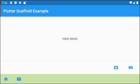
persistentFooterButtons (ex2)
Scaffold(
    appBar: AppBar(
      title:  Text('Flutter Scaffold Example'),
    ),
    body: Center(
        child: Text('Hello World')
    ),
    persistentFooterButtons :  [
      TextButton.icon(icon: Icon(Icons.map), label: Text(""), onPressed: () {}),
      TextButton.icon(icon: Icon(Icons.view_week), label: Text(""), onPressed: () {}),
    ],
    bottomNavigationBar: BottomAppBar(
      color: Colors.lightGreen[200],
      child: new Row(
        mainAxisSize: MainAxisSize.max,
        mainAxisAlignment: MainAxisAlignment.start,
        children: <Widget>[
          TextButton.icon(icon: Icon(Icons.home), label: Text(""), onPressed: () {},),
          TextButton.icon(icon: Icon(Icons.email), label: Text(""), onPressed: () {},),
        ],
      ),
    )
)11. bottomSheet
bottomSheet displays a piece of additional information for the main content of the application. It is persistently displayed near the bottom of the Scaffold even when the user interacts with other parts of the application.
Widget bottomSheetEven though the bottomSheet stands at the bottom of the Scaffold, it still stands before the persistentFooterButtons and the bottomNavigationBar.
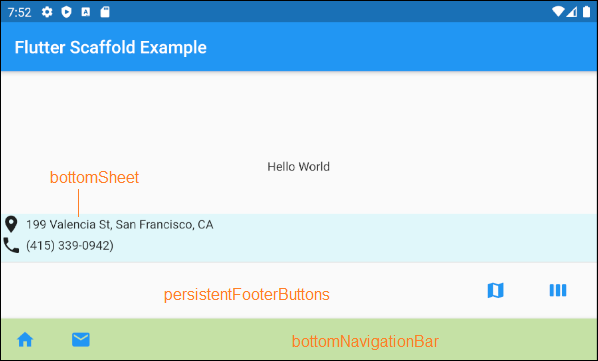
bottomSheet (ex1)
Scaffold(
    appBar: AppBar(
      title:  Text('Flutter Scaffold Example'),
    ),
    body: Center(
        child: Text('Hello World')
    ),
    bottomSheet: Container(
        height: 55,
        color: Colors.cyan[50],
        child:Column    (
          children: [
            Row (
              children: [
                Icon(Icons.place),
                SizedBox(width:5, height:5),
                Text("199 Valencia St, San Francisco, CA")
              ],
            ),
            Row (
              children: [
                Icon(Icons.phone),
                SizedBox(width:5, height:5),
                Text("(415) 339-0942)")
              ],
            )
          ],
        )
    ),
    persistentFooterButtons :  [
      TextButton.icon(icon: Icon(Icons.map), label: Text(""), onPressed: () {}),
      TextButton.icon(icon: Icon(Icons.view_week), label: Text(""), onPressed: () {}),
    ],
    bottomNavigationBar: BottomAppBar(
      color: Colors.lightGreen[200],
      child: new Row(
        mainAxisSize: MainAxisSize.max,
        mainAxisAlignment: MainAxisAlignment.start,
        children: <Widget>[
          TextButton.icon(icon: Icon(Icons.home), label: Text(""), onPressed: () {},),
          TextButton.icon(icon: Icon(Icons.email), label: Text(""), onPressed: () {},),
        ],
      ),
    )
)
ScaffoldState.showButtonSheet()
ScaffoldState.showBottomSheet() method is used to create and display the bottomSheet for the Scaffold if necessary, and the user can close the bottomSheet to save up some space for the application.
main.dart (bottomSheet ex2)
import 'package:flutter/material.dart';
void main() => runApp(MyApp());
// This Widget is the main application widget.
class MyApp extends StatelessWidget {
@override
Widget build(BuildContext context) {
return MaterialApp(
title: "o7planning.org",
debugShowCheckedModeBanner: false,
theme: ThemeData(
primarySwatch: Colors.blue,
visualDensity: VisualDensity.adaptivePlatformDensity,
),
home: MyHomePage(),
);
}
}
class MyHomePage extends StatefulWidget {
MyHomePage({Key key}) : super(key: key);
@override
MyHomePageState createState() => MyHomePageState();
}
class MyHomePageState extends State<MyHomePage> {
Widget build(BuildContext context) {
return Scaffold(
appBar: AppBar(
title: Text('Flutter Scaffold Example'),
),
body: Center(
child: Center(
child: Builder ( // The Builder return a ElevatedButton
// We need a context of Scaffold
builder: (BuildContext ctxOfScaffold) {
return ElevatedButton(
onPressed: () {
this._showMyBottomSheet(ctxOfScaffold);
},
child: Icon(Icons.add),
);
},
)
),
),
floatingActionButton: Builder ( // The Builder return a FloatingActionButton
// We need a context of Scaffold
builder: (BuildContext ctxOfScaffold) {
return FloatingActionButton(
onPressed: () {
this._showMyBottomSheet(ctxOfScaffold);
},
tooltip: 'Increment Counter',
child: Icon(Icons.add),
);
},
),
bottomNavigationBar: BottomAppBar(
color: Colors.lightGreen[200],
child: new Row(
mainAxisSize: MainAxisSize.max,
mainAxisAlignment: MainAxisAlignment.start,
children: <Widget>[
TextButton.icon(icon: Icon(Icons.home), label: Text(""), onPressed: () {},),
TextButton.icon(icon: Icon(Icons.email), label: Text(""), onPressed: () {},),
],
),
)
);
}
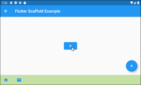
// We need a context object of Scaffold to draw Scaffold.bottomSheet.
void _showMyBottomSheet(BuildContext ctxOfScaffold) { // context of Scaffold.
// ScaffoldState.showBottomSheet:
Scaffold.of(ctxOfScaffold).showBottomSheet<void>(
(BuildContext context) {
return Container(
height: 200,
color: Colors.amber,
child: Center(
child: Column(
mainAxisAlignment: MainAxisAlignment.center,
mainAxisSize: MainAxisSize.min,
children: <Widget>[
const Text('BottomSheet'),
ElevatedButton(
child: Text('Close BottomSheet'),
onPressed: () => Navigator.pop(context),
)
],
),
),
);
},
);
}
}showModalBottomSheet()
showModalBottomSheet() function is used to create and display a Dialog containing a bottom-sheet, which floats above all the other elements of the application. the user have to close it if he/she wants to interact with the elements under it.
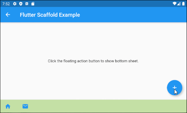
main.dart (bottomSheet ex3)
import 'package:flutter/material.dart';

void main() => runApp(MyApp());

class MyApp extends StatelessWidget {
  @override
  Widget build(BuildContext context) {
    return MaterialApp(
      title: 'o7planning.org',
      debugShowCheckedModeBanner: false,
      theme: ThemeData(
        primarySwatch: Colors.blue,
      ),
      home: MyHomePage(title: 'Flutter Scaffold Example'),
    );
  }
}

class MyHomePage extends StatefulWidget {
  MyHomePage({Key key, this.title}) : super(key: key);

  final String title;

  @override
  MyHomePageState createState() => MyHomePageState();
}

class MyHomePageState extends State<MyHomePage> {

  @override
  Widget build(BuildContext context) {
    return Scaffold(
        appBar: AppBar(
          title: Text(widget.title),
        ),
        body: Center(
          child: Column(
            mainAxisAlignment: MainAxisAlignment.center,
            children: <Widget>[
              Text(
                'Click the floating action button to show bottom sheet.',
              ),
            ],
          ),
        ),
        floatingActionButton: FloatingActionButton(
          onPressed:() =>  _showMyBottomSheet(context),
          child: Icon(Icons.add),
        ),
        bottomNavigationBar: BottomAppBar(
          color: Colors.lightGreen[200],
          child: new Row(
            mainAxisSize: MainAxisSize.max,
            mainAxisAlignment: MainAxisAlignment.start,
            children: <Widget>[
              TextButton.icon(icon: Icon(Icons.home), label: Text(""), onPressed: () {},),
              TextButton.icon(icon: Icon(Icons.email), label: Text(""), onPressed: () {},),
            ],
          ),
        )
    );
  }


  void _showMyBottomSheet(BuildContext context) {
    // Call showModalBottomSheet(), this function open a Dialog
    // and return Future object.
    showModalBottomSheet (
        context: context,
        builder: (ctx) {
          return Container(
            height: MediaQuery.of(context).size.height  * 0.4,
            child: Center(
              child: Text("Welcome to o7planning.org!"),
            ),
          );
        }
    );
  }
}12. backgroundColor
backgroundColor property is used to set the background color of the Scaffold.
Color backgroundColorFor example:
backgroundColor (ex1)
Scaffold(
  appBar: AppBar(
    title:  Text('Flutter Scaffold Example'),
  ),
  body: Center(
      child: Text('Hello World')
  ),
  backgroundColor: Colors.greenAccent,
)Flutter Programming Tutorials
- Flutter Column Tutorial with Examples
- Flutter Stack Tutorial with Examples
- Flutter IndexedStack Tutorial with Examples
- Flutter Spacer Tutorial with Examples
- Flutter Expanded Tutorial with Examples
- Flutter SizedBox Tutorial with Examples
- Flutter Tween Tutorial with Examples
- Install Flutter SDK on Windows
- Install Flutter Plugin for Android Studio
- Create your first Flutter app - Hello Flutter
- Flutter Scaffold Tutorial with Examples
- Flutter AppBar Tutorial with Examples
- Flutter BottomAppBar Tutorial with Examples
- Flutter TextButton Tutorial with Examples
- Flutter ElevatedButton Tutorial with Examples
- Flutter EdgeInsetsGeometry Tutorial with Examples
- Flutter EdgeInsets Tutorial with Examples
- Flutter CircularProgressIndicator Tutorial with Examples
- Flutter LinearProgressIndicator Tutorial with Examples
- Flutter Center Tutorial with Examples
- Flutter Align Tutorial with Examples
- Flutter Row Tutorial with Examples
- Flutter SplashScreen Tutorial with Examples
- Flutter Alignment Tutorial with Examples
- Flutter Positioned Tutorial with Examples
- Flutter SimpleDialog Tutorial with Examples
- Flutter AlertDialog Tutorial with Examples
- Flutter Navigation and Routing Tutorial with Examples
- Flutter TabBar Tutorial with Examples
- Flutter Banner Tutorial with Examples
- Flutter BottomNavigationBar Tutorial with Examples
- Flutter FancyBottomNavigation Tutorial with Examples
- Flutter Card Tutorial with Examples
- Flutter Border Tutorial with Examples
- Flutter ContinuousRectangleBorder Tutorial with Examples
- Flutter RoundedRectangleBorder Tutorial with Examples
- Flutter CircleBorder Tutorial with Examples
- Flutter StadiumBorder Tutorial with Examples
- Flutter Container Tutorial with Examples
- Flutter RotatedBox Tutorial with Examples
- Flutter CircleAvatar Tutorial with Examples
- Flutter IconButton Tutorial with Examples
- Flutter FlatButton Tutorial with Examples
- Flutter SnackBar Tutorial with Examples
Show More