Flutter Card Tutorial with Examples
1. Card
In Flutter, Card is a widget that is used to create a rectangular area with four rounded corners and a shadow effect on its edges. Card contains information such as album, geographic location, contact details, ...
Card Constructor
const Card(
  {Key key,
  Widget child,
  Color color,
  Color shadowColor,
  double elevation,
  ShapeBorder shape,
  bool borderOnForeground: true,
  EdgeInsetsGeometry margin,
  Clip clipBehavior,
  bool semanticContainer: true}
)
Example:
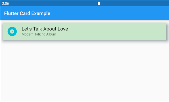
main.dart (ex1)
import 'package:flutter/material.dart';
void main() {
runApp(MyApp());
}
class MyApp extends StatelessWidget {
@override
Widget build(BuildContext context) {
return MaterialApp(
title: 'o7planning.org',
debugShowCheckedModeBanner: false,
theme: ThemeData(
primarySwatch: Colors.blue,
visualDensity: VisualDensity.adaptivePlatformDensity,
),
home: MyHomePage(),
);
}
}
class MyHomePage extends StatelessWidget {
MyHomePage({Key key}) : super(key: key);
@override
Widget build(BuildContext context) {
return Scaffold(
appBar: AppBar(
title: Text("Flutter Card Example")
),
body: Card (
margin: EdgeInsets.all(10),
color: Colors.green[100],
shadowColor: Colors.blueGrey,
elevation: 10,
child: Column(
mainAxisSize: MainAxisSize.min,
children: <Widget>[
const ListTile(
leading: Icon (
Icons.album,
color: Colors.cyan,
size: 45
),
title: Text(
"Let's Talk About Love",
style: TextStyle(fontSize: 20),
),
subtitle: Text('Modern Talking Album'),
),
],
),
),
);
}
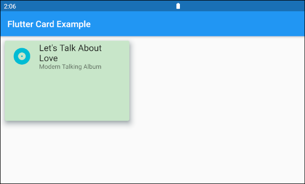
}If you want to customize Card size, put it in a Container or SizedBox.
SizedBox (
  width: 300,
  height: 200,
  child: Card (
    margin: EdgeInsets.all(10),
    color: Colors.green[100],
    shadowColor: Colors.blueGrey,
    elevation: 10,
    child: Column(
      mainAxisSize: MainAxisSize.min,
      children: <Widget>[
        const ListTile(
          leading: Icon (
              Icons.album,
              color: Colors.cyan,
              size: 45
          ),
          title: Text(
            "Let's Talk About Love",
            style: TextStyle(fontSize: 20),
          ),
          subtitle: Text('Modern Talking Album'),
        ),
      ],
    ),
  ),
)
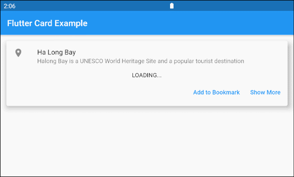
2. Card Example
A Card example with more complex interface:
main.dart (ex3)
import 'package:flutter/material.dart';
import 'dart:async';

void main() {
  runApp(MyApp());
}

class MyApp extends StatelessWidget {

  @override
  Widget build(BuildContext context) {
    return MaterialApp(
      title: 'o7planning.org',
      debugShowCheckedModeBanner: false,
      theme: ThemeData(
        primarySwatch: Colors.blue,
        visualDensity: VisualDensity.adaptivePlatformDensity,
      ),
      home: MyHomePage(),
    );
  }
}

class MyHomePage extends StatelessWidget {
  MyHomePage({Key key}) : super(key: key);

  Future<Widget> getImage() async {
    final Completer<Widget> completer = Completer();
    final url = 'https://s3.o7planning.com/images/ha-long-bay.png';
    final image = NetworkImage(url);
    //
    final load = image.resolve(const ImageConfiguration());

    // Delay 1 second.
    await Future.delayed(Duration(seconds: 1));

    final listener = new ImageStreamListener((ImageInfo info, isSync) async {
      print(info.image.width);
      print(info.image.height);
      completer.complete(Container(child: Image(image: image)));
    });

    load.addListener(listener);
    return completer.future;
  }

  @override
  Widget build(BuildContext context) {
    return Scaffold(
        appBar: AppBar(
            title: Text("Flutter Card Example")
        ),
        body: Container(
            margin: EdgeInsets.all(10) ,
            child: Column(
              children: <Widget>[
                Card(
                  child: Column(
                    mainAxisSize: MainAxisSize.min,
                    children: <Widget>[
                      const ListTile(
                        leading: Icon(Icons.place),
                        title: Text('Ha Long Bay'),
                        subtitle: Text('Halong Bay is a UNESCO World Heritage Site and a popular tourist destination'),
                      ),
                      Container(
                        alignment: Alignment.center,
                        child: FutureBuilder<Widget>(
                          future: getImage(),
                          builder: (context, snapshot) {
                            if (snapshot.hasData) {
                              return snapshot.data;
                            } else {
                              return Text('LOADING...');
                            }
                          },
                        ),
                      ) ,
                      ButtonBarTheme ( // make buttons use the appropriate styles for cards
                        data: ButtonBarThemeData(),
                        child: ButtonBar(
                          children: <Widget>[
                            TextButton(
                              child: const Text('Add to Bookmark'),
                              onPressed: () {},
                            ),
                            TextButton(
                              child: const Text('Show More'),
                              onPressed: () {},
                            ),
                          ],
                        ),
                      ),
                    ],
                  ),
                  elevation: 10,
                ),
              ],
            )
        )
    );
  }
}4. color
color property is used to set background color of Card.
If this property is null then CardTheme.color of ThemeData.cardTheme is used. If CardTheme.color is also null then ThemeData.cardColor is used.
Color color6. elevation
elevation is the coordinates along the Z axis of Card, which affects the size of Card's shadow.
If this property is null, then CardTheme.elevation of ThemeData.cardTheme is used. If CardTheme.elevation is also null, then the default value is 1.0.
double elevationExample:
elevation (ex1)
Card (
  margin: EdgeInsets.all(10),
  color: Colors.green[100],
  shadowColor: Colors.blueGrey,
  elevation: 20,
  child: Column(
    mainAxisSize: MainAxisSize.min,
    children: <Widget>[
      const ListTile(
        leading: Icon (
            Icons.album,
            color: Colors.cyan,
            size: 45
        ),
        title: Text(
          "Let's Talk About Love",
          style: TextStyle(fontSize: 20),
        ),
        subtitle: Text('Modern Talking Album'),
      ),
    ],
  ),
)
7. shape
shape property is used to define border shape of Card.
If this property is null then CardTheme.shape of ThemeData.cardTheme is used. If CardTheme.shape is also null then the shape will be a RoundedRectangleBorder with a circular corner radius of 4.0.
ShapeBorder shape- Flutter ShapeBorder
Example:
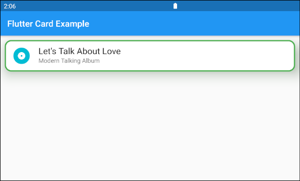
shape (ex1)
Card (
  margin: EdgeInsets.all(10),
  elevation: 20,
  shape: RoundedRectangleBorder(
      side:  BorderSide(color: Colors.green,width: 3),
      borderRadius: BorderRadius.all(Radius.circular(15))
  ),
  shadowColor: Colors.green[100],
  child: Column(
    mainAxisSize: MainAxisSize.min,
    children: <Widget>[
      const ListTile(
        leading: Icon (
            Icons.album,
            color: Colors.cyan,
            size: 45
        ),
        title: Text(
          "Let's Talk About Love",
          style: TextStyle(fontSize: 20),
        ),
        subtitle: Text('Modern Talking Album'),
      ),
    ],
  ),
)
8. borderOnForeground
If borderOnForeground is true, shape's border will be drawn in front of the child. Vice versa, a border will be drawn behind the child.
bool borderOnForeground: trueFlutter Programming Tutorials
- Flutter Column Tutorial with Examples
- Flutter Stack Tutorial with Examples
- Flutter IndexedStack Tutorial with Examples
- Flutter Spacer Tutorial with Examples
- Flutter Expanded Tutorial with Examples
- Flutter SizedBox Tutorial with Examples
- Flutter Tween Tutorial with Examples
- Install Flutter SDK on Windows
- Install Flutter Plugin for Android Studio
- Create your first Flutter app - Hello Flutter
- Flutter Scaffold Tutorial with Examples
- Flutter AppBar Tutorial with Examples
- Flutter BottomAppBar Tutorial with Examples
- Flutter TextButton Tutorial with Examples
- Flutter ElevatedButton Tutorial with Examples
- Flutter EdgeInsetsGeometry Tutorial with Examples
- Flutter EdgeInsets Tutorial with Examples
- Flutter CircularProgressIndicator Tutorial with Examples
- Flutter LinearProgressIndicator Tutorial with Examples
- Flutter Center Tutorial with Examples
- Flutter Align Tutorial with Examples
- Flutter Row Tutorial with Examples
- Flutter SplashScreen Tutorial with Examples
- Flutter Alignment Tutorial with Examples
- Flutter Positioned Tutorial with Examples
- Flutter SimpleDialog Tutorial with Examples
- Flutter AlertDialog Tutorial with Examples
- Flutter Navigation and Routing Tutorial with Examples
- Flutter TabBar Tutorial with Examples
- Flutter Banner Tutorial with Examples
- Flutter BottomNavigationBar Tutorial with Examples
- Flutter FancyBottomNavigation Tutorial with Examples
- Flutter Card Tutorial with Examples
- Flutter Border Tutorial with Examples
- Flutter ContinuousRectangleBorder Tutorial with Examples
- Flutter RoundedRectangleBorder Tutorial with Examples
- Flutter CircleBorder Tutorial with Examples
- Flutter StadiumBorder Tutorial with Examples
- Flutter Container Tutorial with Examples
- Flutter RotatedBox Tutorial with Examples
- Flutter CircleAvatar Tutorial with Examples
- Flutter IconButton Tutorial with Examples
- Flutter FlatButton Tutorial with Examples
- Flutter SnackBar Tutorial with Examples
Show More