Flutter TabBar Tutorial with Examples
1. Flutter Tab
TAB is an interface layout that is widely used in different application frameworks, and Flutter is no exception. Flutter offers an easy way for you to create a TAB layout with the Material library.
Basically, in order to create a TAB layout in Flutter,you need to implement the following steps:
- Create a TabController.
- Create a TabBar.
- Create a TabBarView.
TabController
To make the TAB layout work, you need to synchronize the selected Tab with its contents, which is the job of the TabController.
You can create a TabController manually, or use an available Widget, known as DefaultTabController, which supports some common features.
TabController
DefaultTabController(
  // The number of tabs / content sections to display.
  length: 3,
  child: // Complete this code in the next step.
);
TabBar
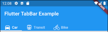
TabBar helps you to create Tab(s), as in the example below, a TabBar contains three subTab(s).
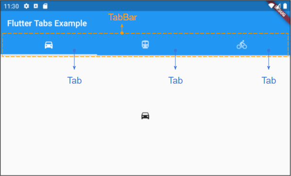
TabBar
DefaultTabController(
  length: 3,
  child: Scaffold(
    appBar: AppBar(
      bottom: TabBar(
        tabs: [
          Tab(icon: Icon(Icons.directions_car)),
          Tab(icon: Icon(Icons.directions_transit)),
          Tab(icon: Icon(Icons.directions_bike)),
        ],
      ),
    ),
  ),
);
Note: You can put many TabBar(s) into a DefaultTabController, but the DefaultTabController will only work with the nearest TabBar (Searching by the tree structure). In this case, you need to consider creating your own TabController manually.
TabBarView
You can use TabBarView to contain the content corresponding to every Tab on the TabBar.
TabBarView
TabBarView (
children: [
Icon(Icons.directions_car),
Icon(Icons.directions_transit),
Icon(Icons.directions_bike),
],
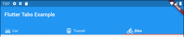
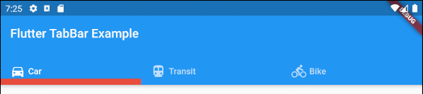
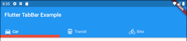
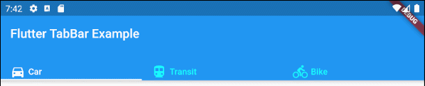
);2. TabBar example
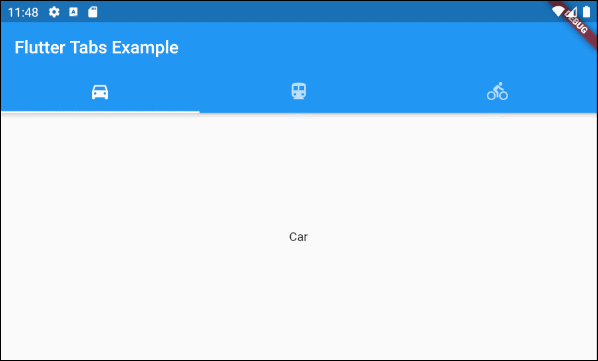
main.dart (ex1)
import 'package:flutter/material.dart';

void main() {
  runApp(MyApp());
}

class MyApp extends StatelessWidget {
  // This widget is the root of your application.
  @override
  Widget build(BuildContext context) {
    return MaterialApp(
      title: 'Title of Application',
      theme: ThemeData(
        primarySwatch: Colors.blue,
        visualDensity: VisualDensity.adaptivePlatformDensity,
      ),
      home: MyHomePage(),
    );
  }
}

class MyHomePage extends StatelessWidget {
  MyHomePage({Key key}) : super(key: key);

  @override
  Widget build(BuildContext context) {
    return DefaultTabController(
        length: 3,
        child: Scaffold(
          appBar: AppBar(
            bottom: TabBar(
              tabs: [
                Tab(icon: Icon(Icons.directions_car)),
                Tab(icon: Icon(Icons.directions_transit)),
                Tab(icon: Icon(Icons.directions_bike)),
              ],
            ),
            title: Text('Flutter Tabs Example'),
          ),
          body: TabBarView(
            children: [
              Center(child: Text("Car")),
              Center(child: Text("Transit")),
              Center(child: Text("Bike"))
            ],
          ),
        )
    );
  }
}
3. TabController, TabBar ... Constructor
TabController Constructor
TabController Constructor
TabController(
    {int initialIndex: 0,
    @required int length,
    @required TickerProvider vsync}
)
DefaultTabController Constructor:
DefaultTabController Constructor
const DefaultTabController(
    {Key key,
    @required int length,
    int initialIndex: 0,
    @required Widget child}
)
TabBar Constructor:
TabBar Constructor
const TabBar(
    {Key key,
    @required List<Widget> tabs,
    TabController controller,
    bool isScrollable: false,
    Color indicatorColor,
    double indicatorWeight: 2.0,
    EdgeInsetsGeometry indicatorPadding: EdgeInsets.zero,
    Decoration indicator,
    TabBarIndicatorSize indicatorSize,
    Color labelColor,
    TextStyle labelStyle,
    EdgeInsetsGeometry labelPadding,
    Color unselectedLabelColor,
    TextStyle unselectedLabelStyle,
    DragStartBehavior dragStartBehavior: DragStartBehavior.start,
    MouseCursor mouseCursor,
    ValueChanged<int> onTap,
    ScrollPhysics physics}
)
TabBarView Constructor:
TabBarView Constructor
const TabBarView(
{Key key,
@required List<Widget> children,
TabController controller,
ScrollPhysics physics,
DragStartBehavior dragStartBehavior: DragStartBehavior.start}
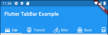
)4. isScrollable
If the isScrollable is true, each Tab will fit its content in width, and the TabBar will have a horizontal scrollbar.
main.dart (isScrollable ex1)
import 'package:flutter/material.dart';

void main() {
  runApp(MyApp());
}

class MyApp extends StatelessWidget {
  // This widget is the root of your application.
  @override
  Widget build(BuildContext context) {
    return MaterialApp(
      title: 'Title of Application',
      theme: ThemeData(
        primarySwatch: Colors.blue,
        visualDensity: VisualDensity.adaptivePlatformDensity,
      ),
      home: MyHomePage(),
    );
  }
}

class MyHomePage extends StatelessWidget {
  MyHomePage({Key key}) : super(key: key);

  @override
  Widget build(BuildContext context) {
    EdgeInsets a2; EdgeInsetsDirectional a;
    return DefaultTabController(
        length: 6,
        child: Scaffold(
          appBar: AppBar(
            bottom: createTabBar(),
            title: Text('Flutter TabBar Example'),
          ),
          body: TabBarView(
            children: [
              Center(child: Text("Car")),
              Center(child: Text("Transit")),
              Center(child: Text("Bike")),
              Center(child: Text("Boat")),
              Center(child: Text("Railway")),
              Center(child: Text("Bus"))
            ],
          ),
        )
    );
  }

  TabBar createTabBar()  {
    return TabBar(
      tabs: [
        Row (children: [Icon(Icons.directions_car), SizedBox(width:5), Text("Car")]),
        Row (children: [Icon(Icons.directions_transit), SizedBox(width:5), Text("Transit")]),
        Row (children: [Icon(Icons.directions_bike), SizedBox(width:5), Text("Bike")]),
        Row (children: [Icon(Icons.directions_boat), SizedBox(width:5), Text("Boat")]),
        Row (children: [Icon(Icons.directions_railway), SizedBox(width:5), Text("Railway")]),
        Row (children: [Icon(Icons.directions_bus), SizedBox(width:5), Text("Bus")]),
      ],
      isScrollable: true,
    );
  }
}
For example, align Tab(s) left in case of TabBar.isScrollable = true.
main.dart (isScrollable ex2)
import 'package:flutter/material.dart';
void main() {
runApp(MyApp());
}
class MyApp extends StatelessWidget {
// This widget is the root of your application.
@override
Widget build(BuildContext context) {
return MaterialApp(
title: 'Title of Application',
theme: ThemeData(
primarySwatch: Colors.blue,
visualDensity: VisualDensity.adaptivePlatformDensity,
),
home: MyHomePage(),
);
}
}
class MyHomePage extends StatelessWidget {
MyHomePage({Key key}) : super(key: key);
@override
Widget build(BuildContext context) {
EdgeInsets a2; EdgeInsetsDirectional a;
return DefaultTabController(
length: 3,
child: Scaffold(
appBar: AppBar(
bottom: PreferredSize(
preferredSize: Size.fromHeight(40),
child: Align(
alignment: Alignment.centerLeft,
child: TabBar(
isScrollable: true,
tabs: [ Row (children: [Icon(Icons.directions_car), SizedBox(width:5), Text("Car")]),
Row (children: [Icon(Icons.directions_transit), SizedBox(width:5), Text("Transit")]),
Row (children: [Icon(Icons.directions_bike), SizedBox(width:5), Text("Bike")])],
),
),
),
title: Text('Flutter TabBar Example'),
),
body: TabBarView(
children: [
Center(child: Text("Car")),
Center(child: Text("Transit")),
Center(child: Text("Bike"))
],
),
)
);
}
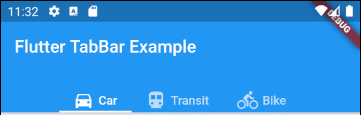
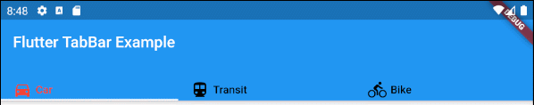
}5. indicatorColor
indicatorColor propertyallows you to specify the color of the line under the currently selected Tab. This property will be ignored if the indicator property is specified.
Color indicatorColorFor example: Set the color red for the line under the currently selected Tab:
indicatorColor (ex1)
TabBar (
  tabs: [
    Row (children: [Icon(Icons.directions_car), SizedBox(width:5), Text("Car")]),
    Row (children: [Icon(Icons.directions_transit), SizedBox(width:5), Text("Transit")]),
    Row (children: [Icon(Icons.directions_bike), SizedBox(width:5), Text("Bike")]),
  ],
  indicatorColor: Color(0xffE74C3C),
);- Flutter Color
6. indicatorWeight
indicatorWeight property is used to set the thickness of the line under the currently selected Tab. Its value is greater than 0, and the default value is 2. This property will be ignored if the indicator property is specified.
double indicatorWeight;For example, set the thickness of the line under the currently selected Tab.
indicatorWeight (ex1)
TabBar(
  tabs: [
    Row (children: [Icon(Icons.directions_car), SizedBox(width:5), Text("Car")]),
    Row (children: [Icon(Icons.directions_transit), SizedBox(width:5), Text("Transit")]),
    Row (children: [Icon(Icons.directions_bike), SizedBox(width:5), Text("Bike")]),
  ],
  indicatorColor: Color(0xffE74C3C),
  indicatorWeight: 10
);
7. indicatorPadding
indicatorPadding property specifies the padding horizontally for the line under the currently selected Tab.
EdgeInsetsGeometry indicatorPadding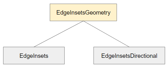
For example:
indicatorPadding (ex1)
TabBar(
  tabs: [
    Row (children: [Icon(Icons.directions_car), SizedBox(width:5), Text("Car")]),
    Row (children: [Icon(Icons.directions_transit), SizedBox(width:5), Text("Transit")]),
    Row (children: [Icon(Icons.directions_bike), SizedBox(width:5), Text("Bike")]),
  ],
  indicatorColor: Color(0xffE74C3C),
  indicatorWeight: 10,
  indicatorPadding: EdgeInsets.only(right: 20),
);
8. indicator
indicator property allows you to define the appearance of the currently selected Tab. If this property is used, other properties such as indicatorColor, indicatorWeight and indicatorPadding will be ignored.
Decoration indicator;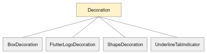
For example:
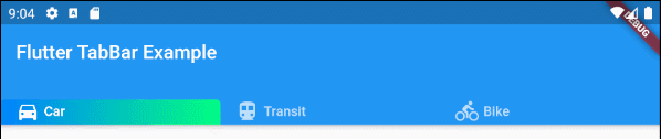
indicator (ex1)
TabBar(
  tabs: [
    Row (children: [Icon(Icons.directions_car), SizedBox(width:5), Text("Car")]),
    Row (children: [Icon(Icons.directions_transit), SizedBox(width:5), Text("Transit")]),
    Row (children: [Icon(Icons.directions_bike), SizedBox(width:5), Text("Bike")]),
  ],
  indicator: ShapeDecoration (
      shape: UnderlineInputBorder (
          borderSide: BorderSide(
              color: Colors.transparent,
              width: 0,
              style: BorderStyle.solid
          )
      ),
      gradient: LinearGradient(colors: [Color(0xff0081ff), Color(0xff01ff80)])
  )
);- Flutter Decoration
9. labelColor
labelColor property is used to specify the font color for the label of the currently selected Tab.
Color labelColor;For example:
TabBar(
    tabs: [
      Row (children: [Icon(Icons.directions_car), SizedBox(width:5), Text("Car")]),
      Row (children: [Icon(Icons.directions_transit), SizedBox(width:5), Text("Transit")]),
      Row (children: [Icon(Icons.directions_bike), SizedBox(width:5), Text("Bike")]),
    ],
    labelColor: Colors.red,
    unselectedLabelColor: Colors.black,
);
10. unselectedLabelColor
unselectedLabelColor property is used to specify the font color for the label of the unselected Tab(s).
Color unselectedLabelColor;For example:
unselectedLabelColor (ex1)
TabBar(
  tabs: [
    Row (children: [Icon(Icons.directions_car), SizedBox(width:5), Text("Car")]),
    Row (children: [Icon(Icons.directions_transit), SizedBox(width:5), Text("Transit")]),
    Row (children: [Icon(Icons.directions_bike), SizedBox(width:5), Text("Bike")]),
  ],
  labelColor: Colors.white,
  unselectedLabelColor: Colors.cyanAccent,
);
11. labelPadding
labelPadding property is used to add padding to each label of the Tab(s).
EdgeInsetsGeometry labelPadding;For example:
labelPadding (ex1)
TabBar(
  tabs: [
    Row (children: [Icon(Icons.directions_car), SizedBox(width:5), Text("Car")]),
    Row (children: [Icon(Icons.directions_transit), SizedBox(width:5), Text("Transit")]),
    Row (children: [Icon(Icons.directions_bike), SizedBox(width:5), Text("Bike")]),
  ],
  labelPadding: EdgeInsets.all( 20),
);
12. labelStyle
labelStyle property is used to specify the text style on the label of the currently selected Tab(s).
TextStyle labelStyle;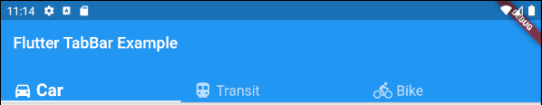
labelStyle (ex1)
TabBar(
  tabs: [
    Row (children: [Icon(Icons.directions_car), SizedBox(width:5), Text("Car")]),
    Row (children: [Icon(Icons.directions_transit), SizedBox(width:5), Text("Transit")]),
    Row (children: [Icon(Icons.directions_bike), SizedBox(width:5), Text("Bike")]),
  ],
  labelStyle: TextStyle(fontWeight: FontWeight.bold, fontSize: 22),
  unselectedLabelStyle: TextStyle(fontStyle: FontStyle.normal, fontSize: 18),
);- Flutter TextStyle
13. unselectedLabelStyle
unselectedLabelStyle property is used to specify the text style on the label of the unselected Tab(s).
TextStyle unselectedLabelStyle;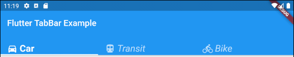
unselectedLabelStyle (ex1)
TabBar(
  tabs: [
    Row (children: [Icon(Icons.directions_car), SizedBox(width:5), Text("Car")]),
    Row (children: [Icon(Icons.directions_transit), SizedBox(width:5), Text("Transit")]),
    Row (children: [Icon(Icons.directions_bike), SizedBox(width:5), Text("Bike")]),
  ],
  labelStyle: TextStyle(fontWeight: FontWeight.bold, fontSize: 22),
  unselectedLabelStyle: TextStyle(fontStyle: FontStyle.italic),
);- Flutter TextStyle
14. onTap
onTap is a callback function called when the user taps one Tab on the TabBar.
ValueChanged<int> onTap;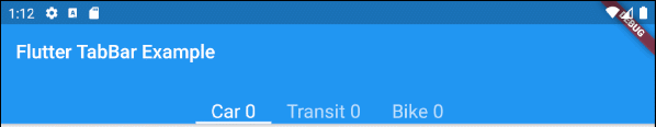
main.dart (onTap ex1)
import 'package:flutter/material.dart';

void main() {
  runApp(MyApp());
}

class MyApp extends StatelessWidget {
  // This widget is the root of your application.
  @override
  Widget build(BuildContext context) {
    return MaterialApp(
      title: 'Title of Application',
      theme: ThemeData(
        primarySwatch: Colors.blue,
        visualDensity: VisualDensity.adaptivePlatformDensity,
      ),
      home: MyHomePage(),
    );
  }
}

class MyHomePage extends StatefulWidget {
  MyHomePage({Key key}) : super(key: key);

  @override
  State<StatefulWidget> createState() {
    return MyHomePageState();
  }
}

class MyHomePageState extends State<MyHomePage> {
  int carClick = 0;
  int transitClick = 0;
  int bikeClick = 0;

  @override
  Widget build(BuildContext context) {
    return DefaultTabController(
        length: 3,
        child: Scaffold(
          appBar: AppBar(
            bottom: createTabBar(),
            title: Text('Flutter TabBar Example'),
          ),
          body: TabBarView(
            children: [
              Center(child: Text("Car")),
              Center(child: Text("Transit")),
              Center(child: Text("Bike"))
            ],
          ),
        )
    );
  }

  TabBar createTabBar()  {
    return TabBar(
        isScrollable: true,
        labelStyle: TextStyle(fontSize: 20),
        tabs: [
          Text("Car " + this.carClick.toString()),
          Text("Transit " + this.transitClick.toString()),
          Text("Bike " + this.bikeClick.toString())
        ],
        onTap: (index) {
          this.onTapHandler(index);
        }
    );
  }

  void onTapHandler(int index)  {
    setState(()  {
      switch(index){
        case 0:
          carClick++;
          break;
        case 1:
          transitClick++;
          break;
        case 2:
          bikeClick++;
          break;
      }
    });
  }

}Flutter Programming Tutorials
- Flutter Column Tutorial with Examples
- Flutter Stack Tutorial with Examples
- Flutter IndexedStack Tutorial with Examples
- Flutter Spacer Tutorial with Examples
- Flutter Expanded Tutorial with Examples
- Flutter SizedBox Tutorial with Examples
- Flutter Tween Tutorial with Examples
- Install Flutter SDK on Windows
- Install Flutter Plugin for Android Studio
- Create your first Flutter app - Hello Flutter
- Flutter Scaffold Tutorial with Examples
- Flutter AppBar Tutorial with Examples
- Flutter BottomAppBar Tutorial with Examples
- Flutter TextButton Tutorial with Examples
- Flutter ElevatedButton Tutorial with Examples
- Flutter EdgeInsetsGeometry Tutorial with Examples
- Flutter EdgeInsets Tutorial with Examples
- Flutter CircularProgressIndicator Tutorial with Examples
- Flutter LinearProgressIndicator Tutorial with Examples
- Flutter Center Tutorial with Examples
- Flutter Align Tutorial with Examples
- Flutter Row Tutorial with Examples
- Flutter SplashScreen Tutorial with Examples
- Flutter Alignment Tutorial with Examples
- Flutter Positioned Tutorial with Examples
- Flutter SimpleDialog Tutorial with Examples
- Flutter AlertDialog Tutorial with Examples
- Flutter Navigation and Routing Tutorial with Examples
- Flutter TabBar Tutorial with Examples
- Flutter Banner Tutorial with Examples
- Flutter BottomNavigationBar Tutorial with Examples
- Flutter FancyBottomNavigation Tutorial with Examples
- Flutter Card Tutorial with Examples
- Flutter Border Tutorial with Examples
- Flutter ContinuousRectangleBorder Tutorial with Examples
- Flutter RoundedRectangleBorder Tutorial with Examples
- Flutter CircleBorder Tutorial with Examples
- Flutter StadiumBorder Tutorial with Examples
- Flutter Container Tutorial with Examples
- Flutter RotatedBox Tutorial with Examples
- Flutter CircleAvatar Tutorial with Examples
- Flutter IconButton Tutorial with Examples
- Flutter FlatButton Tutorial with Examples
- Flutter SnackBar Tutorial with Examples
Show More