Flutter SimpleDialog Tutorial with Examples
1. SimpleDialog
The SimpleDialog class is used to create a simple dialog consisting of a title and a list of options where the user can select an option from the list. Each option is usually a SimpleDialogOption.
If you want a dialog to send the user a message, take the AlertDialog class into consideration.
SimpleDialog Constructor:
SimpleDialog Constructor
const SimpleDialog(
    {Key key,
    Widget title,
    EdgeInsetsGeometry titlePadding: const EdgeInsets.fromLTRB(24.0, 24.0, 24.0, 0.0),
    TextStyle titleTextStyle,
    List<Widget> children,
    EdgeInsetsGeometry contentPadding: const EdgeInsets.fromLTRB(0.0, 12.0, 0.0, 16.0),
    Color backgroundColor,
    double elevation,
    String semanticLabel,
    ShapeBorder shape}
)
2. Examples
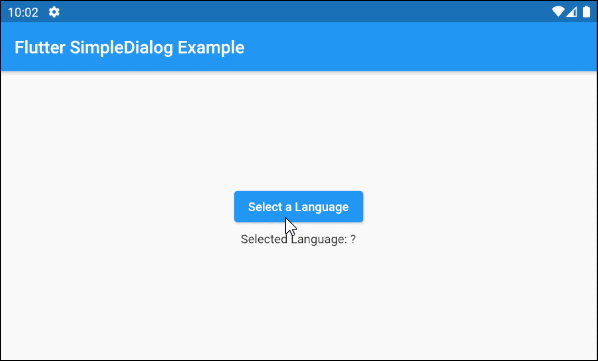
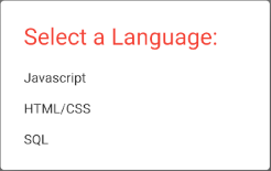
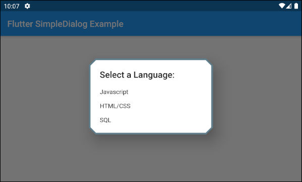
First, let's take a look at a simple but complete example of the SimpleDialog. It will help you answer the following basic questions:
- How to create a SimpleDialog.
- How to add lists of options to the SimpleDialog.
- How to return the user's option.
- How to handle with the returned value.
main.dart (ex1)
import 'package:flutter/material.dart';
void main() {
runApp(MyApp());
}
class MyApp extends StatelessWidget {
@override
Widget build(BuildContext context) {
return MaterialApp(
title: 'o7planning.org',
debugShowCheckedModeBanner: false,
theme: ThemeData(
primarySwatch: Colors.blue,
visualDensity: VisualDensity.adaptivePlatformDensity,
),
home: MyHomePage(),
);
}
}
class MyHomePage extends StatefulWidget {
MyHomePage({Key key}) : super(key: key);
@override
State<StatefulWidget> createState() {
return MyHomePageState();
}
}
class MyHomePageState extends State<MyHomePage> {
ProgrammingLanguage selectedLanguage;
@override
Widget build(BuildContext context) {
return Scaffold (
appBar: AppBar(
title: Text("Flutter SimpleDialog Example")
),
body: Center (
child: Column (
mainAxisAlignment: MainAxisAlignment.center,
crossAxisAlignment: CrossAxisAlignment.center,
children: [
ElevatedButton (
child: Text("Select a Language"),
onPressed: () {
showMyAlertDialog(context);
},
),
SizedBox(width:5, height:5),
Text("Selected Language: "
+ (this.selectedLanguage == null ? '?': this.selectedLanguage.name))
]
)
)
);
}
showMyAlertDialog(BuildContext context) {
var javascript = ProgrammingLanguage("Javascript", 67.7);
var htmlCss = ProgrammingLanguage("HTML/CSS", 63.1);
var sql = ProgrammingLanguage("SQL", 57.4);
// Create SimpleDialog
SimpleDialog dialog = SimpleDialog(
title: const Text('Select a Language:'),
children: <Widget>[
SimpleDialogOption(
onPressed: () {
// Close and return value
Navigator.pop(context, javascript);
},
child: Text(javascript.name)
),
SimpleDialogOption(
onPressed: () {
// Close and return value
Navigator.pop(context, htmlCss);
},
child: Text(htmlCss.name),
),
SimpleDialogOption(
onPressed: () {
// Close and return value
Navigator.pop(context, sql);
},
child: Text(sql.name),
)
],
);
// Call showDialog function to show dialog.
Future<ProgrammingLanguage> futureValue = showDialog(
context: context,
builder: (BuildContext context) {
return dialog;
}
);
futureValue.then( (language) => {
this.setState(() {
this.selectedLanguage = language;
})
});
}
}
class ProgrammingLanguage {
String name;
double percent;
ProgrammingLanguage(this.name, this.percent) ;
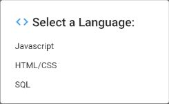
}3. title
title propertyis an option to set the title for the SimpleDialog. In most use cases, it is a Text object.
Widget titleFor example:
title (ex1)
void showMyAlertDialog(BuildContext context) {
  var javascript = ProgrammingLanguage("Javascript", 67.7);
  var htmlCss = ProgrammingLanguage("HTML/CSS", 63.1);
  var sql = ProgrammingLanguage("SQL", 57.4);

  // Create SimpleDialog
  SimpleDialog dialog = SimpleDialog(
    title:  Row (
       children: [
         Icon(Icons.code, color:Colors.blue),
         SizedBox(width:5, height:5),
         Text('Select a Language:'),
       ]
    ),
    children: <Widget>[
      SimpleDialogOption(
          onPressed: () {
            // Close and return value
            Navigator.pop(context, javascript);
          },
          child: Text(javascript.name)
      ),
      SimpleDialogOption(
        onPressed: () {
          // Close and return value
          Navigator.pop(context, htmlCss);
        },
        child:  Text(htmlCss.name),
      ),
      SimpleDialogOption(
        onPressed: () {
          // Close and return value
          Navigator.pop(context, sql);
        },
        child:  Text(sql.name),
      )
    ],
  );;

  // Call showDialog function to show dialog.
  Future<ProgrammingLanguage> futureValue = showDialog(
      context: context,
      builder: (BuildContext context) {
        return dialog;
      }
  );

  futureValue.then( (language) => {
    this.setState(() {
      this.selectedLanguage = language;
    })
  });
}
4. titlePadding
titlePadding property is used to add a padding around the SimpleDialog title. If the title is null, the titlePadding will not be used.
By default, the titlePadding offers 24 pixels at the top, the left and the right of the title, and 0 pixel at the bottom of the title.
EdgeInsetsGeometry titlePadding: const EdgeInsets.fromLTRB(24.0, 24.0, 24.0, 0.0),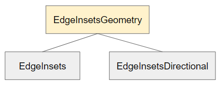
For example:
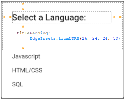
titlePadding (ex1)
titlePadding: EdgeInsets.fromLTRB(24, 24, 24, 50)5. titleTextStyle
titleTextStyle property is used to define the text style of the title area.
TextStyle titleTextStyle- Flutter TextStyle
titleTextStyle (ex1)
titleTextStyle: TextStyle(
    color: Colors.red,
    fontSize: 24
)
6. children
children property is an option that defines a list of the SimpleDialog options. Specifically, it is the list of SimpleDialogOption(s) and placed in a ListBody which is in a SingleChildScrollView.
List<Widget> children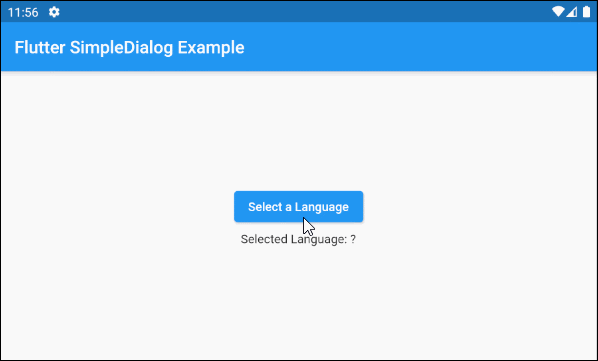
main.dart (children ex1)
import 'package:flutter/material.dart';

void main() {
  runApp(MyApp());
}

class MyApp extends StatelessWidget {
  @override
  Widget build(BuildContext context) {
    return MaterialApp(
      title: 'o7planning.org',
      debugShowCheckedModeBanner: false,
      theme: ThemeData(
        primarySwatch: Colors.blue,
        visualDensity: VisualDensity.adaptivePlatformDensity,
      ),
      home: MyHomePage(),
    );
  }
}

class MyHomePage extends StatefulWidget {
  MyHomePage({Key key}) : super(key: key);

  @override
  State<StatefulWidget> createState() {
    return MyHomePageState();
  }
}

class MyHomePageState extends State<MyHomePage> {
  ProgrammingLanguage selectedLanguage;

  @override
  Widget build(BuildContext context) {
    return Scaffold (
        appBar: AppBar(
            title: Text("Flutter SimpleDialog Example")
        ),
        body: Center (
            child: Column (
                mainAxisAlignment: MainAxisAlignment.center,
                crossAxisAlignment: CrossAxisAlignment.center,
                children: [
                  ElevatedButton (
                    child: Text("Select a Language"),
                    onPressed: () {
                      showMyAlertDialog(context);
                    },
                  ),
                  SizedBox(width:5, height:5),
                  Text("Selected Language: "
                      + (this.selectedLanguage == null ? '?': this.selectedLanguage.name))
                ]
            )
        )
    );
  }

  void showMyAlertDialog(BuildContext context) {
    var languages = [
      ProgrammingLanguage("Javascript", 67.7),
      ProgrammingLanguage("HTML/CSS", 63.1),
      ProgrammingLanguage("SQL", 57.4),
      ProgrammingLanguage("Python", 44.1),
      ProgrammingLanguage("Java", 40.2),
      ProgrammingLanguage("Bash/Shell/PowerShell", 33.1),
      ProgrammingLanguage("C#", 31.4),
      ProgrammingLanguage("PHP", 26.2),
      ProgrammingLanguage("Typescript", 25.4),
      ProgrammingLanguage("C++", 23.9),
      ProgrammingLanguage("C", 21.8),
      ProgrammingLanguage("Go", 8.8)
    ];

    // A List of SimpleDialogOption(s).
    var itemList = languages.map( (lang) => SimpleDialogOption(
        onPressed: () {
          // Close and return value
          Navigator.pop(context, lang);
        },
        child: Row (
            mainAxisAlignment: MainAxisAlignment.spaceBetween,
            children: [
              Text(lang.name),
              Text (
                  lang.percent.toString(),
                  style: TextStyle(color: Colors.red)
              )
            ]
        )
    )).toList();


    // Create SimpleDialog
    SimpleDialog dialog = SimpleDialog(
        title: Text('Select a Language:'),
        children: itemList
    );

    // Call showDialog function to show dialog.
    Future<ProgrammingLanguage> futureValue = showDialog(
        context: context,
        builder: (BuildContext context) {
          return dialog;
        }
    );

    futureValue.then( (language) => {
      this.setState(() {
        this.selectedLanguage = language;
      })
    });
  }

}

class ProgrammingLanguage {
  String name;
  double percent;

  ProgrammingLanguage(this.name, this.percent) ;
}- Flutter SingleChildScrollView
7. contentPadding
contentPadding property is used to add a padding around the content area of the SimpleDialog.
contentPadding offers 16 pixels at the bottom of the content and 12 pixels at the top of the content by default. If the title is null,the padding top will be expanded by 12 pixels.
EdgeInsetsGeometry contentPadding: const EdgeInsets.fromLTRB(0.0, 12.0, 0.0, 16.0)For example:
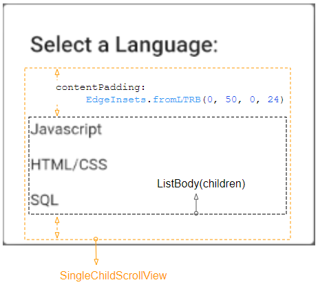
contentPadding (ex1)
contentPadding: EdgeInsets.fromLTRB(0, 50, 0, 24)8. backgroundColor
backgroundColor property is used to specify the background color of the SimpleDialog.
Color backgroundColorFor example:
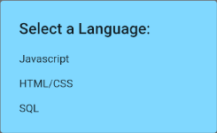
backgroundColor: Colors.lightBlueAccent[100]9. elevation
elevation property defines the Z-axis of the SimpleDialog. Its default value is 24.0 pixels.
double elevation10. semanticLabel
semanticLabel is a descriptive text of the SimpleDialog which is not visible on the user interface. When the user opens or closes the SimpleDialog, the system will read this description to the user if the accessibility mode is enabled.
String semanticLabel11. shape
shape propertyis used to define the outline shape for the SimpleDialog. The default value of the shape is a RoundedRectangleBorder with the radius of 4.0 pixels at all four corners.
ShapeBorder shape- Flutter ShapeBorder
RoundedRectangleBorder:

shape (ex1)
shape: RoundedRectangleBorder (
    side:  BorderSide(color: Colors.blueGrey, width: 3),
    borderRadius: BorderRadius.all(Radius.circular(15))
)
BeveledRectangleBorder:
shape (ex2)
shape: BeveledRectangleBorder (
    side:  BorderSide(color: Colors.blueGrey, width: 2),
    borderRadius: BorderRadius.all(Radius.circular(15))
)
Flutter Programming Tutorials
- Flutter Column Tutorial with Examples
- Flutter Stack Tutorial with Examples
- Flutter IndexedStack Tutorial with Examples
- Flutter Spacer Tutorial with Examples
- Flutter Expanded Tutorial with Examples
- Flutter SizedBox Tutorial with Examples
- Flutter Tween Tutorial with Examples
- Install Flutter SDK on Windows
- Install Flutter Plugin for Android Studio
- Create your first Flutter app - Hello Flutter
- Flutter Scaffold Tutorial with Examples
- Flutter AppBar Tutorial with Examples
- Flutter BottomAppBar Tutorial with Examples
- Flutter TextButton Tutorial with Examples
- Flutter ElevatedButton Tutorial with Examples
- Flutter EdgeInsetsGeometry Tutorial with Examples
- Flutter EdgeInsets Tutorial with Examples
- Flutter CircularProgressIndicator Tutorial with Examples
- Flutter LinearProgressIndicator Tutorial with Examples
- Flutter Center Tutorial with Examples
- Flutter Align Tutorial with Examples
- Flutter Row Tutorial with Examples
- Flutter SplashScreen Tutorial with Examples
- Flutter Alignment Tutorial with Examples
- Flutter Positioned Tutorial with Examples
- Flutter SimpleDialog Tutorial with Examples
- Flutter AlertDialog Tutorial with Examples
- Flutter Navigation and Routing Tutorial with Examples
- Flutter TabBar Tutorial with Examples
- Flutter Banner Tutorial with Examples
- Flutter BottomNavigationBar Tutorial with Examples
- Flutter FancyBottomNavigation Tutorial with Examples
- Flutter Card Tutorial with Examples
- Flutter Border Tutorial with Examples
- Flutter ContinuousRectangleBorder Tutorial with Examples
- Flutter RoundedRectangleBorder Tutorial with Examples
- Flutter CircleBorder Tutorial with Examples
- Flutter StadiumBorder Tutorial with Examples
- Flutter Container Tutorial with Examples
- Flutter RotatedBox Tutorial with Examples
- Flutter CircleAvatar Tutorial with Examples
- Flutter IconButton Tutorial with Examples
- Flutter FlatButton Tutorial with Examples
- Flutter SnackBar Tutorial with Examples
Show More