Flutter ElevatedButton Tutorial with Examples
1. ElevatedButton
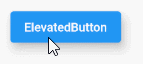
In Flutter, ElevatedButton is used to create a button with an elevation greater than 0 by default.
The ElevatedButton class is created to replace the RaisedButton class (marked outdated since October 2020). This is one of the efforts of Flutter development team to simplify and make the Flutter API consistent.
ElevatedButton Constructor:
ElevatedButton Constructor
const ElevatedButton(
    {Key key,
    @required Widget child,
    @required VoidCallback onPressed,
    VoidCallback onLongPress,
    ButtonStyle style,
    FocusNode focusNode,
    bool autofocus: false,
    Clip clipBehavior: Clip.none
    }
)
ElevatedButton.icon constructor:
ElevatedButton.icon Constructor
ElevatedButton.icon(
    {Key key,
    @required Widget icon,
    @required Widget label,
    @required VoidCallback onPressed,
    VoidCallback onLongPress,
    ButtonStyle style,
    FocusNode focusNode,
    bool autofocus,
    Clip clipBehavior
  }
)
If both the callback functions: onPressed and onLongPress are not specified, ElevatedButton will be disabled and have no response when touched.
2. Examples
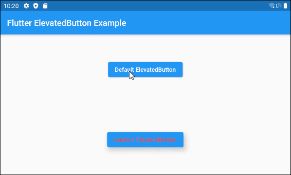
Here is an example consisting of two ElevatedButton(s), a default ElevatedButton and an ElevatedButton with a custom style. In the pressed or disabled state it has an elevation of 0, while in other states it has an elevation of 10.
main.dart (ex1)
import 'package:flutter/material.dart';

void main() {
  runApp(MyApp());
}

class MyApp extends StatelessWidget {
  @override
  Widget build(BuildContext context) {
    return MaterialApp(
      title: 'o7planning.org',
      debugShowCheckedModeBanner: false,
      theme: ThemeData(
        primarySwatch: Colors.blue,
        visualDensity: VisualDensity.adaptivePlatformDensity,
      ),
      home: MyHomePage(),
    );
  }
}

class MyHomePage extends StatelessWidget {
  MyHomePage({Key key}) : super(key: key);

  @override
  Widget build(BuildContext context) {
    return Scaffold (
        appBar: AppBar(
            title: Text("Flutter ElevatedButton Example")
        ),
        body: Center (
            child: Column (
              mainAxisAlignment: MainAxisAlignment.spaceAround,
              children: [
                ElevatedButton (
                  child: Text("Default ElevatedButton"),
                  onPressed: () {},
                ),
                ElevatedButton (
                    child: Text("Custom ElevatedButton"),
                    onPressed: () {},
                    style: ButtonStyle(
                        foregroundColor: MaterialStateProperty.all<Color>(Colors.red),
                        elevation: MaterialStateProperty.resolveWith<double>(
                              (Set<MaterialState> states) {
                            if (states.contains(MaterialState.pressed)
                                ||  states.contains(MaterialState.disabled)) {
                              return 0;
                            }
                            return 10;
                          },
                        )
                    )
                )
              ],
            )
        )
    );
  }
}
3. child
child is the most important property of ElevatedButton, and in most use cases, it is a Text object.
@required Widget childThe simplest child example is a Text object:
ElevatedButton (
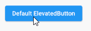
child: Text("Default ElevatedButton"),
onPressed: () {},
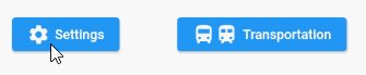
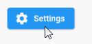
)By assigning a Row object to the child property, you can create a more complex ElevatedButton, for example, Icon and Text included.
child (ex2)
// 1 Icon and 1 Text
ElevatedButton (
child: Row (
children: [
Icon(Icons.settings),
SizedBox(width: 5),
Text("Settings")
],
) ,
onPressed: () {},
)
// 2 Icons and 1 Text
ElevatedButton (
child: Row (
children: [
Icon(Icons.directions_bus),
Icon(Icons.train),
SizedBox(width: 5),
Text("Transportation")
],
) ,
onPressed: () {},
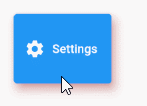
)However, the best way to have an ElevatedButton with Text and Icon is to use ElevatedButton.icon constructor:
main.dart (ex2)
import 'package:flutter/material.dart';

void main() {
  runApp(MyApp());
}

class MyApp extends StatelessWidget {
  @override
  Widget build(BuildContext context) {
    return MaterialApp(
      title: 'o7planning.org',
      debugShowCheckedModeBanner: false,
      theme: ThemeData(
        primarySwatch: Colors.blue,
        visualDensity: VisualDensity.adaptivePlatformDensity,
      ),
      home: MyHomePage(),
    );
  }
}

class MyHomePage extends StatelessWidget {
  MyHomePage({Key key}) : super(key: key);

  @override
  Widget build(BuildContext context) {
    return Scaffold(

        appBar: AppBar(
            title: Text("Flutter ElevatedButton Example")
        ),
        body: Center (
            child: ElevatedButton.icon (
              icon: Icon(Icons.settings),
              label: Text("Settings"),
              onPressed: () {},
            )
        )
    );
  }
}
4. onPressed
onPressed is a callback function, is called when the user clicks on the Button. Specifically, the onPressed event will occur when the user completes both operations including press down and release from the Button.
@required VoidCallback onPressed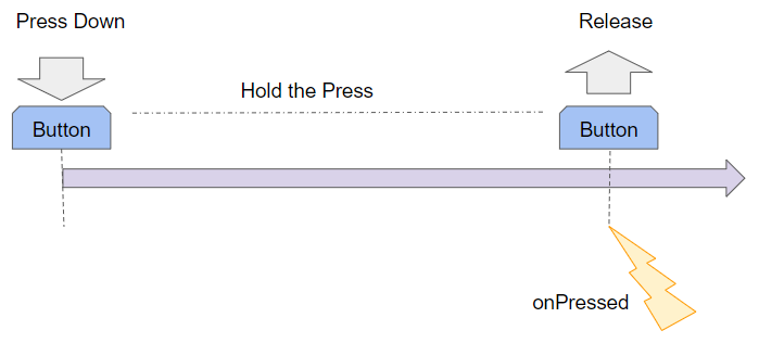
Note: If both onPressed and onLongPress propertiesare not specified, the Button will be disabled and there will be no response when touched.
main.dart (onPressed ex1)
import 'package:flutter/material.dart';
void main() {
runApp(MyApp());
}
class MyApp extends StatelessWidget {
@override
Widget build(BuildContext context) {
return MaterialApp(
title: 'o7planning.org',
debugShowCheckedModeBanner: false,
theme: ThemeData(
primarySwatch: Colors.blue,
visualDensity: VisualDensity.adaptivePlatformDensity,
),
home: MyHomePage(),
);
}
}
class MyHomePage extends StatefulWidget {
MyHomePage({Key key}) : super(key: key);
@override
State<StatefulWidget> createState() {
return MyHomePageState();
}
}
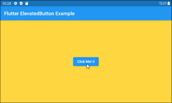
class MyHomePageState extends State<MyHomePage> {
int pressCount = 0;
final List<Color> colors = [Colors.amberAccent, Colors.cyan, Colors.deepOrangeAccent];
@override
Widget build(BuildContext context) {
return Scaffold (
backgroundColor: this.colors[ pressCount % this.colors.length],
appBar: AppBar(
title: Text("Flutter ElevatedButton Example"),
),
body: Center (
child: ElevatedButton (
child: Text("Click Me! " + this.pressCount.toString()),
onPressed: () {
this.setState(() {
this.pressCount++;
});
}
),
)
);
}
}5. onLongPress
onLongPress is a callback function, is called when the user presses down the button for a longer time than the LONG_PRESS_TIMEOUT milliseconds. The Long-Press event will occur at the LONG_PRESS_TIMEOUT millisecond since the user presses it down if during this time (0 --> LONG_PRESS_TIMEOUT), the user does not move the cursor.
VoidCallback onLongPressIf you assign two callback functions, onPressed and onLongPress for a button, in any situations, there will be at most one function to be called.
LONG_PRESS_TIMEOUT | 500 milliseconds |
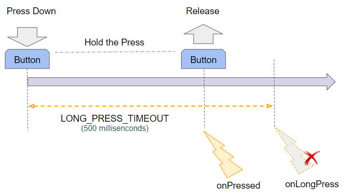
If the user presses down and releases before the LONG_PRESS_TIMEOUT time, only the onPressed event will occur.
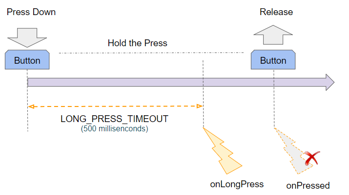
If the user presses down for a longer time than the LONG_PRESS_TIMEOUT milliseconds, the onLongPress event will happen and Flutter will ignore the onPressed event that occurs afterwards.
main.dart (onLongPress ex1)
import 'package:flutter/material.dart';
void main() {
runApp(MyApp());
}
class MyApp extends StatelessWidget {
@override
Widget build(BuildContext context) {
return MaterialApp(
title: 'o7planning.org',
debugShowCheckedModeBanner: false,
theme: ThemeData(
primarySwatch: Colors.blue,
visualDensity: VisualDensity.adaptivePlatformDensity,
),
home: MyHomePage(),
);
}
}
class MyHomePage extends StatefulWidget {
MyHomePage({Key key}) : super(key: key);
@override
State<StatefulWidget> createState() {
return MyHomePageState();
}
}
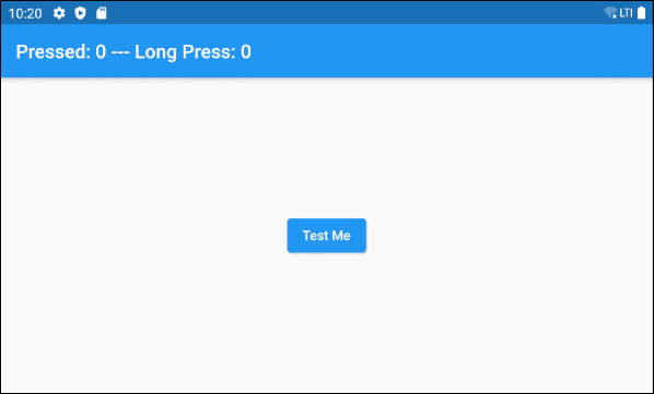
class MyHomePageState extends State<MyHomePage> {
int pressedCount = 0;
int longPressCount = 0;
@override
Widget build(BuildContext context) {
return Scaffold (
appBar: AppBar(
title: Text("Pressed: " + this.pressedCount.toString()
+" --- Long Press: " + this.longPressCount.toString()),
),
body: Center (
child: ElevatedButton (
child: Text("Test Me"),
onPressed: onPressHander,
onLongPress: onLongPressHandler
),
)
);
}
onPressHander() {
this.setState(() {
this.pressedCount++;
});
showDialog (
context: context,
builder: (_) => new AlertDialog(
title: new Text("Message"),
content: new Text("OK, You just Pressed!"),
actions: <Widget>[
FlatButton(
child: Text('Close me!'),
onPressed: () {
Navigator.of(context).pop();
},
)
],
));
}
onLongPressHandler() {
this.setState(() {
this.longPressCount++;
});
showDialog (
context: context,
builder: (_) => new AlertDialog(
title: new Text("Message"),
content: new Text("Hey, I show up for long press"),
actions: <Widget>[
FlatButton(
child: Text('Close me!'),
onPressed: () {
Navigator.of(context).pop();
},
)
],
));
}
}6. style
style property is used to customize the style of the button.
ButtonStyle styleButtonStyle constructor
const ButtonStyle(
    {MaterialStateProperty<TextStyle> textStyle,
    MaterialStateProperty<Color> backgroundColor,
    MaterialStateProperty<Color> foregroundColor,
    MaterialStateProperty<Color> overlayColor,
    MaterialStateProperty<Color> shadowColor,
    MaterialStateProperty<double> elevation,
    MaterialStateProperty<EdgeInsetsGeometry> padding,
    MaterialStateProperty<Size> minimumSize,
    MaterialStateProperty<BorderSide> side,
    MaterialStateProperty<OutlinedBorder> shape,
    MaterialStateProperty<MouseCursor> mouseCursor,
    VisualDensity visualDensity,
    MaterialTapTargetSize tapTargetSize,
    Duration animationDuration,
    bool enableFeedback}
)
The ElevatedButton default style is defined by the defaultStyleOf method.
@override
ButtonStyle defaultStyleOf (
     BuildContext context
)
For example, an ElevatedButton with background color and foreground color changes based on its state.
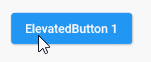
style (ex1)
ElevatedButton (
    child: Text("ElevatedButton 1"),
    onPressed: () {},
    style: ButtonStyle (
        backgroundColor: MaterialStateProperty.resolveWith<Color>(
                (Set<MaterialState> states) {
              if (states.contains(MaterialState.pressed)) {
                return Colors.black45;
              }
              return null; // Use the component's default.
            }
        ),
        foregroundColor: MaterialStateProperty.resolveWith<Color>(
              (Set<MaterialState> states) {
            if (states.contains(MaterialState.pressed)) {
              return Colors.yellow;
            }
            return null; // Use the component's default.
          },
        )
    )
)
Example: An ElevatedButton with an elevation of 10 has an elevation of 0 in a pressed or disabled state.
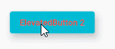
style (ex2)
ElevatedButton (
    child: Text("ElevatedButton 2"),
    onPressed: () {},
    style: ButtonStyle(
        backgroundColor: MaterialStateProperty.resolveWith<Color>(
                (Set<MaterialState> states) {
              if (states.contains(MaterialState.disabled)) {
                return Colors.black26;
              }
              return Colors.cyan;
            }
        ),
        // foregroundColor is red for all states.
        foregroundColor: MaterialStateProperty.all<Color>(Colors.red),
        elevation: MaterialStateProperty.resolveWith<double>(
              (Set<MaterialState> states) {
            if (states.contains(MaterialState.pressed)
                ||  states.contains(MaterialState.disabled)) {
              return 0;
            }
            return 10;
          },
        )
    )
)
ElevatedButton.styleFrom()
The ElevatedButton.styleFrom() static method is a convenient way to create a style for ElevatedButton from simple values.
ElevatedButton.styleFrom static method
ButtonStyle styleFrom (
    {Color primary,
    Color onPrimary,
    Color onSurface,
    Color shadowColor,
    double elevation,
    TextStyle textStyle,
    EdgeInsetsGeometry padding,
    Size minimumSize,
    BorderSide side,
    OutlinedBorder shape,
    MouseCursor enabledMouseCursor,
    MouseCursor disabledMouseCursor,
    VisualDensity visualDensity,
    MaterialTapTargetSize tapTargetSize,
    Duration animationDuration,
    bool enableFeedback}
)
For example:
style (ex3)
ElevatedButton.icon (
  icon: Icon(Icons.settings),
  label: Text("Settings"),
  onPressed: () {},
  // Use ElevatedButton.styleFrom static method
  style: ElevatedButton.styleFrom(
      shadowColor : Colors.redAccent,
      elevation: 10,
      minimumSize: Size( 100,   80 )
  )
)- ButtonStyle
- MaterialStateProperty
Flutter Programming Tutorials
- Flutter Column Tutorial with Examples
- Flutter Stack Tutorial with Examples
- Flutter IndexedStack Tutorial with Examples
- Flutter Spacer Tutorial with Examples
- Flutter Expanded Tutorial with Examples
- Flutter SizedBox Tutorial with Examples
- Flutter Tween Tutorial with Examples
- Install Flutter SDK on Windows
- Install Flutter Plugin for Android Studio
- Create your first Flutter app - Hello Flutter
- Flutter Scaffold Tutorial with Examples
- Flutter AppBar Tutorial with Examples
- Flutter BottomAppBar Tutorial with Examples
- Flutter TextButton Tutorial with Examples
- Flutter ElevatedButton Tutorial with Examples
- Flutter EdgeInsetsGeometry Tutorial with Examples
- Flutter EdgeInsets Tutorial with Examples
- Flutter CircularProgressIndicator Tutorial with Examples
- Flutter LinearProgressIndicator Tutorial with Examples
- Flutter Center Tutorial with Examples
- Flutter Align Tutorial with Examples
- Flutter Row Tutorial with Examples
- Flutter SplashScreen Tutorial with Examples
- Flutter Alignment Tutorial with Examples
- Flutter Positioned Tutorial with Examples
- Flutter SimpleDialog Tutorial with Examples
- Flutter AlertDialog Tutorial with Examples
- Flutter Navigation and Routing Tutorial with Examples
- Flutter TabBar Tutorial with Examples
- Flutter Banner Tutorial with Examples
- Flutter BottomNavigationBar Tutorial with Examples
- Flutter FancyBottomNavigation Tutorial with Examples
- Flutter Card Tutorial with Examples
- Flutter Border Tutorial with Examples
- Flutter ContinuousRectangleBorder Tutorial with Examples
- Flutter RoundedRectangleBorder Tutorial with Examples
- Flutter CircleBorder Tutorial with Examples
- Flutter StadiumBorder Tutorial with Examples
- Flutter Container Tutorial with Examples
- Flutter RotatedBox Tutorial with Examples
- Flutter CircleAvatar Tutorial with Examples
- Flutter IconButton Tutorial with Examples
- Flutter FlatButton Tutorial with Examples
- Flutter SnackBar Tutorial with Examples
Show More