Flutter BottomNavigationBar Tutorial with Examples
1. BottomNavigationBar
A bottom navigation bar is a traditional style of iOS applications. In Flutter, you can do this with the BottomNavigationBar. Besides, the BottomNavigationBar also has a handy feature that allows you to attach a FloatingActionButton to it.
BottomNavigationBar Constructor:
BottomNavigationBar Constructor
BottomNavigationBar(
    {Key key,
    @required List<BottomNavigationBarItem> items,
    ValueChanged<int> onTap,
    int currentIndex: 0,
    double elevation,
    BottomNavigationBarType type,
    Color fixedColor,
    Color backgroundColor,
    double iconSize: 24.0,
    Color selectedItemColor,
    Color unselectedItemColor,
    IconThemeData selectedIconTheme,
    IconThemeData unselectedIconTheme,
    double selectedFontSize: 14.0,
    double unselectedFontSize: 12.0,
    TextStyle selectedLabelStyle,
    TextStyle unselectedLabelStyle,
    bool showSelectedLabels: true,
    bool showUnselectedLabels,
    MouseCursor mouseCursor}
)
BottomNavigationBar is usually placed in a Scaffold through the AppBar.bottomNavigationBar property, and it will appear at the bottom of the Scaffold.

BottomNavigationBar is pretty similar to the BottomAppBar in terms of usage. The BottomNavigationBar offers a template for a navigation bar, so it is simple and easy to use. However, if you want to unleash your creativity, use the BottomAppBar.
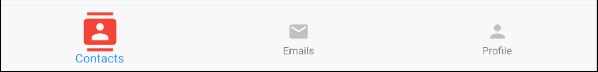
2. Example
Let's get started with a complete example of the BottomNavigationBar. It will help you understand how this Widget works.
main.dart (ex1)
import 'package:flutter/material.dart';
void main() {
runApp(MyApp());
}
class MyApp extends StatelessWidget {
@override
Widget build(BuildContext context) {
return MaterialApp(
title: 'Title of Application',
theme: ThemeData(
primarySwatch: Colors.blue,
visualDensity: VisualDensity.adaptivePlatformDensity,
),
home: MyHomePage(),
);
}
}
class MyHomePage extends StatefulWidget {
MyHomePage({Key key}) : super(key: key);
@override
State<StatefulWidget> createState() {
return MyHomePageState();
}
}
class MyHomePageState extends State<MyHomePage> {
int selectedIndex = 0;
Widget _myContacts = MyContacts();
Widget _myEmails = MyEmails();
Widget _myProfile = MyProfile();
@override
Widget build(BuildContext context) {
return Scaffold(
appBar: AppBar(
title: Text("BottomNavigationBar Example"),
),
body: this.getBody(),
bottomNavigationBar: BottomNavigationBar(
type: BottomNavigationBarType.fixed,
currentIndex: this.selectedIndex,
items: [
BottomNavigationBarItem(
icon: Icon(Icons.contacts),
title: Text("Contacts"),
),
BottomNavigationBarItem(
icon: Icon(Icons.mail),
title: Text("Emails"),
),
BottomNavigationBarItem(
icon: Icon(Icons.person),
title: Text("Profile"),
)
],
onTap: (int index) {
this.onTapHandler(index);
},
),
);
}
Widget getBody( ) {
if(this.selectedIndex == 0) {
return this._myContacts;
} else if(this.selectedIndex==1) {
return this._myEmails;
} else {
return this._myProfile;
}
}
void onTapHandler(int index) {
this.setState(() {
this.selectedIndex = index;
});
}
}
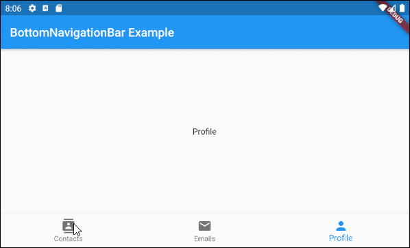
class MyContacts extends StatelessWidget {
@override
Widget build(BuildContext context) {
return Center(child: Text("Contacts"));
}
}
class MyEmails extends StatelessWidget {
@override
Widget build(BuildContext context) {
return Center(child: Text("Emails"));
}
}
class MyProfile extends StatelessWidget {
@override
Widget build(BuildContext context) {
return Center(child: Text("Profile"));
}
}3. items
items property is used to define the list of the BottomNavigationBar items. This property is required and the number of items must be greater than or equal to 2, otherwise you will get an error.
@required List<BottomNavigationBarItem> itemsBottomNavigationBarItem Constructor:
BottomNavigationBarItem Constructor
const BottomNavigationBarItem(
    {@required Widget icon,
    Widget title,
    Widget activeIcon,
    Color backgroundColor}
)
For example:
main.dart (items ex1)
import 'package:flutter/material.dart';
void main() {
runApp(MyApp());
}
class MyApp extends StatelessWidget {
// This widget is the root of your application.
@override
Widget build(BuildContext context) {
return MaterialApp(
title: 'Title of Application',
theme: ThemeData(
primarySwatch: Colors.blue,
visualDensity: VisualDensity.adaptivePlatformDensity,
),
home: MyHomePage(),
);
}
}
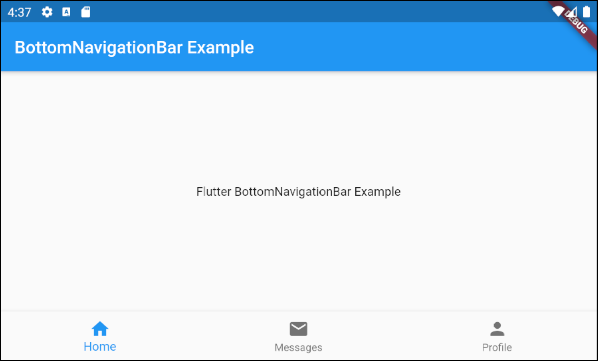
class MyHomePage extends StatelessWidget {
MyHomePage({Key key}) : super(key: key);
@override
Widget build(BuildContext context) {
return Scaffold(
appBar: AppBar(
title: Text("BottomNavigationBar Example"),
),
body: Center(
child: Text(
'Flutter BottomNavigationBar Example',
)
),
bottomNavigationBar: BottomNavigationBar(
items: [
BottomNavigationBarItem(
icon: Icon(Icons.home),
title: Text("Home"),
),
BottomNavigationBarItem(
icon: Icon(Icons.mail),
title: Text("Messages"),
),
BottomNavigationBarItem(
icon: Icon(Icons.person),
title: Text("Profile"),
)
],
),
);
}
}4. onTap
onTap is a callback function. It will be called when the user taps on an item of the BottomNavigationBar.
ValueChanged<int> onTap
main.dart (onTab ex1)
import 'package:flutter/material.dart';

void main() {
  runApp(MyApp());
}

class MyApp extends StatelessWidget {
  @override
  Widget build(BuildContext context) {
    return MaterialApp(
      title: 'Title of Application',
      theme: ThemeData(
        primarySwatch: Colors.blue,
        visualDensity: VisualDensity.adaptivePlatformDensity,
      ),
      home: MyHomePage(),
    );
  }
}

class MyHomePage extends StatefulWidget {
  MyHomePage({Key key}) : super(key: key);

  @override
  State<StatefulWidget> createState() {
    return MyHomePageState();
  }

}

class MyHomePageState extends State<MyHomePage> {
  int tapCount = 0;
  int selectedIndex = 0;

  @override
  Widget build(BuildContext context) {
    return Scaffold(
      appBar: AppBar(
        title: Text("BottomNavigationBar Example"),
      ),
      body: Center(
          child: Text("Tap Count: " + this.tapCount.toString()
                       + ", Index: " + this.selectedIndex.toString())
      ),
      bottomNavigationBar: BottomNavigationBar(
        currentIndex: this.selectedIndex,
        items: [
          BottomNavigationBarItem(
            icon: Icon(Icons.contacts),
            title: Text("Contacts"),
          ),
          BottomNavigationBarItem(
            icon: Icon(Icons.mail),
            title: Text("Emails"),
          ),
          BottomNavigationBarItem(
            icon: Icon(Icons.person),
            title: Text("Profile"),
          )
        ],
        onTap: (int index) {
          this.onTapHandler(index);
        },
      ),
    );
  }

  void onTapHandler(int index)  {
    this.setState(() {
      this.tapCount++;
      this.selectedIndex = index;
    });
  }
}
5. currentIndex
currentIndex is the index of the BottomNavigationBar item currently selected. Its default value is 0 corresponding to the first item.
int currentIndex: 07. iconSize
iconSize property is used to specify the size of the icon of all the BottomNavigationBarItem(s).
double iconSize: 24.0
iconSize (ex1)
BottomNavigationBar(
  currentIndex: this.selectedIndex,
  iconSize: 48,
  items: [
    BottomNavigationBarItem(
      icon: Icon(Icons.contacts),
      title: Text("Contacts"),
    ),
    BottomNavigationBarItem(
      icon: Icon(Icons.mail),
      title: Text("Emails"),
    ),
    BottomNavigationBarItem(
      icon: Icon(Icons.person),
      title: Text("Profile"),
    )
  ],
  onTap: (int index) {
    this.setState(() {
      this.selectedIndex = index;
    });
  },
),
8. selectedIconTheme
selectedIconTheme property is used to set the size, color, and opacity for selected BottomNavigationBarItem icon.
IconThemeData selectedIconThemeIconThemeData Constructor
const IconThemeData (
    {Color color,
    double opacity,
    double size}
)
If the selectedIconTheme property is used, you should specify a value for the unselectedIconTheme property. Otherwise, you will not see icons on the unselected BottomNavigationBarItem(s).

selectedIconTheme (ex1)
BottomNavigationBar(
  currentIndex: this.selectedIndex,
  selectedIconTheme: IconThemeData (
      color: Colors.red,
      opacity: 1.0,
      size: 30
  ),
  items: [
    BottomNavigationBarItem(
      icon: Icon(Icons.contacts),
      title: Text("Contacts"),
    ),
    BottomNavigationBarItem(
      icon: Icon(Icons.mail),
      title: Text("Emails"),
    ),
    BottomNavigationBarItem(
      icon: Icon(Icons.person),
      title: Text("Profile"),
    )
  ],
  onTap: (int index) {
    this.setState(() {
      this.selectedIndex = index;
    });
  },
)
9. unselectedIconTheme
The unselectedIconTheme property is used to set the size, color, and opacity for the icon of the unselected BottomNavigationBarItem(s).
IconThemeData unselectedIconThemeIconThemeData constructor
const IconThemeData (
    {Color color,
    double opacity,
    double size}
)
If the unselectedIconTheme property is used, you should specify a value for the selectedIconTheme property. If not, you will not see the icon on the selected BottomNavigationBarItem.
unselectedIconTheme (ex1)
BottomNavigationBar(
  currentIndex: this.selectedIndex,
  selectedIconTheme: IconThemeData (
      color: Colors.red,
      opacity: 1.0,
      size: 45
  ),
  unselectedIconTheme: IconThemeData (
      color: Colors.black45,
      opacity: 0.5,
      size: 25
  ),
  items: [
    BottomNavigationBarItem(
      icon: Icon(Icons.contacts),
      title: Text("Contacts"),
    ),
    BottomNavigationBarItem(
      icon: Icon(Icons.mail),
      title: Text("Emails"),
    ),
    BottomNavigationBarItem(
      icon: Icon(Icons.person),
      title: Text("Profile"),
    )
  ],
  onTap: (int index) {
    this.setState(() {
      this.selectedIndex = index;
    });
  },
),
10. selectedLabelStyle
selectedLabelStyle property is used to specify the text style on the label of the selected BottomNavigationBarItem.
TextStyle selectedLabelStyle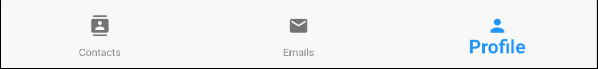
selectedLabelStyle (ex1)
BottomNavigationBar(
  currentIndex: this.selectedIndex,
  selectedLabelStyle: TextStyle(fontWeight: FontWeight.bold, fontSize: 22),
  items: [
    BottomNavigationBarItem(
      icon: Icon(Icons.contacts),
      title: Text("Contacts"),
    ),
    BottomNavigationBarItem(
      icon: Icon(Icons.mail),
      title: Text("Emails"),
    ),
    BottomNavigationBarItem(
      icon: Icon(Icons.person),
      title: Text("Profile"),
    )
  ],
  onTap: (int index) {
    this.setState(() {
      this.selectedIndex = index;
    });
  },
)
11. unselectedLabelStyle
unselectedLabelStyle property is used to specify the text style on the label of the unselected BottomNavigationBarItem(s).
TextStyle unselectedLabelStyle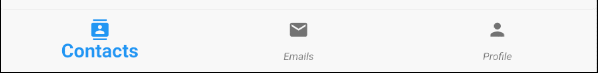
unselectedLabelStyle (ex1)
BottomNavigationBar(
  currentIndex: this.selectedIndex,
  selectedLabelStyle: TextStyle(fontWeight: FontWeight.bold, fontSize: 22),
  unselectedLabelStyle: TextStyle(fontStyle: FontStyle.italic),
  items: [
    BottomNavigationBarItem(
      icon: Icon(Icons.contacts),
      title: Text("Contacts"),
    ),
    BottomNavigationBarItem(
      icon: Icon(Icons.mail),
      title: Text("Emails"),
    ),
    BottomNavigationBarItem(
      icon: Icon(Icons.person),
      title: Text("Profile"),
    )
  ],
  onTap: (int index) {
    this.setState(() {
      this.selectedIndex = index;
    });
  },
)
12. showSelectedLabels
showSelectedLabels property is used to allow or disallow labels to be displayed on the currently selected BottomNavigationBarItem. Its default value is true.
bool showSelectedLabels: true
showSelectedLabels (ex1)
BottomNavigationBar(
  currentIndex: this.selectedIndex,
  showSelectedLabels: false,
  items: [
    BottomNavigationBarItem(
      icon: Icon(Icons.contacts),
      title: Text("Contacts"),
    ),
    BottomNavigationBarItem(
      icon: Icon(Icons.mail),
      title: Text("Emails"),
    ),
    BottomNavigationBarItem(
      icon: Icon(Icons.person),
      title: Text("Profile"),
    )
  ],
  onTap: (int index) {
    this.setState(() {
      this.selectedIndex = index;
    });
  },
)
13. showUnselectedLabels
showUnselectedLabels property is used to allow or disallow labels to be displayed on the unselected BottomNavigationBarItem. Its default value is true.
bool showUnselectedLabels
showUnselectedLabels (ex1)
BottomNavigationBar(
  currentIndex: this.selectedIndex,
  showUnselectedLabels: false,
  items: [
    BottomNavigationBarItem(
      icon: Icon(Icons.contacts),
      title: Text("Contacts"),
    ),
    BottomNavigationBarItem(
      icon: Icon(Icons.mail),
      title: Text("Emails"),
    ),
    BottomNavigationBarItem(
      icon: Icon(Icons.person),
      title: Text("Profile"),
    )
  ],
  onTap: (int index) {
    this.setState(() {
      this.selectedIndex = index;
    });
  },
)
14. selectedFontSize
selectedFontSize property is used to specify the font size on the selected BottomNavigationBarItem. Its default value is 14.
double selectedFontSize: 14.0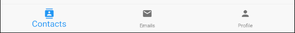
selectedFontSize (ex1)
BottomNavigationBar(
  currentIndex: this.selectedIndex,
  selectedFontSize: 20,
  items: [
    BottomNavigationBarItem(
      icon: Icon(Icons.contacts),
      title: Text("Contacts"),
    ),
    BottomNavigationBarItem(
      icon: Icon(Icons.mail),
      title: Text("Emails"),
    ),
    BottomNavigationBarItem(
      icon: Icon(Icons.person),
      title: Text("Profile"),
    )
  ],
  onTap: (int index) {
    this.setState(() {
      this.selectedIndex = index;
    });
  },
)
15. unselectedFontSize
selectedFontSize property is used to specify the font size on the unselected BottomNavigationBarItem. Its default value is 12.
double unselectedFontSize: 12.0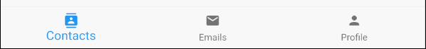
unselectedFontSize (ex1)
BottomNavigationBar(
  currentIndex: this.selectedIndex,
  selectedFontSize: 20,
  unselectedFontSize: 15,
  items: [
    BottomNavigationBarItem(
      icon: Icon(Icons.contacts),
      title: Text("Contacts"),
    ),
    BottomNavigationBarItem(
      icon: Icon(Icons.mail),
      title: Text("Emails"),
    ),
    BottomNavigationBarItem(
      icon: Icon(Icons.person),
      title: Text("Profile"),
    )
  ],
  onTap: (int index) {
    this.setState(() {
      this.selectedIndex = index;
    });
  },
)
16. backgroundColor
backgroundColor property is used to specify the background color of the BottomNavigationBar.
Color backgroundColor
backgroundColor (ex1)
BottomNavigationBar(
  currentIndex: this.selectedIndex,
  backgroundColor : Colors.greenAccent,
  items: [
    BottomNavigationBarItem(
      icon: Icon(Icons.contacts),
      title: Text("Contacts"),
    ),
    BottomNavigationBarItem(
      icon: Icon(Icons.mail),
      title: Text("Emails"),
    ),
    BottomNavigationBarItem(
      icon: Icon(Icons.person),
      title: Text("Profile"),
    )
  ],
  onTap: (int index) {
    this.setState(() {
      this.selectedIndex = index;
    });
  },
)
17. selectedItemColor
selectedItemColor property is used to specify the color of the selected BottomNavigationBarItem, which works for the icon and label.
Note: selectedItemColor property is the same as fixedColor, which you are only allowed to use one of these two properties.
Color selectedItemColor
selectedItemColor (ex1)
BottomNavigationBar(
  currentIndex: this.selectedIndex,
  selectedItemColor : Colors.red,
  items: [
    BottomNavigationBarItem(
      icon: Icon(Icons.contacts),
      title: Text("Contacts"),
    ),
    BottomNavigationBarItem(
      icon: Icon(Icons.mail),
      title: Text("Emails"),
    ),
    BottomNavigationBarItem(
      icon: Icon(Icons.person),
      title: Text("Profile"),
    )
  ],
  onTap: (int index) {
    this.setState(() {
      this.selectedIndex = index;
    });
  },
)
18. unselectedItemColor
unselectedItemColor property is used to specify the color of the unselected BottomNavigationBarItem, which works for the icon and label.
Color unselectedItemColor
unselectedItemColor (ex1)
BottomNavigationBar(
  currentIndex: this.selectedIndex,
  selectedItemColor : Colors.red,
  unselectedItemColor: Colors.cyan,
  items: [
    BottomNavigationBarItem(
      icon: Icon(Icons.contacts),
      title: Text("Contacts"),
    ),
    BottomNavigationBarItem(
      icon: Icon(Icons.mail),
      title: Text("Emails"),
    ),
    BottomNavigationBarItem(
      icon: Icon(Icons.person),
      title: Text("Profile"),
    )
  ],
  onTap: (int index) {
    this.setState(() {
      this.selectedIndex = index;
    });
  },
)
19. fixedColor
The fixedColor property is similar to the selectedItemColor property. Both are used to specify the color of the selected BottomNavigationBarItem. It works for the icon and label.
Note: fixedColor is an old name which is still available for the purpose of backwards compatibility. You should use the selectedItemColor property and not allowed to use both at the same time.
Color fixedColor
fixedColor (ex1)
BottomNavigationBar(
  currentIndex: this.selectedIndex,
  fixedColor: Colors.red,
  items: [
    BottomNavigationBarItem(
      icon: Icon(Icons.contacts),
      title: Text("Contacts"),
    ),
    BottomNavigationBarItem(
      icon: Icon(Icons.mail),
      title: Text("Emails"),
    ),
    BottomNavigationBarItem(
      icon: Icon(Icons.person),
      title: Text("Profile"),
    )
  ],
  onTap: (int index) {
    this.setState(() {
      this.selectedIndex = index;
    });
  },
)Flutter Programming Tutorials
- Flutter Column Tutorial with Examples
- Flutter Stack Tutorial with Examples
- Flutter IndexedStack Tutorial with Examples
- Flutter Spacer Tutorial with Examples
- Flutter Expanded Tutorial with Examples
- Flutter SizedBox Tutorial with Examples
- Flutter Tween Tutorial with Examples
- Install Flutter SDK on Windows
- Install Flutter Plugin for Android Studio
- Create your first Flutter app - Hello Flutter
- Flutter Scaffold Tutorial with Examples
- Flutter AppBar Tutorial with Examples
- Flutter BottomAppBar Tutorial with Examples
- Flutter TextButton Tutorial with Examples
- Flutter ElevatedButton Tutorial with Examples
- Flutter EdgeInsetsGeometry Tutorial with Examples
- Flutter EdgeInsets Tutorial with Examples
- Flutter CircularProgressIndicator Tutorial with Examples
- Flutter LinearProgressIndicator Tutorial with Examples
- Flutter Center Tutorial with Examples
- Flutter Align Tutorial with Examples
- Flutter Row Tutorial with Examples
- Flutter SplashScreen Tutorial with Examples
- Flutter Alignment Tutorial with Examples
- Flutter Positioned Tutorial with Examples
- Flutter SimpleDialog Tutorial with Examples
- Flutter AlertDialog Tutorial with Examples
- Flutter Navigation and Routing Tutorial with Examples
- Flutter TabBar Tutorial with Examples
- Flutter Banner Tutorial with Examples
- Flutter BottomNavigationBar Tutorial with Examples
- Flutter FancyBottomNavigation Tutorial with Examples
- Flutter Card Tutorial with Examples
- Flutter Border Tutorial with Examples
- Flutter ContinuousRectangleBorder Tutorial with Examples
- Flutter RoundedRectangleBorder Tutorial with Examples
- Flutter CircleBorder Tutorial with Examples
- Flutter StadiumBorder Tutorial with Examples
- Flutter Container Tutorial with Examples
- Flutter RotatedBox Tutorial with Examples
- Flutter CircleAvatar Tutorial with Examples
- Flutter IconButton Tutorial with Examples
- Flutter FlatButton Tutorial with Examples
- Flutter SnackBar Tutorial with Examples
Show More