Flutter AlertDialog Tutorial with Examples
1. AlertDialog
AlertDialog is a dialog box that is used to notify the user of some situations which confirmation is requested. It includes an optional title, an optional content and optional action buttons under the content.
If the content is too large for the screen vertically, you can wrap it in a SingleChildScrollView to avoid its overflowing. Nevertheless, it is notable that AlertDialog tries to size itself based on the intrinsic size of its children; therefore, child widgets such as ListView, GridView and CustomScrollView should be considered using in content creation.
The lazy data display mode does not work in AlertDialog. If this is problematic, you can use the Dialog class directly in order to get more creative space.
- Flutter Dialog
If you want a simple dialog containing only one title and one list of options, take the SimpleDialog into consideration.
AlertDialog Constructor:
AlertDialog Constructor
const AlertDialog(
    {Key key,
    Widget title,
    Widget content,
    List<Widget> actions,
    ShapeBorder shape,
    double elevation,
    EdgeInsetsGeometry titlePadding,
    TextStyle titleTextStyle,
    EdgeInsetsGeometry contentPadding: const EdgeInsets.fromLTRB(24.0, 20.0, 24.0, 24.0),
    TextStyle contentTextStyle,
    EdgeInsetsGeometry actionsPadding: EdgeInsets.zero,
    VerticalDirection actionsOverflowDirection,
    double actionsOverflowButtonSpacing,
    EdgeInsetsGeometry buttonPadding,
    Color backgroundColor,
    String semanticLabel,
    EdgeInsets insetPadding: _defaultInsetPadding,
    Clip clipBehavior: Clip.none,
    bool scrollable: false}
)
2. Examples
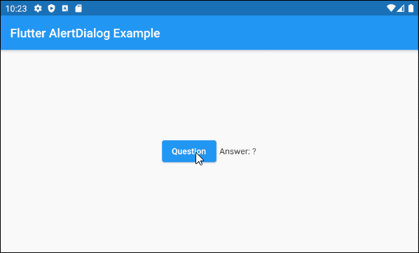
First of all, take a look at the simple but complete example of the AlertDialog. It will help you answer the following basic questions:
- How to create an AlertDialog.
- How to return a value from AlertDialog.
- How to handle the returned value.
main.dart (ex1)
import 'package:flutter/material.dart';

void main() {
  runApp(MyApp());
}

class MyApp extends StatelessWidget {
  @override
  Widget build(BuildContext context) {
    return MaterialApp(
      title: 'o7planning.org',
      debugShowCheckedModeBanner: false,
      theme: ThemeData(
        primarySwatch: Colors.blue,
        visualDensity: VisualDensity.adaptivePlatformDensity,
      ),
      home: MyHomePage(),
    );
  }
}

class MyHomePage extends StatefulWidget {
  MyHomePage({Key key}) : super(key: key);

  @override
  State<StatefulWidget> createState() {
    return MyHomePageState();
  }
}

class MyHomePageState extends State<MyHomePage> {
  String answer = "?";

  @override
  Widget build(BuildContext context) {
    return Scaffold (
        appBar: AppBar(
            title: Text("Flutter AlertDialog Example")
        ),
        body: Center (
            child: Row (
                mainAxisAlignment: MainAxisAlignment.center,
                crossAxisAlignment: CrossAxisAlignment.center,
                children: [
                  ElevatedButton (
                    child: Text("Question"),
                    onPressed: () {
                      showMyAlertDialog(context);
                    },
                  ),
                  SizedBox(width:5, height:5),
                  Text("Answer: " + this.answer.toString())
                ]
            )
        )
    );
  }

  showMyAlertDialog(BuildContext context) {
    // Create AlertDialog
    AlertDialog dialog = AlertDialog(
      title: Text("Election 2020"),
      content: Text("Will you vote for Trump?"),
      actions: [
        ElevatedButton(
            child: Text("Yes"),
            onPressed: (){
              Navigator.of(context).pop("Yes, Of course!"); // Return value
            }
        ),
        ElevatedButton(
            child: Text("No"),
            onPressed: (){
              Navigator.of(context).pop("No, I will vote for Biden"); // Return value
            }
        ),
      ],
    );

    // Call showDialog function to show dialog.
    Future<String> futureValue = showDialog(
        context: context,
        builder: (BuildContext context) {
          return dialog;
        }
    );
    Stream<String> stream = futureValue.asStream();
    stream.listen((String data) {
      String answerValue = data;
      this.setState(() {
        this.answer = answerValue;
      });
    }, onDone : () {
      print("Done!");
    } , onError: (error) {
      print("Error! " + error.toString());
    });
  }

}- Dart Stream Tutorial with examples
3. shape
shape property is used to define the border shape of the AlertDialog. The default value of the shape is a RoundedRectangleBorder with the radius of 4.0 pixels at the four corners.
ShapeBorder shape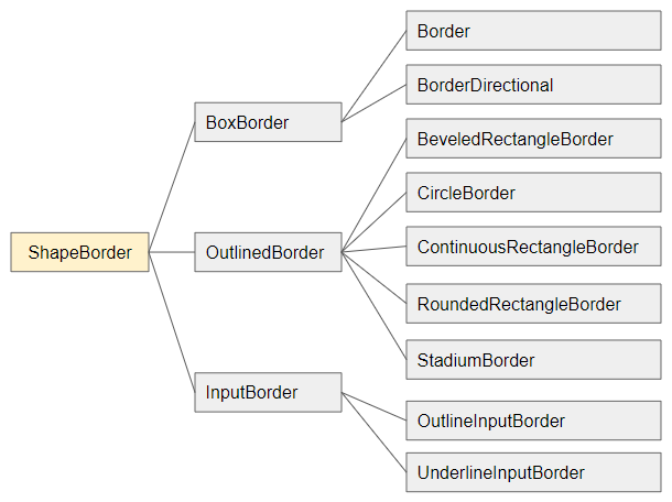
- Flutter ShapeBorder
shape (ex1)
void openMyAlertDialog(BuildContext context)  {
  // Create a AlertDialog.
  AlertDialog dialog = AlertDialog(
    title: Text("Confirm"),
    content: Text("Are you sure to remove this item?"),
    shape: RoundedRectangleBorder(
        side:  BorderSide(color: Colors.green,width: 3),
        borderRadius: BorderRadius.all(Radius.circular(15))
    ),
    actions: [
      ElevatedButton(
          child: Text("Yes Delete"),
          onPressed: (){
            Navigator.of(context).pop(true); // Return true
          }
      ),
      ElevatedButton(
          child: Text("Cancel"),
          onPressed: (){
            Navigator.of(context).pop(false); // Return false
          }
      ),
    ],
  );

  // Call showDialog function.
  Future<bool> futureValue = showDialog(
      context: context,
      builder: (BuildContext context) {
        return dialog;
      }
  );
  futureValue.then( (value) {
    print("Return value: " + value.toString()); // true/false
  });
}
4. elevation
elevation property defines the Z-axis of the AlertDialog. Its default value is 24.0 pixels.
double elevation5. title
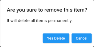
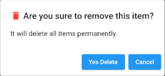
title propertyis an option to set the title for AlertDialog, which in most use cases, it is a Text object.
Widget titleHere is a simple title example of Text object:
title (ex1)
void openMyAlertDialog(BuildContext context)  {
  // Create a AlertDialog.
  AlertDialog dialog = AlertDialog(
    title: Text("Are you sure to remove this item?"),
    content: Text("It will delete all items permanently."),
    actions: [
      ElevatedButton(
          child: Text("Yes Delete"),
          onPressed: (){
            Navigator.of(context).pop(true); // Return true
          }
      ),
      ElevatedButton(
          child: Text("Cancel"),
          onPressed: (){
            Navigator.of(context).pop(false); // Return false
          }
      ),
    ],
  );

  // Call showDialog function.
  Future<bool> futureValue = showDialog(
      context: context,
      builder: (BuildContext context) {
        return dialog;
      }
  );
  futureValue.then( (value) {
      print("Return value: " + value.toString()); // true/false
  });
}
This is another example of a more complicated title:
title (ex2)
void openMyAlertDialog(BuildContext context) {
// Create a AlertDialog.
AlertDialog dialog = AlertDialog(
title: Row (
children: [
Icon(Icons.delete, color: Colors.red),
SizedBox(width: 5, height: 5),
Text("Are you sure to remove this item?"),
]
),
content: Text("It will delete all items permanently."),
actions: [
ElevatedButton(
child: Text("Yes Delete"),
onPressed: (){
Navigator.of(context).pop(true); // Return true
}
),
ElevatedButton(
child: Text("Cancel"),
onPressed: (){
Navigator.of(context).pop(false); // Return false
}
),
],
);
// Call showDialog function.
Future<bool> futureValue = showDialog(
context: context,
builder: (BuildContext context) {
return dialog;
}
);
futureValue.then( (value) {
print("Return value: " + value.toString()); // true/false
});
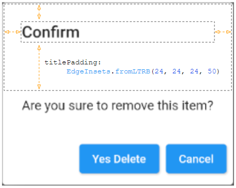
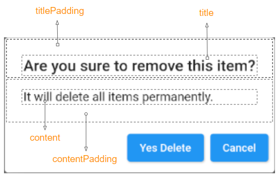
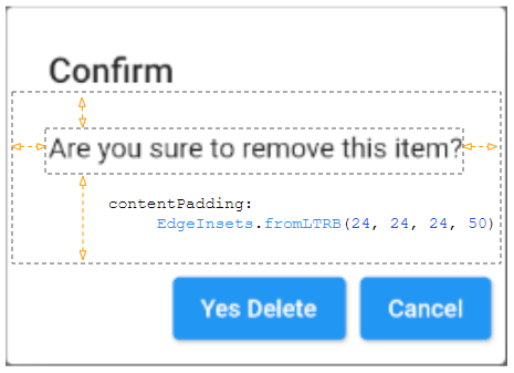
}6. titlePadding
titlePadding property is used to add a padding around the AlertDialog title. If title is null, titlePadding will not be used.
By default, titlePadding offers 24 pixels at the top, the left and the right of the title. It also offers 20 pixels at the bottom of the title if the content is null.

EdgeInsetsGeometry titlePadding
For example:
titlePadding (ex1)
void openMyAlertDialog(BuildContext context)  {
  // Create a AlertDialog.
  AlertDialog dialog = AlertDialog(
    title: Text("Confirm"),
    titlePadding: EdgeInsets.fromLTRB(24, 24, 24, 50),
    content: Text("Are you sure to remove this item?"),
    actions: [
      ElevatedButton(
          child: Text("Yes Delete"),
          onPressed: (){
            Navigator.of(context).pop(true); // Return true
          }
      ),
      ElevatedButton(
          child: Text("Cancel"),
          onPressed: (){
            Navigator.of(context).pop(false); // Return false
          }
      ),
    ],
  );

  // Call showDialog function.
  Future<bool> futureValue = showDialog(
      context: context,
      builder: (BuildContext context) {
        return dialog;
      }
  );
  futureValue.then( (value) {
    print("Return value: " + value.toString()); // true/false
  });
}
7. titleTextStyle
titleTextStyle property is used to define the text style of the title area.
TextStyle titleTextStyle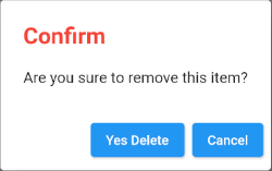
titleTextStyle (ex1)
void openMyAlertDialog(BuildContext context)  {
  // Create a AlertDialog.
  AlertDialog dialog = AlertDialog(
    title: Text("Confirm"),
    titleTextStyle: TextStyle(color: Colors.red, fontSize: 24),
    content: Text("Are you sure to remove this item?"),
    actions: [
      ElevatedButton(
          child: Text("Yes Delete"),
          onPressed: (){
            Navigator.of(context).pop(true); // Return true
          }
      ),
      ElevatedButton(
          child: Text("Cancel"),
          onPressed: (){
            Navigator.of(context).pop(false); // Return false
          }
      ),
    ],
  );

  // Call showDialog function.
  Future<bool> futureValue = showDialog(
      context: context,
      builder: (BuildContext context) {
        return dialog;
      }
  );
  futureValue.then( (value) {
    print("Return value: " + value.toString()); // true/false
  });
}
8. content
content property is an option to define a content to be displayed in the center of the AlertDialog. It should be a SingleChildScrollView object if the content is long.
Widget content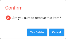
content (ex1)
void openMyAlertDialog(BuildContext context)  {
  // Create a AlertDialog.
  AlertDialog dialog = AlertDialog(
    title: Text("Confirm"),
    titleTextStyle: TextStyle(color: Colors.red, fontSize: 24),
    content: Row (
        children: [
          Icon(Icons.dangerous, size: 30, color: Colors.red),
          SizedBox(width:5, height:5),
          Text("Are you sure to remove this item?")
        ]
    ),
    actions: [
      ElevatedButton(
          child: Text("Yes Delete"),
          onPressed: (){
            Navigator.of(context).pop(true); // Return true
          }
      ),
      ElevatedButton(
          child: Text("Cancel"),
          onPressed: () {
            Navigator.of(context).pop(false); // Return false
          }
      ),
    ],
  );

  // Call showDialog function.
  Future<bool> futureValue = showDialog(
      context: context,
      builder: (BuildContext context) {
        return dialog;
      }
  );
  futureValue.then( (value) {
    print("Return value: " + value.toString()); // true/false
  });
}- Flutter SingleChildScrollView
9. contentPadding
contentPadding property is used to add a padding around the content of AlertDialog. If content is null,contentPadding will not be used.
By default, contentPadding offers 20 pixels on the top of the content and 24 pixels on the left, the right and the bottom of the content.
EdgeInsetsGeometry contentPadding: const EdgeInsets.fromLTRB(24.0, 20.0, 24.0, 24.0)
contentPadding (ex1)
void openMyAlertDialog(BuildContext context)  {
  // Create a AlertDialog.
  AlertDialog dialog = AlertDialog(
    title: Text("Confirm"),
    content: Text("Are you sure to remove this item?"),
    contentPadding: EdgeInsets.fromLTRB(24, 24, 24, 50),
    actions: [
      ElevatedButton(
          child: Text("Yes Delete"),
          onPressed: (){
            Navigator.of(context).pop(true); // Return true
          }
      ),
      ElevatedButton(
          child: Text("Cancel"),
          onPressed: (){
            Navigator.of(context).pop(false); // Return false
          }
      ),
    ],
  );

  // Call showDialog function.
  Future<bool> futureValue = showDialog(
      context: context,
      builder: (BuildContext context) {
        return dialog;
      }
  );
  futureValue.then( (value) {
    print("Return value: " + value.toString()); // true/false
  });
}
10. contentTextStyle
contentTextStyle property is used to define the text style of the content area.
TextStyle contentTextStyle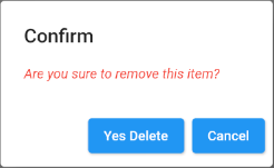
contentTextStyle (ex1)
void openMyAlertDialog(BuildContext context)  {
  // Create a AlertDialog.
  AlertDialog dialog = AlertDialog(
    title: Text("Confirm"),
    content: Text("Are you sure to remove this item?"),
    contentTextStyle: TextStyle(color: Colors.red, fontStyle: FontStyle.italic),
    actions: [
      ElevatedButton(
          child: Text("Yes Delete"),
          onPressed: (){
            Navigator.of(context).pop(true); // Return true
          }
      ),
      ElevatedButton(
          child: Text("Cancel"),
          onPressed: (){
            Navigator.of(context).pop(false); // Return false
          }
      ),
    ],
  );

  // Call showDialog function.
  Future<bool> futureValue = showDialog(
      context: context,
      builder: (BuildContext context) {
        return dialog;
      }
  );
  futureValue.then( (value) {
    print("Return value: " + value.toString()); // true/false
  });
}
11. actions
actions property is an option to define action buttons located at the bottom of the AlertDialog. Specifically, it is a list of TextButton(s)or ElevatedButton(s)wrapped in a ButtonBar.
List<Widget> actions- Flutter ButtonBar
12. actionsPadding
actionsPadding property is used to add a padding around the ButtonBar of the AlertDialog. If actions are null, actionsPadding will not be used. The default value of actionsPadding is EdgeInsets.zero (0,0,0,0).
Instead of using the actionsPadding property, you can use the buttonPadding property in order to create paddings around each button.
EdgeInsetsGeometry actionsPadding: EdgeInsets.zero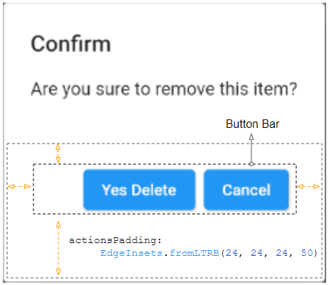
actionsPadding (ex1)
void openMyAlertDialog(BuildContext context)  {
  // Create a AlertDialog.
  AlertDialog dialog = AlertDialog(
    title: Text("Confirm"),
    content: Text("Are you sure to remove this item?"),
    actions: [
      ElevatedButton(
          child: Text("Yes Delete"),
          onPressed: (){
            Navigator.of(context).pop(true); // Return true
          }
      ),
      ElevatedButton(
          child: Text("Cancel"),
          onPressed: (){
            Navigator.of(context).pop(false); // Return false
          }
      )
    ],
    actionsPadding: EdgeInsets.fromLTRB(24, 24, 24, 50),
  );

  // Call showDialog function.
  Future<bool> futureValue = showDialog(
      context: context,
      builder: (BuildContext context) {
        return dialog;
      }
  );
  futureValue.then( (value) {
    print("Return value: " + value.toString()); // true/false
  });
}
13. actionsOverflowDirection
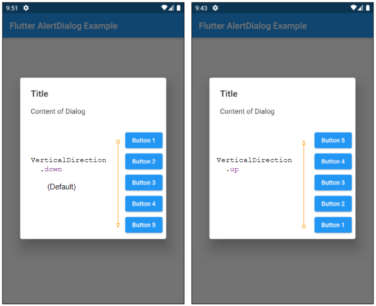
actions are usually placed on a row. However, if the horizontal space is not enough, they will be placed on a column. The actionsOverflowDirection property will specify how to order them on a column, top to bottom (Default) or bottom to top.
VerticalDirection actionsOverflowDirection

// enum VerticalDirection

    VerticalDirection.up
    VerticalDirection.down  (Default)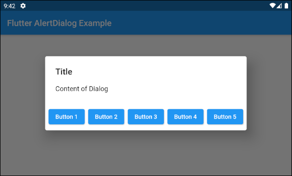
- actionsOverflowDirection: VerticalDirection.up
- actionsOverflowDirection: VerticalDirection.down (Default)
14. actionsOverflowButtonSpacing
actions are usually placed on a row. However, if the horizontal space is not enough, they will be placed on a column. The actionsOverflowButtonSpacing property specifies the space among the actions in the vertical direction.
double actionsOverflowButtonSpacing16. backgroundColor
backgroundColor property is used to specify the background color of the AlertDialog.
Color backgroundColor19. semanticLabel
semanticLabel is a descriptive text of the AlertDialog which is not visible on the user's interface. When the user opens or closes the AlertDialog, the system will read this description to the user if the accessibility mode is enabled.
String semanticLabel20. scrollable
scrollable property is outdated and no longer in use.
@Deprecated(
 'Set scrollable to `true`. This parameter will be removed and '
 'was introduced to migrate AlertDialog to be scrollable by '
 'default. For more information, see '
 'https://flutter.dev/docs/release/breaking-changes/scrollable_alert_dialog. '
 'This feature was deprecated after v1.13.2.'
)
bool scrollable: false
Flutter Programming Tutorials
- Flutter Column Tutorial with Examples
- Flutter Stack Tutorial with Examples
- Flutter IndexedStack Tutorial with Examples
- Flutter Spacer Tutorial with Examples
- Flutter Expanded Tutorial with Examples
- Flutter SizedBox Tutorial with Examples
- Flutter Tween Tutorial with Examples
- Install Flutter SDK on Windows
- Install Flutter Plugin for Android Studio
- Create your first Flutter app - Hello Flutter
- Flutter Scaffold Tutorial with Examples
- Flutter AppBar Tutorial with Examples
- Flutter BottomAppBar Tutorial with Examples
- Flutter TextButton Tutorial with Examples
- Flutter ElevatedButton Tutorial with Examples
- Flutter EdgeInsetsGeometry Tutorial with Examples
- Flutter EdgeInsets Tutorial with Examples
- Flutter CircularProgressIndicator Tutorial with Examples
- Flutter LinearProgressIndicator Tutorial with Examples
- Flutter Center Tutorial with Examples
- Flutter Align Tutorial with Examples
- Flutter Row Tutorial with Examples
- Flutter SplashScreen Tutorial with Examples
- Flutter Alignment Tutorial with Examples
- Flutter Positioned Tutorial with Examples
- Flutter SimpleDialog Tutorial with Examples
- Flutter AlertDialog Tutorial with Examples
- Flutter Navigation and Routing Tutorial with Examples
- Flutter TabBar Tutorial with Examples
- Flutter Banner Tutorial with Examples
- Flutter BottomNavigationBar Tutorial with Examples
- Flutter FancyBottomNavigation Tutorial with Examples
- Flutter Card Tutorial with Examples
- Flutter Border Tutorial with Examples
- Flutter ContinuousRectangleBorder Tutorial with Examples
- Flutter RoundedRectangleBorder Tutorial with Examples
- Flutter CircleBorder Tutorial with Examples
- Flutter StadiumBorder Tutorial with Examples
- Flutter Container Tutorial with Examples
- Flutter RotatedBox Tutorial with Examples
- Flutter CircleAvatar Tutorial with Examples
- Flutter IconButton Tutorial with Examples
- Flutter FlatButton Tutorial with Examples
- Flutter SnackBar Tutorial with Examples
Show More