Flutter IconButton Tutorial with Examples
1. Flutter IconButton
In Flutter, IconButton is a button with an icon which the user can click on to perform an action. IconButton will not include text content, so if you want a button that consists of an icon and text, use FlatButton or RaisedButton.

IconButton Constructor:
IconButton Contructor
const IconButton (
    {Key key,
    double iconSize: 24.0,
    VisualDensity visualDensity,
    EdgeInsetsGeometry padding: const EdgeInsets.all(8.0),
    AlignmentGeometry alignment: Alignment.center,
    double splashRadius,
    @required Widget icon,
    Color color,
    Color focusColor,
    Color hoverColor,
    Color highlightColor,
    Color splashColor,
    Color disabledColor,
    @required VoidCallback onPressed,
    MouseCursor mouseCursor: SystemMouseCursors.click,
    FocusNode focusNode,
    bool autofocus: false,
    String tooltip,
    bool enableFeedback: true,
    BoxConstraints constraints}
)
IconButton is used as an action in AppBar.actions property, which is also used in many other situations.
The hit region of IconButton is sensitive to the user's interaction. It has the smallest size of kMinInteractiveDimension (48.0), regardless of the actual size of the Icon.

2. icon
icon property is used to specify an icon for the IconButton.
@required Widget icon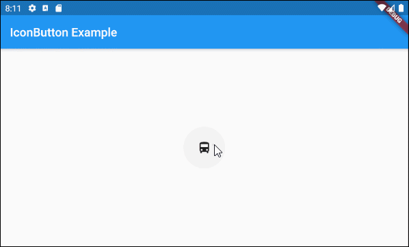
main.dart (icon ex1)
import 'package:flutter/material.dart';

void main() {
  runApp(MyApp());
}

class MyApp extends StatelessWidget {
  // This widget is the root of your application.
  @override
  Widget build(BuildContext context) {
    return MaterialApp(
      title: 'Title of Application',
      theme: ThemeData(
        primarySwatch: Colors.blue,
        visualDensity: VisualDensity.adaptivePlatformDensity,
      ),
      home: MyHomePage(),
    );
  }
}

class MyHomePage extends StatelessWidget {
  MyHomePage({Key key}) : super(key: key);

  @override
  Widget build(BuildContext context) {
    return Scaffold(
      appBar: AppBar(
        title: Text("IconButton Example"),
      ),
      body: Center(
          child:  IconButton (
              icon: Icon(Icons.directions_bus),
              onPressed: () {
                print("Pressed");
              }
          )
      ),
    );
  }
}
You can assign any Widget object to IconButton.icon property. However, it should contain an icon or an image, or else it will not be suitable for the purpose of design of IconButton.

ImageButton - icon (ex2)
IconButton (
    icon: Image.network("https://raw.githubusercontent.com/o7planning/rs/master/flutter/feel_good_24.png"),
    onPressed: () {
      print("Pressed");
    }
)
Let's see what will happen if IconButton.icon is a Text object.

ImageButton - icon (ex3)
IconButton (
    icon: Text("???????????"),
    onPressed: () {
      print("Pressed");
    }
)- Flutter Icon
3. iconSize
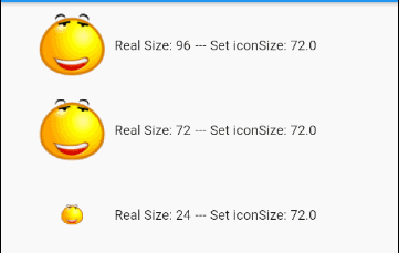
iconSize property is used to specify the size of the icon, whose default value is 24. If the actual size of the icon is larger than the iconSize,it will be shrunk by the iconSize when displayed. Otherwise, the display size of the icon will not change.
double iconSize: 24.0For example:
IconButton (
  icon: Image.network("https://raw.githubusercontent.com/o7planning/rs/master/flutter/feel_good_24.png"),
  onPressed: () {
    print("Pressed");
  },
  iconSize: 96
)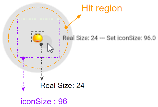
The hit region of IconButton is sensitive to the user's interaction, such as a click. The larger the value of iconSize is, the bigger the hit region will be, regardless of the actual size of the icon. However, the hit region will have the smallest size kMinInteractiveDimension (48.0) to ensure that it is not too small for the user to interact with.
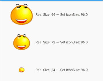
If the actual size of the icon is larger than the iconSize, it will shrink to the same size as the iconSize when displayed.
main.dart (iconSize ex1)
import 'package:flutter/material.dart';

void main() {
  runApp(MyApp());
}

class MyApp extends StatelessWidget {
  // This widget is the root of your application.
  @override
  Widget build(BuildContext context) {
    return MaterialApp(
      title: 'Title of Application',
      theme: ThemeData(
        primarySwatch: Colors.blue,
        visualDensity: VisualDensity.adaptivePlatformDensity,
      ),
      home: MyHomePage(),
    );
  }
}

class MyHomePage extends StatelessWidget {
  MyHomePage({Key key}) : super(key: key);

  @override
  Widget build(BuildContext context) {
    return Scaffold (

      appBar: AppBar(
        title: Text("IconButton Example"),
      ),
      body: Center(
          child: getIconButtons()
      ),
    );
  }

  Widget getIconButtons()  {
    double MAX_SIZE = 96;
    double LEFT = 30;
    return  Center(

        child: Column (

            children: [
              Row (
                  children: [
                    SizedBox(width: LEFT),
                    IconButton (
                      icon: Image.network("https://raw.githubusercontent.com/o7planning/rs/master/flutter/feel_good_96.png"),
                      onPressed: () {
                        print("Pressed");
                      },
                      iconSize: MAX_SIZE,
                    ),
                    Text("Real Size: 96"),
                    Text(" --- "),
                    Text("Set iconSize: " + MAX_SIZE.toString()),
                  ]
              ),
              Row (
                  children: [
                    SizedBox(width: LEFT),
                    IconButton (
                      icon: Image.network("https://raw.githubusercontent.com/o7planning/rs/master/flutter/feel_good_72.png"),
                      onPressed: () {
                        print("Pressed");
                      },
                      iconSize: MAX_SIZE,
                    ),
                    Text("Real Size: 72"),
                    Text(" --- "),
                    Text("Set iconSize: " + MAX_SIZE.toString()),
                  ]
              ),
              Row (
                  children: [
                    SizedBox(width: LEFT),
                    IconButton (
                      icon: Image.network("https://raw.githubusercontent.com/o7planning/rs/master/flutter/feel_good_24.png"),
                      onPressed: () {
                        print("Pressed");
                      },
                      iconSize: MAX_SIZE,
                    ),
                    Text("Real Size: 24"),
                    Text(" --- "),
                    Text("Set iconSize: " + MAX_SIZE.toString()),
                  ]
              ),
            ])
    );
  }
}
4. onPressed
onPressed is a callback function that will be called when the user clicks on the IconButton. If onPressed is not specified, IconButton will be disabled, which means there will be no response when the user clicks on it.
@required VoidCallback onPressed;IconButton (
icon: Icon(Icons.directions_bus),
onPressed: () {
print("Pressed");
}
)
// Or:
Function onPressedHandler = () {
print("Pressed");
};
....
IconButton (
icon: Icon(Icons.directions_bus),
onPressed: onPressedHandler
)For example:
main.dart (onPressed ex2)
import 'package:flutter/material.dart';
void main() {
runApp(MyApp());
}
class MyApp extends StatelessWidget {
// This widget is the root of your application.
@override
Widget build(BuildContext context) {
return MaterialApp(
title: 'Title of Application',
theme: ThemeData(
primarySwatch: Colors.blue,
visualDensity: VisualDensity.adaptivePlatformDensity,
),
home: MyHomePage(),
);
}
}
class MyHomePage extends StatefulWidget {
MyHomePage({Key key}) : super(key: key);
@override
State<StatefulWidget> createState() {
return MyHomePageState();
}
}
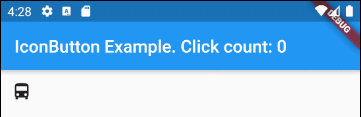
class MyHomePageState extends State<MyHomePage> {
int clickCount = 0;
@override
Widget build(BuildContext context) {
return Scaffold (
appBar: AppBar(
title: Text("IconButton Example. Click count: " + this.clickCount.toString()),
),
body: IconButton (
icon: Icon(Icons.directions_bus),
onPressed: () {
setState(() {
this.clickCount++;
});
}
)
);
}
}5. color
color property specifies the color of the icon inside the IconButton when the IconButton is enabled.
Color color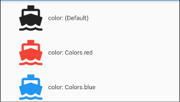
color (ex1)
IconButton (
  icon: Icon(Icons.directions_boat),
  onPressed: () {
    print("Pressed");
  },
  iconSize: MAX_SIZE,
  color: Colors.blue,
),
6. disabledColor
The disabledColor property specifies the color of the icon inside the IconButton when this IconButton is disabled. An IconButton will be disabled if onPressed is null or unspecified.
Color disabledColor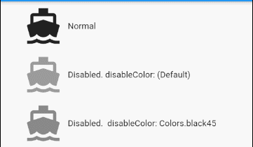
disabledColor (ex1)
IconButton (
  icon: Icon(Icons.directions_boat),
  iconSize: 64
  disabledColor: Colors.black45,
),
7. splashRadius
slashRadius property specifies the radius of the flash that surrounds IconButton when the user presses down the IconButton. Its default value is defaultSplashRadius (35).
double splashRadius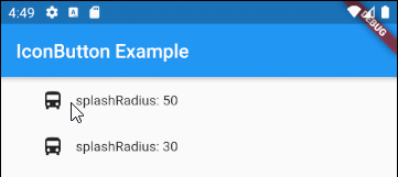
splashRadius (ex1)
IconButton (
  icon: Icon(Icons.directions_bus),
  onPressed: () {
    print("Pressed");
  },
  splashRadius: 50,
)
8. splashColor
splashColor property specifies the primary color of the flash surrounding the point where the user presses down the IconButton.
Color splashColor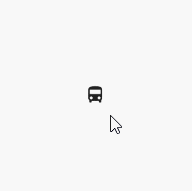
splashColor (ex1)
IconButton (
    icon: Icon(Icons.directions_bus),
    onPressed: () {
      print("Pressed");
    },
    splashRadius: 100,
    splashColor: Colors.lightGreenAccent
)
9. highlightColor
splashColor property specifies the secondary color of the flash surrounding the point where the user presses down the IconButton.
Color highlightColor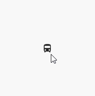
highlightColor (ex1)
IconButton (
  icon: Icon(Icons.directions_bus),
  onPressed: () {
    print("Pressed");
  },
  splashRadius: 100,
  splashColor: Colors.blue,
  highlightColor: Colors.red,
),12. tooltip
tooltip property is a descriptive text of the IconButton. It appears when the user clicks on this IconButton.
String tooltip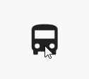
tooltip (ex1)
IconButton (
  icon: Icon(Icons.directions_bus),
  onPressed: () {
    print("Pressed");
  },
  iconSize: 64,
  tooltip: "Bus Direction",
)17. padding
The padding property is used to set the space within the border and around the button's content.
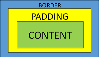
EdgeInsetsGeometry padding: const EdgeInsets.all(8.0)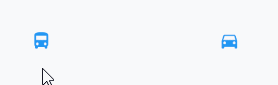
padding (ex1)
IconButton (
    icon: Icon(Icons.directions_bus),
    onPressed: () {},
    color: Colors.blue,
    padding: EdgeInsets.all(10)
)

IconButton (
    icon: Icon(Icons.directions_car),
    onPressed: () {},
    color: Colors.blue,
    padding: EdgeInsets.fromLTRB(50, 10, 30, 10)
)Flutter Programming Tutorials
- Flutter Column Tutorial with Examples
- Flutter Stack Tutorial with Examples
- Flutter IndexedStack Tutorial with Examples
- Flutter Spacer Tutorial with Examples
- Flutter Expanded Tutorial with Examples
- Flutter SizedBox Tutorial with Examples
- Flutter Tween Tutorial with Examples
- Install Flutter SDK on Windows
- Install Flutter Plugin for Android Studio
- Create your first Flutter app - Hello Flutter
- Flutter Scaffold Tutorial with Examples
- Flutter AppBar Tutorial with Examples
- Flutter BottomAppBar Tutorial with Examples
- Flutter TextButton Tutorial with Examples
- Flutter ElevatedButton Tutorial with Examples
- Flutter EdgeInsetsGeometry Tutorial with Examples
- Flutter EdgeInsets Tutorial with Examples
- Flutter CircularProgressIndicator Tutorial with Examples
- Flutter LinearProgressIndicator Tutorial with Examples
- Flutter Center Tutorial with Examples
- Flutter Align Tutorial with Examples
- Flutter Row Tutorial with Examples
- Flutter SplashScreen Tutorial with Examples
- Flutter Alignment Tutorial with Examples
- Flutter Positioned Tutorial with Examples
- Flutter SimpleDialog Tutorial with Examples
- Flutter AlertDialog Tutorial with Examples
- Flutter Navigation and Routing Tutorial with Examples
- Flutter TabBar Tutorial with Examples
- Flutter Banner Tutorial with Examples
- Flutter BottomNavigationBar Tutorial with Examples
- Flutter FancyBottomNavigation Tutorial with Examples
- Flutter Card Tutorial with Examples
- Flutter Border Tutorial with Examples
- Flutter ContinuousRectangleBorder Tutorial with Examples
- Flutter RoundedRectangleBorder Tutorial with Examples
- Flutter CircleBorder Tutorial with Examples
- Flutter StadiumBorder Tutorial with Examples
- Flutter Container Tutorial with Examples
- Flutter RotatedBox Tutorial with Examples
- Flutter CircleAvatar Tutorial with Examples
- Flutter IconButton Tutorial with Examples
- Flutter FlatButton Tutorial with Examples
- Flutter SnackBar Tutorial with Examples
Show More