Flutter Container Tutorial with Examples
1. Flutter Container
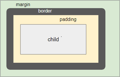
In Flutter, a Container is a box used to contain a child widget. At the same time, you can set its style through properties such as padding, margin, alignment, etc. The Container highlights the content or separates this content from other contents.
Container Constructor:
Container Constructor
Container(
    {Key key,
    AlignmentGeometry alignment,
    EdgeInsetsGeometry padding,
    Color color,
    Decoration decoration,
    Decoration foregroundDecoration,
    double width,
    double height,
    BoxConstraints constraints,
    EdgeInsetsGeometry margin,
    Matrix4 transform,
    Widget child,
    Clip clipBehavior: Clip.none}
)
There are a lot of parameters involved in creating a Container, such as width, height, child, alignment, etc. Moreover, it is impacted by the constraints of the parent widget, so the layout behavior is relatively complex. Now let's take a look at different examples in the following cases:
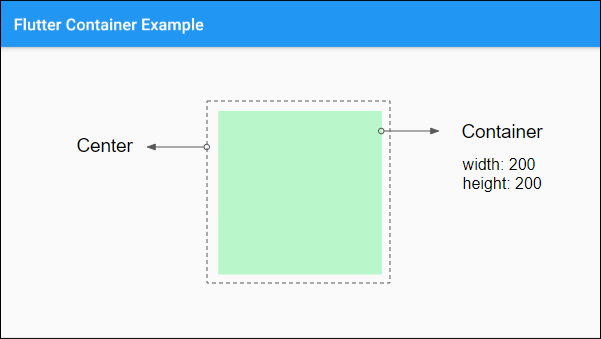
Case 1:
If the width and height parameters are specified, and the parent widget is bounded, the Container will determine its size according to the provided parameters.
For example, if a specified Container (width, height)=(200,200) is the child of a Center object, it will be 200x200 in size.
Center (
  child:  Container (
      color: Colors.greenAccent[100],
      padding: EdgeInsets.fromLTRB(10, 5, 50, 5),
      width: 200,
      height: 200
  )
)
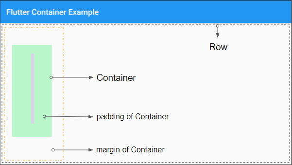
Case 2:
If the child, width, height, and constraints parameters are not specified (or null), and the parent widget is unbounded, the Container will try to determine its size as small as possible.
Let's look at an example: A Container with width, height, child and constraints parameters are not specified, and is a child of a Row, it will try to determine its horizontal size as small as possible.
Note: The Row is a vertically bounded widget but unbounded horizontally.
Row (
    children: [
      Container (
        color: Colors.greenAccent[100],
        padding: EdgeInsets.fromLTRB(50, 30, 50, 30),
        margin: EdgeInsets.fromLTRB(30, 55, 50, 70),
      )
    ]
)
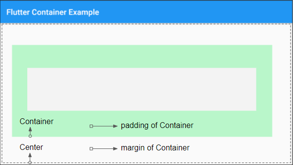
Case 3:
If the child, width, height, and constraints parameters are not specified (or null), and the parent widget is bounded, the Container will try to set its size as large as possible.
Example: A Container with child, width, height and constraints parameters are not be specified, and is a child of a Center, the size of the Container will be as large as possible.
Center (
    child:   Container (
      color: Colors.greenAccent[100],
      padding: EdgeInsets.fromLTRB(50, 30, 50, 30),
      margin: EdgeInsets.fromLTRB(30, 55, 50, 70)
    )
)
Case 4:
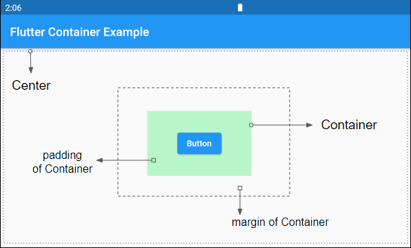
If the child is specified, but the width, height, constraints, and alignment parameters are not, the Container will be as small as possible, and it will conform with the constraints of the parent widget.
For example:
Center (
    child: Container (
        color: Colors.greenAccent[100],
        padding: EdgeInsets.fromLTRB(50, 30, 50, 30),
        margin: EdgeInsets.fromLTRB(30, 55, 50, 70),
        child: ElevatedButton (
          child: Text("Button"),
          onPressed: () {},
        )
    )
)
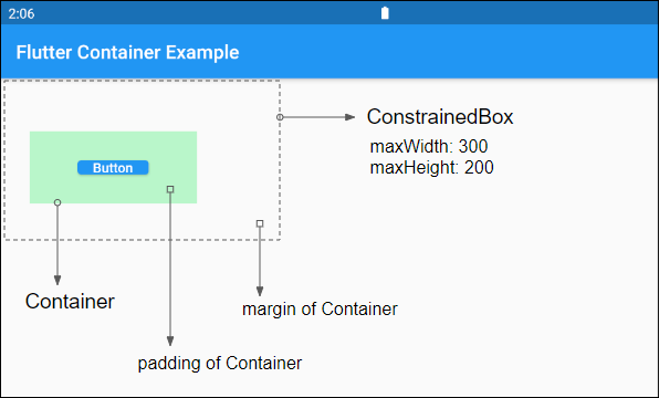
For example:
ConstrainedBox (
    constraints: BoxConstraints (
        maxWidth: 300,
        maxHeight: 200
    ),
    child: Container (
        color: Colors.greenAccent[100],
        padding: EdgeInsets.fromLTRB(50, 30, 50, 30),
        margin: EdgeInsets.fromLTRB(30, 55, 50, 70),
        child: ElevatedButton (
          child: Text("Button"),
          onPressed: () {},
        )
    )
)
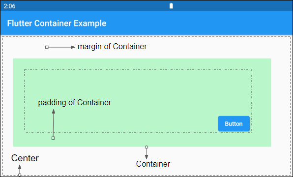
Case 5:
If the child and alignment are specified, but the width, height, constraints parameters are not, the Container will be as large as possible.
See more examples in the alignment section below.
2. alignment
alignment property is used to align the position of the child in the Container.
AlignmentGeometry alignmentIf the Container specifies the child and does not specify the width, height, constraints, and alignment, it will set its dimension as small as possible. However, if the Container specifies the child and alignment but not the width, height, and constraints,it will determine its size as large as possible.
Container (
    alignment: Alignment.bottomRight,
    color: Colors.greenAccent[100],
    padding: EdgeInsets.fromLTRB(50, 30, 50, 30),
    margin: EdgeInsets.fromLTRB(30, 55, 50, 70),
    child: ElevatedButton (
      child: Text("Button"),
      onPressed: () {},
    )
)
- Flutter AlignmentGeometry
3. padding
The padding property is used to create an empty space in the Container and surround the child (if any).
EdgeInsetsGeometry padding4. color
The color property is used to set the background color of the Container and behind the child.
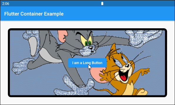
Color color5. decoration
The decoration property is used to draw something over the Container background and behind the child. If you want to draw a color over the background of the Container (as well as behind the child), it is best to use the color property.
Decoration decorationContainer (
alignment: Alignment.center,
decoration: BoxDecoration(
color: const Color(0xff7c94b6),
image: const DecorationImage(
image: NetworkImage('https://s3.o7planning.com/images/tom-and-jerry.png'),
fit: BoxFit.cover,
),
border: Border.all( color: Colors.black, width: 8),
borderRadius: BorderRadius.circular(12),
),
margin: EdgeInsets.all(30),
child: ElevatedButton(
child: Text("I am a Long Button"),
onPressed: () {}
)
)
- Flutter Decoration
6. foregroundDecoration
The foregroundDecoration property is used to draw something over the background of the Container and in front of the child. It can covers and makes the child invisible, but you can still interact with the child.
Decoration foregroundDecorationFor example:
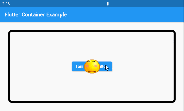
Container (
    alignment: Alignment.center,
    foregroundDecoration: BoxDecoration(
      image: const DecorationImage(
        image: NetworkImage('https://s3.o7planning.com/images/smile-64.png'),
        fit: BoxFit.none,
      ),
      border: Border.all( color: Colors.black, width: 8),
      borderRadius: BorderRadius.circular(12),
    ),
    margin: EdgeInsets.all(30),
    child: ElevatedButton(
        child: Text("I am a Long Button"),
        onPressed: () {}
    )
)9. constraints
The constraints property is used to add additional constraints to the Container.
BoxConstraints constraintsFor example:
Container (
    color: Colors.greenAccent[100],
    padding: EdgeInsets.all(30),
    width: 200,
    height: 200,
    constraints: BoxConstraints(
        maxHeight: 80
    ),
    child:ElevatedButton(
      child: Text("Button"),
      onPressed: (){},
    )
)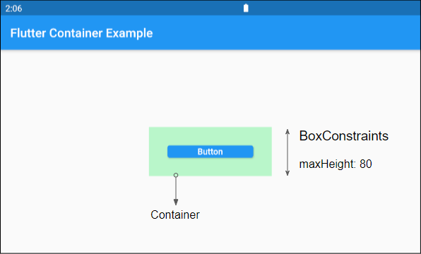
- Flutter BoxConstraints
Flutter Programming Tutorials
- Flutter Column Tutorial with Examples
- Flutter Stack Tutorial with Examples
- Flutter IndexedStack Tutorial with Examples
- Flutter Spacer Tutorial with Examples
- Flutter Expanded Tutorial with Examples
- Flutter SizedBox Tutorial with Examples
- Flutter Tween Tutorial with Examples
- Install Flutter SDK on Windows
- Install Flutter Plugin for Android Studio
- Create your first Flutter app - Hello Flutter
- Flutter Scaffold Tutorial with Examples
- Flutter AppBar Tutorial with Examples
- Flutter BottomAppBar Tutorial with Examples
- Flutter TextButton Tutorial with Examples
- Flutter ElevatedButton Tutorial with Examples
- Flutter EdgeInsetsGeometry Tutorial with Examples
- Flutter EdgeInsets Tutorial with Examples
- Flutter CircularProgressIndicator Tutorial with Examples
- Flutter LinearProgressIndicator Tutorial with Examples
- Flutter Center Tutorial with Examples
- Flutter Align Tutorial with Examples
- Flutter Row Tutorial with Examples
- Flutter SplashScreen Tutorial with Examples
- Flutter Alignment Tutorial with Examples
- Flutter Positioned Tutorial with Examples
- Flutter SimpleDialog Tutorial with Examples
- Flutter AlertDialog Tutorial with Examples
- Flutter Navigation and Routing Tutorial with Examples
- Flutter TabBar Tutorial with Examples
- Flutter Banner Tutorial with Examples
- Flutter BottomNavigationBar Tutorial with Examples
- Flutter FancyBottomNavigation Tutorial with Examples
- Flutter Card Tutorial with Examples
- Flutter Border Tutorial with Examples
- Flutter ContinuousRectangleBorder Tutorial with Examples
- Flutter RoundedRectangleBorder Tutorial with Examples
- Flutter CircleBorder Tutorial with Examples
- Flutter StadiumBorder Tutorial with Examples
- Flutter Container Tutorial with Examples
- Flutter RotatedBox Tutorial with Examples
- Flutter CircleAvatar Tutorial with Examples
- Flutter IconButton Tutorial with Examples
- Flutter FlatButton Tutorial with Examples
- Flutter SnackBar Tutorial with Examples
Show More