Bootstrap Embed Utilities Tutorial with Examples
1. Bootstrap Embed
Sometimes you need to embed a media content into an HTML page, such as Video, PDF, etc. It is not prpbably suitable for all kinds of devices with different screen widths. Therefore, the Bootstrap offers usable classes to solve this problem.
<object> / PDF ...
This is a simple example using <object> to embed a PDF file into an HTML page, but the PDF display window does not match the viewport of the browser.
object-pdf-non-responsive-example.html
<!DOCTYPE html>
<html>
   <head>
      <meta charset="utf-8">
      <title>HTML object PDF</title>
   </head>
   <body>
      <h3 class="mb-3">Non-Responsive object PDF</h3>

      <object data="example.pdf" type="application/pdf" internalinstanceid="9" title="">
         <p>
            Your browser isn't supporting embedded pdf files.
            You can download the file
            <a href="example.pdf">here</a>.
         </p>
      </object>

   </body>
</html>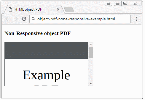
<iframe> / video ...
And other simple example using <iframe> to display a Video on a HTML page. Like the above PDF example, the displayed video is incompatible to different devices
iframe-non-responsive-example.html
<!DOCTYPE html>
<html>
   <head>
      <meta charset="utf-8">
      <title>HTML iframe</title>
   </head>
   <body>
      <h3 class="mb-3">Non-Responsive iframe</h3>

      <iframe
         src="https://www.youtube.com/embed/zpOULjyy-n8?rel=0" allowfullscreen>
      </iframe>

   </body>
</html>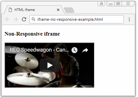
And here's the Bootstrap solution:
- Wrap <iframe>/<object>/.. by <div class="embed-responsive embed-responsive-*by*">. Of which: (*) is a number. I will explain it in more details below.
- Apply the .embed-responsive-item class to the <iframe>/<object>/...
<!-- object/ PDF ... -->
<div class="embed-responsive embed-responsive-16by9">
   <object class="embed-responsive-item" data="example.pdf"
      type="application/pdf" internalinstanceid="9" title="">
      <p>
         Your browser isn't supporting embedded pdf files. You can download the file
         <a href="example.pdf">here</a>
      </p>
   </object>
</div>

<!-- iframe/ Video ... -->
<div class="embed-responsive embed-responsive-16by9">
   <iframe class="embed-responsive-item"
      src="https://www.youtube.com/embed/zpOULjyy-n8?rel=0" allowfullscreen>
   </iframe>
</div>
And the result is actually not bad!
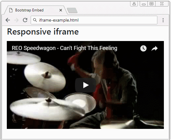
iframe-example.html
<!DOCTYPE html>
<html>
   <head>
      <meta charset="utf-8">
      <title>Bootstrap Embed</title>
      <link rel="stylesheet" href="https://stackpath.bootstrapcdn.com/bootstrap/4.1.1/css/bootstrap.min.css">
   </head>
   <body>
      <h3 class="mb-3">Responsive iframe</h3>

      <div class="embed-responsive embed-responsive-16by9">
         <iframe class="embed-responsive-item"
            src="https://www.youtube.com/embed/zpOULjyy-n8?rel=0" allowfullscreen>
         </iframe>
      </div>

      <script src="https://code.jquery.com/jquery-3.3.1.slim.min.js"></script>
      <script src="https://cdnjs.cloudflare.com/ajax/libs/popper.js/1.14.3/umd/popper.min.js"></script>
      <script src="https://stackpath.bootstrapcdn.com/bootstrap/4.1.1/js/bootstrap.min.js"></script>
   </body>
</html>
.embed-responsive-*by*
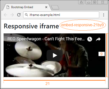
Some classes are built in by the Bootstrap to set up the rate between the width and height of media.
- embed-responsive-21by9
- embed-responsive-16by9
- embed-responsive-4by3
- embed-responsive-1by1
.embed-responsive-*by*
<!-- 21:9 aspect ratio -->
<div class="embed-responsive embed-responsive-21by9">
   <iframe class="embed-responsive-item" src="..."></iframe>
</div>

<!-- 16:9 aspect ratio -->
<div class="embed-responsive embed-responsive-16by9">
   <iframe class="embed-responsive-item" src="..."></iframe>
</div>

<!-- 4:3 aspect ratio -->
<div class="embed-responsive embed-responsive-4by3">
   <iframe class="embed-responsive-item" src="..."></iframe>
</div>

<!-- 1:1 aspect ratio -->
<div class="embed-responsive embed-responsive-1by1">
   <iframe class="embed-responsive-item" src="..."></iframe>
</div>
2. Custom .embed-responsive-*by*
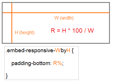
You can create a .embed-responsive-*by* customizationclass, such as .embed-responsive-5by4.
.embed-responsive-5by4
.embed-responsive-5by4 {
  padding-bottom: 80.0%;
}
The general formula:
210:297 is the rate between the width and height of an A4 paper. And you can define the .embed-responsive-210by297 class as follows:
.embed-responsive-210by297
.embed-responsive-210by297 {
  padding-bottom: 141.42%;
}
object-pdf-responsive-example
<style>
   .embed-responsive-210by297 {
   padding-bottom: 141.42%;
   }
</style>

<div class="embed-responsive embed-responsive-210by297">
<object class="embed-responsive-item" data="example.pdf"
   type="application/pdf" internalinstanceid="9" title="">
   <p>
      Your browser isn't supporting embedded pdf files. You can download the file
      <a href="example.pdf">here</a>.
   </p>
</object>
</div
Bootstrap Tutorials
- Bootstrap Jumbotron Tutorial with Examples
- Bootstrap Dropdowns Tutorial with Examples
- Bootstrap Alerts Tutorial with Examples
- Bootstrap Buttons Tutorial with Examples
- Bootstrap Button Group Tutorial with Examples
- Bootstrap Popovers (Tooltips) Tutorial with Examples
- Bootstrap Spinners Tutorial with Examples
- Introduction to Bootstrap
- Bootstrap Grid System Tutorial with Examples
- Bootstrap Cards Tutorial with Examples
- Bootstrap Containers Tutorial with Examples
- Bootstrap Nav Tab/Pill Tutorial with Examples
- Bootstrap NavBars Tutorial with Examples
- Bootstrap Tables Tutorial with Examples
- Bootstrap Modal Tutorial with Examples
- Bootstrap Forms Tutorial with Examples
- Bootstrap Pagination Tutorial with Examples
- Bootstrap Badges Tutorial with Examples
- Bootstrap Input Group Tutorial with Examples
- Bootstrap List Groups Tutorial with Examples
- Bootstrap ProgressBars Tutorial with Examples
- Bootstrap Collapse and Accordion Tutorial with Examples
- Bootstrap Scrollspy Tutorial with Examples
- Bootstrap Breadcrumb Tutorial with Examples
- Bootstrap Carousel Tutorial with Examples
- Bootstrap Spacing Utilities Tutorial with Examples
- Bootstrap Border Utilities Tutorial with Examples
- Bootstrap Color Utilities Tutorial with Examples
- Bootstrap Text Utilities Tutorial with Examples
- Bootstrap Sizing Utilities Tutorial with Examples
- Bootstrap Position Utilities Tutorial with Examples
- Bootstrap Flex Utilities Tutorial with Examples
- Bootstrap Display Utilities Tutorial with Examples
- Bootstrap Visibility Utilities Tutorial with Examples
- Bootstrap Embed Utilities Tutorial with Examples
Show More