Bootstrap Display Utilities Tutorial with Examples
1. Bootstrap Display Utility
Display Utility is part of Bootstrap. It builds a system of classes that helps you control the display (or hiding) of elements. Controls how the elements will display and react to the size changes of parent element. These classes are named in the following format:
.d-{breakpoint}-{value}
Of which:
- {breakpoint}: Not mandatory
- {value}: Mandatory
{breakpoint}:
{breakpoint} | Description |
sm | (Small). works when the element width is >= 567px |
md | (Medium). works when the element width is >= 768px |
lg | (Large). works when the element width is >= 992px |
xl | (Extra Large). works when the element width is >= 1200px |
print | related to printing |
{value}:
{value} | Description |
none | makes elements be hidden. |
inline | is the same as {display: inline}. |
block | is the same as {display: block}. |
inline-block | is the same as {display: inline-block}. |
table | is the same as {display: table}. It makes elements have the same acts as the <table> element. |
table-row | is the same as {display: tabled-row}. It makes elements have the same acts as the <tr> element. |
table-cell | is the same as {display: table-cell}. It makes elements have the same acts as the <td> element. |
flex | is the same as {display: flex}. For details, see theBootstrap Flex lesson |
inline-flex | is the same as {display: inline-flex}. For details, see theFlex Utility lesson |
2. Class .d-inline, .d-block, .d-inline-block
If you have learned CSS, surely, you are familiar with: {display: inline}, {display: block}, {display: inline-block}. Bootstrap uses the .d-inline, .d-block, .d-inline-block classes instead of the above CSS properties. Both above approaches work similarly.
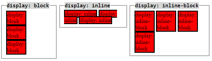
.d-block
The element applied the .d-block class is a rectangular block. It breaks a line in front of and behind it, so they will be located on different rows. If this element is not assigned a fixed width, it will have width of 100%.
Example with .d-block:
d-block-example
<div class="container-fluid">
   <h3 class="mb-3">.d-block example</h3>
   <div class="d-block border" style="width:150px;">
      .d-block (width:150px)
   </div>
   <div class="d-block border">
      .d-block
   </div>
   <div class="d-block border" style="height:90px;">
      .d-block (height:90px)
   </div>
</div>
.d-inline
The elements applied the .d-inline class is not be a rectangular block, therefore, you can not set width and height for them. They are usually in the same row. But if the width of parent element is too small, some elements may be pushed down to lower row. The content of an element may be on one or more lines.
Example with .d-inline:
d-inline-example
<h3 class="mb-3">.d-inline example</h3>

<div class="container-fluid">
   <div class="d-inline border border-primary" style="width:100px;">
      I am a .d-inline (width:100px not worked!)
   </div>
   <div class="d-inline border border-info">
      I am a .d-inline
   </div>
   <div class="d-inline border border-danger" style="height:90px;">
      I am a .d-inline (height:90px not worked!)
   </div>
</div>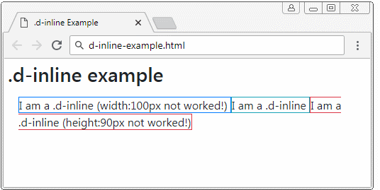
.d-inline-block
The element applied the .d-inline-block class is a rectangular block. They may be on the same row. But if the width of parent element is too small, some elements may be pushed down to lower rows. If this element is not assigned a fixed width, its width will depend on the content.
Example with .d-inline-block:
d-inline-block-example
<h3 class="mb-3">.d-inline-block example</h3>

<div class="container-fluid">
   <div class="d-inline-block border border-primary" style="width:100px;">
      .d-inline (width:100px)
   </div>
   <div class="d-inline-block border border-info">
      .d-inline (no width, no height)
   </div>
   <div class="d-inline-block border border-danger" style="height:90px;">
      .d-inline (height:90px)
   </div>
</div>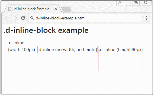
3. Class .d-flex, .d-inline-flex
Flex (.d-flex, .d-inline-flex) is the most important utility in the Bootstrap, because of this importance it should be introduced in a separate lesson:
4. Class .d-table, .d-table-row, .d-table-cell
Class | Description |
.d-table | is the same as {display: table}. It makes elements have the same acts as the <table> element. |
.d-table-row | is the same as {display: table-row}. It makes elements have the same acts as the <tr> element. |
.d-table-cell | is the same as {display: tabled-cell}. It makes elements have the same acts as the <td> element. |
.d-table-row
The element applied the .d-table-row class have to be the child element of ".d-table" element. It can not appear independently. You can not set up margin, padding, height, width for it. These properties are decided by its ".d-table-cell" child element.
The ".d-table-row" element can only establish a border if it is child element of ".d-table {border-collapse: collapse}" element.
d-table-row-example
<div class="container-fluid">
   <h3 class="mb-3 text-danger">.d-table + .d-table-row</h3>

   <h4>.d-table {border-collapse: collapse}</h4>
   <div class="d-table" style="border-collapse: collapse;">
      <div class="d-table-row border border-primary">
         .d-table-row .border .border-primary
      </div>
      <div class="d-table-row border border-success" >
         .d-table-row .border .border-success
      </div>
   </div>

   <h4 class="mt-3">.d-table {border-collapse: collapse} + width: 100% </h4>
   <div class="d-table w-100" style="border-collapse: collapse;">
      <div class="d-table-row border border-primary">
         .d-table-row .border .border-primary
      </div>
      <div class="d-table-row border border-success" >
         .d-table-row .border .border-success
      </div>
   </div>

</div>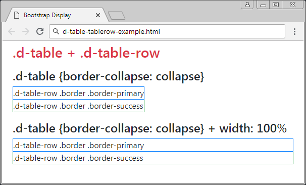
.table-cell
The elements applied the .d-table-cell class will have act like the <td> element. You can set up padding, width, height, border for it but margin can not be set up. The ".d-table-cell" elements can be the direct child elements of".d-table-row" or ".d-table".
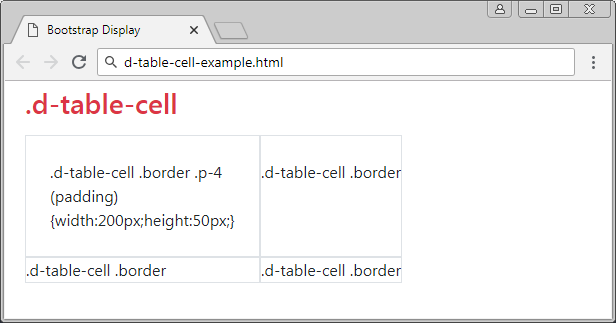
d-table-cell-example
<div class="container-fluid">
   <h3 class="mb-3 text-danger">.d-table-cell</h3>

   <div class="d-table">
      <div class="d-table-row">
         <div class="d-table-cell border p-4" style="width:200px;height:50px;">
            .d-table-cell .border .p-4 (padding)
            {width:200px;height:50px;}
         </div>
         <div class="d-table-cell border">
            .d-table-cell .border
         </div>
      </div>
      <div class="d-table-row">
         <div class="d-table-cell border">
            .d-table-cell .border
         </div>
         <div class="d-table-cell border">
            .d-table-cell .border
         </div>
      </div>
   </div>

</div>
5. Hide the (.d-none) element
The .d-none class applies to an element, which hides this element. It is like you use the Css property {display: none}. Conversely, if you apply one of the .d-inline, .d-inline-block, .d-block classes, this element will display.
The .d-inline, .d-inline-block, .d-block classes have been mentioned in the above section.
Other classes apply to the "Responsive" situation:
- .d-none
- .d-sm-none
- .d-md-none
- .d-lg-none
- .d-xl-none
Below are some situations applying the above classes to an element and explaining their activities:
.d-none | Elements will be hidden with all screen sizes. |
.d-none .d-sm-block | Elements will be hidden with the screen size of xs (Extra Small) (<567px). |
.d-sm-none .d-md-block | Elements will be hidden with the screen size of [567px-768px). |
.d-md-none .d-lg-block | Elements will be hidden with the screen size of [768px-992px). |
.d-lg-none .d-xl-block | Elements will be hidden with the screen size of [992px-1200px). |
.d-xl-none | Elements will be hidden with the screen size of xl (Extra Large) (>=1200px). |
.d-block | Elements always display with all screen size. |
.d-block .d-sm-none | Elements will be hidden with the screen size of xs (Extra Small) (<567px). |
.d-none .d-sm-block .d-md-none | Elements will be hidden with the screen size of [567px,768px). |
.d-none .d-md-block .d-lg-none | Elements will be hidden with the screen size of [768px,992px). |
.d-none .d-lg-block .d-xl-none | Elements will be hidden with the screen size of [992px,1200px). |
.d-none .d-xl-block | Elements will be hidden with the screen size of xl (Extra Large) (>=1200px). |
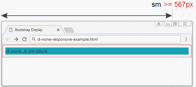
d-none-responsive-example.html
<!DOCTYPE html>
<html>
   <head>
      <meta charset="utf-8">
      <title>Bootstrap Display</title>
      <link rel="stylesheet" href="https://stackpath.bootstrapcdn.com/bootstrap/4.1.1/css/bootstrap.min.css">
   </head>
   <body>

      <div class="container-fluid border border-danger p-2">
         <h3 class="mb-3 text-danger">.d-none</h3>

         <div class="d-none d-sm-block bg-info">
            .d-none .d-sm-block
         </div>

      </div>

      <script src="https://code.jquery.com/jquery-3.3.1.slim.min.js"></script>
      <script src="https://cdnjs.cloudflare.com/ajax/libs/popper.js/1.14.3/umd/popper.min.js"></script>
      <script src="https://stackpath.bootstrapcdn.com/bootstrap/4.1.1/js/bootstrap.min.js"></script>
   </body>
</html>
6. Display when printing (.d-print-*)
Sometimes an user wants to print the content of a page. But actually there are contents unnecessary to print on the page, which costs papers for users. The Bootstrap provides some classes to help you hide or display areas when printing.
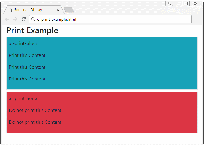
Below is the list of classes related to displaying or hiding elements when printing:
- .d-print-none
- .d-print-inline
- .d-print-inline-block
- .d-print-block
- .d-print-table
- .d-print-table-row
- .d-print-table-cell
- .d-print-flex
- .d-print-inline-flex
Ví dụ:
d-print-example.html
<!DOCTYPE html>
<html>
   <head>
      <meta charset="utf-8">
      <title>Bootstrap Display</title>
      <link rel="stylesheet" href="https://stackpath.bootstrapcdn.com/bootstrap/4.1.1/css/bootstrap.min.css">
   </head>
   <body>

      <div class="container-fluid">
         <h3 class="d-print-none">Print Example</h3>

         <div class="d-print-block border bg-info mb-2 p-2">
             <p>.d-print-block</p>
             <p>Print this Content.</p>
             <p>Print this Content.</p>
             <p>Print this Content.</p>
         </div>
         <div class="d-print-none border bg-danger p-2">
             <p>.d-print-none</p>
             <p>Do not print this Content.</p>
             <p>Do not print this Content.</p>
         </div>

      </div>

      <script src="https://code.jquery.com/jquery-3.3.1.slim.min.js"></script>
      <script src="https://cdnjs.cloudflare.com/ajax/libs/popper.js/1.14.3/umd/popper.min.js"></script>
      <script src="https://stackpath.bootstrapcdn.com/bootstrap/4.1.1/js/bootstrap.min.js"></script>
   </body>
</html>
Bootstrap Tutorials
- Bootstrap Jumbotron Tutorial with Examples
- Bootstrap Dropdowns Tutorial with Examples
- Bootstrap Alerts Tutorial with Examples
- Bootstrap Buttons Tutorial with Examples
- Bootstrap Button Group Tutorial with Examples
- Bootstrap Popovers (Tooltips) Tutorial with Examples
- Bootstrap Spinners Tutorial with Examples
- Introduction to Bootstrap
- Bootstrap Grid System Tutorial with Examples
- Bootstrap Cards Tutorial with Examples
- Bootstrap Containers Tutorial with Examples
- Bootstrap Nav Tab/Pill Tutorial with Examples
- Bootstrap NavBars Tutorial with Examples
- Bootstrap Tables Tutorial with Examples
- Bootstrap Modal Tutorial with Examples
- Bootstrap Forms Tutorial with Examples
- Bootstrap Pagination Tutorial with Examples
- Bootstrap Badges Tutorial with Examples
- Bootstrap Input Group Tutorial with Examples
- Bootstrap List Groups Tutorial with Examples
- Bootstrap ProgressBars Tutorial with Examples
- Bootstrap Collapse and Accordion Tutorial with Examples
- Bootstrap Scrollspy Tutorial with Examples
- Bootstrap Breadcrumb Tutorial with Examples
- Bootstrap Carousel Tutorial with Examples
- Bootstrap Spacing Utilities Tutorial with Examples
- Bootstrap Border Utilities Tutorial with Examples
- Bootstrap Color Utilities Tutorial with Examples
- Bootstrap Text Utilities Tutorial with Examples
- Bootstrap Sizing Utilities Tutorial with Examples
- Bootstrap Position Utilities Tutorial with Examples
- Bootstrap Flex Utilities Tutorial with Examples
- Bootstrap Display Utilities Tutorial with Examples
- Bootstrap Visibility Utilities Tutorial with Examples
- Bootstrap Embed Utilities Tutorial with Examples
Show More