Bootstrap Collapse and Accordion Tutorial with Examples
1. Bootstrap Collapse
Bootstrap Collapse is a useful component that helps to hide or show an "area" on a page, users can actively expand an "area" to view the content there, or hide it to save space.
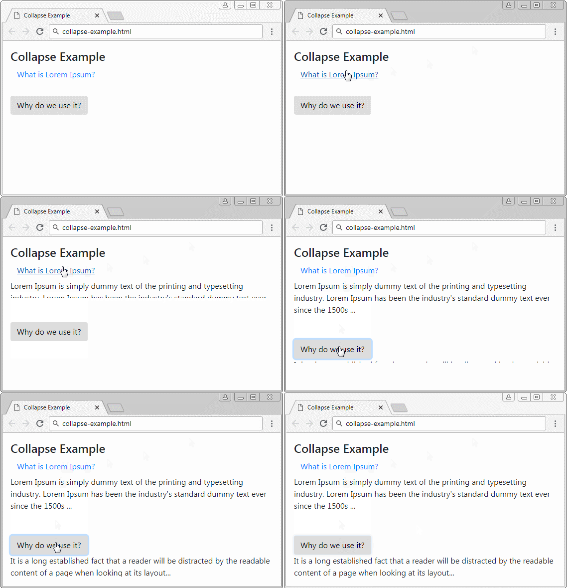
Collapse
<!-- Link collapse -->
<a class="btn btn-link" href="#" data-toggle="collapse" data-target="#target1">
    What is Lorem Ipsum?
</a>
<div id="target1" class="collapse">
   Lorem Ipsum is simply dummy text of the printing and typesetting industry.
   Lorem Ipsum has been the industry's standard dummy text ever since the 1500s ...
</div>


<!-- Button collapse -->
<button class="btn" data-toggle="collapse" data-target="#target2">
    Why do we use it?
</button>
<div id="target2" class="collapse">
   It is a long established fact that a reader will be distracted by the
   readable content of a page when looking at its layout...
</div>
Look at the complete example:
collapse-example.html
<!DOCTYPE html>
<html>
   <head>
      <meta charset="utf-8">
      <title>Dropdown Example</title>
      <link rel="stylesheet" href="https://stackpath.bootstrapcdn.com/bootstrap/4.1.1/css/bootstrap.min.css">
   </head>
   <body>
      <div class="container mt-3">
         <h4 class="mb-1">Collapse Example</h4>

         <a class="btn btn-link" href="#" data-toggle="collapse" data-target="#target1">
             What is Lorem Ipsum?
         </a>
         <div id="target1" class="collapse">
            Lorem Ipsum is simply dummy text of the printing and typesetting industry.
            Lorem Ipsum has been the industry's standard dummy text ever since the 1500s ...
         </div>

         <br><br>

         <button class="btn" data-toggle="collapse" data-target="#target2">
             Why do we use it?
         </button>
         <div id="target2" class="collapse">
            It is a long established fact that a reader will be distracted by the
            readable content of a page when looking at its layout...
         </div>
      </div>
      <script src="https://code.jquery.com/jquery-3.3.1.slim.min.js"></script>
      <script src="https://cdnjs.cloudflare.com/ajax/libs/popper.js/1.14.3/umd/popper.min.js"></script>
      <script src="https://stackpath.bootstrapcdn.com/bootstrap/4.1.1/js/bootstrap.min.js"></script>
   </body>
</html>
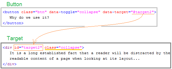
Collapse includes the two components, a button (or Link) and a target. When users click on the button, the target is hidden or displayed. Bootstrap uses jQuery to handle this activity.
- Initially, the .collapse class applies to the target, which is currently hidden.
- Users press button, the .collapsing class applies to the target. You will find that the target is expanded.
- Finally, when the content has been displayed completely, the target will be established the .collapse.show class
2. Multi Targets
You can specify multiple targets for a button (or Link) by using jQuery Selector. This means that when users press the button, a lot of targets will hide or display.
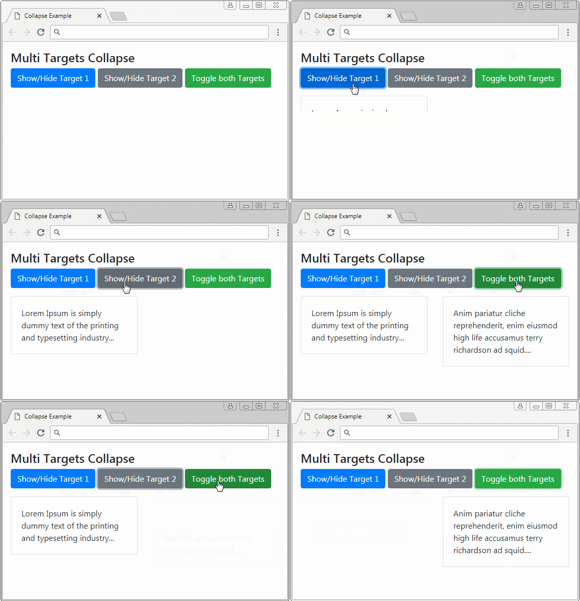
Multi Target
<p>
   <a class="btn btn-primary" data-toggle="collapse" href="#target1" role="button">
     Show/Hide Target 1
   </a>
   <button class="btn btn-secondary" type="button" data-toggle="collapse" data-target="#target2">
     Show/Hide Target 2
   </button>
   <button class="btn btn-success" type="button" data-toggle="collapse" data-target=".myTarget">
     Toggle both Targets
   </button>
</p>

<div class="row">
   <div class="col">
      <div class="collapse myTarget" id="target1">
         <div class="card card-body">
            Lorem Ipsum is simply dummy text of the printing and typesetting industry...
         </div>
      </div>
   </div>
   <div class="col">
      <div class="collapse myTarget" id="target2">
         <div class="card card-body">
            Anim pariatur cliche reprehenderit,
            enim eiusmod high life accusamus terry richardson ad squid....
         </div>
      </div>
   </div>
</div>
3. Accordion
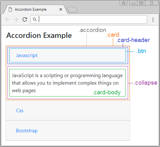
Accordion is an interface component. It is formed from many ".card" stacked vertically. Each .card can be expanded or collapsed depending on configuration.
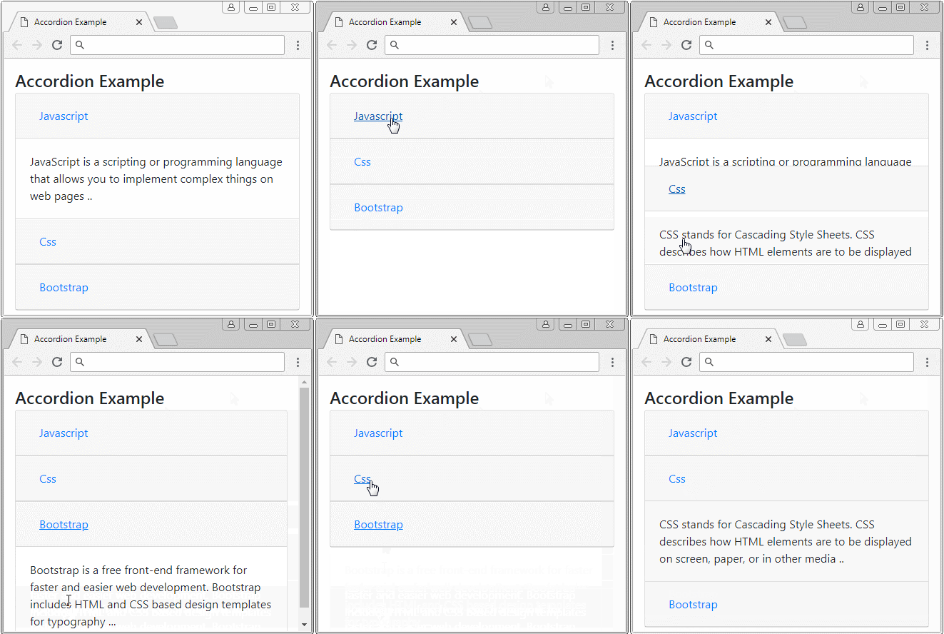
This is the illustration of the structure of an Accordion:
accordion-example.html
<!DOCTYPE html>
<html>
   <head>
      <meta charset="utf-8">
      <title>Accordion Example</title>
      <link rel="stylesheet" href="https://stackpath.bootstrapcdn.com/bootstrap/4.1.1/css/bootstrap.min.css">
   </head>
   <body>
      <div class="container mt-3">
         <h4 class="mb-1">Accordion Example</h4>

         <div class="accordion" id="accordionExample">
            <div class="card">
               <div class="card-header" id="headingOne">
                  <h5 class="mb-0">
                     <button class="btn btn-link" type="button" data-toggle="collapse"
                        data-target="#collapseOne"
                        aria-expanded="true" aria-controls="collapseOne">
                     Javascript
                     </button>
                  </h5>
               </div>
               <div id="collapseOne" class="collapse show"
                  aria-labelledby="headingOne" data-parent="#accordionExample">
                  <div class="card-body">
                     JavaScript is a scripting or programming language that
                     allows you to implement complex things on web pages ..
                  </div>
               </div>
            </div>

            <div class="card">
               <div class="card-header" id="headingTwo">
                  <h5 class="mb-0">
                     <button class="btn btn-link collapsed" type="button" data-toggle="collapse"
                        data-target="#collapseTwo"
                        aria-expanded="false" aria-controls="collapseTwo">
                     Css
                     </button>
                  </h5>
               </div>
               <div id="collapseTwo" class="collapse" aria-labelledby="headingTwo"
                  data-parent="#accordionExample">
                  <div class="card-body">
                     CSS stands for Cascading Style Sheets.
                     CSS describes how HTML elements are to be displayed on screen,
                     paper, or in other media ..
                  </div>
               </div>
            </div>

            <div class="card">
               <div class="card-header" id="headingThree">
                  <h5 class="mb-0">
                     <button class="btn btn-link collapsed" type="button"
                        data-toggle="collapse" data-target="#collapseThree"
                        aria-expanded="false" aria-controls="collapseThree">
                     Bootstrap
                     </button>
                  </h5>
               </div>
               <div id="collapseThree" class="collapse" aria-labelledby="headingThree"
                  data-parent="#accordionExample">
                  <div class="card-body">
                     Bootstrap is a free front-end framework for faster and easier web development.
                     Bootstrap includes HTML and CSS based design templates for typography ...
                  </div>
               </div>
            </div>

         </div>

      </div>

      <script src="https://code.jquery.com/jquery-3.3.1.slim.min.js"></script>
      <script src="https://cdnjs.cloudflare.com/ajax/libs/popper.js/1.14.3/umd/popper.min.js"></script>
      <script src="https://stackpath.bootstrapcdn.com/bootstrap/4.1.1/js/bootstrap.min.js"></script>
   </body>
</html>
Bootstrap Tutorials
- Bootstrap Jumbotron Tutorial with Examples
- Bootstrap Dropdowns Tutorial with Examples
- Bootstrap Alerts Tutorial with Examples
- Bootstrap Buttons Tutorial with Examples
- Bootstrap Button Group Tutorial with Examples
- Bootstrap Popovers (Tooltips) Tutorial with Examples
- Bootstrap Spinners Tutorial with Examples
- Introduction to Bootstrap
- Bootstrap Grid System Tutorial with Examples
- Bootstrap Cards Tutorial with Examples
- Bootstrap Containers Tutorial with Examples
- Bootstrap Nav Tab/Pill Tutorial with Examples
- Bootstrap NavBars Tutorial with Examples
- Bootstrap Tables Tutorial with Examples
- Bootstrap Modal Tutorial with Examples
- Bootstrap Forms Tutorial with Examples
- Bootstrap Pagination Tutorial with Examples
- Bootstrap Badges Tutorial with Examples
- Bootstrap Input Group Tutorial with Examples
- Bootstrap List Groups Tutorial with Examples
- Bootstrap ProgressBars Tutorial with Examples
- Bootstrap Collapse and Accordion Tutorial with Examples
- Bootstrap Scrollspy Tutorial with Examples
- Bootstrap Breadcrumb Tutorial with Examples
- Bootstrap Carousel Tutorial with Examples
- Bootstrap Spacing Utilities Tutorial with Examples
- Bootstrap Border Utilities Tutorial with Examples
- Bootstrap Color Utilities Tutorial with Examples
- Bootstrap Text Utilities Tutorial with Examples
- Bootstrap Sizing Utilities Tutorial with Examples
- Bootstrap Position Utilities Tutorial with Examples
- Bootstrap Flex Utilities Tutorial with Examples
- Bootstrap Display Utilities Tutorial with Examples
- Bootstrap Visibility Utilities Tutorial with Examples
- Bootstrap Embed Utilities Tutorial with Examples
Show More