Bootstrap Spacing Utilities Tutorial with Examples
1. Spacing Utility
Spacing Utility is the part of Bootstrap. It gives classes to help users set up the margin, padding values for elements. These classes are friendly with devices with different screen size.
Basically, these classes are named as the following format:
{property}{sides}-{size}
{property}{sides}-{breakpoint}-{size}
Of which:
- {property} và {size} is mandatory value.
- {sides} và {breakpoint} is non-mandatory value.
{property}:
{property} has "m" or "p" values.
{property} | Description |
m | This is abbreviation of "Margin", related to setting up of margin for elements. |
p | This is abbreviation of "Padding", related to setting up of padding for elements. |
{sides}:
{sides} | Description |
t | This stands for "Top", related to setting up margin-top or padding-top |
b | This stands for "Bottom", related to setting up margin-bottom or padding-bottom |
l | This stands for "Left", related to setting up margin-left or padding-left |
r | This stands for "Right", related to setting up margin-right or padding-right |
x | Refer to X axis (Horizontal), related to setting up margin-left & margin-right or padding-left & padding-right. |
y | Refer to Y axis (Vertical), related to setting up margin-top & margin-bottom or padding-top & padding-bottom. |
{size}:
{size} | Description |
0 | Set the value for padding or margin to 0. |
1 | Set the value for padding or margin to 0.25 * $spacer. |
2 | Set the value for padding or margin to 0.5 * $spacer. |
3 | Set the value for padding or margin to 1 * $spacer. |
4 | Set the value for padding or margin to 1.5 * $spacer. |
5 | Set the value for padding or margin to 3 * $spacer. |
auto | Set the value formargin to auto. |
$spacer is a value defined in the SASS of Bootstrap. This value may be different for the equipment with different screen width.
{breakpoint}
{breakpoint} | Description |
sm | Works when the width of parent element is >= 567px. |
md | Works when the width of parent element is >= 768px. |
lg | Works when the width of parent element is >= 992px. |
xl | Works when the width of parent element is >= 1200px. |
2. Examples
margin-example.html
<!DOCTYPE html>
<html>
   <head>
      <meta charset="utf-8">
      <title>Margin Example</title>
      <link rel="stylesheet" href="https://stackpath.bootstrapcdn.com/bootstrap/4.1.1/css/bootstrap.min.css">
   </head>
   <body>

      <div class="container-fluid border border-primary mt-5">
         <div class="border border-danger mt-5 mr-4 mb-4 ml-auto" style="width:100px;">
           Div
         </div>
      </div>

      <script src="https://code.jquery.com/jquery-3.3.1.slim.min.js"></script>
      <script src="https://cdnjs.cloudflare.com/ajax/libs/popper.js/1.14.3/umd/popper.min.js"></script>
      <script src="https://stackpath.bootstrapcdn.com/bootstrap/4.1.1/js/bootstrap.min.js"></script>
   </body>

</html>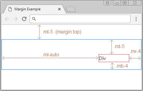
paddingexample
<div class="border border-danger pt-5 pr-4 pb-4 pl-5" style="width:300px;">
   Bootstrap is a free front-end framework for faster and easier web development.
   Bootstrap includes HTML and CSS based design templates for typography ...
</div>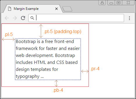
If an element is set up margin automatically on the left and on the right. It will appear in the center of father element horizontally.
center-example
<div class="container-fluid border border-primary mt-5">

   <div class="mx-auto border border-danger" style="width:100px;">
      Center DIV
   </div>

</div>
Responsive:
<div class="container-fluid border border-primary">

   <div class="border border-danger m-1 m-sm-5" style="width:100px;">
      .m-1 .m-sm-5
   </div>

</div>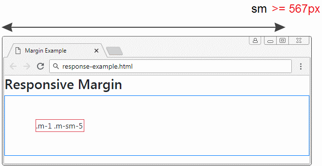
Bootstrap Tutorials
- Bootstrap Jumbotron Tutorial with Examples
- Bootstrap Dropdowns Tutorial with Examples
- Bootstrap Alerts Tutorial with Examples
- Bootstrap Buttons Tutorial with Examples
- Bootstrap Button Group Tutorial with Examples
- Bootstrap Popovers (Tooltips) Tutorial with Examples
- Bootstrap Spinners Tutorial with Examples
- Introduction to Bootstrap
- Bootstrap Grid System Tutorial with Examples
- Bootstrap Cards Tutorial with Examples
- Bootstrap Containers Tutorial with Examples
- Bootstrap Nav Tab/Pill Tutorial with Examples
- Bootstrap NavBars Tutorial with Examples
- Bootstrap Tables Tutorial with Examples
- Bootstrap Modal Tutorial with Examples
- Bootstrap Forms Tutorial with Examples
- Bootstrap Pagination Tutorial with Examples
- Bootstrap Badges Tutorial with Examples
- Bootstrap Input Group Tutorial with Examples
- Bootstrap List Groups Tutorial with Examples
- Bootstrap ProgressBars Tutorial with Examples
- Bootstrap Collapse and Accordion Tutorial with Examples
- Bootstrap Scrollspy Tutorial with Examples
- Bootstrap Breadcrumb Tutorial with Examples
- Bootstrap Carousel Tutorial with Examples
- Bootstrap Spacing Utilities Tutorial with Examples
- Bootstrap Border Utilities Tutorial with Examples
- Bootstrap Color Utilities Tutorial with Examples
- Bootstrap Text Utilities Tutorial with Examples
- Bootstrap Sizing Utilities Tutorial with Examples
- Bootstrap Position Utilities Tutorial with Examples
- Bootstrap Flex Utilities Tutorial with Examples
- Bootstrap Display Utilities Tutorial with Examples
- Bootstrap Visibility Utilities Tutorial with Examples
- Bootstrap Embed Utilities Tutorial with Examples
Show More