Bootstrap Cards Tutorial with Examples
1. Bootstrap Card
A Card is a structured, flexible, and extensible content container. It can include the options such as header, footer, contextual background colors, etc. Basically, the structure of the Card looks like this:
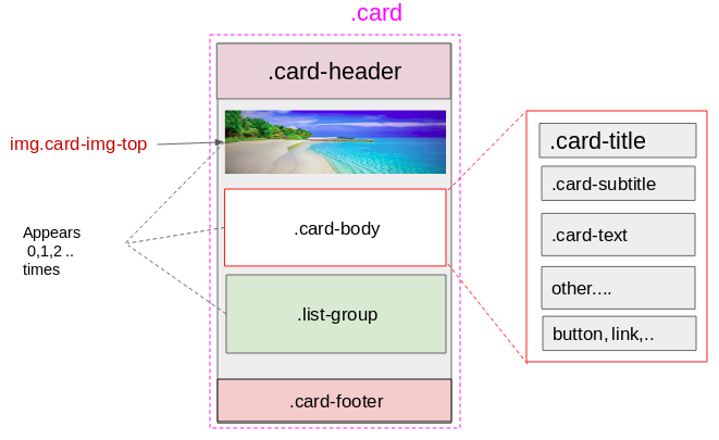
- All components such as .card-header, img.card-img*, .card-body, .list-group, .card-footer are not mandatory.
- The .card-body, .list-group elements can appear 0 or many times.
- The .card-header, .card-footer, img.card-img*components can appear 0 or 1 time.
Card (img.card-img-top + .card-body)
Below is the example of a simple Card. It consists of the two components such as img.card-img-top & .card-body:
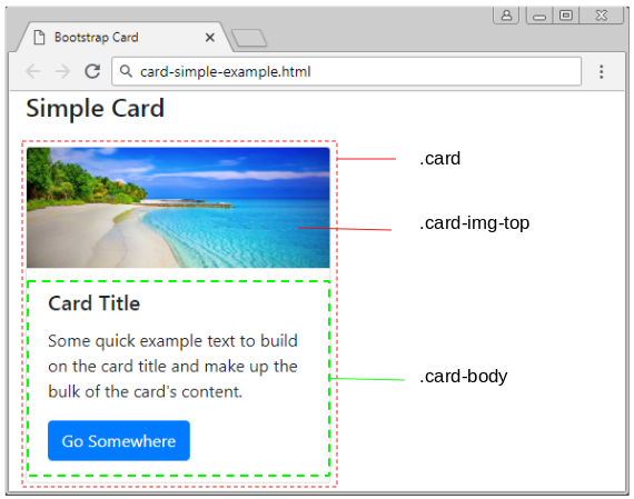
simple-card-example
<h4 class="mb-4">Simple Card</h4>
<div class="card" style="width: 18rem;">
   <img class="card-img-top" src="../images/beach.png" alt="">
   <div class="card-body">
      <h5 class="card-title">Card Title</h5>
      <p class="card-text">
         Some quick example text to build on the card
         title and make up the bulk of the card's content.
      </p>
      <a href="#" class="btn btn-primary">Go Somewhere</a>
   </div>
</div>
Card (.card-body):
Example, a simple Card includes a .card-body:
card-subtitle-link-example
<h4 class="mb-4">Simple Card</h4>
<div class="card" style="width: 18rem;">
   <div class="card-body">
      <h5 class="card-title">Card Title</h5>
      <h6 class="card-subtitle mb-2 text-muted">Card subtitle</h6>
      <p class="card-text">
         Some quick example text to build on
         the card title and make up the bulk of the card's content.
      </p>
      <a href="#" class="card-link">Card link</a>
      <a href="#" class="card-link">Another link</a>
   </div>
</div>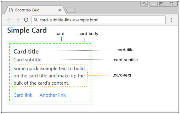
Card (.card-header + .list-group)
card-list-group-example
<h4 class="mb-4">Card (.card-header + .list-group)</h4>
<div class="card" style="width: 18rem;">
   <div class="card-header">
      Food Menu:
   </div>
   <ul class="list-group list-group-flush">
      <li class="list-group-item">Banh My</li>
      <li class="list-group-item">Pho</li>
      <li class="list-group-item">Salad</li>
   </ul>
</div>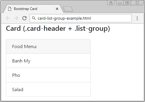
Card (.card-header + .card-footer)
card-header-footer-example
<h4 class="mb-4">Card (.card-header + .card-footer)</h4>

<div class="card text-center">
   <div class="card-header">
      Featured
   </div>
   <div class="card-body">
      <h5 class="card-title">Special title treatment</h5>
      <p class="card-text">
         With supporting text below as a natural
         lead-in to additional content.
      </p>
      <a href="#" class="btn btn-primary">
      Go somewhere
      </a>
   </div>
   <div class="card-footer text-muted">
      2 days ago
   </div>
</div>
A complex example:
card-comple-example
<h4 class="mb-4">Card Complex Example</h4>

<div class="card" style="width: 18rem;">
   <img class="card-img-top" src="../images/beach.png" alt="">
   <div class="card-body">
      <h5 class="card-title">Card title</h5>
      <p class="card-text">
         Some quick example text to build on the card title
         and make up the bulk of the card's content.
      </p>
   </div>
   <ul class="list-group list-group-flush">
      <li class="list-group-item">Cras justo odio</li>
      <li class="list-group-item">Dapibus ac facilisis in</li>
      <li class="list-group-item">Vestibulum at eros</li>
   </ul>
   <div class="card-body">
      <a href="#" class="card-link">Card link</a>
      <a href="#" class="card-link">Another link</a>
   </div>
</div>
2. Card with Image
Several classes are built in by the Bootstrap for you to apply to the image that appears in the Card. These classes set a width of 100% for the image and round the angles of the image. Specifically, below is the definition of these classes:
- .card-img-top
- .card-img-bottom
- .card-img
.card-img-*
/* Code see in Bootstrap */

.card-img-top {
    width: 100%;
    border-top-left-radius: calc(.25rem - 1px);
    border-top-right-radius: calc(.25rem - 1px);
}

.card-img-bottom {
    width: 100%;
    border-bottom-right-radius: calc(.25rem - 1px);
    border-bottom-left-radius: calc(.25rem - 1px);
}

.card-img {
    width: 100%;
    border-radius: calc(.25rem - 1px);
}
card-img-top-bottom-example
<h4 class="mb-4">Card (.card-img-top .card-img-bottom)</h4>

<div class="card mb-3">
   <img class="card-img-top" src="../images/beach.png" alt="">
   <div class="card-body">
      <h5 class="card-title">Card title</h5>
      <p class="card-text">
         This is a wider card with supporting text below as
         a natural lead-in to additional content.
         This content is a little bit longer.
      </p>
      <p class="card-text">
         <small class="text-muted">Last updated 3 mins ago</small>
      </p>
   </div>
   <img class="card-img" src="../images/beach2.png" alt="">
</div>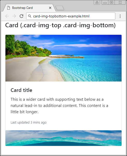
.card-img-overlap
One of the useful options different from the image is that you can display the text content overlapping the images, which saves space of the Card.
card-img-overlay-example
<h4 class="mb-4">Card (.card-img-overlay)</h4>

<div class="card mb-3">
   <img class="card-img" src="../images/beach.png" alt="">

   <div class="card-img-overlay">
      <h5 class="card-title text-light">Card title</h5>
      <p class="card-text text-light">
         This is a wider card with supporting text below
         as a natural lead-in to additional content.
         This content is a little bit longer.
      </p>
      <p class="card-text text-light">
         Last updated 3 mins ago
      </p>
   </div>

</div>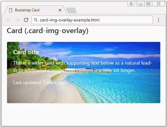
.card-img-overlay
/* Code see in Bootstrap */
.card-img-overlay {
    position: absolute;
    top: 0;
    right: 0;
    bottom: 0;
    left: 0;
    padding: 1.25rem;
}
3. Card with Grid System
You can combine the Card with the Grid System to obtain a beautiful Gallery and compatible with the devices with different screen widths.
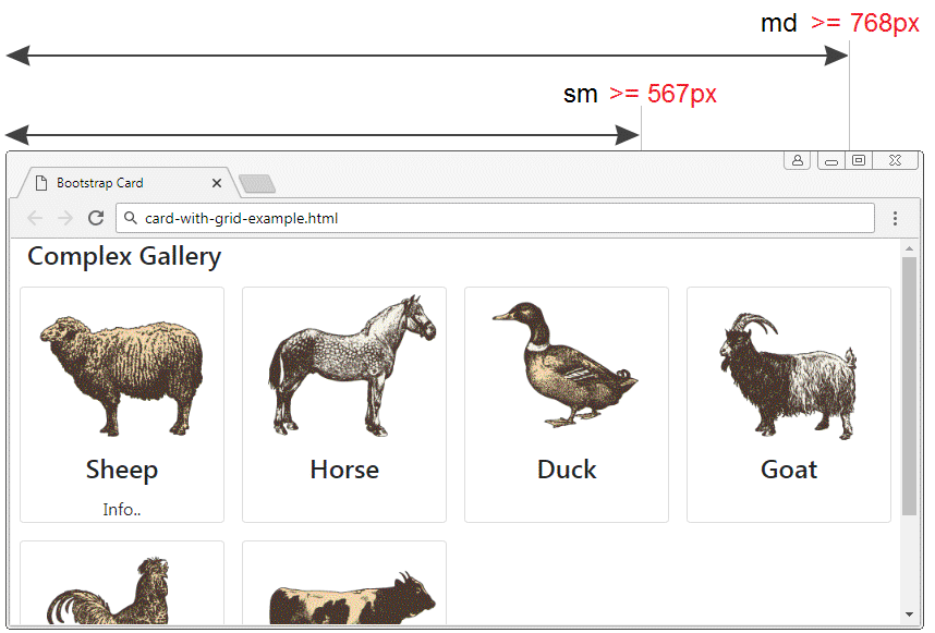
card-with-grid-example.html
<!DOCTYPE html>
<html>
   <head>
      <meta charset="utf-8">
      <title>Bootstrap Card</title>
      <link rel="stylesheet" href="https://stackpath.bootstrapcdn.com/bootstrap/4.1.1/css/bootstrap.min.css">
   </head>
   <body>
      <div class= "container-fluid">
         <h4>Complex Gallery</h4>
         <div class= "row d-inline-flex">
            <!-- Gallery Item 1 -->
            <div class ="col-6 col-sm-4 col-md-3 p-2">
               <div class="card h-100">
                  <img class="card-img-top" src="../images/animal1.png"/>
                  <h4 class="card-title text-center">Sheep</h4>
                  <p class="card-text text-center">Info..</p>
               </div>
            </div>
            <!-- Gallery Item 2 -->
            <div class ="col-6 col-sm-4 col-md-3 p-2">
               <div class="card h-100">
                  <img class="card-img-top" src="../images/animal2.png"/>
                  <h4 class="card-title text-center">Horse</h4>
               </div>
            </div>
            <!-- Gallery Item 3 -->
            <div class ="col-6 col-sm-4 col-md-3 p-2">
               <div class="card h-100">
                  <img class="card-img-top" src="../images/animal3.png"/>
                  <h4 class="card-title text-center">Duck</h4>
               </div>
            </div>
            <!-- Gallery Item 4 -->
            <div class ="col-6 col-sm-4 col-md-3 p-2">
               <div class="card h-100">
                  <img class="card-img-top" src="../images/animal4.png"/>
                  <h4 class="card-title text-center">Goat</h4>
               </div>
            </div>
            <!-- Gallery Item 5 -->
            <div class ="col-6 col-sm-4 col-md-3 p-2">
               <div class="card h-100">
                  <img class="card-img-top" src="../images/animal5.png"/>
                  <h4 class="card-title text-center">Chicken</h4>
               </div>
            </div>
            <!-- Gallery Item 6 -->
            <div class ="col-6 col-sm-4 col-md-3 p-2">
               <div class="card h-100">
                  <img class="card-img-top" src="../images/animal6.png"/>
                  <h4 class="card-title text-center">Cow</h4>
               </div>
            </div>
         </div>
      </div>
      <script src="https://code.jquery.com/jquery-3.3.1.slim.min.js"></script>
      <script src="https://cdnjs.cloudflare.com/ajax/libs/popper.js/1.14.3/umd/popper.min.js"></script>
      <script src="https://stackpath.bootstrapcdn.com/bootstrap/4.1.1/js/bootstrap.min.js"></script>
   </body>
</html>
h-100 (?)
4. Card Group (.card-group)
Wrapping the ".card" elements inside a ".card-group" element will help the ".card" element have the same width and height. The reason is that ".card-group" uses {display: flex}, and the ".card" elements will be put closely each other (distance = 0).
card-group-example
<h4 class="mb-4">Card Group (.card-group)</h4>

<div class="card-group">
   <div class="card">
      <img class="card-img-top" src="../images/picture.png" alt="Card image cap">
      <div class="card-body">
         <h5 class="card-title">Card title</h5>
         <p class="card-text">
            This is a wider card with supporting text below
            as a natural lead-in to additional content.
            This content is a little bit longer.
         </p>
         <p class="card-text">
            <small class="text-muted">Last updated 3 mins ago</small>
         </p>
      </div>
   </div>
   <div class="card">
      <img class="card-img-top" src="../images/picture.png" alt="Card image cap">
      <div class="card-body">
         <h5 class="card-title">Card title</h5>
         <p class="card-text">
            This card has supporting text below as a natural lead-in to additional content.
         </p>
         <p class="card-text">
            <small class="text-muted">Last updated 3 mins ago</small>
         </p>
      </div>
   </div>
   <div class="card">
      <img class="card-img-top" src="../images/picture.png" alt="Card image cap">
      <div class="card-body">
         <h5 class="card-title">Card title</h5>
         <p class="card-text">
            This is a wider card with supporting text
            below as a natural lead-in to additional content.
            This card has even longer content than the first to show that equal height action.
         </p>
         <p class="card-text">
            <small class="text-muted">Last updated 3 mins ago</small>
         </p>
      </div>
   </div>
</div>
If all ".card" elements in the Card-Group have footer, the footers will be lined up.
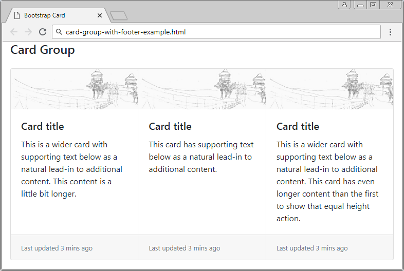
card-group-with-footers-example
<h4 class="mb-4">Card Group</h4>
<div class="card-group">
<div class="card">
<img class="card-img-top" src="../images/picture.png" alt="">
<div class="card-body">
<h5 class="card-title">Card title</h5>
<p class="card-text">
This is a wider card with supporting text below
as a natural lead-in to additional content.
This content is a little bit longer.
</p>
</div>
<div class="card-footer">
<small class="text-muted">Last updated 3 mins ago</small>
</div>
</div>
<div class="card">
<img class="card-img-top" src="../images/picture.png" alt="">
<div class="card-body">
<h5 class="card-title">Card title</h5>
<p class="card-text">
This card has supporting text below as a natural lead-in to additional content.
</p>
</div>
<div class="card-footer">
<small class="text-muted">Last updated 3 mins ago</small>
</div>
</div>
<div class="card">
<img class="card-img-top" src="../images/picture.png" alt="">
<div class="card-body">
<h5 class="card-title">Card title</h5>
<p class="card-text">
This is a wider card with supporting text
below as a natural lead-in to additional content.
This card has even longer content than the first to show that equal height action.
</p>
</div>
<div class="card-footer">
<small class="text-muted">Last updated 3 mins ago</small>
</div>
</div>
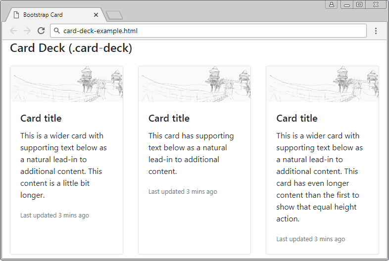
</div>5. Card Deck (.card-deck)
If you want to have a set of ".cards" which has the same width and height and is separated, please set them into the ".card-deck" element. Note: the .card-deck works quite similarly to the .card-group. The only difference is that its child elements (.card) will be not sticked with each other.
card-deck-example
<h4 class="mb-4">Card Deck (.card-deck)</h4>
<div class="card-deck">
<div class="card">
<img class="card-img-top" src="../images/picture.png" alt="">
<div class="card-body">
<h5 class="card-title">Card title</h5>
<p class="card-text">
This is a wider card with supporting text below
as a natural lead-in to additional content.
This content is a little bit longer.
</p>
<p class="card-text">
<small class="text-muted">Last updated 3 mins ago</small>
</p>
</div>
</div>
<div class="card">
<img class="card-img-top" src="../images/picture.png" alt="">
<div class="card-body">
<h5 class="card-title">Card title</h5>
<p class="card-text">
This card has supporting text below as a natural lead-in to additional content.
</p>
<p class="card-text">
<small class="text-muted">Last updated 3 mins ago</small>
</p>
</div>
</div>
<div class="card">
<img class="card-img-top" src="../images/picture.png" alt="">
<div class="card-body">
<h5 class="card-title">Card title</h5>
<p class="card-text">
This is a wider card with supporting text
below as a natural lead-in to additional content.
This card has even longer content than the first to show that equal height action.
</p>
<p class="card-text">
<small class="text-muted">Last updated 3 mins ago</small>
</p>
</div>
</div>
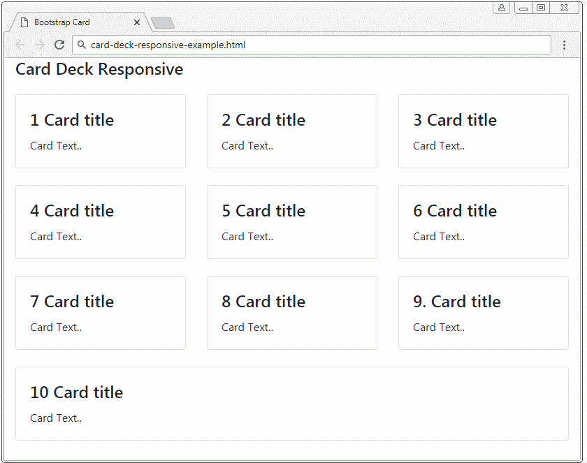
</div>6. Responsive .card-group, .card-deck
By using the .d-*-none, .d-*-block, .w-100 classes flexibly, you can create a Responsive Card Deck or Responsive Card Group.
.d-*-none, .d-*-block, .w-100 (?)
card-deck-responsive-example
<h4 class="mb-4">Card Deck Responsive</h4>
<div class="card-deck">
   <div class="card mb-4">
      <div class="card-body">
         <h4 class="card-title">1 Card title</h4>
         <p class="card-text">Card Text..</p>
      </div>
   </div>
   <div class="card mb-4">
      <div class="card-body">
         <h4 class="card-title">2 Card title</h4>
         <p class="card-text">Card Text..</p>
      </div>
   </div>
   <div class="w-100 d-none d-sm-block d-md-none">
      <!-- wrap every 2 on sm-->
   </div>
   <div class="card mb-4">
      <div class="card-body">
         <h4 class="card-title">3 Card title</h4>
         <p class="card-text">Card Text..</p>
      </div>
   </div>
   <div class="w-100 d-none d-md-block d-lg-none">
      <!-- wrap every 3 on md-->
   </div>
   <div class="card mb-4">
      <div class="card-body">
         <h4 class="card-title">4 Card title</h4>
         <p class="card-text">Card Text..</p>
      </div>
   </div>
   <div class="w-100 d-none d-sm-block d-md-none">
      <!-- wrap every 2 on sm-->
   </div>
   <div class="w-100 d-none d-lg-block d-xl-none">
      <!-- wrap every 4 on lg-->
   </div>
   <div class="card mb-4">
      <div class="card-body">
         <h4 class="card-title">5 Card title</h4>
         <p class="card-text">Card Text..</p>
      </div>
   </div>
   <div class="w-100 d-none d-xl-block">
      <!-- wrap every 5 on xl-->
   </div>
   <div class="card mb-4">
      <div class="card-body">
         <h4 class="card-title">6 Card title</h4>
         <p class="card-text">Card Text..</p>
      </div>
   </div>
   <div class="w-100 d-none d-sm-block d-md-none">
      <!-- wrap every 2 on sm-->
   </div>
   <div class="w-100 d-none d-md-block d-lg-none">
      <!-- wrap every 3 on md-->
   </div>
   <div class="card mb-4">
      <div class="card-body">
         <h4 class="card-title">7 Card title</h4>
         <p class="card-text">Card Text..</p>
      </div>
   </div>
   <div class="card mb-4">
      <div class="card-body">
         <h4 class="card-title">8 Card title</h4>
         <p class="card-text">Card Text..</p>
      </div>
   </div>
   <div class="w-100 d-none d-sm-block d-md-none">
      <!-- wrap every 2 on sm-->
   </div>
   <div class="w-100 d-none d-lg-block d-xl-none">
      <!-- wrap every 4 on lg-->
   </div>
   <div class="card mb-4">
      <div class="card-body">
         <h4 class="card-title">9. Card title</h4>
         <p class="card-text">Card Text..</p>
      </div>
   </div>
   <div class="w-100 d-none d-md-block d-lg-none">
      <!-- wrap every 3 on md-->
   </div>
   <div class="card mb-4">
      <div class="card-body">
         <h4 class="card-title">10 Card title</h4>
         <p class="card-text">Card Text..</p>
      </div>
   </div>
</div>
7. Card Columns (.card-columns)
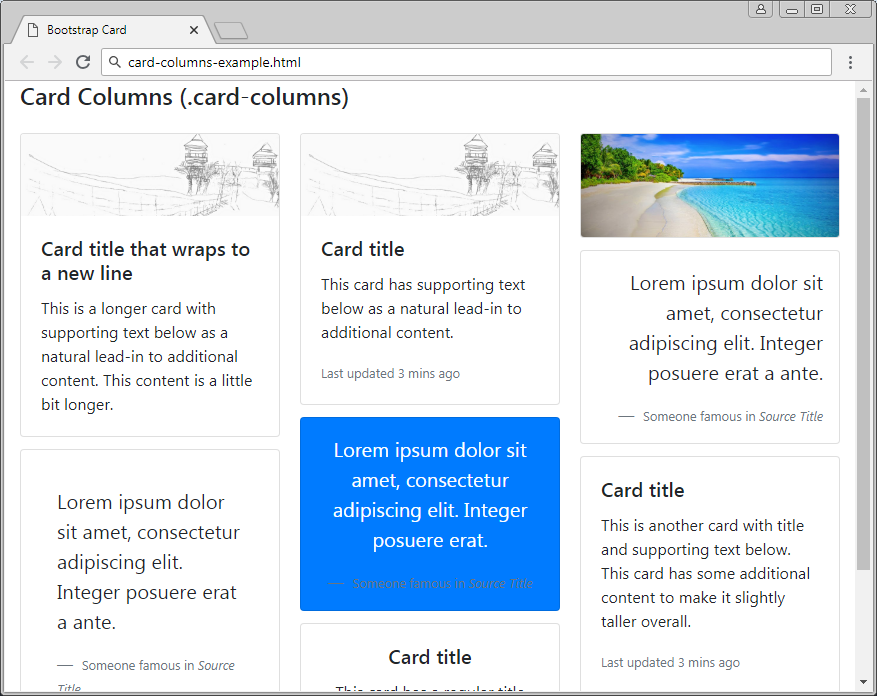
If ".cards" are put in a ".card-columns" element, they will be arranged up down, left right and located on 3 columns as in the following illustration. It is noted that the .card-columns class is built based on CSS properties instead of Flexbox. The ".card" elements have the same width but their height can be different. You can customize the quantity of columns based on screen size. by default, the quantity of columns is 3.
card-columns-example
<h4 class="mb-4">Card Columns (.card-columns)</h4>
<div class="card-columns">
   <div class="card">
      <img class="card-img-top" src="../images/picture.png" alt="">
      <div class="card-body">
         <h5 class="card-title">Card title that wraps to a new line</h5>
         <p class="card-text">
            This is a longer card with supporting text below
            as a natural lead-in to additional content.
            This content is a little bit longer.
         </p>
      </div>
   </div>
   <div class="card p-3">
      <blockquote class="blockquote mb-0 card-body">
         <p>
            Lorem ipsum dolor sit amet, consectetur adipiscing elit.
            Integer posuere erat a ante.
         </p>
         <footer class="blockquote-footer">
            <small class="text-muted">
            Someone famous in <cite title="Source Title">Source Title</cite>
            </small>
         </footer>
      </blockquote>
   </div>
   <div class="card">
      <img class="card-img-top" src="../images/picture.png" alt="">
      <div class="card-body">
         <h5 class="card-title">Card title</h5>
         <p class="card-text">
            This card has supporting text below as a natural lead-in to additional content.
         </p>
         <p class="card-text">
            <small class="text-muted">Last updated 3 mins ago</small>
         </p>
      </div>
   </div>
   <div class="card bg-primary text-white text-center p-3">
      <blockquote class="blockquote mb-0">
         <p>
            Lorem ipsum dolor sit amet, consectetur adipiscing elit.
            Integer posuere erat.
         </p>
         <footer class="blockquote-footer">
            <small>
            Someone famous in <cite title="Source Title">Source Title</cite>
            </small>
         </footer>
      </blockquote>
   </div>
   <div class="card text-center">
      <div class="card-body">
         <h5 class="card-title">Card title</h5>
         <p class="card-text">
            This card has a regular title and short paragraphy of text below it.
         </p>
         <p class="card-text">
            <small class="text-muted">Last updated 3 mins ago</small>
         </p>
      </div>
   </div>
   <div class="card">
      <img class="card-img" src="../images/beach.png" alt="">
   </div>
   <div class="card p-3 text-right">
      <blockquote class="blockquote mb-0">
         <p>
            Lorem ipsum dolor sit amet, consectetur adipiscing elit.
            Integer posuere erat a ante.
         </p>
         <footer class="blockquote-footer">
            <small class="text-muted">
            Someone famous in <cite title="Source Title">Source Title</cite>
            </small>
         </footer>
      </blockquote>
   </div>
   <div class="card">
      <div class="card-body">
         <h5 class="card-title">Card title</h5>
         <p class="card-text">
            This is another card with title and supporting text below.
            This card has some additional content to make it slightly taller overall.
         </p>
         <p class="card-text">
            <small class="text-muted">Last updated 3 mins ago</small>
         </p>
      </div>
   </div>
</div>
8. Responsive .card-columns
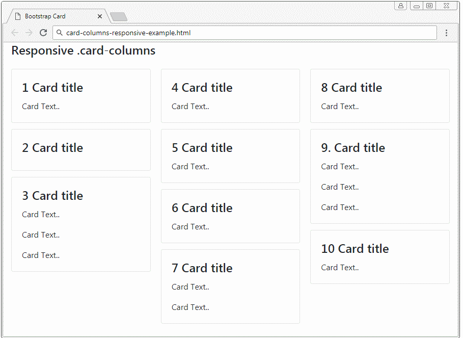
Suppose you want to create a Responsive .card-columns operating by the following rule: Card elements will display on 5 columns if the device is in xl size, or 4 columns if the device is in lg size, 3 columns if the devices is in md size, 2 columns if the devices is in sm size, 1 column if the device is in Extra-Small size.
You have 2 ways to do it:
- Use SASS Mixin.
- Use CSS.
SASS mixin
.card-columns {
     @include media-breakpoint-only(xl) {
         column-count: 5;
    }
     @include media-breakpoint-only(lg) {
         column-count: 4;
    }
     @include media-breakpoint-only(md) {
         column-count: 3;
    }
     @include media-breakpoint-only(sm) {
         column-count: 2;
    }
}
CSS
@media (min-width: 576px) {
     .card-columns {
         column-count: 2;
    }
}
 @media (min-width: 768px) {
     .card-columns {
         column-count: 3;
    }
}
 @media (min-width: 992px) {
     .card-columns {
         column-count: 4;
    }
}
 @media (min-width: 1200px) {
     .card-columns {
         column-count: 5;
    }
}
card-columns-responsive-example
<h4 class="mb-4">Responsive .card-columns</h4>
<div class="card-columns">
   <div class="card">
      <div class="card-body">
         <h4 class="card-title">1 Card title</h4>
         <p class="card-text">Card Text..</p>
      </div>
   </div>
   <div class="card">
      <div class="card-body">
         <h4 class="card-title">2 Card title</h4>
      </div>
   </div>
   <div class="card">
      <div class="card-body">
         <h4 class="card-title">3 Card title</h4>
         <p class="card-text">Card Text..</p>
         <p class="card-text">Card Text..</p>
         <p class="card-text">Card Text..</p>
      </div>
   </div>
   <div class="card">
      <div class="card-body">
         <h4 class="card-title">4 Card title</h4>
         <p class="card-text">Card Text..</p>
      </div>
   </div>
   <div class="card">
      <div class="card-body">
         <h4 class="card-title">5 Card title</h4>
         <p class="card-text">Card Text..</p>
      </div>
   </div>
   <div class="card">
      <div class="card-body">
         <h4 class="card-title">6 Card title</h4>
         <p class="card-text">Card Text..</p>
      </div>
   </div>
   <div class="card">
      <div class="card-body">
         <h4 class="card-title">7 Card title</h4>
         <p class="card-text">Card Text..</p>
         <p class="card-text">Card Text..</p>
      </div>
   </div>
   <div class="card">
      <div class="card-body">
         <h4 class="card-title">8 Card title</h4>
         <p class="card-text">Card Text..</p>
      </div>
   </div>
   <div class="card">
      <div class="card-body">
         <h4 class="card-title">9. Card title</h4>
         <p class="card-text">Card Text..</p>
         <p class="card-text">Card Text..</p>
         <p class="card-text">Card Text..</p>
      </div>
   </div>
   <div class="card">
      <div class="card-body">
         <h4 class="card-title">10 Card title</h4>
         <p class="card-text">Card Text..</p>
      </div>
   </div>
</div>
Bootstrap Tutorials
- Bootstrap Jumbotron Tutorial with Examples
- Bootstrap Dropdowns Tutorial with Examples
- Bootstrap Alerts Tutorial with Examples
- Bootstrap Buttons Tutorial with Examples
- Bootstrap Button Group Tutorial with Examples
- Bootstrap Popovers (Tooltips) Tutorial with Examples
- Bootstrap Spinners Tutorial with Examples
- Introduction to Bootstrap
- Bootstrap Grid System Tutorial with Examples
- Bootstrap Cards Tutorial with Examples
- Bootstrap Containers Tutorial with Examples
- Bootstrap Nav Tab/Pill Tutorial with Examples
- Bootstrap NavBars Tutorial with Examples
- Bootstrap Tables Tutorial with Examples
- Bootstrap Modal Tutorial with Examples
- Bootstrap Forms Tutorial with Examples
- Bootstrap Pagination Tutorial with Examples
- Bootstrap Badges Tutorial with Examples
- Bootstrap Input Group Tutorial with Examples
- Bootstrap List Groups Tutorial with Examples
- Bootstrap ProgressBars Tutorial with Examples
- Bootstrap Collapse and Accordion Tutorial with Examples
- Bootstrap Scrollspy Tutorial with Examples
- Bootstrap Breadcrumb Tutorial with Examples
- Bootstrap Carousel Tutorial with Examples
- Bootstrap Spacing Utilities Tutorial with Examples
- Bootstrap Border Utilities Tutorial with Examples
- Bootstrap Color Utilities Tutorial with Examples
- Bootstrap Text Utilities Tutorial with Examples
- Bootstrap Sizing Utilities Tutorial with Examples
- Bootstrap Position Utilities Tutorial with Examples
- Bootstrap Flex Utilities Tutorial with Examples
- Bootstrap Display Utilities Tutorial with Examples
- Bootstrap Visibility Utilities Tutorial with Examples
- Bootstrap Embed Utilities Tutorial with Examples
Show More