Bootstrap Carousel Tutorial with Examples
1. Bootstrap Carousel
Carousel is similar to a slidershow, which displays to cycle some contents, for example, image, text,... The Carousel of Bootstrap is built based on the CSS and a little Javascript.
Below is the illustration of a Carousel. It displays to cycle some images.
A full Carousel has structure like the following illustration:
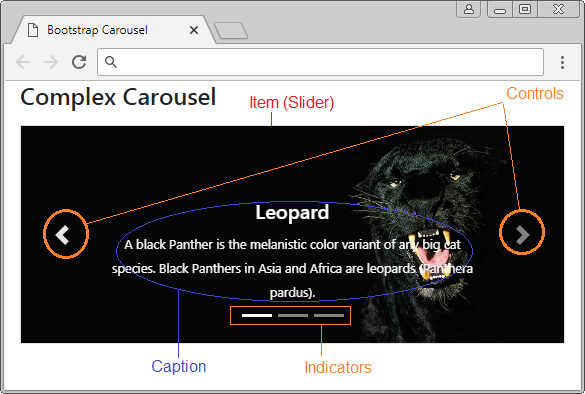
The most simple Carousel includes only Items (Slider) and the content of each Slider is an image. It doesn't consist of controls and Indicators.
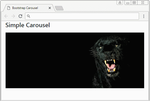
simple-carousel-example.html
<!DOCTYPE html>
<html>
   <head>
      <meta charset="utf-8">
      <title>Bootstrap Carousel</title>
      <link rel="stylesheet" href="https://stackpath.bootstrapcdn.com/bootstrap/4.1.1/css/bootstrap.min.css">
   </head>
   <body>
      <div class="container">
         <h4 class="mb-3">Simple Carousel</h4>
         <div id="myCarousel" class="carousel slide border" data-ride="carousel">
            <div class="carousel-inner">
               <div class="carousel-item active">
                  <img class="d-block w-100" src="../images/carousel-img-1.jpg" alt="Panther">
               </div>
               <div class="carousel-item">
                  <img class="d-block w-100" src="../images/carousel-img-2.jpg" alt="Black Cat">
               </div>
               <div class="carousel-item">
                  <img class="d-block w-100" src="../images/carousel-img-3.jpg" alt="Lion">
               </div>
            </div>
         </div>
      </div>
      <script src="https://code.jquery.com/jquery-3.3.1.slim.min.js"></script>
      <script src="https://cdnjs.cloudflare.com/ajax/libs/popper.js/1.14.3/umd/popper.min.js"></script>
      <script src="https://stackpath.bootstrapcdn.com/bootstrap/4.1.1/js/bootstrap.min.js"></script>
   </body>
</html>
2. Carousel with Controls
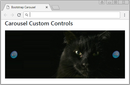
A normal Carousel has "Next" and "Previous" buttons to allow users to jump to a next Slider or back previous Slider. They are called Controls.
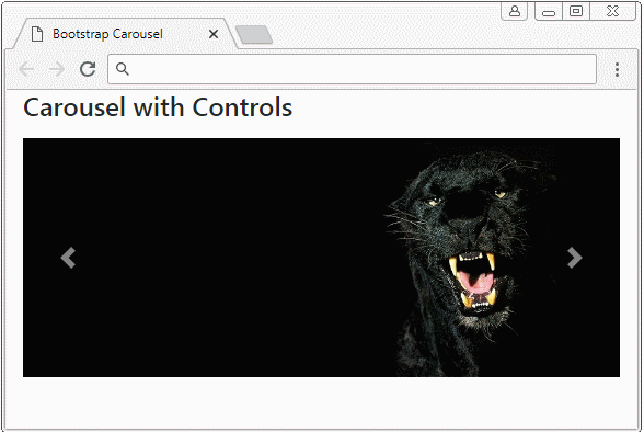
Carousel with Control
<div id="myCarousel" class="carousel slide border" data-ride="carousel">
   <div class="carousel-inner">
      <div class="carousel-item active">
         <img class="d-block w-100" src="../images/carousel-img-1.jpg" alt="Leopard">
      </div>
      <div class="carousel-item">
         <img class="d-block w-100" src="../images/carousel-img-2.jpg" alt="Cat">
      </div>
      <div class="carousel-item">
         <img class="d-block w-100" src="../images/carousel-img-3.jpg" alt="Lion">
      </div>
   </div>
   <!-- Controls -->
   <a class="carousel-control-prev" href="#myCarousel" role="button" data-slide="prev">
     <span class="carousel-control-prev-icon" aria-hidden="true"></span>
     <span class="sr-only">Previous</span>
   </a>
   <a class="carousel-control-next" href="#myCarousel" role="button" data-slide="next">
     <span class="carousel-control-next-icon" aria-hidden="true"></span>
     <span class="sr-only">Next</span>
   </a>
</div>
Example of Controls customization:
Custom Controls
.carousel-control-prev-icon {
     background-image: url(../images/previous-32.png);
     width: 32px;
     height: 32px;
}
 .carousel-control-next-icon {
     background-image: url(../images/next-32.png);
     width: 32px;
     height: 32px;
}
3. Carousel with Indicators
Indicators like Shortcuts help users jump to a specific Item (Slider) in the list of Items of Carousel. Note: The Items in Carousel is marked index starting from 0 (0, 1, 2,..)
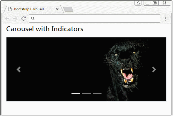
Carousel Indicators
<div id="myCarousel" class="carousel slide border" data-ride="carousel">
   <!-- Indicators -->
   <ol class="carousel-indicators">
      <li data-target="#myCarousel" data-slide-to="0" class="active"></li>
      <li data-target="#myCarousel" data-slide-to="1"></li>
      <li data-target="#myCarousel" data-slide-to="2"></li>
   </ol>

   ...

</div>
Carousel Indicators
<div id="myCarousel" class="carousel slide border" data-ride="carousel">
   <!-- Indicators -->
   <ol class="carousel-indicators">
      <li data-target="#myCarousel" data-slide-to="0" class="active"></li>
      <li data-target="#myCarousel" data-slide-to="1"></li>
      <li data-target="#myCarousel" data-slide-to="2"></li>
   </ol>
   <div class="carousel-inner">
      <div class="carousel-item active">
         <img class="d-block w-100" src="../images/carousel-img-1.jpg" alt="Leopard">
      </div>
      <div class="carousel-item">
         <img class="d-block w-100" src="../images/carousel-img-2.jpg" alt="Cat">
      </div>
      <div class="carousel-item">
         <img class="d-block w-100" src="../images/carousel-img-3.jpg" alt="Lion">
      </div>
   </div>
   <!-- Controls -->
   <a class="carousel-control-prev" href="#myCarousel" role="button" data-slide="prev">
     <span class="carousel-control-prev-icon" aria-hidden="true"></span>
     <span class="sr-only">Previous</span>
   </a>
   <a class="carousel-control-next" href="#myCarousel" role="button" data-slide="next">
     <span class="carousel-control-next-icon" aria-hidden="true"></span>
     <span class="sr-only">Next</span>
   </a>
</div>
Below are some examples of Indicators customization.
Custom Indicators (1)
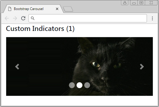
Custom Indicators (1)
.carousel-indicators li {
  width: 20px;
  height: 20px;
  border-radius: 100%;
}
Custom Indicators (2)
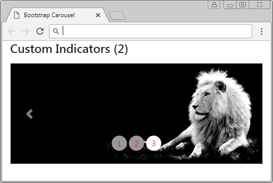
Custom Indicators (2)
.carousel-indicators li {
     text-indent: 0px;
     text-align: center;
     color: red;
     margin: 0 2px;
     width: 30px;
     height: 30px;
     border: none;
     border-radius: 100%;
     line-height: 30px;
     background-color: #999;
     transition: all 0.25s ease;
}
 .carousel-indicators .active, .hover {
     margin: 0 2px;
     width: 30px;
     height: 30px;
     background-color: #337ab7;
}
Custom Indicators (2)
<div id="myCarousel" class="carousel slide border" data-ride="carousel">
   <ol class="carousel-indicators">
      <li data-target="#myCarousel" data-slide-to="0" class="active">1</li>
      <li data-target="#myCarousel" data-slide-to="1">2</li>
      <li data-target="#myCarousel" data-slide-to="2">3</li>
   </ol>
   <div class="carousel-inner">
      <div class="carousel-item active">
         <img class="d-block w-100" src="../images/carousel-img-1.jpg" alt="Panther">
      </div>
      <div class="carousel-item">
         <img class="d-block w-100" src="../images/carousel-img-2.jpg" alt="Black Cat">
      </div>
      <div class="carousel-item">
         <img class="d-block w-100" src="../images/carousel-img-3.jpg" alt="Lion">
      </div>
   </div>
   <a class="carousel-control-prev" href="#myCarousel" role="button" data-slide="prev">
   <span class="carousel-control-prev-icon" aria-hidden="true"></span>
   <span class="sr-only">Previous</span>
   </a>
   <a class="carousel-control-next" href="#myCarousel" role="button" data-slide="next">
   <span class="carousel-control-next-icon" aria-hidden="true"></span>
   <span class="sr-only">Next</span>
   </a>
</div>
Custom Indicators (3)
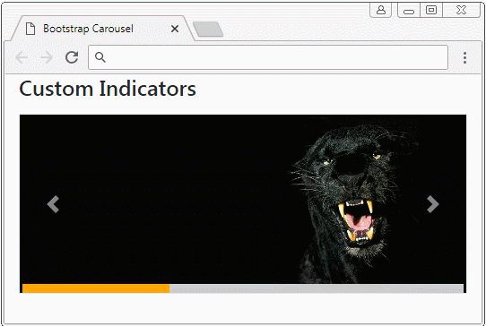
Cutom Indicators (3)
.carousel-indicators {
position: absolute;
bottom: 0;
margin: 0;
left: 0;
right: 0;
width: auto;
}
.carousel-indicators li, .carousel-indicators li.active {
float: left;
width: 33%;
height: 10px;
margin: 0;
border-radius: 0;
border: 0;
background: #ccc;
}
.carousel-indicators li.active {
background: orange;
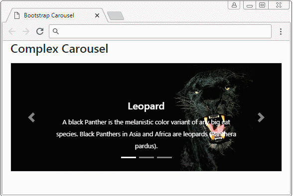
}4. Carousel with Caption
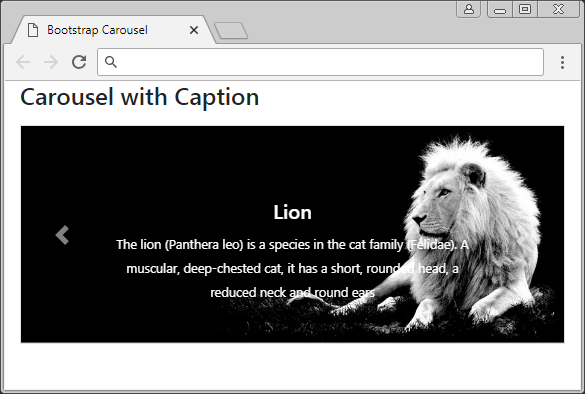
For each Slider you can add caption to it. This is done easily by wrapping your caption content in the <div class="carousel-caption"> tag.
Carousel Item with Caption!
<div class="carousel-item">
   <img class="d-block w-100" src="../images/carousel-img-2.jpg" alt="Cat">

   <!--Caption here -->
   <div class="carousel-caption">
      <h5>Black Cat</h5>
      <small>
      A black cat is a domestic cat with black fur that may be a mixed or specific breed
      </small>
   </div>

</div>
Carousel with caption
<div id="myCarousel" class="carousel slide border" data-ride="carousel">
<div class="carousel-inner">
<div class="carousel-item active">
<img class="d-block w-100" src="../images/carousel-img-1.jpg" alt="Leopard">
<div class="carousel-caption">
<h5>Leopard</h5>
<small>
A black Panther is the melanistic color variant of any big cat species.
Black Panthers in Asia and Africa are leopards (Panthera pardus).
</small>
</div>
</div>
<div class="carousel-item">
<img class="d-block w-100" src="../images/carousel-img-2.jpg" alt="Cat">
<div class="carousel-caption">
<h5>Black Cat</h5>
<small>
A black cat is a domestic cat with black fur that may be a mixed or specific breed
</small>
</div>
</div>
<div class="carousel-item">
<img class="d-block w-100" src="../images/carousel-img-3.jpg" alt="Lion">
<div class="carousel-caption">
<h5>Lion</h5>
<small>
The lion (Panthera leo) is a species in the cat family (Felidae).
A muscular, deep-chested cat, it has a short, rounded head, a reduced neck and round ears
</small>
</div>
</div>
</div>
<a class="carousel-control-prev" href="#myCarousel" role="button" data-slide="prev">
<span class="carousel-control-prev-icon" aria-hidden="true"></span>
<span class="sr-only">Previous</span>
</a>
<a class="carousel-control-next" href="#myCarousel" role="button" data-slide="next">
<span class="carousel-control-next-icon" aria-hidden="true"></span>
<span class="sr-only">Next</span>
</a>
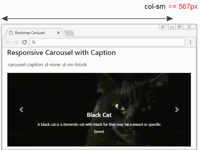
</div>The captions should be display for devices with large screen width. For too small screen equipment, you can hide them, which can be performed with the support of the .d-(sm|md|lg|xl)-block, .d-none class.
Class | Description |
.d-sm-block .d-none | Caption will display if the width of Carousel is >= 567px. Conversely, it will be hidden. |
.d-md-block .d-none | Caption will display if the width of Carousel is >= 768px. Conversely, it will be hidden. |
.d-lg-block .d-none | Caption will display if the width of Carousel is >= 992px. Conversely, it will be hidden. |
.d-xl-block .d-none | Caption will display if the width of Carousel is >= 1200px. Conversely, it will be hidden. |
carousel-responsive-caption-example.html
<!DOCTYPE html>
<html>
<head>
<meta charset="utf-8">
<title>Bootstrap Carousel</title>
<link rel="stylesheet" href="https://stackpath.bootstrapcdn.com/bootstrap/4.1.1/css/bootstrap.min.css">
</head>
<body>
<div class="container-fluid">
<h4 class="mb-3">Responsive Carousel with Caption</h4>
<p>.carousel-caption .d-none .d-sm-block</p>
<div id="myCarousel" class="carousel slide border" data-ride="carousel">
<div class="carousel-inner">
<div class="carousel-item active">
<img class="d-block w-100" src="../images/carousel-img-1.jpg" alt="Leopard">
<div class="carousel-caption d-none d-sm-block">
<h5>Leopard</h5>
<small>
A black Panther is the melanistic color variant of any big cat species.
Black Panthers in Asia and Africa are leopards (Panthera pardus).
</small>
</div>
</div>
<div class="carousel-item">
<img class="d-block w-100" src="../images/carousel-img-2.jpg" alt="Cat">
<div class="carousel-caption d-none d-sm-block">
<h5>Black Cat</h5>
<small>
A black cat is a domestic cat with black fur that may be a mixed or specific breed
</small>
</div>
</div>
<div class="carousel-item">
<img class="d-block w-100" src="../images/carousel-img-3.jpg" alt="Lion">
<div class="carousel-caption d-none d-sm-block">
<h5>Lion</h5>
<small>
The lion (Panthera leo) is a species in the cat family (Felidae).
A muscular, deep-chested cat, it has a short, rounded head,
a reduced neck and round ears
</small>
</div>
</div>
</div>
<a class="carousel-control-prev" href="#myCarousel" role="button" data-slide="prev">
<span class="carousel-control-prev-icon" aria-hidden="true"></span>
<span class="sr-only">Previous</span>
</a>
<a class="carousel-control-next" href="#myCarousel" role="button" data-slide="next">
<span class="carousel-control-next-icon" aria-hidden="true"></span>
<span class="sr-only">Next</span>
</a>
</div>
</div>
<script src="https://code.jquery.com/jquery-3.3.1.slim.min.js"></script>
<script src="https://cdnjs.cloudflare.com/ajax/libs/popper.js/1.14.3/umd/popper.min.js"></script>
<script src="https://stackpath.bootstrapcdn.com/bootstrap/4.1.1/js/bootstrap.min.js"></script>
</body>
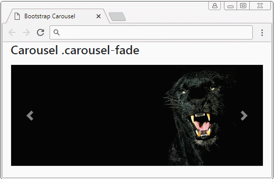
</html>5. Effect
Add .carousel-fade to Carousel, you will see fade effect when the Carousel transfers from this Slider to another Slider.
.carousel-fade
<div id="myCarousel" class="carousel carousel-fade slide border" data-ride="carousel">
   <div class="carousel-inner">
      <div class="carousel-item active">
         <img class="d-block w-100" src="../images/carousel-img-1.jpg" alt="Leopard">
      </div>
      <div class="carousel-item">
         <img class="d-block w-100" src="../images/carousel-img-2.jpg" alt="Cat">
      </div>
      <div class="carousel-item">
         <img class="d-block w-100" src="../images/carousel-img-3.jpg" alt="Lion">
      </div>
   </div>
   <!-- Controls -->
   <a class="carousel-control-prev" href="#myCarousel" role="button" data-slide="prev">
   <span class="carousel-control-prev-icon" aria-hidden="true"></span>
   <span class="sr-only">Previous</span>
   </a>
   <a class="carousel-control-next" href="#myCarousel" role="button" data-slide="next">
   <span class="carousel-control-next-icon" aria-hidden="true"></span>
   <span class="sr-only">Next</span>
   </a>
</div>Bootstrap Tutorials
- Bootstrap Jumbotron Tutorial with Examples
- Bootstrap Dropdowns Tutorial with Examples
- Bootstrap Alerts Tutorial with Examples
- Bootstrap Buttons Tutorial with Examples
- Bootstrap Button Group Tutorial with Examples
- Bootstrap Popovers (Tooltips) Tutorial with Examples
- Bootstrap Spinners Tutorial with Examples
- Introduction to Bootstrap
- Bootstrap Grid System Tutorial with Examples
- Bootstrap Cards Tutorial with Examples
- Bootstrap Containers Tutorial with Examples
- Bootstrap Nav Tab/Pill Tutorial with Examples
- Bootstrap NavBars Tutorial with Examples
- Bootstrap Tables Tutorial with Examples
- Bootstrap Modal Tutorial with Examples
- Bootstrap Forms Tutorial with Examples
- Bootstrap Pagination Tutorial with Examples
- Bootstrap Badges Tutorial with Examples
- Bootstrap Input Group Tutorial with Examples
- Bootstrap List Groups Tutorial with Examples
- Bootstrap ProgressBars Tutorial with Examples
- Bootstrap Collapse and Accordion Tutorial with Examples
- Bootstrap Scrollspy Tutorial with Examples
- Bootstrap Breadcrumb Tutorial with Examples
- Bootstrap Carousel Tutorial with Examples
- Bootstrap Spacing Utilities Tutorial with Examples
- Bootstrap Border Utilities Tutorial with Examples
- Bootstrap Color Utilities Tutorial with Examples
- Bootstrap Text Utilities Tutorial with Examples
- Bootstrap Sizing Utilities Tutorial with Examples
- Bootstrap Position Utilities Tutorial with Examples
- Bootstrap Flex Utilities Tutorial with Examples
- Bootstrap Display Utilities Tutorial with Examples
- Bootstrap Visibility Utilities Tutorial with Examples
- Bootstrap Embed Utilities Tutorial with Examples
Show More