Bootstrap Forms Tutorial with Examples
1. Overview of Bootstrap Form
For Layout, Bootstrap has 3 ways for laying out elements on interface.
- Use .form-group class to lay out elements vertically.
- Use .form-inline class to lay out elements horizontally.
- Place elements on Grid, and then the elements will be displayed according to the rules of the grid system of the Bootstrap.
.form-group

.form-inline

Grid
2. Vertical Form (.form-group)
To lay out elements vertically, you need to wrap them by a <div class="form-group"> tag. These elements will have width filling parent element.
Vertical Form (.form-group)
<form>

   <!-- Vertical -->
   <div class="form-group">
      <label for="myEmail">Email</label>
      <input type="email" id = "myEmail" class="form-control" placeholder="Email">
      <label for="myPassword">Password</label>
      <input type="password" id="myPassword" class="form-control" placeholder="Password">
      <button type="submit" class="btn btn-primary">Submit</button>
   </div>

</form>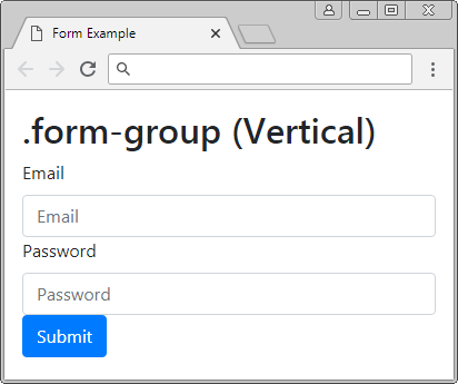
See the full example:
form-group-example.html
<!DOCTYPE html>
<html>
   <head>
      <meta charset="utf-8">
      <title>Form Example</title>
      <link rel="stylesheet" href="https://stackpath.bootstrapcdn.com/bootstrap/4.1.1/css/bootstrap.min.css">
   </head>
   <body>
      <div class="container-fluid mt-3">
         <h2>.form-group (Vertical)</h2>

         <form>
            <!-- Vertical -->
            <div class="form-group">
               <label for="myEmail">Email</label>
               <input type="email" id = "myEmail" class="form-control" placeholder="Email">
               <label for="myPassword">Password</label>
               <input type="password" id="myPassword" class="form-control" placeholder="Password">
               <button type="submit" class="btn btn-primary">Submit</button>
            </div>
         </form>

      </div>
      <script src="https://code.jquery.com/jquery-3.3.1.slim.min.js"></script>
      <script src="https://cdnjs.cloudflare.com/ajax/libs/popper.js/1.14.3/umd/popper.min.js"></script>
      <script src="https://stackpath.bootstrapcdn.com/bootstrap/4.1.1/js/bootstrap.min.js"></script>
   </body>
</html>
3. Horizontal Form (.form-inline) **
To lay out the elements to display on 1 line, you can wrap them by the <div class = "form-inline"> tag. However, they may be on different lines if parent element has too small width.
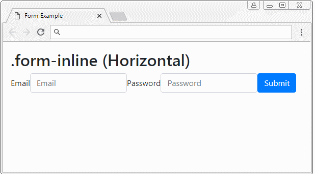
Horizontal Form (.form-inline)
<form>
   <!-- Horizontal -->
   <div class="form-inline">
      <label for="myEmail">Email</label>
      <input type="email" id="myEmail" class="form-control" placeholder="Email">
      <label for="myPassword">Password</label>
      <input type="password" id="myPassword" class="form-control" placeholder="Password">
      <button type="submit" class="btn btn-primary">Submit</button>
   </div>
</form>
4. Form Grid
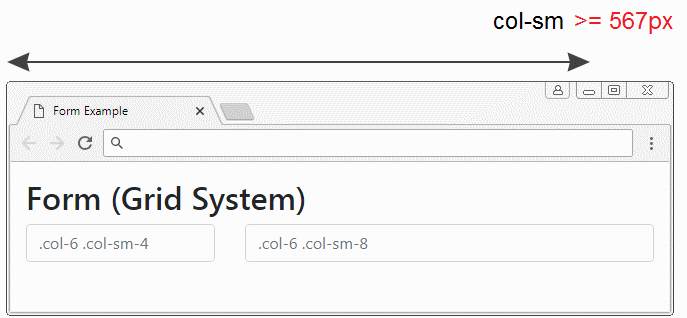
Grid System is a strong one to lay out elements on interface and you can fully use it to apply to Form.
Grid
Below is a example using the grid system to lay out elements on the interface. Note: the .row and .form-row classes work like each other, but you should use the .form-row to match context.
Grid example
<form>
<div class="row">
<div class="col-6 col-sm-4">
<input type="text" class="form-control" placeholder=".col-6 .col-sm-4">
</div>
<div class="col-6 col-sm-8">
<input type="text" class="form-control" placeholder=".col-6 .col-sm-8">
</div>
</div>
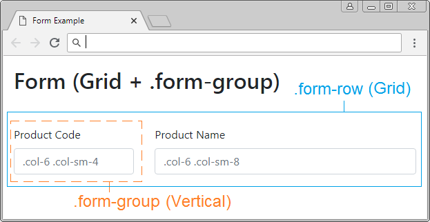
</form>Grid + .form-group
Example: combine Grid and .form-group class:
Grid + .form-group example
<form>
   <div class="form-row">
      <div class="col-6 col-sm-4 form-group">
         <label>Product Code</label>
         <input type="text" class="form-control" placeholder=".col-6 .col-sm-4">
      </div>
      <div class="col-6 col-sm-8 form-group">
         <label>Product Name</label>
         <input type="text" class="form-control" placeholder=".col-6 .col-sm-8">
      </div>
   </div>
</form>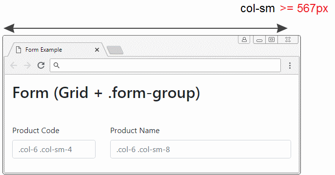
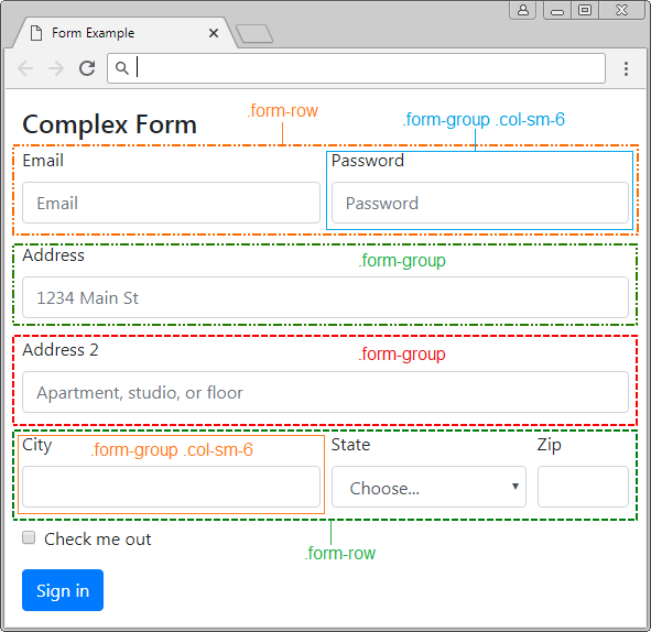
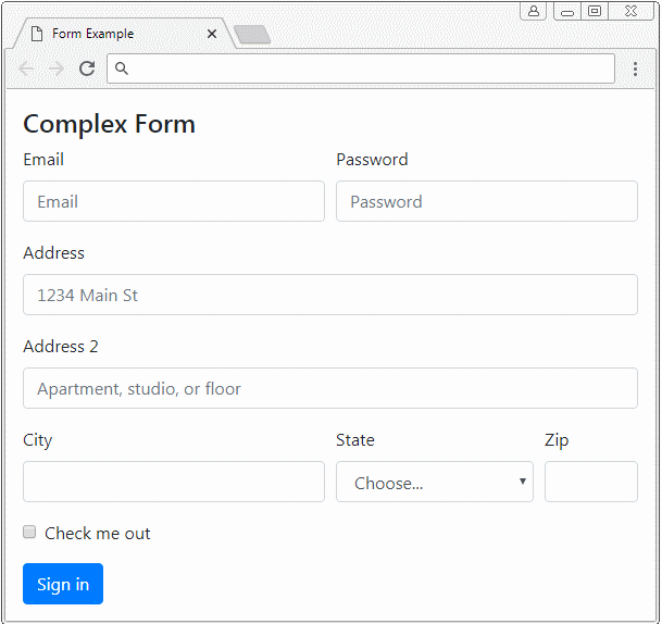
5. Example of complex Form
Combine .form-group, .form-row, .form-inline,.. classes to obtain a Form with complex layout.
complex-form-example.html
<!DOCTYPE html>
<html>
   <head>
      <meta charset="utf-8">
      <title>Form Example</title>
      <link rel="stylesheet" href="https://stackpath.bootstrapcdn.com/bootstrap/4.1.1/css/bootstrap.min.css">
   </head>
   <body>
      <div class="container-fluid mt-3">
         <h4 class="mb-2">Complex Form</h4>
         <form>
            <div class="form-row">
               <div class="form-group col-sm-6">
                  <label for="myEmail">Email</label>
                  <input type="email" class="form-control"
                     id="myEmail" placeholder="Email">
               </div>
               <div class="form-group col-sm-6">
                  <label for="myPassword">Password</label>
                  <input type="password" class="form-control"
                     id="myPassword" placeholder="Password">
               </div>
            </div>
            <div class="form-group">
               <label for="inputAddress">Address</label>
               <input type="text" class="form-control"
                  id="myAddress" placeholder="1234 Main St">
            </div>
            <div class="form-group">
               <label for="inputAddress2">Address 2</label>
               <input type="text" class="form-control"
                  id="myAddress2" placeholder="Apartment, studio, or floor">
            </div>
            <div class="form-row">
               <div class="form-group col-sm-6">
                  <label for="myCity">City</label>
                  <input type="text" class="form-control" id="myCity">
               </div>
               <div class="form-group col-sm-4">
                  <label for="myState">State</label>
                  <select id="myState" class="form-control">
                     <option selected>Choose...</option>
                     <option>...</option>
                  </select>
               </div>
               <div class="form-group col-sm-2">
                  <label for="myZip">Zip</label>
                  <input type="text" class="form-control" id="myZip">
               </div>
            </div>
            <div class="form-group">
               <div class="form-check">
                  <input class="form-check-input" type="checkbox" id="myCheck">
                  <label class="form-check-label" for="myCheck">
                  Check me out
                  </label>
               </div>
            </div>
            <button type="submit" class="btn btn-primary">Sign in</button>
         </form>
      </div>
      <script src="https://code.jquery.com/jquery-3.3.1.slim.min.js"></script>
      <script src="https://cdnjs.cloudflare.com/ajax/libs/popper.js/1.14.3/umd/popper.min.js"></script>
      <script src="https://stackpath.bootstrapcdn.com/bootstrap/4.1.1/js/bootstrap.min.js"></script>
   </body>
</html>
6. HTML Input Types
The <input> element is one of the components involved in a Form. Before HTML5, there are 9 <input> classes such as button, checkbox, file, hidden, image, password, radio, reset, submit, text. In October 2014, HTML5 was born. It introduces 12 other types of <input> such as color, date, datetime-local, email, month, number, range, search, tel, time, url, week. All these types are supported by Bootstrap and pre-created classes to apply:
Bootstrap Class | Type | Description |
.btn | button | Defines a clickable button |
.btn | reset | Defines a Reset button to reset the values of Form. |
.btn | submit | Defines submit button |
.form-check-input
.form-check-label | checkbox | Defines a heckbox. |
.form-check-input
.form-check-label | radio | Defines a radio button. |
.form-control | text | (Default type). Defines a field to enter a text line. |
.form-control | password | Defines a field to enter a password |
.form-control |  email email | Defines a field to enter an email address. |
.form-control | search | Defines a text field to enter a search keyword. |
.form-control | url | Defines a field to enter an URL. |
.form-control | tel | Defines a field to enter telephone number |
.form-control | number | Defines a field to enter a number |
.form-control | color | Defines a color picker |
.form-control-file | file | Defines a field displaying a selected file and a "Browse" button to choose the file. |
hidden | Defines a hiden field. | |
image | Defines an image such as a submit button. | |
.form-control-range | range | Defines a control to select a value in a range (Like slider) |
.form-control | date | Defines a control to select date, month (year, month, date excluding time) |
.form-control | time | Defines a control to select time (Excluding time zone) |
.form-control | datetime-local | Defines a control to select date, month, year and time (year, month, date, time, not including timezone)) |
.form-control | month | Defines a control to select month and year. |
.form-control | week | Defines a control to select week and year ( not including timezone). |
button, reset, submit
The <input type="button|reset|submit"> elements is actually a button. Bootstrap uses the .btn class to apply them. You can see in details in the lesson of Bootstrap Button.
text, password, email, search, url, tel, number
The <input> element with the above types is a field so that an user enter textual data. The Bootstrap uses the .form-control class to apply for these elements.
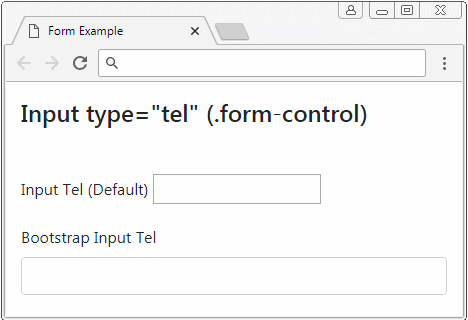
text, password, email, search, url, tel, number
<form>
   <div class="form-group">
      <label for="myTel1">Input Tel (Default)</label>
      <input type="tel" id="myTel1">
   </div>
   <div class="form-group">
      <label for="myTel2">Bootstrap Input Tel</label>
      <input type="tel" id="myTel2" class="form-control">
   </div>
</form>
color
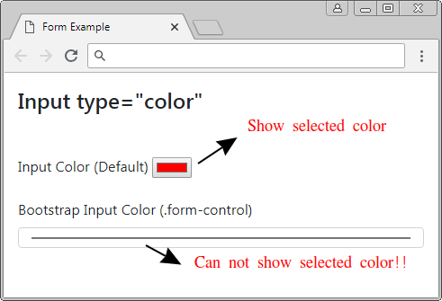
Bootstrap uses .form-control class to apply for <input type="color">. But it seems it doesn't work as well as expected (at least up to version 4.1).
For example, below are 2 <input type="color"> elements, an element is not applied .form-control class, and an element is applied .form-control class:
Below is an example of making a solution to remedy the foresaid problem:
input[type=color].form-control {
     height: 40px;
}
input-color-example.html
<!DOCTYPE html>
<html>
   <head>
      <meta charset="utf-8">
      <title>Form Example</title>
      <link rel="stylesheet" href="https://stackpath.bootstrapcdn.com/bootstrap/4.1.1/css/bootstrap.min.css">
      <style>
         input[type=color].form-control {
         height: 40px;
         }
      </style>
   </head>
   <body>
      <div class="container-fluid mt-3">
         <h4 class="mb-5">Input type="color"</h4>
         <form>
            <div class="form-group">
               <label for="myColor1">Input Color (Default)</label>
               <input type="color" id="myColor1">
            </div>
            <div class="form-group">
               <label for="myColor2">Bootstrap Input Color (.form-control)</label>
               <input type="color" class="form-control input-sm" id="myColor2">
            </div>
         </form>
      </div>
      <script src="https://code.jquery.com/jquery-3.3.1.slim.min.js"></script>
      <script src="https://cdnjs.cloudflare.com/ajax/libs/popper.js/1.14.3/umd/popper.min.js"></script>
      <script src="https://stackpath.bootstrapcdn.com/bootstrap/4.1.1/js/bootstrap.min.js"></script>
   </body>
</html>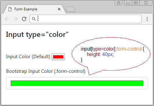
checkbox, radio
For Bootstrap, a full checkbox (or radio) component consists of 2 elements such as <input> and <label> wrapped by <div class="form-check">. Bootstrap uses the .form-check-input class to apply for <input>, and uses the .form-check-label class to apply for <label>.
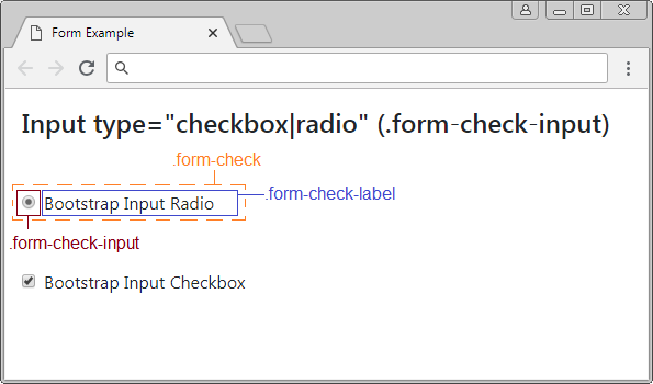
Note: The <label> has to be placed right in front of <input type="checkbox|radio">.
checkbox/radio
<form>
   <div class="form-group">
      <div class="form-check">
         <input type="radio" id="myRadio1" class="form-check-input">
         <label for="myRadio1">Bootstrap Input Radio</label>
      </div>
   </div>
   <div class="form-group">
      <div class="form-check">
         <input type="checkbox" id="myCheckbox2" class="form-check-input">
         <label for="myCheckbox2" class="form-check-label">Bootstrap Input Checkbox</label>
      </div>
   </div>
</form>
Apply the disabled attribute to the <input type="checkbox|radio"> element to disable it. Users will not be able to interact with this element and it also disables <label> elements in the same .form-check as the above <input>.
disabled checkbox/radio
<form>
   <div class="form-check">
      <input class="form-check-input" type="checkbox" value="" id="defaultCheck1">
      <label class="form-check-label" for="defaultCheck1">
      Default checkbox
      </label>
   </div>
   <div class="form-check">
      <input class="form-check-input" type="checkbox" value="" id="defaultCheck2" disabled>
      <label class="form-check-label" for="defaultCheck2"
      Disabled checkbox
      </label>
   </div>
</form>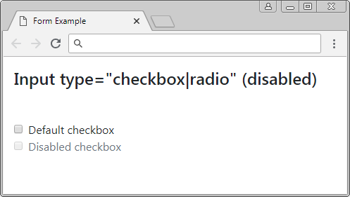
range
<input type="range"> is introduced in HTML from version 5. It allows users to select a value in the range. The Bootstrap uses the .form-control-range class to apply to this element.
Input range
<form>
   <div class="form-group">
      <label for="myRange1">Input Range (Default)</label>
      <input type="range" id="myRange1" min="5" max="10" step="0.01">
   </div>
   <div class="form-group">
      <label for="myRange2">Bootstrap Input Range</label>
      <input type="range" id="myRange2" min="5" max="10" step="0.01"
         class="form-control-range">
   </div>
</form>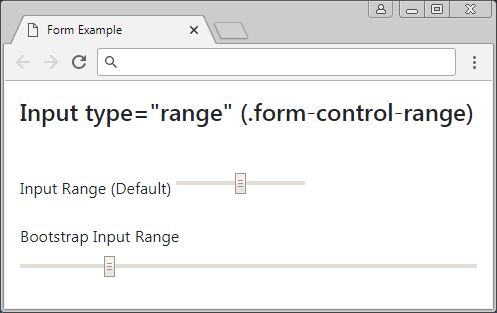
file
The <input type="file"> allows users to select a file to upload. The Bootstrap uses the .form-control-file class to apply to this elment.
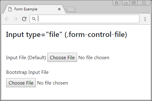
Form file
<form>
   <div class="form-group">
      <label for="myFile1">Input File (Default)</label>
      <input type="file" id="myFile1">
   </div>
   <div class="form-group">
      <label for="myFile2">Bootstrap Input File</label>
      <input type="file" class="form-control-file" id="myFile2">
   </div>
</form>
date, time, datetime-local, week, month
The HTML5 version is introduced some <input> types to allow users to enter the information related to date, month and time. The Bootstrap applies the .form-control class to these types.
Input Date
<!DOCTYPE html>
<html>
   <head>
      <meta charset="utf-8">
      <title>Form Example</title>
      <link rel="stylesheet" href="https://stackpath.bootstrapcdn.com/bootstrap/4.1.1/css/bootstrap.min.css">
   </head>
   <body>
      <div class="container-fluid mt-3">
         <h4 class="mb-5">Input type="date" (.form-control)</h4>
         <form>
            <div class="form-group">
               <label for="myDate1">Input Date (Default)</label>
               <input type="date" id="myDate1">
            </div>
            <div class="form-group">
               <label for="myDate2">Bootstrap Input Date</label>
               <input type="date" id="myDate2" class="form-control"
                  min="2018-01-01" max="2018-12-31" value="2018-05-18">
            </div>
         </form>
      </div>
      <script src="https://code.jquery.com/jquery-3.3.1.slim.min.js"></script>
      <script src="https://cdnjs.cloudflare.com/ajax/libs/popper.js/1.14.3/umd/popper.min.js"></script>
      <script src="https://stackpath.bootstrapcdn.com/bootstrap/4.1.1/js/bootstrap.min.js"></script>
   </body>
</html>
<input type="date">
Input Date
<div class="form-group">
   <label for="myDate2">Bootstrap Input Date</label>
   <input type="date" id="myDate2" class="form-control"
      min="2018-01-01" max="2018-12-31" value="2018-05-18">
</div>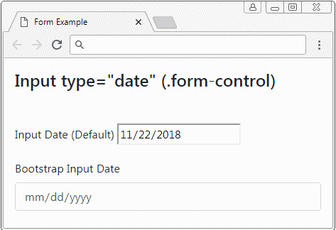
<input type="datetime-local">
Input Datetime-Local
<div class="form-group">
   <label for="myDateTimeLocal2">Bootstrap Input DateTimeLocal</label>
   <input type="datetime-local" id="myDateTimeLocal2" class="form-control"
      min="2018-06-07T00:00" max="2018-06-14T00:00" value="2018-06-08T14:02">
</div>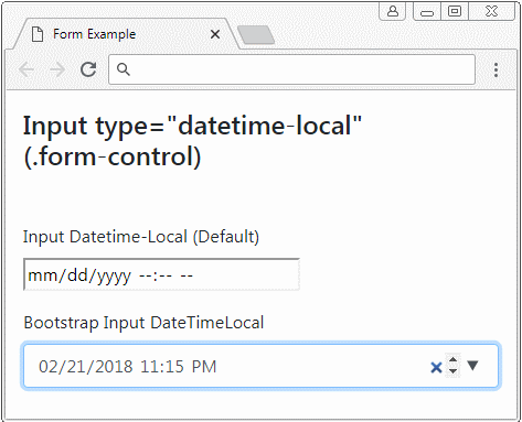
<input type="time">
Input Time
<div class="form-group">
   <label for="myTime2">Bootstrap Input Time</label>
   <input id="myTime2" class="form-control"
      type="time"
      min="9:00" max="18:00" value="13:07">
</div>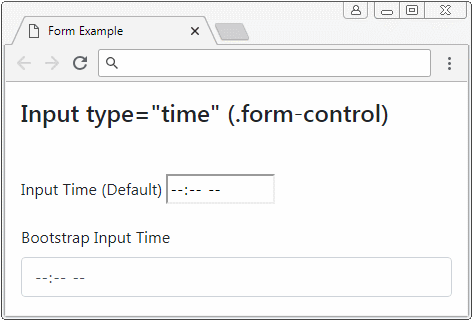
<input type="week">
Input Week
<div class="form-group">
   <label for="myWeek2">Bootstrap Input Week</label>
   <input id="myWeek2" class="form-control"
      type="week"
      min="2018-W27" max="2018-W35" value="2018-W30">
</div>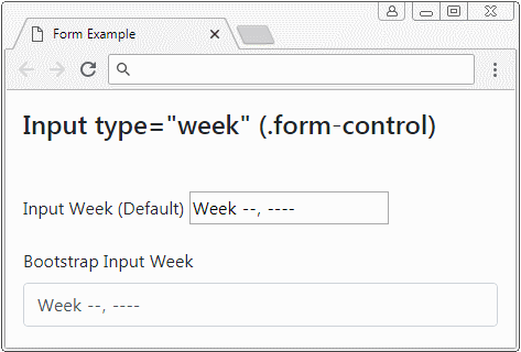
<input type="month">
Input Month
<div class="form-group">
   <label for="myMonth2">Bootstrap Input Month</label>
   <input id="myMonth2" class="form-control"
      type="month"
      min="2018-03" value="2018-05">
</div>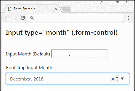
7. Form Textarea, Select
The <textarea> element is used to create an area to allow users to enter textual data on one or more lines. The Bootstrap applies the .form-control class to this element.
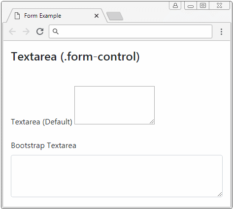
Textarea
<form>
   <div class="form-group">
      <label for="myTextarea1">Textarea (Default)</label>
      <textarea id="myTextarea1" rows="3">Line1<br>Line2</textarea>
   </div>
   <div class="form-group">
      <label for="myTextarea2">Bootstrap Textarea</label>
      <textarea id="myTextarea2" class="form-control" rows="3"></textarea>
   </div>
</form>
The <select> element is used to create a list of choices and users can select one or more of those one.
Form Select
<form>
   <div class="form-group">
      <label for="mySelect1">Select (Single Select)</label>
      <select id="mySelect1" class="form-control">
         <option value="js">Javascript</option>
         <option value="css">Css</option>
         <option value="bootstrap" selected>Bootstrap</option>
      </select>
   </div>
   <div class="form-group">
      <label for="mySelect2">Select (Multi Select)</label>
      <select id="mySelect2" class="form-control" multiple>
         <option value="js">Javascript</option>
         <option value="css">Css</option>
         <option value="bootstrap" selected>Bootstrap</option>
      </select>
   </div>
</form>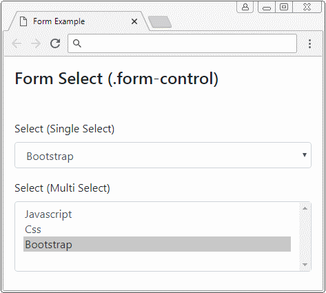
8. Disabled Form
Basically, you can use the disabled attribute for <input>,<texarea>,<select> to disable them. However, if you want to disable all these elements, please wrap them by <fieldset disabled>.
Note: The disabled attribute of <fieldset> doesn't probably operate with some browsers, for example, IE, version 11 or older. Therefore, you have to use customerized Javascript for these browsers.
fieldset disabled
<form>
   <fieldset disabled>
      <div class="form-group">
         <label for="myEmail">Email</label>
         <input type="email" id = "myEmail" class="form-control" placeholder="Email">
         <label for="myPassword">Password</label>
         <input type="password" id="myPassword" class="form-control" placeholder="Password">
         <button type="submit" class="btn btn-primary">Submit</button>
      </div>
   </fieldset>
</form>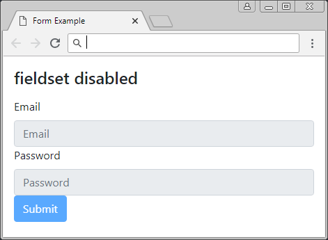
Bootstrap Tutorials
- Bootstrap Jumbotron Tutorial with Examples
- Bootstrap Dropdowns Tutorial with Examples
- Bootstrap Alerts Tutorial with Examples
- Bootstrap Buttons Tutorial with Examples
- Bootstrap Button Group Tutorial with Examples
- Bootstrap Popovers (Tooltips) Tutorial with Examples
- Bootstrap Spinners Tutorial with Examples
- Introduction to Bootstrap
- Bootstrap Grid System Tutorial with Examples
- Bootstrap Cards Tutorial with Examples
- Bootstrap Containers Tutorial with Examples
- Bootstrap Nav Tab/Pill Tutorial with Examples
- Bootstrap NavBars Tutorial with Examples
- Bootstrap Tables Tutorial with Examples
- Bootstrap Modal Tutorial with Examples
- Bootstrap Forms Tutorial with Examples
- Bootstrap Pagination Tutorial with Examples
- Bootstrap Badges Tutorial with Examples
- Bootstrap Input Group Tutorial with Examples
- Bootstrap List Groups Tutorial with Examples
- Bootstrap ProgressBars Tutorial with Examples
- Bootstrap Collapse and Accordion Tutorial with Examples
- Bootstrap Scrollspy Tutorial with Examples
- Bootstrap Breadcrumb Tutorial with Examples
- Bootstrap Carousel Tutorial with Examples
- Bootstrap Spacing Utilities Tutorial with Examples
- Bootstrap Border Utilities Tutorial with Examples
- Bootstrap Color Utilities Tutorial with Examples
- Bootstrap Text Utilities Tutorial with Examples
- Bootstrap Sizing Utilities Tutorial with Examples
- Bootstrap Position Utilities Tutorial with Examples
- Bootstrap Flex Utilities Tutorial with Examples
- Bootstrap Display Utilities Tutorial with Examples
- Bootstrap Visibility Utilities Tutorial with Examples
- Bootstrap Embed Utilities Tutorial with Examples
Show More