Bootstrap Buttons Tutorial with Examples
1. Bootstrap Button
Bootstrap has built in some Css classes to create a Button, with a few styles for different contextual purposes, including the main class: .btn, and some additional classes to set color, size, status ...
Simple Button
<button class="btn">Simple Button</button>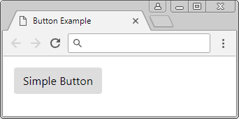
There are several additional Css classes to set up color for the Button, or make the Button display as a Link. You can use it in different contexts.
- btn-primary
- btn-secondary
- btn-success
- btn-danger
- btn-warning
- btn-info
- btn-light
- btn-dark
- btn-link
button-example.html
<!DOCTYPE html>
<html>
   <head>
      <meta charset="utf-8">
      <title>Button Example</title>
      <link rel="stylesheet" href="https://maxcdn.bootstrapcdn.com/bootstrap/4.0.0/css/bootstrap.min.css">
   </head>
   <body>

      <div class="container mt-3">
         <button class="btn btn-primary">Primary</button>
         <button class="btn btn-secondary">Secondary</button>
         <button class="btn btn-success">Success</button>
         <button class="btn btn-danger">Danger</button>
         <button class="btn btn-warning">Warning</button>
         <button class="btn btn-info">Info</button>
         <button class="btn btn-light">Light</button>
         <button class="btn btn-dark">Dark</button>
         <button class="btn btn-link">Link</button>
      </div>

      <script src="https://code.jquery.com/jquery-3.2.1.slim.min.js"></script>
      <script src="https://cdnjs.cloudflare.com/ajax/libs/popper.js/1.12.9/umd/popper.min.js"></script>
      <script src="https://maxcdn.bootstrapcdn.com/bootstrap/4.0.0/js/bootstrap.min.js"></script>
   </body>
</html>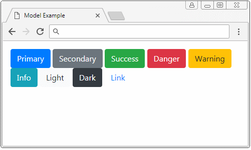
.btn, .btn- * classes are designed for <button> tags, however, you can also use them for <a>, <input>, <div>, <span> tags, although it may display slightly different for different browsers.
Note: If you want to create a Button with the tags other than <button> tags, you should use the role = "button" attribute. This attribute is useful hint for the device such as Screen Reader. (the screen reading device for the blind).
<a class="btn btn-primary m-1" href="#" role="button">Button (A tag)</a>
<button class="btn btn-primary m-1" type="submit">Button (Button tag)</button>
<div class="btn btn-primary m-1" role="button">Button (Div tag)</div>
<span class="btn btn-primary m-1" role="button">Button (Span tag)</span>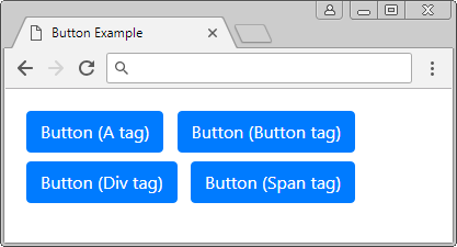
2. Outline buttons
In the Bootstrap, Button is defaulted to have background color. If you want to have a simple Button without background color, please use .btn-outline-* classes.
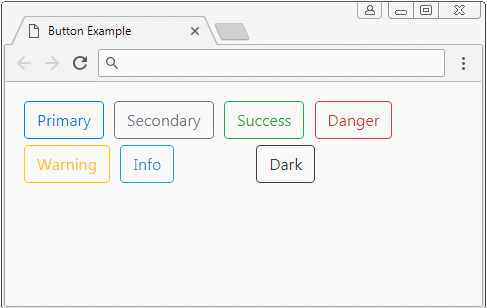
outline buttons
<button class="btn btn-outline-primary">Primary</button>
<button class="btn btn-outline-secondary">Secondary</button>
<button class="btn btn-outline-success">Success</button>
<button class="btn btn-outline-danger">Danger</button>
<button class="btn btn-outline-warning">Warning</button>
<button class="btn btn-outline-info">Info</button>
<button class="btn btn-outline-light">Light</button>
<button class="btn btn-outline-dark">Dark</button>
3. Size of Button
By default, the Buttons in the Bootstrap have a medium size. Use the. btn-sm class if you want to have a button with smaller size. Use the. btn-lg class if you want to have a Button with greater size.
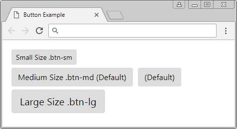
<button class="btn btn-sm">Small Size .btn-sm</button>
<button class="btn btn-md">Medium Size .btn-md (Default)</button>
<button class="btn">(Default)</button>
<button class="btn btn-lg">Large Size .btn-lg</button>
The .btn-block class helps the width of Button to fill the width of parent element.
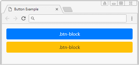
<button class="btn btn-primary btn-block">.btn-block</button>
<button class="btn btn-block btn-warning">.btn-block</button>
4. Active & disabled status
.active
Use the .active class to makea Button to have the status like it is active. For Bootstrap, a Button in "active" status will have darker color than it in normal status.
You can view the following figure to find the difference between a Button in active status and it in normal status:
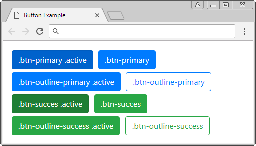
.active
<button class="btn btn-primary active">.btn-primary .active</button>
<button class="btn btn-primary">.btn-primary</button>
<br>
<button class="btn btn-outline-primary active">.btn-outline-primary .active</button>
<button class="btn btn-outline-primary">.btn-outline-primary</button>
<br>
<button class="btn btn-success active">.btn-succes .active</button>
<button class="btn btn-success">.btn-succes</button>
<br>
<button class="btn btn-outline-success active">.btn-outline-success .active</button>
<button class="btn btn-outline-success">.btn-outline-success</button>
.disabled
Using the .disabled class to disable a Button, an user will not be able to interact with this Button.
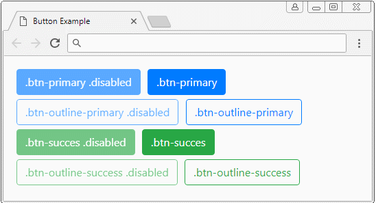
.disabled
<button class="btn btn-primary disabled">.btn-primary .disabled</button>
<button class="btn btn-primary">.btn-primary</button>
<br>
<button class="btn btn-outline-primary disabled">.btn-outline-primary .disabled</button>
<button class="btn btn-outline-primary">.btn-outline-primary</button>
<br>
<button class="btn btn-success disabled">.btn-succes .disabled</button>
<button class="btn btn-success">.btn-succes</button>
<br>
<button class="btn btn-outline-success disabled">.btn-outline-success .disabled</button>
<button class="btn btn-outline-success">.btn-outline-success</button>
Bootstrap Tutorials
- Bootstrap Jumbotron Tutorial with Examples
- Bootstrap Dropdowns Tutorial with Examples
- Bootstrap Alerts Tutorial with Examples
- Bootstrap Buttons Tutorial with Examples
- Bootstrap Button Group Tutorial with Examples
- Bootstrap Popovers (Tooltips) Tutorial with Examples
- Bootstrap Spinners Tutorial with Examples
- Introduction to Bootstrap
- Bootstrap Grid System Tutorial with Examples
- Bootstrap Cards Tutorial with Examples
- Bootstrap Containers Tutorial with Examples
- Bootstrap Nav Tab/Pill Tutorial with Examples
- Bootstrap NavBars Tutorial with Examples
- Bootstrap Tables Tutorial with Examples
- Bootstrap Modal Tutorial with Examples
- Bootstrap Forms Tutorial with Examples
- Bootstrap Pagination Tutorial with Examples
- Bootstrap Badges Tutorial with Examples
- Bootstrap Input Group Tutorial with Examples
- Bootstrap List Groups Tutorial with Examples
- Bootstrap ProgressBars Tutorial with Examples
- Bootstrap Collapse and Accordion Tutorial with Examples
- Bootstrap Scrollspy Tutorial with Examples
- Bootstrap Breadcrumb Tutorial with Examples
- Bootstrap Carousel Tutorial with Examples
- Bootstrap Spacing Utilities Tutorial with Examples
- Bootstrap Border Utilities Tutorial with Examples
- Bootstrap Color Utilities Tutorial with Examples
- Bootstrap Text Utilities Tutorial with Examples
- Bootstrap Sizing Utilities Tutorial with Examples
- Bootstrap Position Utilities Tutorial with Examples
- Bootstrap Flex Utilities Tutorial with Examples
- Bootstrap Display Utilities Tutorial with Examples
- Bootstrap Visibility Utilities Tutorial with Examples
- Bootstrap Embed Utilities Tutorial with Examples
Show More