Bootstrap Popovers (Tooltips) Tutorial with Examples
1. PopOver
PopOver is an interface component. It displays to annotate (or hint) a certain component on the interface. It's similar to the Tooltip concept in other libraries.
PopOver is a Javascript library developed by third party. It is integrated into the Bootstrap as a Plugin.
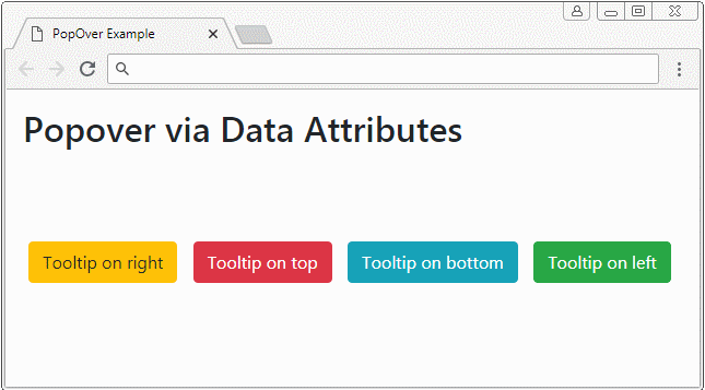
popover
<button type="button" class="btn btn-warning myPopover"
   data-toggle="popover"
   data-placement="right" title="Right Popover"
   data-content="Popover show on Right">Tooltip on right</button>

...

<script>
   $(function(){
      $(".myPopover").popover();
   });
</script>
popover-example.html
<!DOCTYPE html>
<html>
   <head>
      <meta charset="utf-8">
      <title>PopOver Example</title>
      <link rel="stylesheet" href="https://maxcdn.bootstrapcdn.com/bootstrap/4.0.0/css/bootstrap.min.css">
      <style>
         .btn {margin: 5px;}
      </style>
   </head>
   <body>
      <div class="container-fluid mt-3">
         <h2>Popover via Data Attributes</h2>
         <br><br><br>

         <button type="button" class="btn btn-warning myPopover"
            data-toggle="popover"
            data-placement="right" title="Right Popover"
            data-content="Popover show on Right">Tooltip on right</button>

         <button type="button" class="btn btn-danger myPopover"
            data-toggle="popover"
            data-placement="top" title="Top Popover"
            data-content="Popover show on top.">Tooltip on top</button>

         <button type="button" class="btn btn-info myPopover"
            data-toggle="popover"
            data-placement="bottom" title="Bottom Popover"
            data-content="Popover show on Bottom.">Tooltip on bottom</button>

         <button type="button" class="btn btn-success myPopover"
            data-toggle="popover"
            data-placement="left" title="Left Popover"
            data-content="Popover show on Left">Tooltip on left</button>

      </div>
      <script src="https://code.jquery.com/jquery-3.2.1.slim.min.js"></script>
      <script src="https://cdnjs.cloudflare.com/ajax/libs/popper.js/1.12.9/umd/popper.min.js"></script>
      <script src="https://maxcdn.bootstrapcdn.com/bootstrap/4.0.0/js/bootstrap.min.js"></script>

      <script>
         $(function(){
            $(".myPopover").popover();
         });
      </script>

   </body>
</html>
2. PopOver (Focus)
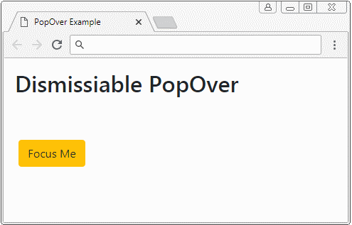
One of the behaviors of Popover is to show when an user "focuses" on the element that owns it. And it automatically hides when the user "focuses" on another element. For example, the user clicks on an element and the Popover of this element is displayed, when the user clicks on another place, the Popover will automatically hides. This is achieved by setting the data-trigger = "focus" attribute for the element.
<button type="button"
   class="btn btn-warning myPopover"
   data-toggle="popover"
   data-placement="right" title="Dismissiabe Popover"
   data-trigger="focus"
   data-content="I display when the button is focused!">Focus Me</button>

<script>
   $('.myPopover').popover();
</script>
See the full example:
dismissiable-popover-example.html
<!DOCTYPE html>
<html>
   <head>
      <meta charset="utf-8">
      <title>PopOver Example</title>
      <link rel="stylesheet" href="https://maxcdn.bootstrapcdn.com/bootstrap/4.0.0/css/bootstrap.min.css">
      <style>
         .btn {margin: 5px;}
      </style>
   </head>
   <body>
      <div class="container-fluid mt-3">
         <h2>Dismissiable PopOver</h2>
         <br><br>

         <button type="button"
            class="btn btn-warning myPopover"
            data-toggle="popover"
            data-placement="right" title="Dismissiabe Popover"
            data-trigger="focus"
            data-content="I display when the button is focused!">Focus Me</button>

      </div>

      <script src="https://code.jquery.com/jquery-3.2.1.slim.min.js"></script>
      <script src="https://cdnjs.cloudflare.com/ajax/libs/popper.js/1.12.9/umd/popper.min.js"></script>
      <script src="https://maxcdn.bootstrapcdn.com/bootstrap/4.0.0/js/bootstrap.min.js"></script>

      <script>
          $('.myPopover').popover();
      </script>

   </body>
</html>
3. Popover (Hover)
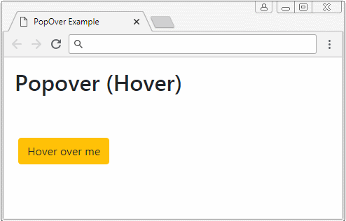
By setting up the data-trigger = "hower" attribute, when the cursor moves over the element, Popover is displayed, and when the cursor leaves the element the Popover will be hidden.
<button type="button"
   class="btn btn-warning myPopover"
   data-toggle="popover"
   data-placement="right" title="Hover Popover"
   data-trigger="hover"
   data-content="I display when pointer over the element">Hower over Me</button>


<script>
   $('.myPopover').popover();
</script>
Full example:
hover-popover-example.html
<!DOCTYPE html>
<html>
   <head>
      <meta charset="utf-8">
      <title>PopOver Example</title>
      <link rel="stylesheet" href="https://maxcdn.bootstrapcdn.com/bootstrap/4.0.0/css/bootstrap.min.css">
      <style>
         .btn {margin: 5px;}
      </style>
   </head>
   <body>
      <div class="container-fluid mt-3">
         <h2>Popover (Hover)</h2>
         <br><br>

         <button type="button"
            class="btn btn-warning myPopover"
            data-toggle="popover"
            data-placement="right" title="Hover Popover"
            data-trigger="hover"
            data-content="I display when pointer over the element">Hover over me</button>

      </div>

      <script src="https://code.jquery.com/jquery-3.2.1.slim.min.js"></script>
      <script src="https://cdnjs.cloudflare.com/ajax/libs/popper.js/1.12.9/umd/popper.min.js"></script>
      <script src="https://maxcdn.bootstrapcdn.com/bootstrap/4.0.0/js/bootstrap.min.js"></script>

      <script>
          $('.myPopover').popover();
      </script>

   </body>
</html>
4. Popover with the HTML content
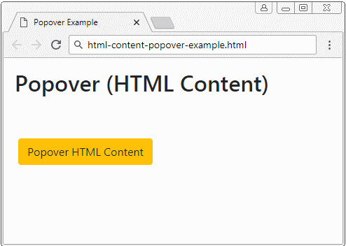
By default, the Popover displays text content, although capably, the content provided by you is HTML. Because jQuery has converted HTML to Text before displaying (the text method has been called to convert the HTML into Text). Therefore, you need to add the data-html = true attribute to tell the Popover plugin that it should display the content in HTML form.
Popover with HTML Content
<button type="button"
   class="btn btn-warning myPopover"
   data-toggle="popover"
   data-placement="right" title="Popover with HTML content"
   data-trigger="hover"
   data-html="true"
   data-content="This is <b style='color:red;'>Simple</b> HTML Content.">Popover HTML Content</button>

<script>
   $('.myPopover').popover();
</script>
If you want to have a Popover with long HTML content, below is a better example:
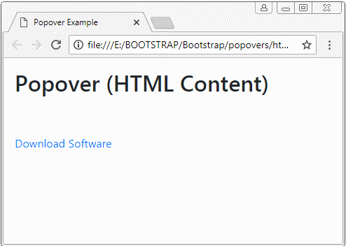
html-content-popover-example2.html
<!DOCTYPE html>
<html>
   <head>
      <meta charset="utf-8">
      <title>Popover Example</title>
      <link rel="stylesheet" href="https://maxcdn.bootstrapcdn.com/bootstrap/4.0.0/css/bootstrap.min.css">
      <style>
         .btn {margin: 5px;}
      </style>
   </head>
   <body>
      <div class="container-fluid mt-3">
         <h2>Popover (HTML Content)</h2>
         <br><br>
         <a href="#"
            class="myPopover"
            data-toggle="popover"
            data-placement="right" title="Quick guide"
            data-trigger="hover"
            data-html="true"
            data-popover-content="#myPopoverContent">Download Software</a>

         <!-- Content for Popover: -->
         <div id="myPopoverContent" style="display:none">
            <strong>Steps to do..</strong>
            <ol style="padding:10px">
               <li>Download this file</li>
               <li>Install the software</li>
               <li>Restart your computer</li>
            </ol>
         </div>

      </div>

      <script src="https://code.jquery.com/jquery-3.2.1.slim.min.js"></script>
      <script src="https://cdnjs.cloudflare.com/ajax/libs/popper.js/1.12.9/umd/popper.min.js"></script>
      <script src="https://maxcdn.bootstrapcdn.com/bootstrap/4.0.0/js/bootstrap.min.js"></script>

      <script>
         $('.myPopover').popover({
         html : true,
         content: function() {
          var elementId = $(this).attr("data-popover-content");
          return $(elementId).html();
         }
         });
      </script>
   </body>
</html>
Bootstrap Tutorials
- Bootstrap Jumbotron Tutorial with Examples
- Bootstrap Dropdowns Tutorial with Examples
- Bootstrap Alerts Tutorial with Examples
- Bootstrap Buttons Tutorial with Examples
- Bootstrap Button Group Tutorial with Examples
- Bootstrap Popovers (Tooltips) Tutorial with Examples
- Bootstrap Spinners Tutorial with Examples
- Introduction to Bootstrap
- Bootstrap Grid System Tutorial with Examples
- Bootstrap Cards Tutorial with Examples
- Bootstrap Containers Tutorial with Examples
- Bootstrap Nav Tab/Pill Tutorial with Examples
- Bootstrap NavBars Tutorial with Examples
- Bootstrap Tables Tutorial with Examples
- Bootstrap Modal Tutorial with Examples
- Bootstrap Forms Tutorial with Examples
- Bootstrap Pagination Tutorial with Examples
- Bootstrap Badges Tutorial with Examples
- Bootstrap Input Group Tutorial with Examples
- Bootstrap List Groups Tutorial with Examples
- Bootstrap ProgressBars Tutorial with Examples
- Bootstrap Collapse and Accordion Tutorial with Examples
- Bootstrap Scrollspy Tutorial with Examples
- Bootstrap Breadcrumb Tutorial with Examples
- Bootstrap Carousel Tutorial with Examples
- Bootstrap Spacing Utilities Tutorial with Examples
- Bootstrap Border Utilities Tutorial with Examples
- Bootstrap Color Utilities Tutorial with Examples
- Bootstrap Text Utilities Tutorial with Examples
- Bootstrap Sizing Utilities Tutorial with Examples
- Bootstrap Position Utilities Tutorial with Examples
- Bootstrap Flex Utilities Tutorial with Examples
- Bootstrap Display Utilities Tutorial with Examples
- Bootstrap Visibility Utilities Tutorial with Examples
- Bootstrap Embed Utilities Tutorial with Examples
Show More