Bootstrap ProgressBars Tutorial with Examples
1. Progress Bar
Progress Bar is a visual interface component that describes the progress of a work, for example, download progress, installation progress. The Progress Bar allows the user to know the percentage of completion, and estimate the time when the work will be completed.
Bootstrap provides a few classes for you to build a Progress Bar.
- .progress-bar: This class is used for the element denoting current work progress.
- .progress: This class is used for the element wraping the .progress-bar element, which denotes the maximum value of progress bar.
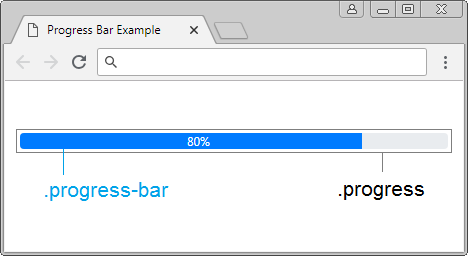
<div class="progress">

   <div class="progress-bar"
      role="progressbar"
      aria-valuenow="80"
      aria-valuemin="0" aria-valuemax="100"
      style="width:80%">
      80%
   </div>

</div>
Explanation about code:
Thuộc tính (Attribute) | Description |
aria-valuemin aria-valuemax aria-valuenow | The minimum value, maximum value and current value of progress. These attributes do not serve as displaying the length of progress-bar which you see on the interface. But these attributes allow you to get values through Javascript. |
style="width:80%" | This is the way for displaying the length (percentage) of progress-bar which you see on the interface. |
Look at full example:
progressbar-example.html
<!DOCTYPE html>
<html>
   <head>
      <meta charset="utf-8">
      <title>Progress Bar Example</title>
      <link rel="stylesheet" href="https://stackpath.bootstrapcdn.com/bootstrap/4.1.1/css/bootstrap.min.css">
   </head>
   <body>
      <div class="container mt-3">
         <h4>Progress Bar:</h4>

         <div class="progress">
            <div class="progress-bar" role="progressbar"
               aria-valuenow="80"
               aria-valuemin="0" aria-valuemax="100"
               style="width:80%">
               80%
            </div>
         </div>

      </div>

      <script src="https://code.jquery.com/jquery-3.3.1.slim.min.js"></script>
      <script src="https://cdnjs.cloudflare.com/ajax/libs/popper.js/1.14.3/umd/popper.min.js"></script>
      <script src="https://stackpath.bootstrapcdn.com/bootstrap/4.1.1/js/bootstrap.min.js"></script>
   </body>
</html>
Colors:
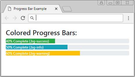
You can apply background color to the Progress-bar. Below is the list of predefined background colors of the Bootstrap.
- bg-primary
- bg-secondary
- bg-success
- bg-danger
- bg-warning
- bg-info
- bg-light
- bg-dark
- bg-muted
- bg-white
colored-progressbar-example.html
<!DOCTYPE html>
<html>
   <head>
      <meta charset="utf-8">
      <title>Progress Bar Example</title>
      <link rel="stylesheet" href="https://stackpath.bootstrapcdn.com/bootstrap/4.1.1/css/bootstrap.min.css">
      <style>
      .progress {
         margin: 5px 0px;
      }
      </style>
   </head>
   <body>
      <div class="container mt-3">
         <h4>Colored Progress Bars:</h4>

         <div class="progress">
            <div class="progress-bar bg-success text-left"
               role="progressbar" aria-valuenow="40" aria-valuemin="0" aria-valuemax="100" style="width:40%">
               40% Complete (.bg-success)
            </div>
         </div>

         <div class="progress">
            <div class="progress-bar bg-info text-left"
               role="progressbar" aria-valuenow="50" aria-valuemin="0" aria-valuemax="100" style="width:50%">
               50% Complete (.bg-info)
            </div>
         </div>

         <div class="progress">
            <div class="progress-bar bg-warning text-left"
               role="progressbar" aria-valuenow="60" aria-valuemin="0" aria-valuemax="100" style="width:60%">
               60% Complete (.bg-warning)
            </div>
         </div>

      </div>

      <script src="https://code.jquery.com/jquery-3.3.1.slim.min.js"></script>
      <script src="https://cdnjs.cloudflare.com/ajax/libs/popper.js/1.14.3/umd/popper.min.js"></script>
      <script src="https://stackpath.bootstrapcdn.com/bootstrap/4.1.1/js/bootstrap.min.js"></script>

   </body>
</html>
Height:
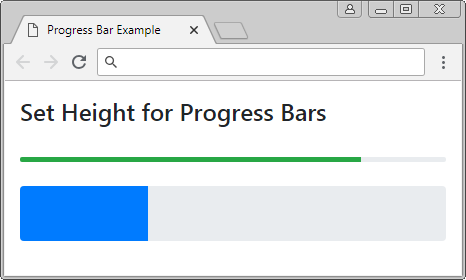
You need to set up only the height of .progress, all inner .progress-bar will also be automatically changed height.
Set Height for Progress
<div class="progress" style="height:5px;">
   <div class="progress-bar bg-success" role="progressbar"
      aria-valuenow="80"
      aria-valuemin="0" aria-valuemax="100"
      style="width:80%">
   </div>
</div>

<br>

<div class="progress" style="height:55px;">
   <div class="progress-bar" role="progressbar"
      aria-valuenow="30"
      aria-valuemin="0" aria-valuemax="100"
      style="width:30%">
   </div>
</div>
2. Striped Progress Bar
Use the .striped-progress-bar class with the .progress-bar, you will get a progress bar with stripes
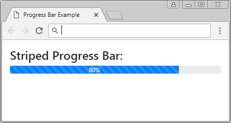
Striped Progress Bar
<div class="progress">

   <div class="progress-bar progress-bar-striped" role="progressbar"
      aria-valuenow="80"
      aria-valuemin="0" aria-valuemax="100"
      style="width:80%">
      80%
   </div>

</div>
Combine the .progress-bar-striped class & .progress-bar-animated class, you can create a progress bar with animation effect.
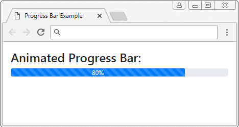
Animated Progress Bar
<div class="progress">

   <div class="progress-bar progress-bar-striped progress-bar-animated"
      role="progressbar"
      aria-valuenow="80"
      aria-valuemin="0" aria-valuemax="100"
      style="width:80%">
      80%
   </div>

</div>
3. Stacked Progress Bar
Progress-bars can also be stacked each other, which is similar to the following illustration.
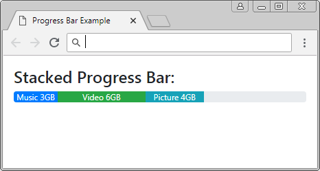
Stacked Progress Bar
<div class="progress">

   <div class="progress-bar" role="progressbar" style="width: 15%"
      aria-valuenow="15" aria-valuemin="0" aria-valuemax="100">
      Music 3GB
   </div>

   <div class="progress-bar bg-success" role="progressbar" style="width: 30%"
      aria-valuenow="30" aria-valuemin="0" aria-valuemax="100">
      Video 6GB
   </div>

   <div class="progress-bar bg-info" role="progressbar" style="width: 20%"
      aria-valuenow="20" aria-valuemin="0" aria-valuemax="100">
      Picture 4GB
   </div>

</div>
Bootstrap Tutorials
- Bootstrap Jumbotron Tutorial with Examples
- Bootstrap Dropdowns Tutorial with Examples
- Bootstrap Alerts Tutorial with Examples
- Bootstrap Buttons Tutorial with Examples
- Bootstrap Button Group Tutorial with Examples
- Bootstrap Popovers (Tooltips) Tutorial with Examples
- Bootstrap Spinners Tutorial with Examples
- Introduction to Bootstrap
- Bootstrap Grid System Tutorial with Examples
- Bootstrap Cards Tutorial with Examples
- Bootstrap Containers Tutorial with Examples
- Bootstrap Nav Tab/Pill Tutorial with Examples
- Bootstrap NavBars Tutorial with Examples
- Bootstrap Tables Tutorial with Examples
- Bootstrap Modal Tutorial with Examples
- Bootstrap Forms Tutorial with Examples
- Bootstrap Pagination Tutorial with Examples
- Bootstrap Badges Tutorial with Examples
- Bootstrap Input Group Tutorial with Examples
- Bootstrap List Groups Tutorial with Examples
- Bootstrap ProgressBars Tutorial with Examples
- Bootstrap Collapse and Accordion Tutorial with Examples
- Bootstrap Scrollspy Tutorial with Examples
- Bootstrap Breadcrumb Tutorial with Examples
- Bootstrap Carousel Tutorial with Examples
- Bootstrap Spacing Utilities Tutorial with Examples
- Bootstrap Border Utilities Tutorial with Examples
- Bootstrap Color Utilities Tutorial with Examples
- Bootstrap Text Utilities Tutorial with Examples
- Bootstrap Sizing Utilities Tutorial with Examples
- Bootstrap Position Utilities Tutorial with Examples
- Bootstrap Flex Utilities Tutorial with Examples
- Bootstrap Display Utilities Tutorial with Examples
- Bootstrap Visibility Utilities Tutorial with Examples
- Bootstrap Embed Utilities Tutorial with Examples
Show More