Bootstrap Grid System Tutorial with Examples
1. Grid System
Grid System is one of the most important concept of Bootstrap. It gives you the way how to arrange components on an interface and for your website to be able to be compatible with different devices.
Our first confirmation is that the Grid System of the Bootstrap has many rows but they have 12 fixed columns. On the cells, you can put interface components. For example, the following is a surface. It is divided into cells:
span 1 | span 1 | span 1 | span 1 | span 1 | span 1 | span 1 | span 1 | span 1 | span 1 | span 1 | span 1 |
span 4 | span 4 | span 4 | |||||||||
span 4 | span 8 | ||||||||||
span 6 | span 6 | ||||||||||
span 12 | |||||||||||
Bootstrap4 has 5 different Css-classes:
Css Class Prefix | Description |
.col- | For Extra Small equipment with the width of less than 576px |
.col-sm- | For Small equipment with the width of more than or equal to 567px. |
.col-md- | For Medium equipment with the width of more than or equal to 768px |
.col-lg- | For Large equipment with the width of more than or equal to 992px |
.col-xl- | For Extra Large equipment with the width of more than or equal to 1200px. |
Examples are the best way for explaining the operating principle of the Grid System in the Bootstrap.
col-sm-*
sm: stands for"Small". It refers to the devices with small screens and their width of more than or equal to 567px. (For the devices with screen width of smaller than 567px, which is called extra small.)
col-sm-example.html
<!DOCTYPE html>
<html>
   <head>
      <meta charset="utf-8">
      <title>Grid Example</title>
      <link rel="stylesheet" href="https://maxcdn.bootstrapcdn.com/bootstrap/4.0.0/css/bootstrap.min.css">
   </head>
   <body>
      <div class= "container-fluid">
         <div class= "row">
            <div class ="col-sm-3 bg-primary">
               <p>col-sm-3</p>
            </div>
            <div class ="col-sm-9 bg-success">
               <p>col-sm-9</p>
            </div>
         </div>
      </div>

      <script src="https://code.jquery.com/jquery-3.2.1.slim.min.js"></script>
      <script src="https://cdnjs.cloudflare.com/ajax/libs/popper.js/1.12.9/umd/popper.min.js"></script>
      <script src="https://maxcdn.bootstrapcdn.com/bootstrap/4.0.0/js/bootstrap.min.js"></script>
   </body>
</html>
Run the above example and observe:
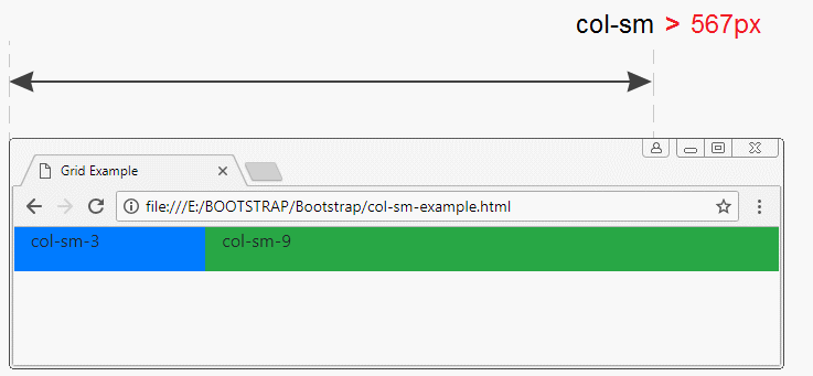
If ".container" is >= 567px wide, ".col-sm-*" elements will be in a row, and they fill the width of the .container. But when the width of the .container is less than 567px, ".col-sm-*" elements will be on different rows, they still fill the width of the .container. We conclude that 567px is a special value of the ".col-sm-*"elements:
col-md-*
md: Stands for "Medium". It refers to the devices with medium screen width of more than or equal to 768px, which is the size of tablets.
col-md-example.js
<!DOCTYPE html>
<html>
   <head>
      <meta charset="utf-8">
      <title>Grid Example</title>
      <link rel="stylesheet" href="https://maxcdn.bootstrapcdn.com/bootstrap/4.0.0/css/bootstrap.min.css">
   </head>
   <body>
      <div class= "container-fluid">
         <div class= "row">
            <div class ="col-md-2 bg-primary">
              <p>col-md-2</p>
            </div>
            <div class ="col-md-3 bg-secondary">
               <p>col-md-3</p>
            </div>
            <div class ="col-md-7 bg-success">
               <p>col-md-7</p>
            </div>
         </div>
      </div>

      <script src="https://code.jquery.com/jquery-3.2.1.slim.min.js"></script>
      <script src="https://cdnjs.cloudflare.com/ajax/libs/popper.js/1.12.9/umd/popper.min.js"></script>
      <script src="https://maxcdn.bootstrapcdn.com/bootstrap/4.0.0/js/bootstrap.min.js"></script>
   </body>
</html>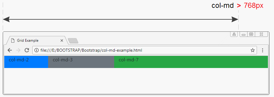
The 768px value is special for ".col-md-*" elements.
col-lg-*, col-xl-*
lg: stands for "Large", referring to the devices with screen width of larger than or equal to 992px.
xl: stands for "Extra Large", referreing to the devices with screen width of more than or equal to 1200px.
xl: stands for "Extra Large", referreing to the devices with screen width of more than or equal to 1200px.
The operating principle of ".col-lg-*"& ".col-xl-*" is also similar to ".col-sm-*", ".col-md-*".
col-*
The devices that have the screen width of less than 567px, are referred to as extra small.
col-example.html
<!DOCTYPE html>
<html>
   <head>
      <meta charset="utf-8">
      <title>Grid Example</title>
      <link rel="stylesheet" href="https://maxcdn.bootstrapcdn.com/bootstrap/4.0.0/css/bootstrap.min.css">
   </head>
   <body>
      <div class= "container-fluid">
         <div class= "row">
            <div class ="col-2 bg-primary">
              <p>col-2</p>
            </div>
            <div class ="col-3 bg-secondary">
               <p>col-3</p>
            </div>
            <div class ="col-7 bg-success">
               <p>col-7</p>
            </div>
         </div>
      </div>

      <script src="https://code.jquery.com/jquery-3.2.1.slim.min.js"></script>
      <script src="https://cdnjs.cloudflare.com/ajax/libs/popper.js/1.12.9/umd/popper.min.js"></script>
      <script src="https://maxcdn.bootstrapcdn.com/bootstrap/4.0.0/js/bootstrap.min.js"></script>
   </body>
</html>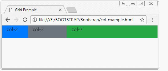
The ".col-*" elements are still on a row although you make the width of ".container" reduce. However, you can not make the width of ".container" less than 320px.
2. Combine: col-sm-*,col-md-*, ..
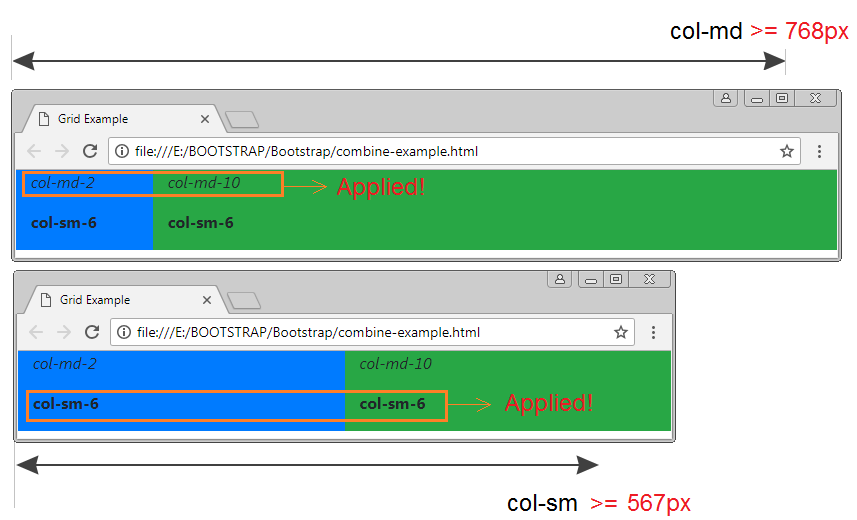
An element can be used to combine col-*, col-sm-* , col-md-*classes...with each other. The following example shows you the way how the Bootstrap applies such classes.
combine-example.html
<!DOCTYPE html>
<html>
   <head>
      <meta charset="utf-8">
      <title>Grid Example</title>
      <link rel="stylesheet" href="https://maxcdn.bootstrapcdn.com/bootstrap/4.0.0/css/bootstrap.min.css">
   </head>
   <body>
      <div class= "container-fluid">
         <div class= "row">
            <div class ="col-md-2 col-sm-6 bg-primary">
              <p style="font-style:italic;">col-md-2</p>
              <p style="font-weight:bold;">col-sm-6</p>
            </div>
            <div class ="col-md-10 col-sm-6 bg-success">
               <p style="font-style:italic;">col-md-10</p>
               <p style="font-weight:bold;">col-sm-6</p>
            </div>
         </div>
      </div>

      <script src="https://code.jquery.com/jquery-3.2.1.slim.min.js"></script>
      <script src="https://cdnjs.cloudflare.com/ajax/libs/popper.js/1.12.9/umd/popper.min.js"></script>
      <script src="https://maxcdn.bootstrapcdn.com/bootstrap/4.0.0/js/bootstrap.min.js"></script>
   </body>
</html>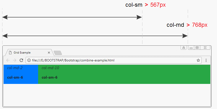
3. col, col-sm,.. col-auto, col-sm-auto,..
col, col-sm, col-md, col-lg, col-xl
The above examples show you how to use col-*, col-sm-*, col-md-*, col-lg-*, col-xl-* classes (specify width). The following example is the way of using the col, col-sm, col-md, col-lg, col-xl classes (Do not specify width):
equal-width-example.html
<!DOCTYPE html>
<html>
   <head>
      <meta charset="utf-8">
      <title>Grid Example</title>
      <link rel="stylesheet" href="https://maxcdn.bootstrapcdn.com/bootstrap/4.0.0/css/bootstrap.min.css">
   </head>
   <body>
      <div class= "container-fluid">
         <div class= "row">
            <div class ="col bg-primary">
              <p>col</p>
            </div>
            <div class ="col bg-secondary">
               <p>col</p>
            </div>
            <div class ="col bg-success">
               <p>col</p>
            </div>
         </div>

         <hr>

         <div class= "row">
            <div class ="col bg-primary">
              <p>col</p>
            </div>
            <div class ="col bg-secondary">
               <p>col</p>
            </div>
            <div class ="col-2 bg-success">
               <p>col-2</p>
            </div>
         </div>
      </div>

      <script src="https://code.jquery.com/jquery-3.2.1.slim.min.js"></script>
      <script src="https://cdnjs.cloudflare.com/ajax/libs/popper.js/1.12.9/umd/popper.min.js"></script>
      <script src="https://maxcdn.bootstrapcdn.com/bootstrap/4.0.0/js/bootstrap.min.js"></script>
   </body>
</html>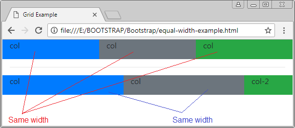
col-auto, col-sm-auto, col-md-auto, col-lg-auto, col-xl-auto
The elements using *-auto will have automatic width based on their length.
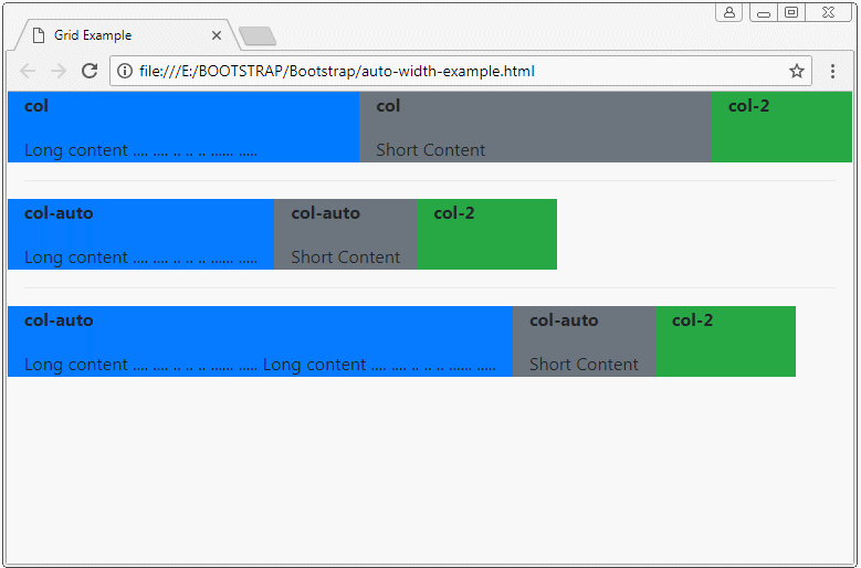
auto-column-example.html
<!DOCTYPE html>
<html>
   <head>
      <meta charset="utf-8">
      <title>Grid Example</title>
      <link rel="stylesheet" href="https://maxcdn.bootstrapcdn.com/bootstrap/4.0.0/css/bootstrap.min.css">
      <style>
         p  {
           font-weight: bold;
         }
      </style>
   </head>
   <body>
      <div class= "container-fluid">

        <div class= "row">
           <div class ="col bg-primary">
             <p>col</p>
             Long content .... .... .. .. .. ...... .....
           </div>
           <div class ="col bg-secondary">
              <p>col</p>
              Short Content
           </div>
           <div class ="col-2 bg-success">
              <p>col-2</p>
           </div>
        </div>

        <hr>

        <div class= "row">
           <div class ="col-auto bg-primary">
             <p>col-auto</p>
             Long content .... .... .. .. .. ...... .....
           </div>
           <div class ="col-auto bg-secondary">
              <p>col-auto</p>
              Short Content
           </div>
           <div class ="col-2 bg-success">
              <p>col-2</p>
           </div>
        </div>

        <hr>

         <div class= "row">
            <div class ="col-auto bg-primary">
              <p>col-auto</p>
              Long content .... .... .. .. .. ...... ..... Long content .... .... .. .. .. ...... .....
            </div>
            <div class ="col-auto bg-secondary">
               <p>col-auto</p>
               Short Content
            </div>
            <div class ="col-2 bg-success">
               <p>col-2</p>
            </div>
         </div>

      </div>

      <script src="https://code.jquery.com/jquery-3.2.1.slim.min.js"></script>
      <script src="https://cdnjs.cloudflare.com/ajax/libs/popper.js/1.12.9/umd/popper.min.js"></script>
      <script src="https://maxcdn.bootstrapcdn.com/bootstrap/4.0.0/js/bootstrap.min.js"></script>
   </body>

</html>
col-sm-auto
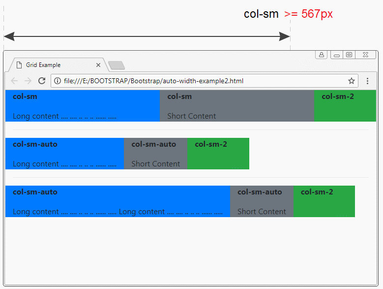
auto-width-example2.html
<!DOCTYPE html>
<html>
   <head>
      <meta charset="utf-8">
      <title>Grid Example</title>
      <link rel="stylesheet" href="https://maxcdn.bootstrapcdn.com/bootstrap/4.0.0/css/bootstrap.min.css">
      <style>
         p  {
           font-weight: bold;
         }
      </style>
   </head>
   <body>
      <div class= "container-fluid">

        <div class= "row">
           <div class ="col-sm bg-primary">
             <p>col-sm</p>
             Long content .... .... .. .. .. ...... .....
           </div>
           <div class ="col-sm bg-secondary">
              <p>col-sm</p>
              Short Content
           </div>
           <div class ="col-sm-2 bg-success">
              <p>col-sm-2</p>
           </div>
        </div>

        <hr>

        <div class= "row">
           <div class ="col-sm-auto bg-primary">
             <p>col-sm-auto</p>
             Long content .... .... .. .. .. ...... .....
           </div>
           <div class ="col-sm-auto bg-secondary">
              <p>col-sm-auto</p>
              Short Content
           </div>
           <div class ="col-sm-2 bg-success">
              <p>col-sm-2</p>
           </div>
        </div>

        <hr>

         <div class= "row">
            <div class ="col-sm-auto bg-primary">
              <p>col-sm-auto</p>
              Long content .... .... .. .. .. ...... ..... Long content .... .... .. .. .. ...... .....
            </div>
            <div class ="col-sm-auto bg-secondary">
               <p>col-sm-auto</p>
               Short Content
            </div>
            <div class ="col-sm-2 bg-success">
               <p>col-sm-2</p>
            </div>
         </div>

      </div>

      <script src="https://code.jquery.com/jquery-3.2.1.slim.min.js"></script>
      <script src="https://cdnjs.cloudflare.com/ajax/libs/popper.js/1.12.9/umd/popper.min.js"></script>
      <script src="https://maxcdn.bootstrapcdn.com/bootstrap/4.0.0/js/bootstrap.min.js"></script>
   </body>

</html>
4. Create Gallery using Grid
Suppose that you have a ".row" element and 2 ".col-**" child elements with total columns of more than 12, what will happen?
- The answer is that the two child elements will display on 2 different rows.
greater-12columns-example
<!-- 5 + 8 > 12 -->
<div class= "row">
   <div class ="col-5 bg-primary">
      <p>col-5</p>
   </div>
   <div class ="col-8 bg-secondary">
      <p>col-8</p>
   </div>
</div>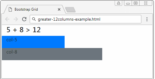
greater-12columns-example2
<div class= "container-fluid">
   <h4>(col-sm-*) 5 + 8 > 12</h4>

   <!-- (col-sm-*) 5 + 8 > 12 -->
   <div class= "row">
      <div class ="col-6 col-sm-5 bg-primary">
         <p>.col-6 <b>.col-sm-5</b></p>
      </div>
      <div class ="col-6 col-sm-8 bg-secondary">
         <p>.col-6 <b>.col-sm-8</b></p>
      </div>
   </div>

</div>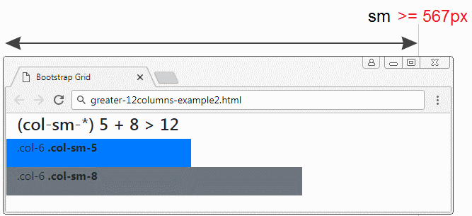
col-12, col-*-12
Suppose that you have a ".row" element and a child elements. a child element has the number of columns of 12. What will happen ?
- The answer is that the child element with the number of column of 12 will display on a raw. It fill up the width of such row.
element-12columns-example
<div class= "container-fluid">
   <h4>Element with 12 columns</h4>

   <div class= "row">
      <div class ="col-2 bg-primary">
         <p>.col-2</p>
      </div>
      <div class ="col-12 bg-secondary">
         <p>.col-12</p>
      </div>
      <div class ="col-5 bg-danger">
         <p>.col-5</p>
      </div>
   </div>
</div>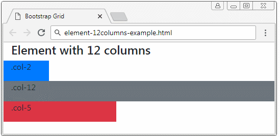
Gallery
Using the above features of the Grid will help you create a beautiful Gallery which changes based on the size of device.
grid-gallery-example
<div class= "container-fluid">
   <h4>Gallery</h4>

   <div class= "row">
      <div class ="col-12 col-sm-6 col-md-4 bg-primary">
         <p>.col-12 .col-sm-6 .col-md-4</p>
      </div>
      <div class ="col-12 col-sm-6 col-md-4 bg-secondary">
         <p>.col-12 .col-sm-6 .col-md-4</p>
      </div>
      <div class ="col-12 col-sm-6 col-md-4 bg-danger">
         <p>.col-12 .col-sm-6 .col-md-4</p>
      </div>
      <div class ="col-12 col-sm-6 col-md-4 bg-success">
         <p>.col-12 .col-sm-6 .col-md-4</p>
      </div>
      <div class ="col-12 col-sm-6 col-md-4 bg-info">
         <p>.col-12 .col-sm-6 .col-md-4</p>
      </div>
      <div class ="col-12 col-sm-6 col-md-4 bg-dark">
         <p>.col-12 .col-sm-6 .col-md-4</p>
      </div>
   </div>
</div>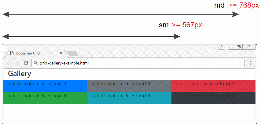
OK, below is a more complex example- using the Grid to create a Gallery. In this example, I have used several utility classes of Bootstrap.
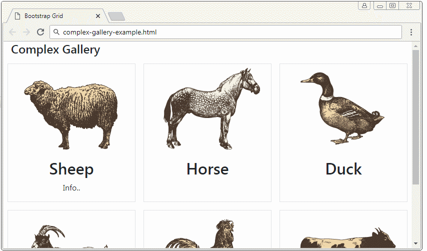
complex-gallery-example.html
<!DOCTYPE html>
<html>
   <head>
      <meta charset="utf-8">
      <title>Bootstrap Grid</title>
      <link rel="stylesheet" href="https://stackpath.bootstrapcdn.com/bootstrap/4.1.1/css/bootstrap.min.css">
      <style>
         .height100 {
         height: 100%;
         }
      </style>
   </head>
   <body>
      <div class= "container-fluid">
         <h4>Complex Gallery</h4>
         <div class= "row d-inline-flex">
            <!-- Gallery Item 1 -->
            <div class ="col-12 col-sm-6 col-md-4 p-2">
               <div class="d-flex flex-column text-center border height100">
                  <div>
                     <img src="../images/animal1.png"/>
                  </div>
                  <h2>Sheep</h2>
                  <p>Info..</p>
               </div>
            </div>
            <!-- Gallery Item 2 -->
            <div class ="col-12 col-sm-6 col-md-4 p-2">
               <div class="d-flex flex-column text-center border height100">
                  <div>
                     <img src="../images/animal2.png"/>
                  </div>
                  <h2>Horse</h2>
               </div>
            </div>
            <!-- Gallery Item 3 -->
            <div class ="col-12 col-sm-6 col-md-4 p-2">
               <div class="d-flex flex-column text-center border height100">
                  <div>
                     <img src="../images/animal3.png"/>
                  </div>
                  <h2>Duck</h2>
               </div>
            </div>
            <!-- Gallery Item 4 -->
            <div class ="col-12 col-sm-6 col-md-4 p-2">
               <div class="d-flex flex-column text-center border height100">
                  <div>
                     <img src="../images/animal4.png"/>
                  </div>
                  <h2>Goat</h2>
               </div>
            </div>
            <!-- Gallery Item 5 -->
            <div class ="col-12 col-sm-6 col-md-4 p-2">
               <div class="d-flex flex-column text-center border height100">
                  <div>
                     <img src="../images/animal5.png"/>
                  </div>
                  <h2>Chicken</h2>
               </div>
            </div>
            <!-- Gallery Item 6 -->
            <div class ="col-12 col-sm-6 col-md-4 p-2">
               <div class="d-flex flex-column text-center border height100">
                  <div>
                     <img src="../images/animal6.png"/>
                  </div>
                  <h2>Cow</h2>
               </div>
            </div>
         </div>
      </div>
      <script src="https://code.jquery.com/jquery-3.3.1.slim.min.js"></script>
      <script src="https://cdnjs.cloudflare.com/ajax/libs/popper.js/1.14.3/umd/popper.min.js"></script>
      <script src="https://stackpath.bootstrapcdn.com/bootstrap/4.1.1/js/bootstrap.min.js"></script>
   </body>
</html>
.d-flex, .flex-column (?) .p-2 (?)
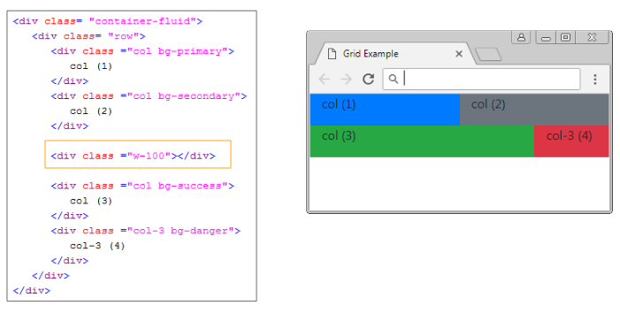
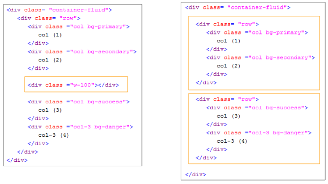
5. Use .w-100
In the Bootstrap4, the w-100 classmakeselement to have width filling .container (width = 100%). It will split elements on its left and right into 2 different rows. However, in fact, all these elements still have the same parent element (.row)
.w-100
<div class= "container-fluid">
   <div class= "row">
      <div class ="col bg-primary">
         col (1)
      </div>
      <div class ="col bg-secondary">
         col (2)
      </div>

      <div class ="w-100"></div>

      <div class ="col bg-success">
         col (3)
      </div>
      <div class ="col-3 bg-danger">
         col-3 (4)
      </div>
   </div>
</div>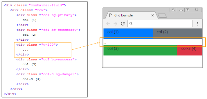
At this moment, your question is why the Bootstrap creates the .w-100 class, and 2 .row classes are not used to obtain the same results?
The first benefits: For the .w-100 class, you can change the elements displayed on two rows into one row and vice versa. For example, you have 5 elements on a .container. And you want that, if the width of the .container<567px, they display on 2 rows. Conversely, they will display on a row.
.w-100 d-*-none
<div class= "container-fluid">
   <div class= "row">

      <div class ="col bg-primary">
         <p>col (1)</p>
      </div>
      <div class ="col bg-secondary">
         <p>col (2)</p>
      </div>

      <!-- d-sm-none: display sm none -->
      <div class ="w-100 d-sm-none"></div>

      <div class ="col bg-success">
         <p>col (3)</p>
      </div>
      <div class ="col-3 bg-danger">
         <p>col-3 (4)</p>
      </div>
      <div class ="col bg-warning">
         <p>col (5)</p>
      </div>
   </div>

</div>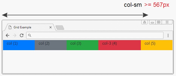
The second benefit: You can change the order of elements if they belong to the same ".row". You can not change the order of elements if they are on two different ".rows".
.w-100 order-*-*
<div class= "container-fluid">

   <div class= "row">
      <div class ="col order-sm-12 bg-primary">
         <p>col (1)</p>
         <p>order-sm-12</p>
      </div>
      <div class ="col order-sm-11 bg-secondary">
         <p>col (2)</p>
         <p>order-sm-11</p>
      </div>

      <!-- d-sm-none: display sm none -->
      <div class ="w-100 d-sm-none"></div>

      <div class ="col order-sm-2 bg-success">
         <p>col (3)</p>
         <p>order-sm-2</p>
      </div>
      <div class ="col-3 order-sm-3 bg-danger">
         <p>col-3 (4)</p>
         <p>order-sm-3</p>
      </div>
      <div class ="col  order-sm-1 bg-warning">
         <p>col (5)</p>
         <p>order-sm-1</p>
      </div>
   </div>

</div>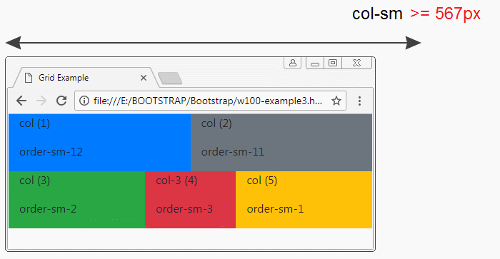
Bootstrap Tutorials
- Bootstrap Jumbotron Tutorial with Examples
- Bootstrap Dropdowns Tutorial with Examples
- Bootstrap Alerts Tutorial with Examples
- Bootstrap Buttons Tutorial with Examples
- Bootstrap Button Group Tutorial with Examples
- Bootstrap Popovers (Tooltips) Tutorial with Examples
- Bootstrap Spinners Tutorial with Examples
- Introduction to Bootstrap
- Bootstrap Grid System Tutorial with Examples
- Bootstrap Cards Tutorial with Examples
- Bootstrap Containers Tutorial with Examples
- Bootstrap Nav Tab/Pill Tutorial with Examples
- Bootstrap NavBars Tutorial with Examples
- Bootstrap Tables Tutorial with Examples
- Bootstrap Modal Tutorial with Examples
- Bootstrap Forms Tutorial with Examples
- Bootstrap Pagination Tutorial with Examples
- Bootstrap Badges Tutorial with Examples
- Bootstrap Input Group Tutorial with Examples
- Bootstrap List Groups Tutorial with Examples
- Bootstrap ProgressBars Tutorial with Examples
- Bootstrap Collapse and Accordion Tutorial with Examples
- Bootstrap Scrollspy Tutorial with Examples
- Bootstrap Breadcrumb Tutorial with Examples
- Bootstrap Carousel Tutorial with Examples
- Bootstrap Spacing Utilities Tutorial with Examples
- Bootstrap Border Utilities Tutorial with Examples
- Bootstrap Color Utilities Tutorial with Examples
- Bootstrap Text Utilities Tutorial with Examples
- Bootstrap Sizing Utilities Tutorial with Examples
- Bootstrap Position Utilities Tutorial with Examples
- Bootstrap Flex Utilities Tutorial with Examples
- Bootstrap Display Utilities Tutorial with Examples
- Bootstrap Visibility Utilities Tutorial with Examples
- Bootstrap Embed Utilities Tutorial with Examples
Show More