- CSS {display: grid | inline-grid}
- Some basic concepts
- Naming rule
- CSS grid-template-columns/-rows
- CSS grid-template-areas, grid-area
- CSS grid-template
- CSS grid-column-start, grid-row-start,..
- CSS grid-column, grid-row
- CSS grid-column-gap, grid-row-gap
- CSS justify-items
- CSS justify-self
- CSS align-items
- CSS align-self
CSS Grid Layout Tutorial with Examples
1. CSS {display: grid | inline-grid}
CSS {display:grid | inline-grid} is used for an element to divide its surface into a grid, consisting of rows and columns,. Its child elements will be arranged on grid cells. It is easier for you to design pages instead of using CSS float or element positioning techniques.
CSS {display:grid | inline-grid} is supported by all modern browsers.
grid, inline-grid are only two of the values of CSS display. You may also see other values in the following post:
To create a grid system you need to combine some of the following CSS properties, including properties for parent elements, and properties for child elements.
Parent | Children (Grid Items) |
| |
|
|
2. Some basic concepts
There are a few concepts in the CSS Grid System that you need to be familiar with before you start learning about it:
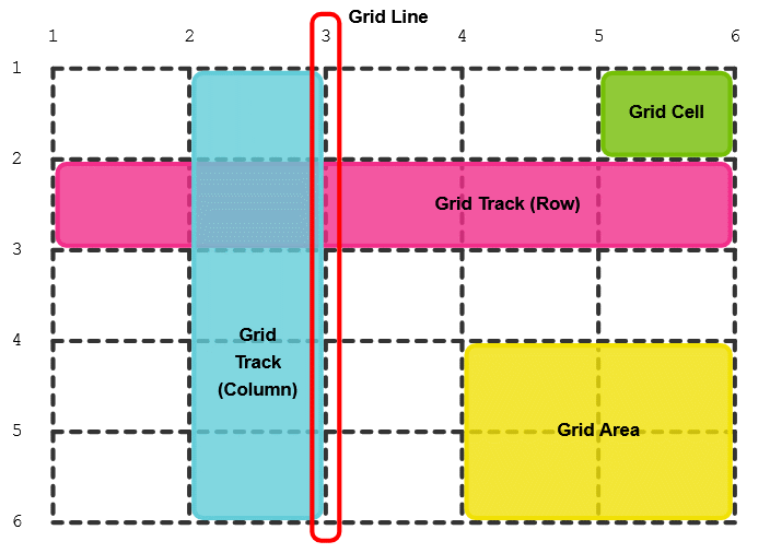
Grid Line
Grid Line: A horizontal (or vertical) line taking part in dividing the element surface into grid cells.
Grid Track
Grid Track: A row or a column.
Track Size
Track Size: Width of a column, or height of a row.
Grid Cell
Grid Cell: A rectangle, the intersection of a row and a column.
Grid Area
Grid Area: A rectangle created by merging many grid cells near each other
3. Naming rule
CSS Grid allows you to name Grid Lines, and Grid Tracks arbitrarily. Naming Grid Lines, Grid Tracks makes it easier to describe parameters for a child element, such as position, align, ...
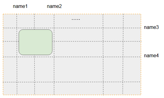
CSS Grid recommend that you name according to the following rule:
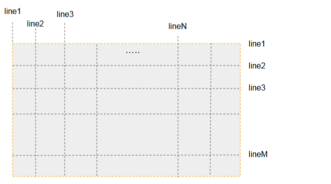
Grid Lines (or Grid Tracks) may be named line1, line2, line3,.... This way is suitable for a grid with many columns and rows.
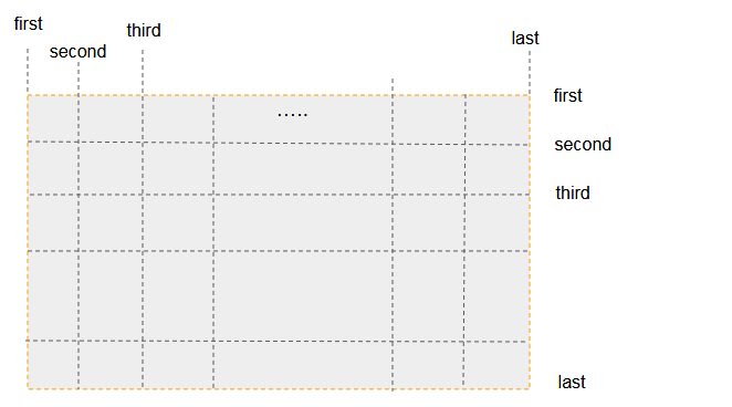
Grid Lines (or Grid Tracks) can be named first, second, third,.. last. This is suitable for a grid with a small number of rows and columns (Less than 5).
Vertical Grid Lines can be named col1-start, col1-end, col2-start, col2-end,....
Horizontal Grid Lines may be named row1-start, row1-end, row2-start, row2-end,...
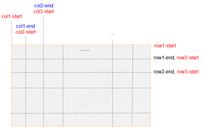
Note: You will learn more about naming through the examples in this post.
4. CSS grid-template-columns/-rows
CSS grid-template-columns allows you to declare the width of grid columns or the names of columns and their widths.
CSS grid-template-rows allows you to declare the width of Grid rows.or the names of rows and their height.
grid-template-columns: <track-size> ... | [name] <track-size> ...;

grid-template-rows: <track-size> ... | [name] <track-size> ...;
Example, a Grid with 2 rows, 3 columns:
.container {
    display: grid;
    grid-template-rows: 100px 50px;
    grid-template-columns: 250px 150px 120px;
    border:1px solid #ddd;
}
.container {
display: grid;
grid-template-rows: [first] 100px [line2] 50px ;
grid-template-columns: [first] 250px [line2] 150px 120px ;
border:1px solid #ddd;
}.
See full example:
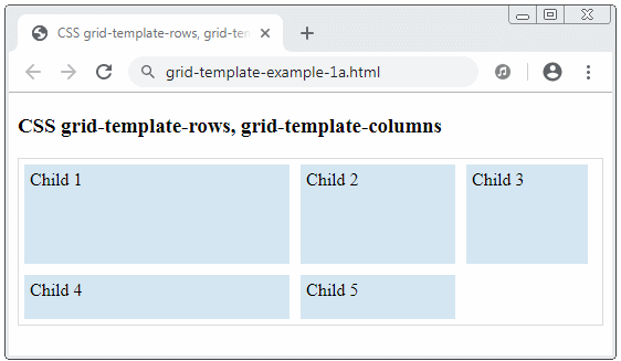
grid-template-example-1a.html
<!DOCTYPE html>
<html>
   <head>
      <title>CSS grid-template-rows, grid-template-columns</title>
      <meta charset="UTF-8"/>
      <style>
         .container {
            display: grid;
            grid-template-rows: 100px 50px;
            grid-template-columns: 250px 150px 120px;
            border:1px solid #ddd;
         }
         .child {
           padding: 5px;
           background: #d4e6f1;
           margin: 5px;
         }
      </style>
   </head>
   <body>
       <h3>CSS grid-template-rows, grid-template-columns</h3>
        <div class="container">
           <div class="child">
               Child 1
           </div>
           <div class="child">
               Child 2
           </div>
           <div class="child">
               Child 3
           </div>
           <div class="child">
               Child 4
           </div>
           <div class="child">
               Child 5
           </div>
        </div>
   </body>
</html>
The width, or height of a column also accepts percent (%) or auto values.
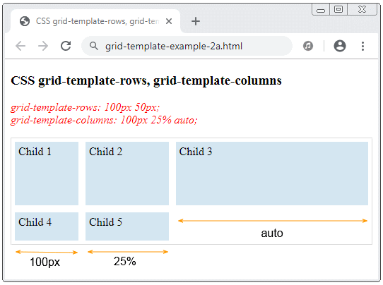
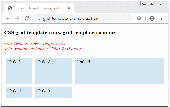
grid-template-example-2a.html
<!DOCTYPE html>
<html>
   <head>
      <title>CSS grid-template-rows, grid-template-columns</title>
      <meta charset="UTF-8"/>
      <style>
         .container {
            display: grid;
            grid-template-rows: 100px 50px;
            grid-template-columns: 100px 25% auto;
            border:1px solid #ddd;
         }
         .child {
           padding: 5px;
           background: #d4e6f1;
           margin: 5px;
         }
      </style>
   </head>
   <body>
       <h3>CSS grid-template-rows, grid-template-columns</h3>
       <p style="color: red;font-style: italic;">
         grid-template-rows: 100px 50px; <br/>
         grid-template-columns: 100px 25% auto;
       </p>
        <div class="container">
           <div class="child">
               Child 1
           </div>
           <div class="child">
               Child 2
           </div>
           <div class="child">
               Child 3
           </div>
           <div class="child">
               Child 4
           </div>
           <div class="child">
               Child 5
           </div>
        </div>
   </body>
</html>
repeat()
repeat() notation helps you repeat part of code.
.container {
    display: grid;
    grid-template-rows: 100px 50px;
    grid-template-columns: 100px repeat(2, [my-column] auto);
    border:1px solid #ddd;
}
The above code snippet is equivalent to:
.container {
    display: grid;
    grid-template-rows: 100px 50px;
    grid-template-columns: 100px [my-column] auto [my-column] auto;
    border:1px solid #ddd;
}
Sometimes, the columns have the same name, to refer to it, you have to use its name and order number (the order number begins with 1).
.child {
grid-column-start: my-column 2;
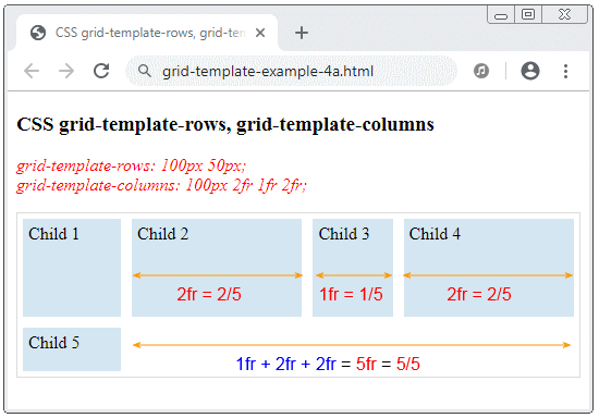
}FR (Fraction):
FR (Fraction) is an unit in the CSS grid system.
Example:
.container {
    display: grid;
    grid-template-rows: 100px 50px;
    grid-template-columns: 100px 2fr 1fr 2fr;
    border:1px solid #ddd;
}
5. CSS grid-template-areas, grid-area
CSS grid-template-areas helps you to define a template for Grid Areas. The definition of each Grid Area is put in double quotation marks ( " " ).
.container {
  grid-template-areas:
     "<grid-area-name> | . | none | ..."
     "<grid-area-name> | . | none | ..."
     "...";
}
<grid-area-name> | Name of a Grid Area. |
. | (Dot), denotes an empty grid cell. |
none | No Grid Area is defined |
CSS grid-area
.child {
grid-area: <name> | <row-start> / <column-start> / <row-end> / <column-end>;
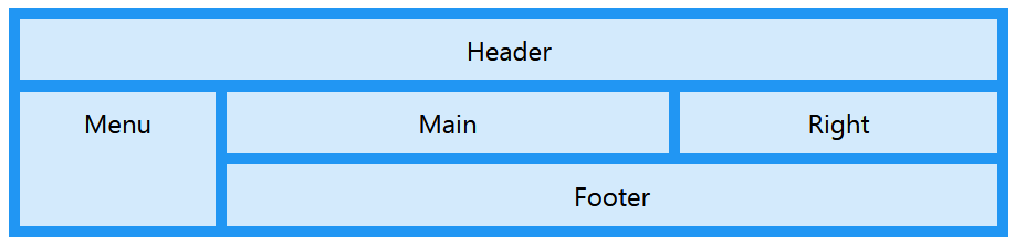
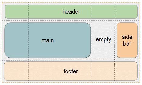
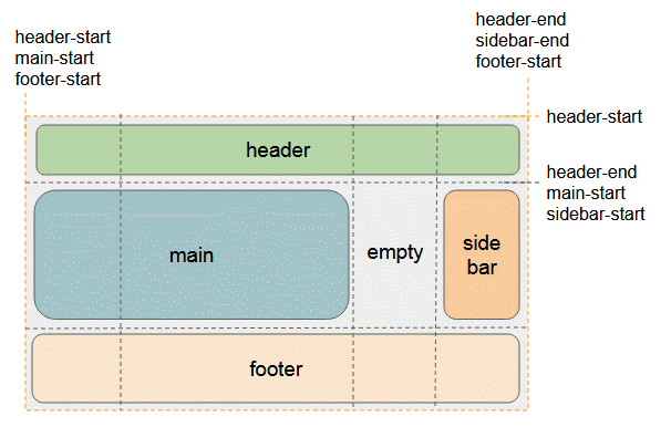
}Example, Definition of 4 Grid Areas: (header, main, sidebar, footer) is the following illustration:
template-areas-example1.css
.container {
   display: grid;
   grid-template-rows: 50px 100px 50px;
   grid-template-columns: 100px auto 100px 100px;
   grid-template-areas:
      "header header header header"
      "main main . sidebar"
      "footer footer footer footer";
   border:1px solid #ddd;
}
.child {
  padding: 5px;
  background: #d4e6f1;
  margin: 5px;
}
.child-header {
   grid-area: header;
}
.child-main {
   grid-area: main;
}
.child-sidebar {
   grid-area: sidebar;
}
.child-footer {
   grid-area: footer;
}
template-areas-example1.html
<!DOCTYPE html>
<html>
   <head>
      <title>CSS grid-template-areas</title>
      <meta charset="UTF-8"/>
      <link rel="stylesheet" href="template-areas-example1.css" />
   </head>
   <body>
       <h2>CSS grid-template-areas</h2>
       <p style="color: red;font-style: italic;">
          <b>grid-template-areas:</b> <br/>
             "header header header header" <br/>
             "main main . sidebar" <br/>
             "footer footer footer footer";
       </p>
        <div class="container">
           <div class="child child-header">
               Header
           </div>
           <div class="child child-main">
               Main
           </div>
           <div class="child child-sidebar">
               Sidebar
           </div>
           <div class="child child-footer">
               Footer
           </div>
        </div>
   </body>
</html>
It is noted that, when you define Grid Area, some Grid Lines will have more names based on the name of the Grid Area. A Grid Line can have many names, like the following illustrations.
6. CSS grid-template
Using CSS grid-template is a short way to set up grid-template-rows, grid-template-columns, grid-template-areas.
Syntax
.container {
  grid-template: none | <grid-template-rows> / <grid-template-columns>;
}
none
Set values for CSS grid-template-rows, grid-template-columns, grid-template-areas to their initial values.
<grid-template-rows> / <grid-template-columns>
Set values for grid-template-rows, grid-template-columns, and set up the none value for grid-template-areas.
Example:
.container {
   display: grid;
   border:1px solid #ddd;
   grid-template: 100px 50px / 150px auto 120px;
}
/* Same As: */
.container {
   display: grid;
   border:1px solid #ddd;
   grid-template-rows: 100px 50px;
   grid-template-columns: 150px auto 120px;
   grid-template-areas: none;
}
A complex example with the participation of grid-template-areas:
.container {
   display: grid;
   border:1px solid #ddd;
   grid-template:
         [row1-start] "header header header" 100px [row1-end]
         [row2-start] "main main ." 50px [row2-end]
         [row3-start] "footer footer footer" 50px [row3-end]
        / 150px auto 120px;
}
/* Same As: */
.container2 {
   display: grid;
   border:1px solid #ddd;
   grid-template-rows: [row1-start] 100px [row1-end row2-start] 50px [row2-end row3-start] 50px [row3-end];
   grid-template-columns: 150px auto 120px;
   grid-template-areas:
          "header header header"
          "main main ."
          "footer footer footer";
}
7. CSS grid-column-start, grid-row-start,..
To set the position of a Grid Item, you need to provide values for the following 4 properties:
- grid-column-start
- grid-column-end
- grid-row-start
- grid-row-end
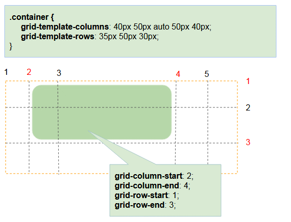
The above properties accept numeric values (As the order of Grid Line). It also accepts the Grid Line name. the names of the Grid Lines need to be defined before use.
Syntax
.child {
  grid-column-start: <number> | <name> | span <number> | span <name> | auto;
  grid-column-end: <number> | <name> | span <number> | span <name> | auto;
  grid-row-start: <number> | <name> | span <number> | span <name> | auto;
  grid-row-end: <number> | <name> | span <number> | span <name> | auto;
}
Grid Lines by default are are numbered, starting with 1:
.container {
   display: grid;
   grid-template-columns: 40px 50px auto 50px 40px;
   grid-template-rows: 35px 50px 30px;
   border:1px solid #ddd;
   margin-top:10px;
}
.child {
  padding: 5px;
  background: #d4e6f1;
  margin: 5px;
}
.child-1 {
  grid-column-start: 2;
  grid-column-end: 4;
  grid-row-start: 1;
  grid-row-end: 3;
}
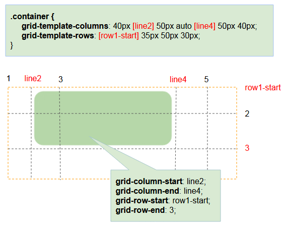
If you want to use a name you need to define it before you use it.
.container {
   display: grid;
   grid-template-columns: 40px [line2] 50px auto [line4] 50px 40px;
   grid-template-rows: [row1-start] 35px 50px 30px;

   border:1px solid #ddd;
   margin-top:10px;
}
.child {
  padding: 5px;
  background: #d4e6f1;
  margin: 5px;
}
.child-1 {
  grid-column-start: line2;
  grid-column-end: line4;
  grid-row-start: row1-start;
  grid-row-end: 3;
}
.container {
   display: grid;
   grid-template-columns: 40px 50px auto [col4-start] 50px 40px;
   grid-template-rows: 35px 50px 30px;

   border:1px solid #ddd;
   margin-top:10px;
}
.child {
  padding: 5px;
  background: #d4e6f1;
  margin: 5px;
}
.child-1 {
   grid-column-start: 2;
   grid-column-end: span col4-start;
   grid-row-start: 2;
   grid-row-end: span 2;
}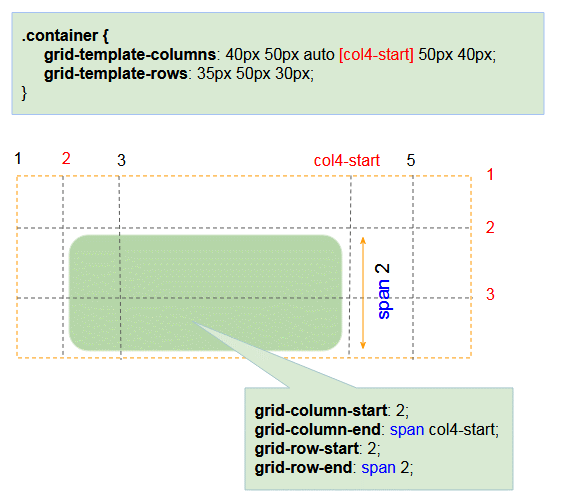
Note: If CSS grid-column-end, CSS grid-row-end is not provided they will have the default value of "span 1".
Grid Items can overlap, so you can use CSS z-index to control them.
grid-overlap-example.css
.container {
   display: grid;
   grid-template-columns: 40px 50px auto 50px 40px;
   grid-template-rows: 35px 50px 30px;

   border:1px solid #ddd;
   margin-top:10px;
}
.child {
  padding: 5px;
  background: #d4e6f1;
  margin: 5px;
}
.child-1 {
   grid-column-start: 2;
   grid-column-end: 4;
   grid-row-start: 2;
   grid-row-end: 4;
   z-index: 1000;
   background: lightblue;
}
.child-2 {
    grid-column-start: 3;
    grid-column-end: 5;
    grid-row-start: 1;
    grid-row-end: 3;
    z-index: 2000;
    background: lightgreen;
  }
grid-overlap-example.html
<!DOCTYPE html>
<html>
   <head>
      <title>CSS grid-column-*, grid-row-*</title>
      <meta charset="UTF-8"/>
      <link rel="stylesheet" href="grid-overlap-example.css" />
   </head>
   <body>
       <h3>CSS Overlap Grid Items</h3>
        <div class="container">
          <div class="child"></div>
          <div class="child"></div>
          <div class="child"></div>
          <div class="child"></div>
          <div class="child"></div>
          <div class="child"></div>
          <div class="child"></div>
          <div class="child"></div>
          <div class="child"></div>
          <div class="child"></div>
          <div class="child"></div>
          <div class="child"></div>
          <div class="child"></div>
          <div class="child"></div>
          <div class="child"></div>
        </div>
        <div class="container">
          <div class="child child-1"></div>
          <div class="child child-2"></div>
        </div>
   </body>
</html>
8. CSS grid-column, grid-row
Using CSS grid-column is a short way to set values for grid-column-start, grid-column-end. Similarly, using CSS grid-row is a short way to set values for grid-row-start, grid-row-end.
Syntax
.child {
  grid-column: <start-line> / <end-line> | <start-line> / span <value>;
  grid-row: <start-line> / <end-line> | <start-line> / span <value>;
}
Example:
grid-column-row-example.css
.container {
   display: grid;
   grid-template-columns: 40px [line2] 50px auto [line4] 50px 40px;
   grid-template-rows: [row1-start] 35px 50px 30px;

   border:1px solid #ddd;
   margin-top:10px;
}
.child {
  padding: 5px;
  background: #d4e6f1;
  margin: 5px;
}
.child-1 {
  background: lightblue;
  grid-column : line2 / line4;
  grid-row : row1-start / 3;
}
.child-2 {
   background: lightgreen;
   grid-column : 1 / span 2;
   grid-row : 2 / 4;
  }
grid-column-row-example.html
<!DOCTYPE html>
<html>
<head>
<title>CSS grid-column, grid-row</title>
<meta charset="UTF-8"/>
<link rel="stylesheet" href="grid-column-row-example.css" />
</head>
<body>
<h3>CSS grid-column, grid-row</h3>
<div class="container">
<div class="child"></div>
<div class="child"></div>
<div class="child"></div>
<div class="child"></div>
<div class="child"></div>
<div class="child"></div>
<div class="child"></div>
<div class="child"></div>
<div class="child"></div>
<div class="child"></div>
<div class="child"></div>
<div class="child"></div>
<div class="child"></div>
<div class="child"></div>
<div class="child"></div>
</div>
<div class="container">
<div class="child child-1">Child 1</div>
<div class="child child-2">Chid 2</div>
</div>
</body>
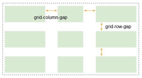
</html>9. CSS grid-column-gap, grid-row-gap
CSS grid-column-gap, CSS grid-row-gap are used to set width of Grid Line. This creates spaces between the Grid Tracks.
CSS grid-row-gap, CSS grid-column-gap accept specific values, such as 1px, 2em,... or a percent value ( % ).
.container {
  grid-template-columns: 100px auto 100px;
  grid-template-rows: 80px auto 80px;
  grid-column-gap: 10px;
  grid-row-gap: 15px;
}
Note: grid-column-grid, grid-row-grid are changed name into column-grid, row-grid. And they are now available in browsers:Firefox 63+, Chrome 68+, Safari 11.2 Release 50+, Opera 54+.
CSS grid-gap
Using CSS grid-gap is the short way to set values for grid-row-gap & grid-column-gap.
Syntax
.container {
  grid-gap: <grid-row-gap> <grid-column-gap>;
}
Example:
.container {
  grid-template-columns: 100px auto 100px;
  grid-template-rows: 80px auto 80px;
  grid-gap: 15px 10px;
}
.container {
...
grid-gap: 15px ;
}
/* Same as: */
.container {
...
grid-gap: 15px 15px;
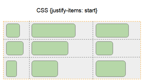
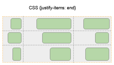
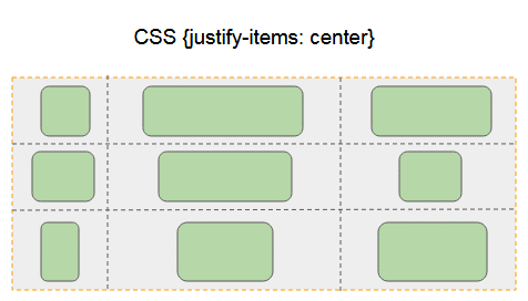
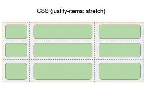
}10. CSS justify-items
CSS justify-items is used for parent elements, to align horizontally its child elements. Its possible values are:
- start
- end
- center
- stretch (Default)
.container  {
   justify-items: start | end | center | stretch;
}
CSS {justify-items:start}
Align the Grid Items to the left of the cell containing it.
CSS {justify-items:end}
Align the Grid Items to the right of the cell containing it.
CSS {justify-items:center}
Align the Grid Items to the middle of the cell horizontally.
CSS {justify-items:stretch}
Make Grid Items fill up the cell containing it horizontally.
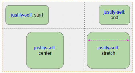
11. CSS justify-self
CSS justify-self is used to align a Grid Item horizontally in a Grid Cell (Or Grid Area). Its values may be:
- start
- end
- center
- stretch (Default)
.child {
   justify-self: start | end | center | stretch;
}
justify-self-example.css
.container {
     display: grid;
     grid-template-rows: 150px 100px;
     grid-template-columns: auto auto;
     border:1px solid #ddd;
}
.child {
     padding: 5px;
     background: #d4e6f1;
     margin: 5px;
}
.child-1 {
     justify-self: start;
}
.child-2 {
     justify-self: end;
}
.child-3 {
     justify-self: center;
}
.child-4 {
     justify-self: stretch;
}
justify-self-example.html
<!DOCTYPE html>
<html>
   <head>
      <title>CSS justify-self</title>
      <meta charset="UTF-8"/>
      <link rel="stylesheet" href="justify-self-example.css" />
   </head>
   <body>
       <h2>CSS justify-self</h2>
        <div class="container">
           <div class="child child-1">
               justify-self: start
           </div>
           <div class="child child-2">
               justify-self: end
           </div>
           <div class="child child-3">
               justify-self: center
           </div>
           <div class="child child-4">
               justify-self: stretch
           </div>
        </div>
   </body>
</html>
12. CSS align-items
CSS align-items is used for parent elements, to align (vertically) its child elements. Its possible values are:
- start
- end
- center
- stretch (Default)
.container  {
   align-items: start | end | center | stretch;
}
CSS {align-items:start}
Align the Grid Items to the top of grid cell
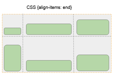
CSS {align-items:end}
Align the Grid Items to the bottom of grid cell
CSS {align-items:center}
Align the Grid Items to the middle of the cell containing it vertically.
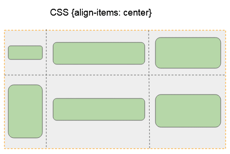
CSS {align-items:stretch}
Make Grid Items fill up the cell containing it vertically.
13. CSS align-self
CSS align-self is used to align a Grid Item vertically in a Grid Cell (Or Grid Area). Its values may be:
- start
- end
- center
- stretch (Default)
.child {
   align-self: start | end | center | stretch;
}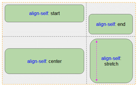
align-self-example.css
.container {
     display: grid;
     grid-template-rows: 150px 100px;
     grid-template-columns: 200px auto;
     border:1px solid #ddd;
}
.child {
     padding: 5px;
     background: #d4e6f1;
     margin: 5px;
}
.child-1 {
     align-self: start;
}
.child-2 {
     align-self: end;
}
.child-3 {
     align-self: center;
}
.child-4 {
     align-self: stretch;
}
align-self-example.html
<!DOCTYPE html>
<html>
   <head>
      <title>CSS align-self</title>
      <meta charset="UTF-8"/>
      <link rel="stylesheet" href="align-self-example.css" />
   </head>
   <body>
       <h2>CSS align-self</h2>
        <div class="container">
           <div class="child child-1">
               align-self: start
           </div>
           <div class="child child-2">
               align-self: end
           </div>
           <div class="child child-3">
               align-self: center
           </div>
           <div class="child child-4">
               align-self: stretch
           </div>
        </div>
   </body>
</html>
CSS Tutorials
- Units in CSS
- Basic CSS Selectors Tutorial with Examples
- CSS Attribute Selector Tutorial with Examples
- CSS combinator Selectors Tutorial with Examples
- CSS Backgrounds Tutorial with Examples
- CSS Opacity Tutorial with Examples
- CSS Padding Tutorial with Examples
- CSS Margins Tutorial with Examples
- CSS Borders Tutorial with Examples
- CSS Outline Tutorial with Examples
- CSS box-sizing Tutorial with Examples
- CSS max-width and min-width Tutorial with Examples
- The keywords min-content, max-content, fit-content, stretch in CSS
- CSS Links Tutorial with Examples
- CSS Fonts Tutorial with Examples
- Understanding Generic Font Family Names in CSS
- CSS @font-face Tutorial with Examples
- CSS Align Tutorial with Examples
- CSS Cursors Tutorial with Examples
- CSS Overflow Tutorial with Examples
- CSS Lists Tutorial with Examples
- CSS Tables Tutorial with Examples
- CSS visibility Tutorial with Examples
- CSS Display Tutorial with Examples
- CSS Grid Layout Tutorial with Examples
- CSS Float and Clear Tutorial with Examples
- CSS Position Tutorial with Examples
- CSS line-height Tutorial with Examples
- CSS text-align Tutorial with Examples
- CSS text-decoration Tutorial with Examples
Show More