CSS Backgrounds Tutorial with Examples
1. CSS Background Overview
CSS provides several properties helping you to define background effects for an element, which are:
- background-color
- background-image
- background-repeat
- background-attachment
- background-position
2. CSS background-color
CSS background-color is used to set the background color of an element.
/* Keyword values */
background-color: red;
background-color: indigo;

/* Hexadecimal value */
background-color: #bbff00;    /* Fully opaque */
background-color: #bf0;       /* Fully opaque shorthand */
background-color: #11ffee00;  /* Fully transparent */
background-color: #1fe0;      /* Fully transparent shorthand  */
background-color: #11ffeeff;  /* Fully opaque */
background-color: #1fef;      /* Fully opaque shorthand  */

/* RGB value */
background-color: rgb(255, 255, 128);        /* Fully opaque */
background-color: rgba(117, 190, 218, 0.5);  /* 50% transparent */

/* HSL value */
background-color: hsl(50, 33%, 25%);         /* Fully opaque */
background-color: hsla(50, 33%, 25%, 0.75);  /* 75% transparent */

/* Special keyword values */
background-color: currentcolor;
background-color: transparent;

/* Global values */
background-color: inherit;
background-color: initial;
background-color: unset;
Using the RGBA function helps you create a color with opacity. You can use this color as the background color of an element. This opacity only works with the element background. It does not affect element contents and chil elements.
<div style="background-color: rgba(76, 175, 80, 0.1);">
     {background-color: rgba(76, 175, 80, 0.1);}
</div>
<div style="background-color: rgba(76, 175, 80, 0.3);">
     {background-color: rgba(76, 175, 80, 0.3);}
</div>
<div style="background-color: rgba(76, 175, 80, 0.6);">
     {background-color: rgba(76, 175, 80, 0.6);}
</div>
<div style="background-color: rgba(76, 175, 80);">
    {background-color: rgba(76, 175, 80);}
</div>
For example, create an almost transparent box containing the description text of an image.
background-color-grba-example2.html
<!DOCTYPE html>
<html>
<head>
    <title>CSS background-color</title>
    <meta charset="UTF-8"/>
    <style>
       .img-container {
          display: inline-block;
          position: relative;
       }
       .img-desc {
          position: absolute;
          left: 5px;
          right: 5px;
          bottom: 15px;
          padding: 5px;
          text-align: center;
          background-color: rgba(76, 175, 80, 0.3);
          color: white;
       }
    </style>
</head>
<body>
    <h3>CSS background-color with GRBA function</h3>
    <div class = "img-container">
       <img src="../images/image.png" width="320" height="178"/>
       <div class="img-desc">
          This is an Image
       </div>
    </div>
    <p style="font-style: italic;">
       { background-color: GRBA(76, 175, 80, 0.3); }
    </p>
</body>
</html>
See also:
- CSS Color
3. CSS background-image
CSS background-image is used to set one or more background images for an element.
div {
  padding: 5px;
  margin-top: 10px;
  border: 1px solid #ddd;
  height: 115px;
}
.bg-a {
  background-image: url('../images/bg1.png');
}
.bg-b {
  background-image: url('../images/bg2.png');
}
.bg-ab {
  background-image: url('../images/bg1.png'), url('../images/bg2.png');
}
Each background image will be drawn on a transparent layer. These layers are overlapped
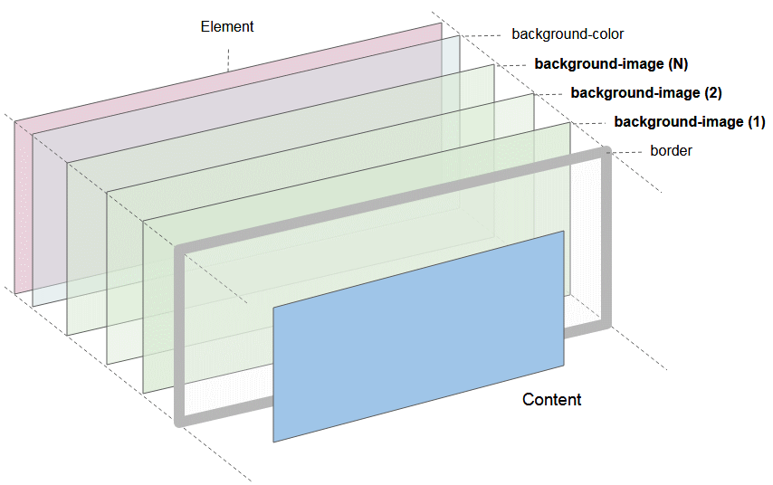
Image illustrating an element with the participation of the components: background-color, background-images, borders.
- Element border is drawn on the layer closest to the user.
- Next is layers for drawing the background image and layers for drawing background color
Syntax
background-image: none;
background-image: «image»;
background-image: «image», «image», «image»;
none
Is a keyword denoting the absence of images.
«image»
Of which «image» can be one of the following functions:
- url( url-string )
- image( image-tags? [ image-src? , color? ] )
- image-set( image-set-option# )
- element( id-selectors )
- paint( ident , declaration-value )
- cross-fade( cf-mixing-image, cf-final-image)
- linear-gradient( [ angle | to side-or-corner ]? , color-stop-list )
- repeating-linear-gradient( [ angle | to side-or-corner ]? , color-stop-list )
- radial-gradient( [ ending-shape> || size ]? [ at position ]? , color-stop-list )
- repeating-radial-gradient( [ ending-shape || size ]? [ at position ]? , color-stop-list )
- conic-gradient( [ from angle ]? [ at position ]?, angular-color-stop-list )
Example:
background-image: none;

background-image: url( '../images/bg.png' );

background-image: image(ltr 'arrow.png#xywh=0,0,16,16', red);

background-image: image-set( "cat.png" 1x, "cat-2x.png" 2x, "cat-print.png" 600dpi);

background-image: element( #myElementId );

(!) paint(  ident ,  declaration-value ) ;

background-image: cross-fade( url(red.png) 33.33%, url(yellow.png) 33.33%, url(blue.png) 33.33%);

background-image: linear-gradient(red, yellow, blue);

background-image: repeating-linear-gradient(45deg, #3f87a6, #ebf8e1 15%, #f69d3c 20%);

background-image: repeating-radial-gradient(#e66465, #9198e5 20%);

background-image: conic-gradient(at 50% 50%, yellow 0deg, orange 360deg);
4. CSS background-repeat
CSS background-repeat is used to set how a background image is repeated. It can be repeated horizontally, vertically or both, or not repeated.
/* Keyword values */
background-repeat: repeat-x;
background-repeat: repeat-y;
background-repeat: repeat;
background-repeat: space;
background-repeat: round;
background-repeat: no-repeat;

/* Two-value syntax: horizontal | vertical */
background-repeat: repeat space;
background-repeat: repeat repeat;
background-repeat: round space;
background-repeat: no-repeat round;

/* Global values */
background-repeat: inherit;
background-repeat: initial;
background-repeat: unset;
One value syntax is a shortened form of a complete syntax of two values:
Single value | Two-value equivalent |
repeat-x | repeat no-repeat |
repeat-y | no-repeat repeat |
repeat | repeat repeat |
space | space space |
round | round round |
no-repeat | no-repeat no-repeat |
repeat
Image will be repeated many times, enough so that it can cover the entire space of the element. Final image can be clipped to ensure that it is not drawn over element.
space
The image is repeated as much as possible without clipping. The first and last images are pinned to either side of the element, and whitespace is distributed evenly between the images. CSS background-position property is ignored unless only one image can be displayed without clipping. The only case where clipping happens using space is when there isn't enough room to display one image.
round
Images is repeated like {background-repeat: space}, but images can be zoomed in to ensure there is no free space between images.
no-repeat
The image is not repeated (and hence the background image painting area will not necessarily be entirely covered).
background-repeat-example.html
<!DOCTYPE html>
<html>
<head>
    <title>CSS background-repeat</title>
    <meta charset="UTF-8"/>
    <script>
        function setBgRepeat(value) {
           var myElement = document.getElementById("my-div");
           myElement.style.backgroundRepeat = value;
        }
    </script>
    <style>
       #my-div {
          border: 1px solid gray;
          height:110px;
          width: 310px;
          margin-top: 10px;
          background-image: url('../images/flower.png');
       }
    </style>
</head>
<body>
    <h3>CSS background-repeat</h3>
    Background Image:
    <img src="../images/flower.png" /> <hr/>
    <p style="color:blue;">Set CSS background-repeat:</p>

    <input name ="abc" type="radio" onClick="setBgRepeat('repeat-x')" /> repeat-x <br/>
    <input name ="abc" type="radio" onClick="setBgRepeat('repeat-y')" /> repeat-y <br/>
    <input name ="abc" type="radio" onClick="setBgRepeat('repeat')" checked/> repeat <br/>
    <input name ="abc" type="radio" onClick="setBgRepeat('space')" /> space <br/>
    <input name ="abc" type="radio" onClick="setBgRepeat('round')" /> round <br/>
    <input name ="abc" type="radio" onClick="setBgRepeat('no-repeat')" /> no-repeat <br/>
    <div id = "my-div"> </div>
</body>
</html>
5. CSS background-origin
CSS background-orgin is used to set the orgin position of background image. It can take one of the following values:
- border-box
- padding-box (Default)
- content-box
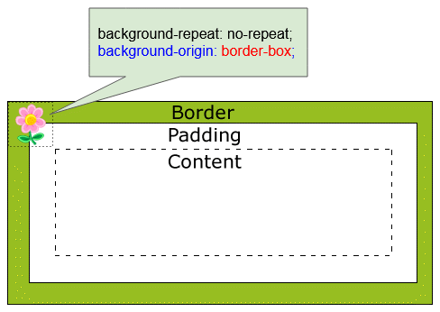
CSS {background-origin: border-box}
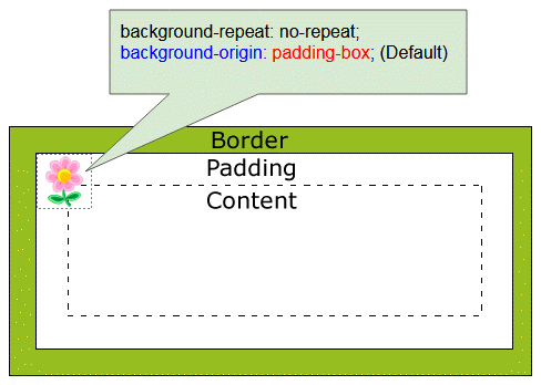
CSS {background-origin: padding-box}
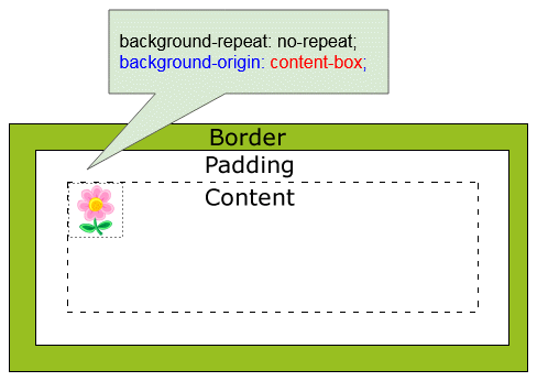
CSS {background-origin: content-box}
background-origin-example.html
<!DOCTYPE html>
<html>
<head>
    <title>CSS background-origin</title>
    <meta charset="UTF-8"/>
    <script>
        function setBgOrigin(value) {
           var myElement = document.getElementById("my-div");
           myElement.style.backgroundOrigin = value;
        }
        function setBgRepeat(value) {
           var myElement = document.getElementById("my-div");
           myElement.style.backgroundRepeat = value;
        }
    </script>
    <style>
      .option {
         padding: 5px;
         width: 160px;
         display:inline-block;
         border: 1px solid gray;
      }
       #my-div {
          border: 20px dashed gray;
          height:110px;
          width: 310px;
          margin-top: 10px;
          padding: 15px;
          background-image: url('../images/flower.png');
          background-repeat: no-repeat;
       }
    </style>
</head>
<body>
    <h3>CSS background-origin</h3>
    Background Image:
    <img src="../images/flower.png" /> <hr/>
    <div class="option">
      <p style="color:blue;">background-origin:</p>
      <input name ="a" type="radio" onClick="setBgOrigin('border-box')" /> border-box <br/>
      <input name ="a" type="radio" onClick="setBgOrigin('padding-box')" checked/> padding-box <br/>
      <input name ="a" type="radio" onClick="setBgOrigin('content-box')" /> content-box
    </div>
    <div class="option">
      <p style="color:blue;">background-repeat:</p>
      <input name ="b" type="radio" onClick="setBgRepeat('repeat-x')" /> repeat-x <br/>
      <input name ="b" type="radio" onClick="setBgRepeat('repeat-y')" /> repeat-y <br/>
      <input name ="b" type="radio" onClick="setBgRepeat('repeat')" /> repeat <br/>
      <input name ="b" type="radio" onClick="setBgRepeat('space')" /> space <br/>
      <input name ="b" type="radio" onClick="setBgRepeat('round')" /> round <br/>
      <input name ="b" type="radio" onClick="setBgRepeat('no-repeat')" checked/> no-repeat
    </div>
    <div id = "my-div"> </div>
</body>
</html>
6. CSS background-position
CSS background-position is used to set the starting position of each background image (relative to the origin position)
/* Keyword values */
background-position: top;
background-position: bottom;
background-position: left;
background-position: right;
background-position: center;

/* <percentage> values */
background-position: 25% 75%;

/* <length> values */
background-position: 0 0;
background-position: 1cm 2cm;
background-position: 10ch 8em;

/* Multiple images */
background-position: 0 0, center;

/* Edge offsets values */
background-position: bottom 10px right 20px;
background-position: right 3em bottom 10px;
background-position: bottom 10px right;
background-position: top right 10px;

/* Global values */
background-position: inherit;
background-position: initial;
background-position: unset;
Example:
background-position-example.html
<!DOCTYPE html>
<html>
<head>
    <title>CSS background-position</title>
    <meta charset="UTF-8"/>
    <script src="background-position-example.js"> </script>
    <style>
      .option {
         padding: 5px;
         display:inline-block;
         border: 1px solid gray;
      }
       #my-div {
          border: 20px dashed gray;
          height:110px;
          width: 310px;
          margin-top: 10px;
          padding: 15px;
          background-image: url('../images/flower.png');
          background-repeat: no-repeat;
       }
    </style>
</head>
<body>
    <h3>CSS background-position</h3>
    Background Image:
    <img src="../images/flower.png" /> <hr/>
    <div class="option">
      <p style="color:red;">background-position:</p>

      <input name ="x" type="radio" onClick="setBgPosition('1px 2px 5px 10px')" /> top <br/>
      <input name ="x" type="radio" onClick="setBgPosition('bottom')" /> bottom <br/>
      <input name ="x" type="radio" onClick="setBgPosition('left')" /> left <br/>
      <input name ="x" type="radio" onClick="setBgPosition('right')" /> right <br/>
      <input name ="x" type="radio" onClick="setBgPosition('center')" /> center <br/>
      <input name ="x" type="radio" onClick="setBgPosition('left top')" checked/> left top <br/>
      <input name ="x" type="radio" onClick="setBgPosition('left bottom')" /> left bottom <br/>
      <input name ="x" type="radio" onClick="setBgPosition('bottom 10px right')" />
               bottom 10px right <br/>
      <input name ="x" type="radio" onClick="setBgPosition('bottom 10px right 20px')" />
               bottom 10px right 20px <br/>
       ... <br/>
    </div>
    <div class="option">
      <p style="color:blue;">background-origin:</p>
      <input name ="a" type="radio" onClick="setBgOrigin('border-box')" /> border-box <br/>
      <input name ="a" type="radio" onClick="setBgOrigin('padding-box')" checked/> padding-box <br/>
      <input name ="a" type="radio" onClick="setBgOrigin('content-box')" /> content-box
    </div>
    <div class="option">
      <p style="color:blue;">background-repeat:</p>

      <input name ="b" type="radio" onClick="setBgRepeat('repeat-x')" /> repeat-x <br/>
      <input name ="b" type="radio" onClick="setBgRepeat('repeat-y')" /> repeat-y <br/>
      <input name ="b" type="radio" onClick="setBgRepeat('repeat')" /> repeat <br/>
      <input name ="b" type="radio" onClick="setBgRepeat('space')" /> space <br/>
      <input name ="b" type="radio" onClick="setBgRepeat('round')" /> round <br/>
      <input name ="b" type="radio" onClick="setBgRepeat('no-repeat')" checked/> no-repeat
    </div>
    <div id = "my-div"> </div>
</body>
</html>
background-position-example.js
function setBgPosition(value) {
   var myElement = document.getElementById("my-div");
   myElement.style.backgroundPosition = value;
}
function setBgOrigin(value) {
   var myElement = document.getElementById("my-div");
   myElement.style.backgroundOrigin = value;
}
function setBgRepeat(value) {
   var myElement = document.getElementById("my-div");
   myElement.style.backgroundRepeat = value;
}
CSS background-position accepts 1- value, 2- value, 3-value or 4 -value syntax.
1-value syntax
CSS background-position in 1-value syntax accepts the following values:
- center
- left, top, right, bottom
- 10px, 5cm, 20%,...
/* Keyword values */
background-position: top;
background-position: bottom;
background-position: left;
background-position: right;
background-position: center;

/* <percentage> values */
background-position: 25% 75%;

/* <length> values */
background-position: 0;
background-position: 1cm;
background-position: 10ch;
2-value syntax
CSS background-position in 2-value syntax accepts the following values:
Value | Same As |
left top | top left |
left bottom | bottom left |
right top | top right |
right bottom | bottom right |
10px 20cm | |
10% 20px | |
... |
Note: In 2-value syntax, if you provide an invalid value it will be ignored by browser. For example, CSS {background-position: left left} is an invalid value.
3-value syntax
3-value syntax is an extension of 2-value syntax. You can understand it better through the following illustration:
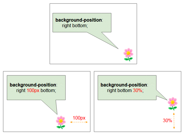
/* Edge offsets values */

background-position: bottom 10px right;
background-position: top right 10px;
4-value syntax
4-value syntax is an extension of 2-value syntax.You can understand it better through the following illustration:
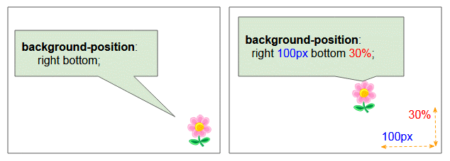
/* Edge offsets values */
background-position: bottom 10px right 20px;
background-position: right 3em bottom 10px;CSS Tutorials
- Units in CSS
- Basic CSS Selectors Tutorial with Examples
- CSS Attribute Selector Tutorial with Examples
- CSS combinator Selectors Tutorial with Examples
- CSS Backgrounds Tutorial with Examples
- CSS Opacity Tutorial with Examples
- CSS Padding Tutorial with Examples
- CSS Margins Tutorial with Examples
- CSS Borders Tutorial with Examples
- CSS Outline Tutorial with Examples
- CSS box-sizing Tutorial with Examples
- CSS max-width and min-width Tutorial with Examples
- The keywords min-content, max-content, fit-content, stretch in CSS
- CSS Links Tutorial with Examples
- CSS Fonts Tutorial with Examples
- Understanding Generic Font Family Names in CSS
- CSS @font-face Tutorial with Examples
- CSS Align Tutorial with Examples
- CSS Cursors Tutorial with Examples
- CSS Overflow Tutorial with Examples
- CSS Lists Tutorial with Examples
- CSS Tables Tutorial with Examples
- CSS visibility Tutorial with Examples
- CSS Display Tutorial with Examples
- CSS Grid Layout Tutorial with Examples
- CSS Float and Clear Tutorial with Examples
- CSS Position Tutorial with Examples
- CSS line-height Tutorial with Examples
- CSS text-align Tutorial with Examples
- CSS text-decoration Tutorial with Examples
Show More