HTML Images Tutorial with Examples
1. Attributes
The <img> tag helps you display an image on the page. The list below shows you some attributes of the <img> tag.
Attribute | Value | Description |
src | URL | Specifies the URL of an image |
alt | text | Specifies an alternate text for an image |
width | pixels | Specifies the width of an image |
height | pixels | Specifies the height of an image |
crossorigin | anonymous
use-credentials | Allows reading image data from another website to work with Canvas on the current website. |
ismap | ismap | Specifies an image as a server-side image-map |
sizes | Specifies image sizes for different page layouts | |
srcset | URL | Specifies the URL of the image to use in different situations |
usemap | #mapname | Specifies an image as a client-side image-map |
Note: This list does not consist of the align, border, hspace and vspace attributes. The reason is that these attributes were introduced in HTML4.1, but they are no longer supported in HTML5.
2. Src
The most important attribute of the <img> is the src, which specifies the URL of the image.
- The src can be a relative path to the image file location.
- The src can be a link to the image source.
<p>src='flower.png'</p>
<img src='flower.png' />

<p>src='../../_testdatas_/flower.png'</p>
<img src='../../_testdatas_/flower.png' />

<p>src='https://ex1.o7planning.com/_testdatas_/flower.png'</p>
<img src='https://ex1.o7planning.com/_testdatas_/flower.png' />
img-example.html
<!DOCTYPE html>
<html>
<head>
  <title>Image example</title>
  <meta charset="UTF-8">
</head>
<body>
  <p>src='flower.png'</p>
  <img src='flower.png' />

  <p>src='../../_testdatas_/flower.png'</p>
  <img src='../../_testdatas_/flower.png' />

  <p>src='https://ex1.o7planning.com/_testdatas_/flower.png'</p>
  <img src='https://ex1.o7planning.com/_testdatas_/flower.png' />
</body>
</html>
Base 64 URL:
The data of an image file is binary data which can be converted into a Base64 String by Base64 algorithm.
Base64 String
iVBORw0KGgoAAAANSUhEUgAAAAUA AAAFCAYAAACNbyblAAAAHElEQVQI12P4//8/w38GIAXDIBKE0DHxgljNBAAO 9TXL0Y4OHwAAAABJRU5ErkJggg==The thing is, you are able to make a Base64 URL:
Base64 URL
data:image/png;base64, iVBORw0KGgoAAAANSUhEUgAAAAUA AAAFCAYAAACNbyblAAAAHElEQVQI12P4//8/w38GIAXDIBKE0DHxgljNBAAO 9TXL0Y4OHwAAAABJRU5ErkJggg==For instance, the <img> with the src is a Base64 URL:
base64-url-example.html
<!DOCTYPE html>
<html>
<head>
  <title>Base64 URL example</title>
  <meta charset="UTF-8">
</head>
<body>
  <p>Red dot:</p>
  <img src='data:image/png;base64, iVBORw0KGgoAAAANSUhEUgAAAAUA AAAFCAYAAACNbyblAAAAHElEQVQI12P4//8/w38GIAXDIBKE0DHxgljNBAAO 9TXL0Y4OHwAAAABJRU5ErkJggg==' />
</body>
</html>
3. Alt
The alt attribute is used to display the alternative text to an image if the browser cannot display the image for some reason, such as the unavailable image source, the unsupported image format and so forth. Alt is short for Alternative.
Moreover, the Alt makes the image more accessible to the blind when they use Screen Reader, even though they cannot see the image, they are still able to read the content provided by the Alt.
The Alt attribute also supports the image collectors like Google.Google uses alternative text as the key while it is trying to interpret what the image is about.
alt-example.html
<!DOCTYPE html>
<html>
<head>
<title>Alt</title>
<meta charset="UTF-8">
</head>
<body>
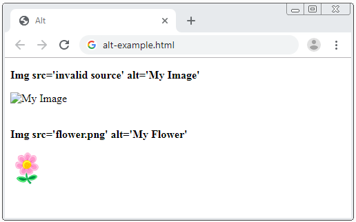
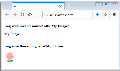
<p><b>Img src='invalid source' alt='My Image'</b></p>
<img src='invalid source' alt='My Image' />
<br /><br />
<p><b>Img src='flower.png' alt='My Flower'</b></p>
<img src='flower.png' alt='My Image' />
</body>
</html>Run the above example in Chrome browser like this:
Run the above example in Firefox browser as well:
4. Width/Height
The width and height attributes help you specify the width and height for images in pixels. This allows the browser to readily provide the necessary space to display the image. However, if you do not specify these two attributes, the image which needs to be downloaded by the browser, will be set the size to display afterwards. As a result, the page layout may change during the process of loading the image
It is notable that in HTML 4.1 you can assign a value (can be a number in pixels, or a string), such as "100%" to the width and height attributes. But in HTML 5 you can only assign a number in pixels to the width and height attributes.
width-height-example.html
<!DOCTYPE html>
<html>
<head>
  <title>Width/Height</title>
  <meta charset="UTF-8">
</head>
<body>
  <p><b>Img src='flower.png'</b></p>
  <img src='flower.png' />
  <p><b>Img src='flower.png' width= 30</b></p>
  <img src='flower.png' width=70 />

  <p><b>Img src='flower.png' width= 70 height=120</b></p>
  <img src='flower.png' width=70 height=120 />
</body>
</html>
5. usemap
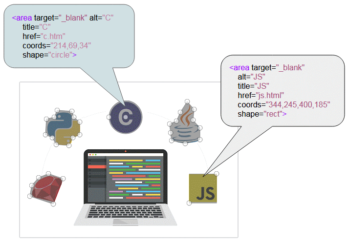
An Image map is a technique for creating different areas on the image, each of which involves a link to a different page.
usemap-example.html
<!DOCTYPE html>
<html>
<head>
  <title>Image Map</title>
  <meta charset="UTF-8">
</head>
<body>
  <p>Move the mouse over the image surface.
    A few places on the image you can click.</p>
  <img src="languages.png" usemap="#image-map">

  <map name="image-map">
    <area target="_blank" alt="C" title="C"
          href="c.htm" coords="214,69,34" shape="circle">
    <area target="_blank" alt="JS" title="JS"
          href="js.html" coords="344,245,400,185" shape="rect">
    <area target="_blank" alt="Python" title="Python"
          href="python.html"
          coords="74,57,68,71,52,75,50,107,64,113,72,127,98,129,106,113,120,107,120,81,108,71,104,59"
          shape="poly">
    <area target="_blank" alt="Ruby" title="Ruby"
          href="ruby.html"
          coords="56,185,36,193,22,209,18,231,66,247,86,195"
          shape="poly">
    <area target="_blank" alt="Java" title="Java"
          href="java.html"
          coords="340,37,326,59,318,77,304,83,306,101,308,117,336,123,366,115,366,91,352,75,354,53"
          shape="poly">
  </map>
</body>
</html>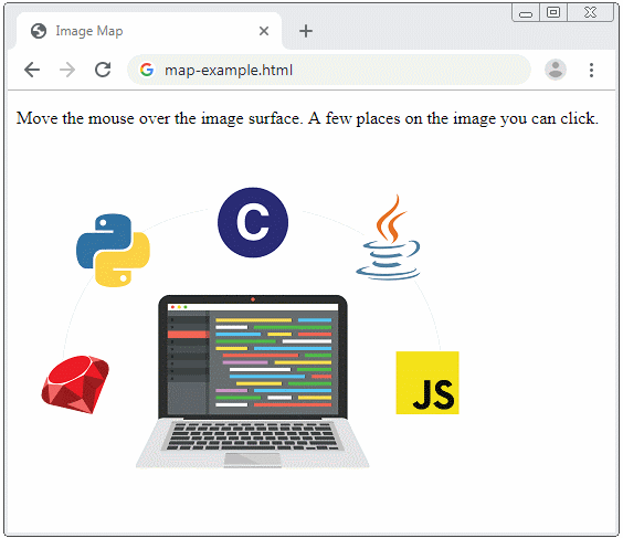
The website below is a tool to help you create <map> data:
6. ismap
The ismap attribute tells the browser that the image uses the Image-map at the server side. When the users click on any part of the image, information about the focal point will be sent to the server as a Query-string.
<a href="/show-language-at">
    <img src="languages.png" ismap>
</a>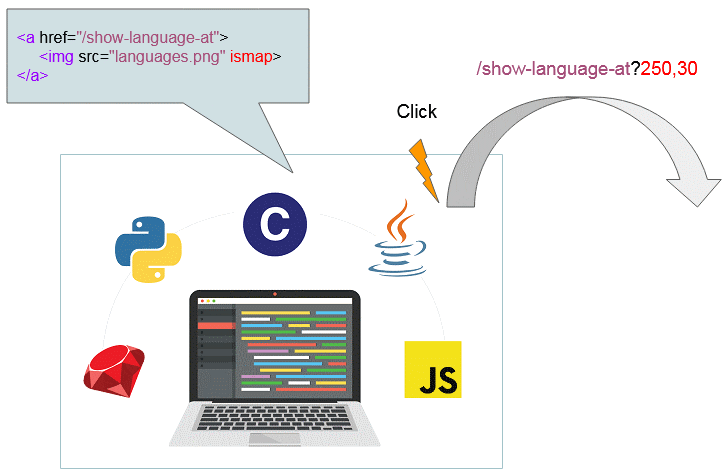
ismap-example.html
<!DOCTYPE html>
<html>
<head>
  <title>Image Map</title>
  <meta charset="UTF-8">
</head>
<body>
  <p>Move the mouse over the image surface.And Click</p>
  <a href="/show-language-at">
    <img src="languages.png" ismap>
  </a>
</body>
</html>
7. srcset, sizes
A friendly website must be adjustable to various devices with different screen sizes such as computers, tablets, phones and so on. Thus, the size of the image must be compatible with these devices as well.
The easiest way to make images suitable for all devices is to use the CSSmax-width:
<img src="../../_testdatas_/tom-and-jerry.png" style="max-width:100%;">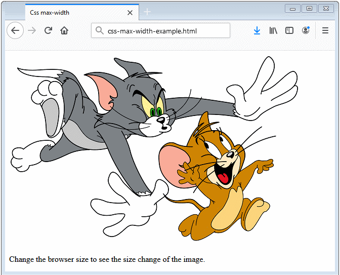
srcset
The srcset attribute of the <img> tag helps you define a set of images as well as which situations they will be used.
For instance:
<img src="image300.png" srcset="image100.png 480w, image150.png 600w">- If the Viewport width is less than 480w, the image100.png will be used.
- If the Viewport width is less than 600w, the image150.png will be used.
- If neither of them happens, the image300.png will be used.
Use "w" to tell the browser the size of the image source.Retina screen (available on high-end Apple computers) uses 200 pixels to display a 100w image.The common screen uses only 100 pixels to display a 100w image.With the same image, its size that you see on the Retina screen remains the same as on the common screen. However, the image on Retina screen is sharper.
sizes
The sizes attribute of the <img> tag allows you to define a set of media conditions as well asindicates which image size is the best choice for each media condition.
<img src="image300.png"
        srcset="image100.png 480w, image150.png 600w"
        sizes="<media condition> <width>, <media condition> <width>, <optional default image width>"
/>

<!-- Example: -->
<img src="image300.png"
        srcset="image100.png 480w, image150.png 600w"
        sizes="(min-width: 900px) 1000px,
                   (max-width: 900px) and (min-width: 400px) 50em,
                   ( not (orientation: portrait) ) 300px,
                   ( (orientation: landscape) or (min-width: 1000px) ) 50vw,
                   100vw"
/>
vw is the abbreviation of the Viewport Width. For example: 25vw = 25% of the width of Viewport; 100vm = 100% of the width of Viewport.
In fact, there are many issues for us to discuss the srcset and sizes attributes, so they should be mentioned in a different article. If that is what you are interested, you can read the article below:
- HTML Response Image
HTML Tutorials
- Introduction to HTML
- Install Atom Editor
- Install Atom HTML Preview
- Starting with HTML
- HTML Images Tutorial with Examples
- HTML Block/Inline Elements Tutorial with Examples
- HTML Editors
- Install Atom-Beautify
- HTML Styles Tutorial with Examples
- HTML Hyperlinks Tutorial with Examples
- HTML Email Links Tutorial with Examples
- HTML Paragraphs Tutorial with Examples
- HTML IFrames Tutorial with Examples
- HTML Entities Tutorial with Examples
- HTML Lists Tutorial with Examples
- HTML Tables Tutorial with Examples
- HTML Col, Colgroup Tutorial with Examples
- HTML Headings Tutorial with Examples
- HTML Quotations Tutorial with Examples
- HTML URL Encoding Tutorial with Examples
- HTML Video Tutorial with Examples
- HTML Dir Attribute Tutorial with Examples
Show More