Flutter RoundedRectangleBorder Tutorial with Examples
1. RoundedRectangleBorder
RoundedRectangleBorder is used to create a rectangular border with rounded corners. It is often used with ShapeDecoration to draw a box with rounded corners.
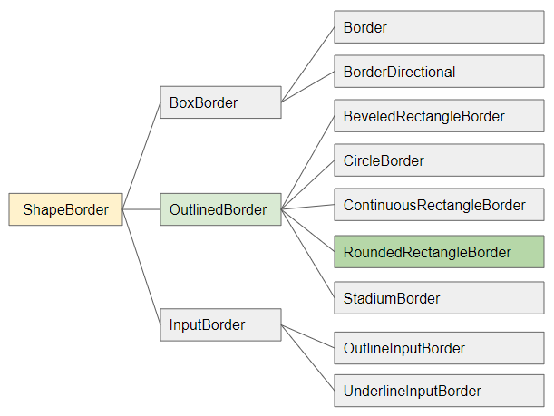
- ShapeBorder
- OutlinedBorder
- Border
- CircleBorder
- ContinuousRectangleBorder
- StadiumBorder
- BoxBorder
- InputBorder
- BorderDirectional
- BeveledRectangleBorder
- OutlineInputBorder
- UnderlineInputBorder
RoundedRectangleBorder constructor
const RoundedRectangleBorder(
    {BorderSide side: BorderSide.none,
    BorderRadiusGeometry borderRadius: BorderRadius.zero}
)
2. Examples
Example: Using RoundedRectangleBorder for a Container.
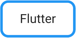
(ex1)
Container(
  width: 300,
  height: 150,
  decoration: ShapeDecoration(
      color: Colors.white,
      shape: RoundedRectangleBorder (
          borderRadius: BorderRadius.circular(32.0),
          side: BorderSide(
              width: 10,
              color: Colors.blue
          )
      )
  ),
  child: Center(
      child: Text(
          "Flutter",
          style: TextStyle(fontSize: 50)
      )
  ),
)
Use addition operator (+) to add 2 ShapeBorder in order to create an associative border:
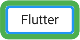
(ex2)
Container(
  width: 300,
  height: 150,
  decoration: ShapeDecoration(
      color: Colors.white,
      shape: RoundedRectangleBorder (
          borderRadius: BorderRadius.circular(16.0),
          side: BorderSide(
              width: 10,
              color: Colors.blue
          )
      ) + RoundedRectangleBorder (
          borderRadius: BorderRadius.circular(32.0),
          side: BorderSide(
              width: 20,
              color: Colors.green
          )
      )
  ),
  child: Center(
      child: Text(
          "Flutter",
          style: TextStyle(fontSize: 50)
      )
  ),
)
Example: Use RoundedRectangleBorder to shape an ElevatedButton:
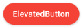
ElevatedButton(
  child: Text("ElevatedButton"),
  onPressed: () {},
  style: ElevatedButton.styleFrom( // returns ButtonStyle
    primary: Colors.red,
    onPrimary: Colors.white,
    shape: RoundedRectangleBorder(
      borderRadius: BorderRadius.circular(32.0),
    ),
  ),
)
Note: RoundedRectangleBorder.side property does not work with ElevatedButton, TextButton and OutlinedButton. It is overridden by ButtonStyle.side.
ElevatedButton(
  child: Text("ElevatedButton"),
  onPressed: () {},
  style: ElevatedButton.styleFrom( // returns ButtonStyle
    primary: Colors.red,
    onPrimary: Colors.white,
    side: BorderSide(color: Colors.green, width: 3), //  Work!
    shape: RoundedRectangleBorder(
        borderRadius: BorderRadius.circular(32.0),
        side: BorderSide(color: Colors.yellow, width: 3) // (Not working - Read note!!)
    ),
  ),
)
ElevatedButton.icon(
  icon: Icon(Icons.thumb_up),
  label: Text("Like"),
  onPressed: () {},
  style: ElevatedButton.styleFrom( // returns ButtonStyle
    shape: RoundedRectangleBorder(
      borderRadius: BorderRadius.circular(32.0),
    ),
  ),
)
// with side:
ElevatedButton.icon(
  icon: Icon(Icons.thumb_up),
  label: Text("Like"),
  onPressed: () {},
  style: ElevatedButton.styleFrom( // returns ButtonStyle
    side: BorderSide(color: Colors.green, width: 3),
    shape: RoundedRectangleBorder(
      borderRadius: BorderRadius.circular(32.0),
    ),
  ),
)
OutlinedButton.icon (
  icon: Icon(Icons.star_outline),
  label: Text("OutlinedButton"),
  onPressed: () {},
  style: ElevatedButton.styleFrom( // returns ButtonStyle
    shape: RoundedRectangleBorder(
      borderRadius: BorderRadius.circular(32.0),
    ),
  ),
)
// with side:
OutlinedButton.icon (
  icon: Icon(Icons.star_outline),
  label: Text("OutlinedButton"),
  onPressed: () {},
  style: ElevatedButton.styleFrom( // returns ButtonStyle
    side: BorderSide(width: 2.0, color: Colors.green),
    shape: RoundedRectangleBorder(
      borderRadius: BorderRadius.circular(32.0),
    ),
  ),
)
3. side
side - Provides parameters related to border such as color, width, style.
BorderSide side: BorderSide.noneBorderSide constructor
const BorderSide (
    {Color color: const Color(0xFF000000),
    double width: 1.0,
    BorderStyle style: BorderStyle.solid}
)- Flutter BorderSide
Note: RoundedRectangleBorder.side property will not work with ElevatedButton, TextButton and OutlinedButton, it was overridden by ButtonStyle.side. (See more examples above).
4. borderRadius
borderRadius - Provides 4 corner radius value of the rectangle.
BorderRadiusGeometry borderRadius: BorderRadius.zero- Flutter BorderRadiusGeometry
borderRadius (ex1)
Container(
  width: 300,
  height: 150,
  decoration: ShapeDecoration(
      color: Colors.white,
      shape: RoundedRectangleBorder (
          borderRadius: BorderRadius.only(
              bottomLeft: Radius.zero,
              topLeft:   Radius.zero,
              bottomRight: Radius.circular(20),
              topRight: Radius.circular(45)
          ),
          side: BorderSide(
              width: 10,
              color: Colors.blue
          )
      )
  ),
  child: Center(
      child: Text(
          "Flutter",
          style: TextStyle(fontSize: 50)
      )
  ),
)
Flutter Programming Tutorials
- Flutter Column Tutorial with Examples
- Flutter Stack Tutorial with Examples
- Flutter IndexedStack Tutorial with Examples
- Flutter Spacer Tutorial with Examples
- Flutter Expanded Tutorial with Examples
- Flutter SizedBox Tutorial with Examples
- Flutter Tween Tutorial with Examples
- Install Flutter SDK on Windows
- Install Flutter Plugin for Android Studio
- Create your first Flutter app - Hello Flutter
- Flutter Scaffold Tutorial with Examples
- Flutter AppBar Tutorial with Examples
- Flutter BottomAppBar Tutorial with Examples
- Flutter TextButton Tutorial with Examples
- Flutter ElevatedButton Tutorial with Examples
- Flutter EdgeInsetsGeometry Tutorial with Examples
- Flutter EdgeInsets Tutorial with Examples
- Flutter CircularProgressIndicator Tutorial with Examples
- Flutter LinearProgressIndicator Tutorial with Examples
- Flutter Center Tutorial with Examples
- Flutter Align Tutorial with Examples
- Flutter Row Tutorial with Examples
- Flutter SplashScreen Tutorial with Examples
- Flutter Alignment Tutorial with Examples
- Flutter Positioned Tutorial with Examples
- Flutter SimpleDialog Tutorial with Examples
- Flutter AlertDialog Tutorial with Examples
- Flutter Navigation and Routing Tutorial with Examples
- Flutter TabBar Tutorial with Examples
- Flutter Banner Tutorial with Examples
- Flutter BottomNavigationBar Tutorial with Examples
- Flutter FancyBottomNavigation Tutorial with Examples
- Flutter Card Tutorial with Examples
- Flutter Border Tutorial with Examples
- Flutter ContinuousRectangleBorder Tutorial with Examples
- Flutter RoundedRectangleBorder Tutorial with Examples
- Flutter CircleBorder Tutorial with Examples
- Flutter StadiumBorder Tutorial with Examples
- Flutter Container Tutorial with Examples
- Flutter RotatedBox Tutorial with Examples
- Flutter CircleAvatar Tutorial with Examples
- Flutter IconButton Tutorial with Examples
- Flutter FlatButton Tutorial with Examples
- Flutter SnackBar Tutorial with Examples
Show More