Flutter CircularProgressIndicator Tutorial with Examples
1. CircularProgressIndicator
CircularProgressIndicator is a subclass of ProgressIndicator. It creates a circular progress indicator.
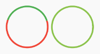
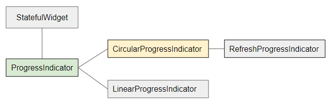
- LinearProgressIndicator
- ProgressIndicator
CircularProgressIndicator is divided into two types:
Determinate
Determinate: a progress indicator that shows the user the percentage of work completed based on the value of the value property (in the range of 0 and 1).
Indeterminate
Indeterminate: a progress indicator that neither identifies the percentage of work completed nor indicates the end time.
CircularProgressIndicator Constructor:
CircularProgressIndicator constructor
const CircularProgressIndicator(
{Key key,
double value,
Color backgroundColor,
Animation<Color> valueColor,
double strokeWidth: 4.0,
String semanticsLabel,
String semanticsValue}
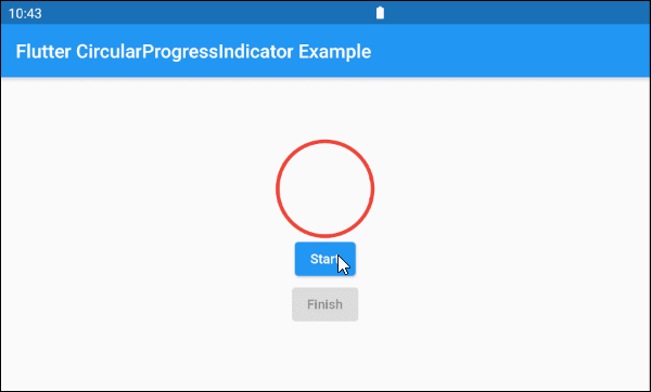
)2. Example: Indeterminate
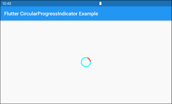
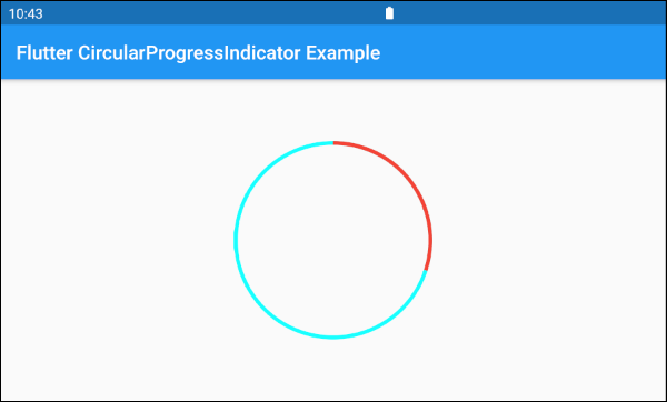
Let's begin with the simplest example, a CircularProgressIndicator simulates an active process but does not know the percentage of work that has been completed and does not know when to finish.
main.dart (ex 1)
import 'package:flutter/material.dart';

void main() => runApp(MyApp());

class MyApp extends StatelessWidget {
  @override
  Widget build(BuildContext context) {
    return MaterialApp(
      title: 'o7planning.org',
      debugShowCheckedModeBanner: false,
      home: HomePage(),
    );
  }
}

class HomePage extends StatelessWidget {

  @override
  Widget build(BuildContext context) {
    return Scaffold(
      appBar: AppBar(
        title: Text('Flutter CircularProgressIndicator Example'),
      ),
      body: Center(
        child:  CircularProgressIndicator(
          backgroundColor: Colors.cyanAccent,
          valueColor: new AlwaysStoppedAnimation<Color>(Colors.red),
        ),
      ),
    );
  }
}
By default CircularProgressIndicator has a pretty small radius, but if you want to customize the size, let's put it in a SizedBox.
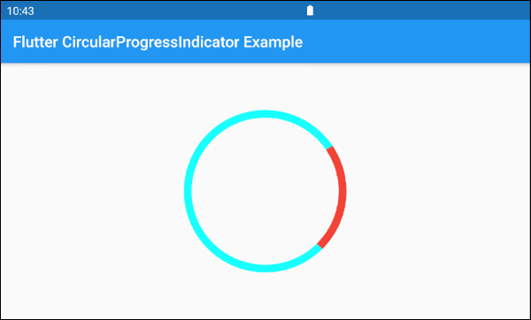
SizedBox(
  width: 200,
  height: 200,
  child: CircularProgressIndicator(
    strokeWidth: 10,
    backgroundColor: Colors.cyanAccent,
    valueColor: new AlwaysStoppedAnimation<Color>(Colors.red),
  ),
)The valueColor parameter is used to specify a color animation to the progress of CircularProgressIndicator, for example:
valueColor: new AlwaysStoppedAnimation<Color>(Colors.red)AlwaysStoppedAnimation<Color> will always stop the animation of CircularProgressIndicator if the value parameter is a specific value, not null.
SizedBox(
  width: 200,
  height: 200,
  child: CircularProgressIndicator(
    value: 0.3,
    backgroundColor: Colors.cyanAccent,
    valueColor: new AlwaysStoppedAnimation<Color>(Colors.red),
  ),
)
Based on the aforementioned features of the value and valueColor parameters, you can control the behavior of the CircularProgressIndicator. Let's see an example:
main.dart (ex 1d)
import 'package:flutter/material.dart';

void main() => runApp(MyApp());

class MyApp extends StatelessWidget {
  @override
  Widget build(BuildContext context) {
    return MaterialApp(
      title: 'o7planning.org',
      debugShowCheckedModeBanner: false,
      home: HomePage(),
    );
  }
}

class HomePage extends StatefulWidget {

  @override
  State<StatefulWidget> createState() {
    return _HomePageState();
  }
}

class _HomePageState extends State<HomePage> {

  bool _working = false;

  void startWorking() async {
    this.setState(() {
      this._working = true;
    });
  }

  void finishWorking() {
    this.setState(() {
      this._working = false;
    });
  }

  @override
  Widget build(BuildContext context) {
    return Scaffold(
      appBar: AppBar(
        title: Text('Flutter CircularProgressIndicator Example'),
      ),
      body: Center(
          child:  Column (
              mainAxisAlignment: MainAxisAlignment.center,
              children:  [
                SizedBox(
                  width: 100,
                  height: 100,
                  child: CircularProgressIndicator(
                    value: this._working? null: 1,
                    backgroundColor: Colors.cyanAccent,
                    valueColor: new AlwaysStoppedAnimation<Color>(Colors.red),
                  ),
                ),
                ElevatedButton(
                    child: Text("Start"),
                    onPressed: this._working? null: () {
                      this.startWorking();
                    }
                ),
                ElevatedButton(
                    child: Text("Finish"),
                    onPressed: !this._working? null: () {
                      this.finishWorking();
                    }
                )
              ]
          )
      ),
    );
  }
}
3. Example: Determinate
The following example uses CircularProgressIndicator to show a progress with the percentage of work completed. The value parameter has a value from 0 to 1.
main.dart (ex 2)
import 'package:flutter/material.dart';

void main() => runApp(MyApp());

class MyApp extends StatelessWidget {
  @override
  Widget build(BuildContext context) {
    return MaterialApp(
      title: 'o7planning.org',
      debugShowCheckedModeBanner: false,
      home: HomePage(),
    );
  }
}

class HomePage extends StatefulWidget {

  @override
  State<StatefulWidget> createState() {
    return _HomePageState();
  }
}

class _HomePageState extends State<HomePage> {

  double _value = 0;
  bool _working = false;

  void startWorking()  async {
    this.setState(() {
      this._working = true;
      this._value = 0;
    });
    for(int i = 0; i< 10; i++) {
      if(!this._working)  {
         break;
      }
      await Future.delayed(Duration(seconds: 1));
      this.setState(() {
        this._value += 0.1;
      });
    }
    this.setState(() {
      this._working = false;
    });
  }

  void stopWorking() {
    this.setState(() {
      this._working = false;
    });
  }

  @override
  Widget build(BuildContext context) {
    return Scaffold(
      appBar: AppBar(
        title: Text('Flutter CircularProgressIndicator Example'),
      ),
      body: Center(
          child:  Column (
              mainAxisAlignment: MainAxisAlignment.center,
              children:  [
                SizedBox(
                  width: 100,
                  height: 100,
                  child: CircularProgressIndicator(
                    value: this._value,
                    backgroundColor: Colors.cyanAccent,
                    valueColor: new AlwaysStoppedAnimation<Color>(Colors.red),
                  ),
                ),
                Text(
                  "Percent: " + (this._value * 100).round().toString()+ "%",
                  style: TextStyle(fontSize: 20),
                ),
                ElevatedButton(
                    child: Text("Start"),
                    onPressed: this._working? null: () {
                      this.startWorking();
                    }
                ),
                ElevatedButton(
                    child: Text("Stop"),
                    onPressed: !this._working? null: () {
                      this.stopWorking();
                    }
                )
              ]
          )
      ),
    );
  }
}
4. backgroundColor
backgroundColor is used to set the background color of the CircularProgressIndicator.
Color backgroundColor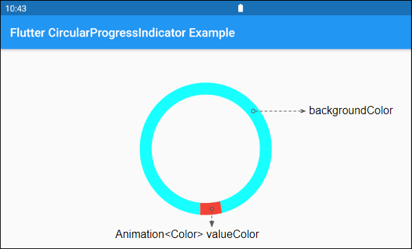
6. valueColor
valueColor is used to specify a color animation to the progress.
Animation<Color> valueColor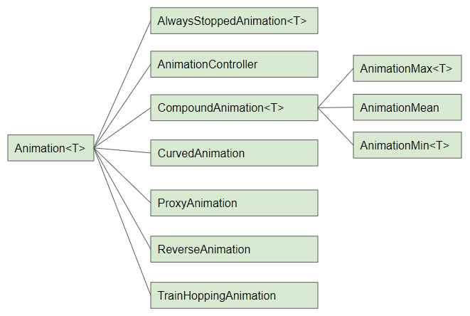
For example:
CircularProgressIndicator(
  strokeWidth: 20,
  backgroundColor: Colors.cyanAccent,
  valueColor: new AlwaysStoppedAnimation<Color>(Colors.red),
)- Flutter Animation
7. strokeWidth
strokeWidth is the width of the circle stroke. Its default value is 4 pixel(s).
double strokeWidth: 4.08. semanticsLabel
semanticsLabel is used to describe the intended use of CircularProgressIndicator, which is completely hidden on the interface and is purposeful for Screen readers, such as screen readers for the blind.
String semanticsLabel9. semanticsValue
semanticsValue is completely hidden on the screen. Its purpose is to provide information about the current progress for screen readers.
By default, the value of the semanticsValue is the percentage of the work completed, for example, the value of the value property is 0.3 meaning that the semanticsValue is "30%".
String semanticsValueVí dụ:
CircularProgressIndicator(
  value: this._value,
  backgroundColor: Colors.cyanAccent,
  valueColor: new AlwaysStoppedAnimation<Color>(Colors.red),
  semanticsLabel: "Downloading file abc.mp3",
  semanticsValue: "Percent " + (this._value * 100).toString() + "%",
)
Flutter Programming Tutorials
- Flutter Column Tutorial with Examples
- Flutter Stack Tutorial with Examples
- Flutter IndexedStack Tutorial with Examples
- Flutter Spacer Tutorial with Examples
- Flutter Expanded Tutorial with Examples
- Flutter SizedBox Tutorial with Examples
- Flutter Tween Tutorial with Examples
- Install Flutter SDK on Windows
- Install Flutter Plugin for Android Studio
- Create your first Flutter app - Hello Flutter
- Flutter Scaffold Tutorial with Examples
- Flutter AppBar Tutorial with Examples
- Flutter BottomAppBar Tutorial with Examples
- Flutter TextButton Tutorial with Examples
- Flutter ElevatedButton Tutorial with Examples
- Flutter EdgeInsetsGeometry Tutorial with Examples
- Flutter EdgeInsets Tutorial with Examples
- Flutter CircularProgressIndicator Tutorial with Examples
- Flutter LinearProgressIndicator Tutorial with Examples
- Flutter Center Tutorial with Examples
- Flutter Align Tutorial with Examples
- Flutter Row Tutorial with Examples
- Flutter SplashScreen Tutorial with Examples
- Flutter Alignment Tutorial with Examples
- Flutter Positioned Tutorial with Examples
- Flutter SimpleDialog Tutorial with Examples
- Flutter AlertDialog Tutorial with Examples
- Flutter Navigation and Routing Tutorial with Examples
- Flutter TabBar Tutorial with Examples
- Flutter Banner Tutorial with Examples
- Flutter BottomNavigationBar Tutorial with Examples
- Flutter FancyBottomNavigation Tutorial with Examples
- Flutter Card Tutorial with Examples
- Flutter Border Tutorial with Examples
- Flutter ContinuousRectangleBorder Tutorial with Examples
- Flutter RoundedRectangleBorder Tutorial with Examples
- Flutter CircleBorder Tutorial with Examples
- Flutter StadiumBorder Tutorial with Examples
- Flutter Container Tutorial with Examples
- Flutter RotatedBox Tutorial with Examples
- Flutter CircleAvatar Tutorial with Examples
- Flutter IconButton Tutorial with Examples
- Flutter FlatButton Tutorial with Examples
- Flutter SnackBar Tutorial with Examples
Show More