Flutter Row Tutorial with Examples
1. Row
Row is a widget that displays its child widgets on a row. Another variation is Column which shows its child widgets on a column.
To make the child widget of Row expand to fill the available horizontal space, you can wrap it in an Expanded object.
Row places its children on one line and cannot be scrolled. If you want a similar and scrollable container, you should consider using ListView.
Row Constructor:
Row Constructor
Row(
    {Key key,
    List<Widget> children: const <Widget>[],
    MainAxisAlignment mainAxisAlignment: MainAxisAlignment.start,
    MainAxisSize mainAxisSize: MainAxisSize.max,
    CrossAxisAlignment crossAxisAlignment: CrossAxisAlignment.center,
    TextDirection textDirection,
    VerticalDirection verticalDirection: VerticalDirection.down,
    TextBaseline textBaseline: TextBaseline.alphabetic
    }
)2. children
children property is used to define a list of the child widgets of Row.
You can add child widgets to children, or remove widgets from children, but you have to follow the rule that is mentioned in the "Add/Remove Children" section.
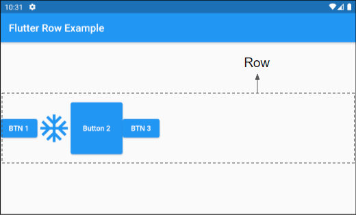
List<Widget> children: const <Widget>[]Let's get started with the first example, a Row with four child widgets:
main.dart (children ex1)
import 'package:flutter/material.dart';

void main() {
  runApp(MyApp());
}

class MyApp extends StatelessWidget {
  @override
  Widget build(BuildContext context) {
    return MaterialApp(
      title: 'o7planning.org',
      debugShowCheckedModeBanner: false,
      theme: ThemeData(
        primarySwatch: Colors.blue,
        visualDensity: VisualDensity.adaptivePlatformDensity,
      ),
      home: MyHomePage(),
    );
  }
}

class MyHomePage extends StatelessWidget {
  MyHomePage({Key key}) : super(key: key);

  @override
  Widget build(BuildContext context) {
    return Scaffold(
      appBar: AppBar(
          title: Text("Flutter Row Example")
      ),
      body: Center(
          child: Row (
              children: [
                ElevatedButton(child: Text("BTN 1"), onPressed:(){}),
                Icon(Icons.ac_unit, size: 64, color: Colors.blue),
                ElevatedButton(
                    child: Text("Button 2"),
                    onPressed:(){},
                    style: ButtonStyle(
                        minimumSize: MaterialStateProperty.all(Size.square(100))
                    )
                ),
                ElevatedButton(child: Text("BTN 3"), onPressed:(){}),
              ]
          )
      ),
    );
  }
}
Some child widgets with flex > 0 is able to expand its width to fill the remaining space horizontally such as Expanded, Spacer, etc. They are often used to adjust the distance among the child widgets of Row. Here is an example:
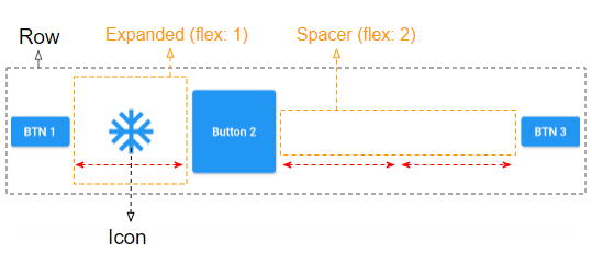
children (ex2)
Row (
    children: [
      ElevatedButton(child: Text("BTN 1"), onPressed:(){}),
      Expanded(
         flex: 1,
         child: Icon(Icons.ac_unit, size: 64, color: Colors.blue),
      ),
      ElevatedButton(
          child: Text("Button 2"),
          onPressed:(){},
          style: ButtonStyle(
              minimumSize: MaterialStateProperty.all(Size.square(100))
          )
      ),
      Spacer(
         flex: 2
      ),
      ElevatedButton(child: Text("BTN 3"), onPressed:(){}),
    ]
)3. Add/Remove children
You can add a few child widgets to a Row or remove some of them from Row. Doing what is shown below may lead to unexpected results:
** Not Working! **
class SomeWidgetState extends State<SomeWidget> {
  List<Widget> _children;

  void initState() {
    _children = [];
  }

  void someHandler() {
    setState(() {
        _children.add(newWidget);
    });
  }

  Widget build(BuildContext context) {
    // Reusing `List<Widget> _children` here is problematic.
    return Row(children: this._children);
  }
}
To solve the above problem, you need to comply with the following rules:
- Child widgets need to be explicitly assigned a Key value, which helps Flutter recognize old or new child widgets as the number of widgets changes.
- A new List object need to be created for Row.children if a certain child widget changes, or the number of child widgets does.
** Worked! **
class SomeWidgetState extends State<SomeWidget> {
  List<Widget> _children;

  void initState() {
    this._children = [];
  }

  // Add or remove some children..
  void someHandler() {
    setState(() {
      // The key here allows Flutter to reuse the underlying render
      // objects even if the children list is recreated.
      this._children.add(newWidget(key: ...));
    });
  }

  Widget build(BuildContext context) {
    // Always create a new list of children as a Widget is immutable.
    var newChildren = List.from(this._children);
    this._children = newChildren;

    return Row(children: this._children);
  }
}
For example:
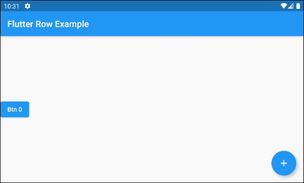
main.dart (children ex3)
import 'package:flutter/material.dart';

void main() {
  runApp(MyApp());
}

class MyApp extends StatelessWidget {
  @override
  Widget build(BuildContext context) {
    return MaterialApp(
      title: 'o7planning.org',
      debugShowCheckedModeBanner: false,
      theme: ThemeData(
        primarySwatch: Colors.blue,
        visualDensity: VisualDensity.adaptivePlatformDensity,
      ),
      home: MyHomePage(),
    );
  }
}

class MyHomePage extends StatefulWidget {
  MyHomePage({Key key}) : super(key: key);

  @override
  State<StatefulWidget> createState() {
    return MyHomePageState();
  }
}


class MyHomePageState extends State<MyHomePage> {
  List<Widget> _children = [];
  int idx = 0;

  @override
  void initState()  {
    super.initState();

    this._children = [
      ElevatedButton(
          key: Key(this.idx.toString()),
          child: Text("Btn " + idx.toString()),
          onPressed: (){}
      )
    ];
  }

  void addChildHandler()  {
    this.idx++;
    this.setState(() {
      var newChild = ElevatedButton(
          key: Key(this.idx.toString()),
          child: Text("Btn " + idx.toString()),
          onPressed: (){}
      );
      this._children.add(newChild);
    });
  }

  @override
  Widget build(BuildContext context) {
    // Create new List object:

    this._children = this._children == null? [] : List.from(this._children);

    return Scaffold(
      appBar: AppBar(
          title: Text("Flutter Row Example")
      ),
      body: Center(
          child: Row (
              children:  this._children
          )
      ),
      floatingActionButton: FloatingActionButton(
          child: Icon(Icons.add),
          onPressed: ()  {
            this.addChildHandler();
          }
      ),
    );
  }
}
4. mainAxisAlignment
mainAxisAlignment property is used to specify how the child widgets will be arranged on the main axis. As for Row, the main axis is the main horizontal axis.
MainAxisAlignment mainAxisAlignment: MainAxisAlignment.start

// MainAxisAlignment enum:

MainAxisAlignment.start
MainAxisAlignment.center
MainAxisAlignment.end

MainAxisAlignment.spaceBetween
MainAxisAlignment.spaceAround
MainAxisAlignment.spaceEvenly
MainAxisAlignment.start
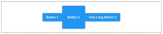
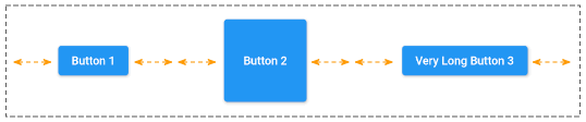
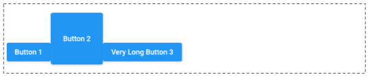
In case textDirection = TextDirection.ltr (Default) and mainAxisAlignment = MainAxisAlignment.start, the child widgets of Row will be placed side by side from left to right.
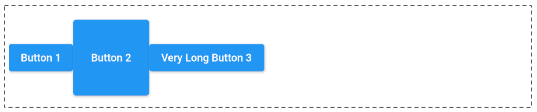
MainAxisAlignment.start
Row (
    mainAxisAlignment: MainAxisAlignment.start,
    children: [
      ElevatedButton(child: Text("Button 1"), onPressed:(){}),
      ElevatedButton(
          child: Text("Button 2"),
          onPressed:(){},
          style: ButtonStyle(
              minimumSize: MaterialStateProperty.all(Size.square(100))
          )
      ),
      ElevatedButton(child: Text("Very Long Button 3"), onPressed:(){})
    ]
)
MainAxisAlignment.center
mainAxisAlignment: MainAxisAlignment.centerMainAxisAlignment.end
In case textDirection = TextDirection.ltr (Default) and mainAxisAlignment = MainAxisAlignment.end, the child widgets of Row will be placed side by side from right to left.
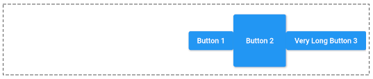
mainAxisAlignment: MainAxisAlignment.endMainAxisAlignment.spaceBetween
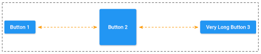
mainAxisAlignment: MainAxisAlignment.spaceBetweenMainAxisAlignment.spaceEvenly
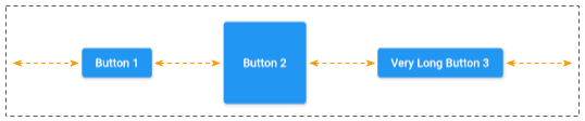
mainAxisAlignment: MainAxisAlignment.spaceEvenlyMainAxisAlignment.spaceAround
mainAxisAlignment: MainAxisAlignment.spaceAround5. mainAxisSize
mainAxisSize property specifies how much vertical space should be occupied by Row. Its default value is MainAxisSize.max meaning Row tries to occupy as much horizontal space as possible.
If there is a child widget with "flex > 0 && fit != FlexFit.loose", Row will try to take up as much space as possible regardless of the value of mainAxisSize.
Conversely, if mainAxisSize = MainAxisSize.min, Row will have a sufficient width for all of its child widgets.
MainAxisSize mainAxisSize: MainAxisSize.max

// MainAxisSize enum:

MainAxisSize.max
MainAxisSize.min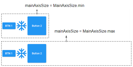
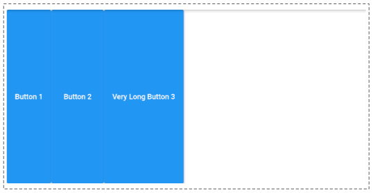
6. crossAxisAlignment
crossAxisAlignment property is used to specify how the child widgets will be arranged on the cross axis. As for Row, the cross axis is the vertical axis.
CrossAxisAlignment crossAxisAlignment: CrossAxisAlignment.center

// CrossAxisAlignment enum:

CrossAxisAlignment.start
CrossAxisAlignment.end
CrossAxisAlignment.center
CrossAxisAlignment.baseline
CrossAxisAlignment.stretch
CrossAxisAlignment.start
In case verticalDirection = VerticalDirection.down (Default) and crossAxisAlignment = CrossAxisAlignment.start , the child widgets of Row will be placed close to the top edge of the Row.
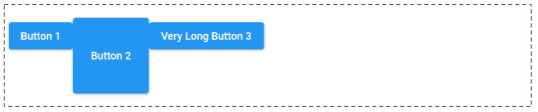
CrossAxisAlignment.start
Row (
    crossAxisAlignment: CrossAxisAlignment.start,

    children: [
      ElevatedButton(child: Text("Button 1"), onPressed:(){}),
      ElevatedButton(
          child: Text("Button 2"),
          onPressed:(){},
          style: ButtonStyle(
              minimumSize: MaterialStateProperty.all(Size.square(100))
          )
      ),
      ElevatedButton(child: Text("Very Long Button 3"), onPressed:(){})
    ]
)
CrossAxisAlignment.center (Default).
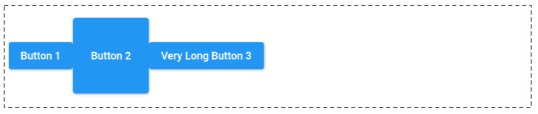
crossAxisAlignment: CrossAxisAlignment.centerCrossAxisAlignment.end
In case verticalDirection = VerticalDirection.down (Default) and crossAxisAlignment = CrossAxisAlignment.end, the child widgets of Row will be placed close to the bottom edge of the Row.
crossAxisAlignment: CrossAxisAlignment.endCrossAxisAlignment.stretch
crossAxisAlignment: CrossAxisAlignment.stretchCrossAxisAlignment.baseline
crossAxisAlignment: CrossAxisAlignment.baselineFor example:
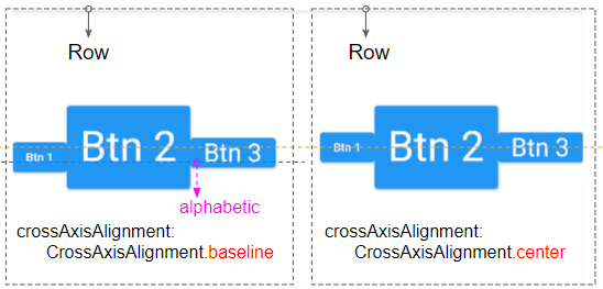
crossAxisAlignment: CrossAxisAlignment.baseline,
textBaseline: TextBaseline.alphabetic
7. textDirection
textDirection property specifies how the child widgets of Row will be arranged on the main axis (horizontal axis) and how the words "start" and "end" are interpreted.
TextDirection textDirection

// TextDirection enum:

TextDirection.ltr (Left to Right) (Default)
TextDirection.rtl (Right to Left)
If textDirection = TextDirection.ltr (Default), the word "start" will correspond to "left" and the word "end" will correspond to "right".
In contrast, in case textDirection = TextDirection.rtl, the word "start" will correspond to "right" and the word "end" will correspond to "left".
8. verticalDirection
verticalDirection property specifies how the child widgets of Row will be arranged on the cross axis (vertical axis) and how the words "start" and "end" are interpreted.
VerticalDirection verticalDirection: VerticalDirection.down

// VerticalDirection enum:

VerticalDirection.down (Default)
VerticalDirection.up
In case verticalDirection = VerticalDirection.down (Default), the word "start" will correspond to "top" and the word "end" will correspond to "bottom".
Conversely, if verticalDirection = VerticalDirection.up, the word "start" will correspond to "bottom" and the word "end" will correspond to "top".
9. textBaseline
If aligning the child widgets based on the baseline, the textBaseline property specifies what kind of baseline will be used.
TextBaseline textBaseline: TextBaseline.alphabetic

// TextBaseline enum:

TextBaseline.alphabetic  (Default)
TextBaseline.ideographic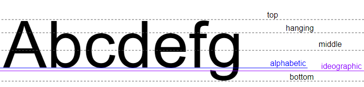
For example:
crossAxisAlignment: CrossAxisAlignment.baseline,
textBaseline: TextBaseline.alphabetic
Flutter Programming Tutorials
- Flutter Column Tutorial with Examples
- Flutter Stack Tutorial with Examples
- Flutter IndexedStack Tutorial with Examples
- Flutter Spacer Tutorial with Examples
- Flutter Expanded Tutorial with Examples
- Flutter SizedBox Tutorial with Examples
- Flutter Tween Tutorial with Examples
- Install Flutter SDK on Windows
- Install Flutter Plugin for Android Studio
- Create your first Flutter app - Hello Flutter
- Flutter Scaffold Tutorial with Examples
- Flutter AppBar Tutorial with Examples
- Flutter BottomAppBar Tutorial with Examples
- Flutter TextButton Tutorial with Examples
- Flutter ElevatedButton Tutorial with Examples
- Flutter EdgeInsetsGeometry Tutorial with Examples
- Flutter EdgeInsets Tutorial with Examples
- Flutter CircularProgressIndicator Tutorial with Examples
- Flutter LinearProgressIndicator Tutorial with Examples
- Flutter Center Tutorial with Examples
- Flutter Align Tutorial with Examples
- Flutter Row Tutorial with Examples
- Flutter SplashScreen Tutorial with Examples
- Flutter Alignment Tutorial with Examples
- Flutter Positioned Tutorial with Examples
- Flutter SimpleDialog Tutorial with Examples
- Flutter AlertDialog Tutorial with Examples
- Flutter Navigation and Routing Tutorial with Examples
- Flutter TabBar Tutorial with Examples
- Flutter Banner Tutorial with Examples
- Flutter BottomNavigationBar Tutorial with Examples
- Flutter FancyBottomNavigation Tutorial with Examples
- Flutter Card Tutorial with Examples
- Flutter Border Tutorial with Examples
- Flutter ContinuousRectangleBorder Tutorial with Examples
- Flutter RoundedRectangleBorder Tutorial with Examples
- Flutter CircleBorder Tutorial with Examples
- Flutter StadiumBorder Tutorial with Examples
- Flutter Container Tutorial with Examples
- Flutter RotatedBox Tutorial with Examples
- Flutter CircleAvatar Tutorial with Examples
- Flutter IconButton Tutorial with Examples
- Flutter FlatButton Tutorial with Examples
- Flutter SnackBar Tutorial with Examples
Show More