Flutter AppBar Tutorial with Examples
1. AppBar
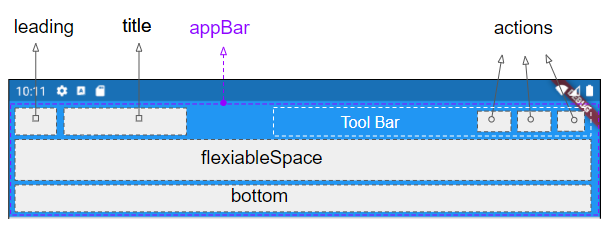
In Flutter, AppBar consists of one Tool Bar and other potential Widget(s). Particularly, AppBar is divided into five areas, leading, title, Tool Bar (actions), flexiableSpace, and bottom.
AppBar Constructor:
AppBar Constructor
AppBar( {Key key,
Widget leading,
bool automaticallyImplyLeading: true,
Widget title,
List<Widget> actions,
Widget flexibleSpace,
PreferredSizeWidget bottom,
double elevation,
Color shadowColor,
ShapeBorder shape,
Color backgroundColor,
Brightness brightness,
IconThemeData iconTheme,
IconThemeData actionsIconTheme,
TextTheme textTheme,
bool primary: true,
bool centerTitle,
bool excludeHeaderSemantics: false,
double titleSpacing: NavigationToolbar.kMiddleSpacing,
double toolbarOpacity: 1.0,
double bottomOpacity: 1.0,
double toolbarHeight
}
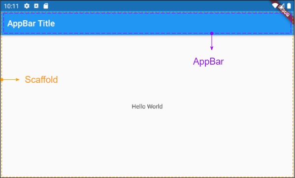
)AppBar is normally put in a Scaffold through the Scaffold.appBar property. AppBar will have a fixed height and appear on the top of the Scaffbar. If you want a scrollable app bar, use the SliverAppBar.
- SliverAppBar
- Scaffold
2. title
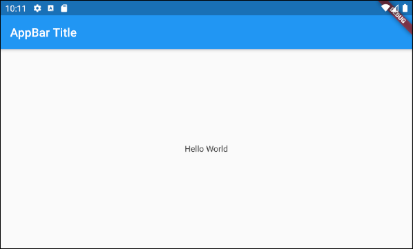
Widget title;For example, a simple AppBar consists of a title put in a Scaffold. It will appear on the top of the Scaffold.
main.dart (title ex1)
import 'package:flutter/material.dart';
void main() {
runApp(MyApp());
}
class MyApp extends StatelessWidget {
// This widget is the root of your application.
@override
Widget build(BuildContext context) {
return MaterialApp(
title: 'Title of Application',
theme: ThemeData(
primarySwatch: Colors.blue,
visualDensity: VisualDensity.adaptivePlatformDensity,
),
home: MyHomePage(),
);
}
}
class MyHomePage extends StatelessWidget {
MyHomePage({Key key}) : super(key: key);
@override
Widget build(BuildContext context) {
return Scaffold(
appBar: AppBar(
title: Text("AppBar Title"),
),
body: Center(
child: Text(
'Hello World',
)
),
);
}
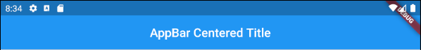
}An example of an AppBar with the title centered or right aligned:
AppBar(
title: Align (
child: Text("AppBar Centered Title"),
alignment: Alignment.center
)
);
AppBar(
title: Align (
child: Text("AppBar Right Title"),
alignment: Alignment.centerRight
)
);
AppBar(
title: Text("AppBar Centered Title"),
centerTitle: true,
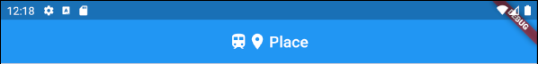
);An example of creating a "Title Widget" consisting of icons and text.
main.dart (title ex3)
import 'package:flutter/material.dart';

void main() {
  runApp(MyApp());
}

class MyApp extends StatelessWidget {

  @override
  Widget build(BuildContext context) {
    return MaterialApp(
      title: 'Title of Application',
      theme: ThemeData(
        primarySwatch: Colors.blue,
        visualDensity: VisualDensity.adaptivePlatformDensity,
      ),
      home: MyHomePage(),
    );
  }
}

class MyHomePage extends StatelessWidget {
  MyHomePage({Key key}) : super(key: key);

  @override
  Widget build(BuildContext context) {
    return Scaffold(
      appBar: AppBar(
          title: IconTitleWidget()
      ),
      body: Center(
          child: Text(
            'Flutter AppBar Tutorial',
          )
      ),
    );
  }
}

class IconTitleWidget extends StatelessWidget {

  @override
  Widget build(BuildContext context) {
    imageCache.clear();
    return Row (
      mainAxisAlignment: MainAxisAlignment.center, // Centers horizontally
      crossAxisAlignment: CrossAxisAlignment.center, // Centers vertically
      children: <Widget>[
        Icon(Icons.train),
        Icon(Icons.place),
        // The SizedBox provides an immediate spacing between the widgets
        SizedBox (
          width: 3,
        ),
        Text(
          "Place",
        )
      ],
    );
  }
}
3. leading
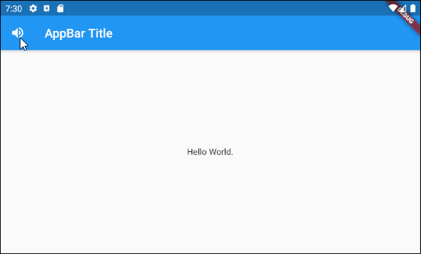
leading is a Widget placed in front of the title area. It is usually an Icon or an IconButton.
Widget leading;For example, leading is an IconButton. When the user clicks on the IconButton, a certain action will be executed.
// Example: leading is an IconButton
appBar: AppBar(
    title: Text("AppBar Title"),
    leading: IconButton(
        icon: Icon(Icons.notifications_active),
        onPressed: () {
             // Do something.
        }
    )
)

// Example: leading is an Icon
appBar: AppBar(
    title: Text("AppBar Title"),
    leading: Icon(Icons.notifications_active)
)
main.dart (leading ex1)
import 'package:flutter/material.dart';

void main() {
  runApp(MyApp());
}

class MyApp extends StatelessWidget {
  // This widget is the root of your application.
  @override
  Widget build(BuildContext context) {
    return MaterialApp(
      title: 'Title of Application',
      theme: ThemeData(
        primarySwatch: Colors.blue,
        visualDensity: VisualDensity.adaptivePlatformDensity,
      ),
      home: MyHomePage(),
    );
  }
}

class MyHomePage extends StatelessWidget {
  MyHomePage({Key key}) : super(key: key);

  @override
  Widget build(BuildContext context) {
    return Scaffold(
      appBar: AppBar(
          title: Text("AppBar Title"),
          leading: IconButton(
              icon: Icon(Icons.notifications_active),
              onPressed: () {
                showAlert(context);
              }
          )
      ),
      body: Center(
          child:  Text("Hello World.")
      ),
    );
  }

  void showAlert(BuildContext context) {
    showDialog(
        context: context,
        builder: (context) => AlertDialog(
          content: Text("Hi"),
        ));
  }
}
For example:
main.dart (leading ex2)
import 'package:flutter/material.dart';
void main() {
runApp(MyApp());
}
class MyApp extends StatelessWidget {
// This widget is the root of your application.
@override
Widget build(BuildContext context) {
return MaterialApp(
title: 'Title of Application',
theme: ThemeData(
primarySwatch: Colors.blue,
visualDensity: VisualDensity.adaptivePlatformDensity,
),
home: MyHomePage(),
);
}
}
class MyHomePage extends StatelessWidget {
MyHomePage({Key key}) : super(key: key);
@override
Widget build(BuildContext context) {
return Scaffold(
appBar: AppBar(
title: Text("AppBar Title"),
leading: MyVolumeButton()
),
body: Center(
child: Text("Hello World.")
),
);
}
}
class MyVolumeButton extends StatefulWidget {
MyVolumeButton({Key key}) : super(key: key);
@override
State<StatefulWidget> createState() {
return MyVolumeButtonState();
}
}
class MyVolumeButtonState extends State<MyVolumeButton> {
bool volumeOn = true;
@override
Widget build(BuildContext context) {
return IconButton(
icon: this.volumeOn? Icon(Icons.volume_up):Icon(Icons.volume_mute),
onPressed: () {
// Set new State
setState(() => this.volumeOn = !this.volumeOn);
}
);
}
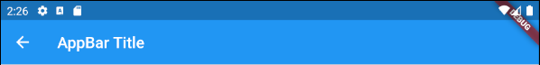
}4. automaticallyImplyLeading
bool automaticallyImplyLeading: true
automaticallyImplyLeading is an optional property of the AppBar, whose default value is true. When you do not place any Widget in the leading area, an appropriate Widget may be automatically put in it contextually.
- The leading area of AppBar is empty.
- AppBar.automaticallyImplyLeading : true.
- AppBar is placed in a Scaffold.
- Scaffold contains a Drawer (Scaffold.drawer is specified).
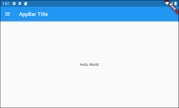
The leading area of the AppBar is empty. AppBar. automaticallyImplyLeading : true . AppBar.drawer : null - You jumped to the current screen from a previous screen.
main.dart (automaticallyImplyLeading : true)
import 'package:flutter/material.dart';

void main() {
  runApp(MyApp());
}

class MyApp extends StatelessWidget {
  // This widget is the root of your application.
  @override
  Widget build(BuildContext context) {
    return MaterialApp(
      title: 'Title of Application',
      theme: ThemeData(
        primarySwatch: Colors.blue,
        visualDensity: VisualDensity.adaptivePlatformDensity,
      ),
      home: MyHomePage(),
    );
  }
}

class MyHomePage extends StatelessWidget {
  MyHomePage({Key key}) : super(key: key);

  @override
  Widget build(BuildContext context) {
    return Scaffold(
      // AppBar with automaticallyImplyLeading = "true" (Default)
      appBar: AppBar(
          title: Text("AppBar Title"),
          automaticallyImplyLeading: true
      ),
      body: Center(
          child:  Text("Hello World.")
      ),
      drawer: Drawer(
        child: ListView(
          children: const <Widget> [
            DrawerHeader(
              decoration: BoxDecoration(
                color: Colors.green,
              ),
              child: Text(
                'My Drawer',
                style: TextStyle(
                  color: Colors.green,
                  fontSize: 24,
                ),
              ),
            ),
            ListTile(
              title: Text('Gallery'),
            ),
            ListTile(
              title: Text('Slideshow'),
            ),
          ],
        ),
      ),
    );
  }
}
5. actions
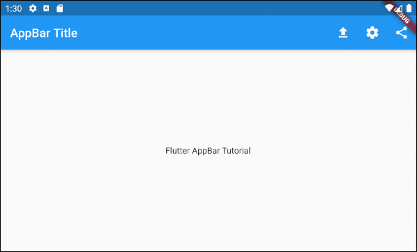
List<Widget> actions
An example of adding action(s) to the Tool bar of the AppBar.
main.dart (actions ex1)
import 'package:flutter/material.dart';

void main() {
  runApp(MyApp());
}

class MyApp extends StatelessWidget {

  @override
  Widget build(BuildContext context) {
    return MaterialApp(
      title: 'Title of Application',
      theme: ThemeData(
        primarySwatch: Colors.blue,
        visualDensity: VisualDensity.adaptivePlatformDensity,
      ),
      home: MyHomePage(),
    );
  }
}

class MyHomePage extends StatelessWidget {
  MyHomePage({Key key}) : super(key: key);

  @override
  Widget build(BuildContext context) {
    return Scaffold(
      appBar: AppBar(
          title: Text("AppBar Title"),
          actions: <Widget> [
            IconButton(
              icon: Icon(Icons.file_upload),
              onPressed: () => {
                print("Click on upload button")
              },
            ),
            IconButton(
                icon: Icon(Icons.settings),
                onPressed: () => {
                  print("Click on settings button")
                }
            ),
            PopupMenuButton(
              icon: Icon(Icons.share),
              itemBuilder: (context) => [
                PopupMenuItem(
                  value: 1,
                  child: Text("Facebook"),

                ),
                PopupMenuItem(
                  value: 2,
                  child: Text("Instagram"),
                ),
              ],
            )
          ]
      ),
      body: Center(
          child: Text(
            'Flutter AppBar Tutorial',
          )
      ),
    );
  }
}
Note: The height of the action(s) is limited by the height of the Tool Bar, but you can set the height of the Tool Bar by using
toolbarHeight
property
.
- Flutter IconButton
- Flutter PopupMenuButton
6. bottom
PreferredSizeWidget bottom;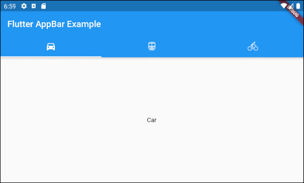
main.dart (bottom ex1)
import 'package:flutter/material.dart';

void main() {
  runApp(MyApp());
}

class MyApp extends StatelessWidget {
  // This widget is the root of your application.
  @override
  Widget build(BuildContext context) {
    return MaterialApp(
      title: 'Title of Application',
      theme: ThemeData(
        primarySwatch: Colors.blue,
        visualDensity: VisualDensity.adaptivePlatformDensity,
      ),
      home: MyHomePage(),
    );
  }
}

class MyHomePage extends StatelessWidget {
  MyHomePage({Key key}) : super(key: key);

  @override
  Widget build(BuildContext context) {
    return DefaultTabController(
        length: 3,
        child: Scaffold(
          appBar: AppBar(
            bottom: TabBar(
              tabs: [
                Tab(icon: Icon(Icons.directions_car)),
                Tab(icon: Icon(Icons.directions_transit)),
                Tab(icon: Icon(Icons.directions_bike)),
              ],
            ),
            title: Text('Flutter AppBar Example'),
          ),
          body: TabBarView (
            children: [
              Center(child: Text("Car")),
              Center(child: Text("Transit")),
              Center(child: Text("Bike"))
            ],
          ),
        )
    );
  }
}
Flutter Programming Tutorials
- Flutter Column Tutorial with Examples
- Flutter Stack Tutorial with Examples
- Flutter IndexedStack Tutorial with Examples
- Flutter Spacer Tutorial with Examples
- Flutter Expanded Tutorial with Examples
- Flutter SizedBox Tutorial with Examples
- Flutter Tween Tutorial with Examples
- Install Flutter SDK on Windows
- Install Flutter Plugin for Android Studio
- Create your first Flutter app - Hello Flutter
- Flutter Scaffold Tutorial with Examples
- Flutter AppBar Tutorial with Examples
- Flutter BottomAppBar Tutorial with Examples
- Flutter TextButton Tutorial with Examples
- Flutter ElevatedButton Tutorial with Examples
- Flutter EdgeInsetsGeometry Tutorial with Examples
- Flutter EdgeInsets Tutorial with Examples
- Flutter CircularProgressIndicator Tutorial with Examples
- Flutter LinearProgressIndicator Tutorial with Examples
- Flutter Center Tutorial with Examples
- Flutter Align Tutorial with Examples
- Flutter Row Tutorial with Examples
- Flutter SplashScreen Tutorial with Examples
- Flutter Alignment Tutorial with Examples
- Flutter Positioned Tutorial with Examples
- Flutter SimpleDialog Tutorial with Examples
- Flutter AlertDialog Tutorial with Examples
- Flutter Navigation and Routing Tutorial with Examples
- Flutter TabBar Tutorial with Examples
- Flutter Banner Tutorial with Examples
- Flutter BottomNavigationBar Tutorial with Examples
- Flutter FancyBottomNavigation Tutorial with Examples
- Flutter Card Tutorial with Examples
- Flutter Border Tutorial with Examples
- Flutter ContinuousRectangleBorder Tutorial with Examples
- Flutter RoundedRectangleBorder Tutorial with Examples
- Flutter CircleBorder Tutorial with Examples
- Flutter StadiumBorder Tutorial with Examples
- Flutter Container Tutorial with Examples
- Flutter RotatedBox Tutorial with Examples
- Flutter CircleAvatar Tutorial with Examples
- Flutter IconButton Tutorial with Examples
- Flutter FlatButton Tutorial with Examples
- Flutter SnackBar Tutorial with Examples
Show More