Flutter FlatButton Tutorial with Examples
1. FlatButton
In Flutter, FlatButton allows you to create a flat button with an elevation of 0.
FlatButton Constructor:
FlatButton Constructor
const FlatButton(
    {Key key,
    @required VoidCallback onPressed,
    VoidCallback onLongPress,
    ValueChanged<bool> onHighlightChanged,
    MouseCursor mouseCursor,
    ButtonTextTheme textTheme,
    Color textColor,
    Color disabledTextColor,
    Color color,
    Color disabledColor,
    Color focusColor,
    Color hoverColor,
    Color highlightColor,
    Color splashColor,
    Brightness colorBrightness,
    EdgeInsetsGeometry padding,
    VisualDensity visualDensity,
    ShapeBorder shape,
    Clip clipBehavior: Clip.none,
    FocusNode focusNode,
    bool autofocus: false,
    MaterialTapTargetSize materialTapTargetSize,
    @required Widget child}
)
FlatButton.icon Constructor:
FlatButton.icon Constructor
FlatButton.icon(
    {Key key,
    @required VoidCallback onPressed,
    VoidCallback onLongPress,
    ValueChanged<bool> onHighlightChanged,
    MouseCursor mouseCursor,
    ButtonTextTheme textTheme,
    Color textColor,
    Color disabledTextColor,
    Color color,
    Color disabledColor,
    Color focusColor,
    Color hoverColor,
    Color highlightColor,
    Color splashColor,
    Brightness colorBrightness,
    EdgeInsetsGeometry padding,
    ShapeBorder shape,
    Clip clipBehavior,
    FocusNode focusNode,
    bool autofocus,
    MaterialTapTargetSize materialTapTargetSize,
    @required Widget icon,
    @required Widget label}
)
FlatButton can be used in toolbars, dialogs, etc. But oftentimes you need to highlight it in order not to cause confusion for the user. In case you intentionally use flat buttons without the border, you should put it in an appropriate position to the context. Avoid placing FlatButton(s) where they are blended with other content, such as in the middle of a list.
If both the callback: onPressed and onLongPress functions are not specified, FlatButton will be disabled and have no response when touched. Besides, its color will be indicated by the disableColor property instead of the color property.
The smallest size of FlatButton is 88x36, but it can be overridden by ButtomTheme.
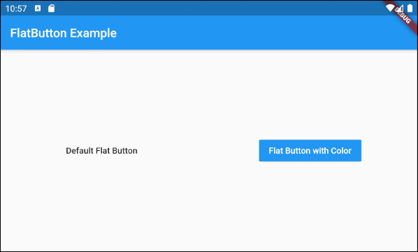
2. An example of FlatterButton
In the example below, it consists of two FlatButton(s), one simplest FlatButton (containing only one text label) and another FlatButton with the background and text color already set.
main.dart (ex1)
import 'package:flutter/material.dart';

void main() {
  runApp(MyApp());
}

class MyApp extends StatelessWidget {
  @override
  Widget build(BuildContext context) {
    return MaterialApp(
      title: 'Title of Application',
      theme: ThemeData(
        primarySwatch: Colors.blue,
        visualDensity: VisualDensity.adaptivePlatformDensity,
      ),
      home: MyHomePage(),
    );
  }
}

class MyHomePage extends StatelessWidget {
  MyHomePage({Key key}) : super(key: key);

  @override
  Widget build(BuildContext context) {
    return Scaffold(
     // backgroundColor: Color(0xffF4F6F6),
      appBar: AppBar(
        title: Text("FlatButton Example"),
      ),
      body: Center (
        child: Row (
          mainAxisAlignment: MainAxisAlignment.spaceAround,
          children: [
            FlatButton (
              child: Text("Default Flat Button"),
              onPressed: () {},
            ),
            FlatButton (
              child: Text("Flat Button with Color"),
              onPressed: () {},
              color: Colors.blue,
              textColor: Colors.white,
            )
          ],
        )
      )
    );
  }
}
3. child
child is the most important property of FlatButton. In most use cases, it is a Text object.
@required Widget childHere is the simplest example that the child is a Text object:
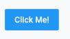
FlatButton (
  child: Text("Click Me!"),
  onPressed: () {},
  color: Colors.blue,
  textColor: Colors.white,
)
Assigning the Row object to the child property can create a more complex FlatButton, such as Icon and Text included.
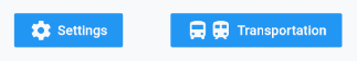
// 1 Icon and 1 Text
FlatButton (
  child: Row (
    children: [
        Icon(Icons.settings),
        SizedBox(width: 5),
        Text("Settings")
    ],
  ) ,
  onPressed: () {},
  color: Colors.blue,
  textColor: Colors.white,
)

// 2 Icons and 1 Text
FlatButton (
  child: Row (
    children: [
      Icon(Icons.directions_bus),
      Icon(Icons.train),
      SizedBox(width: 5),
      Text("Transportation")
    ],
  ) ,
  onPressed: () {},
  color: Colors.blue,
  textColor: Colors.white,
)
Note: When you want a FlatButton including Icon and Text, it is the best to use the FlatButton.icon constructor.
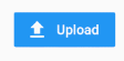
FlatButton.icon(
  icon: Icon(Icons.file_upload),
  label: Text("Upload"),
  onPressed: () {},
  color: Colors.blue,
  textColor: Colors.white,
)
4. onPressed
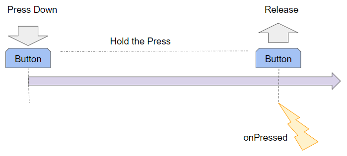
onPressed is a callback function. It is called when the user clicks on FlatButton. Specifically, an onPressed event will happen when the user completes both tasks consisting of pressing down and releasing FlatButton.
Note: If both onPress and onLongPress properties are not specified, FlatButton will be disabled. As a result, there will be no response when it is touched, and its color will be indicated by the disableColor property instead of the color property.
@required VoidCallback onPressed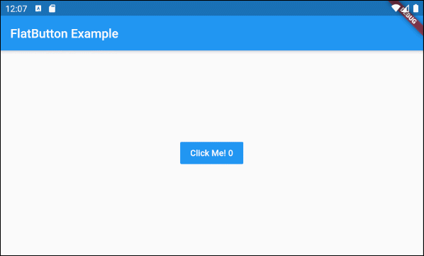
main.dart (onPress ex1)
import 'package:flutter/material.dart';

void main() {
  runApp(MyApp());
}

class MyApp extends StatelessWidget {
  @override
  Widget build(BuildContext context) {
    return MaterialApp(
      title: 'Title of Application',
      theme: ThemeData(
        primarySwatch: Colors.blue,
        visualDensity: VisualDensity.adaptivePlatformDensity,
      ),
      home: MyHomePage(),
    );
  }
}

class MyHomePage extends StatefulWidget {
  MyHomePage({Key key}) : super(key: key);

  @override
  State<StatefulWidget> createState() {
    return MyHomePageState();
  }
}

class MyHomePageState extends State<MyHomePage> {
  int pressCount = 0;

  @override
  Widget build(BuildContext context) {
    return Scaffold (
        appBar: AppBar(
          title: Text("FlatButton Example"),
        ),
        body: Center (
          child:  FlatButton (
              child: Text("Click Me! " + this.pressCount.toString()),
              color: Colors.blue,
              textColor: Colors.white,
              onPressed: onPressHander
          ),
        )
    );
  }

  onPressHander()  {
    this.setState(() {
      this.pressCount++;
    });
  }

}
Note: If you specify both callback: onPressed and onLongPress functions, only one of them will be called depending on the user's behavior. You can see a more detailed explanation of it in the onLongPress section.
5. onLongPress
onLongPress is a callback function that is called when the user presses down a FlatButton longer than LONG_PRESS_TIMEOUT milliseconds. The Long-Press event will happen at milliseconds of LONG_PRESS_TIMEOUT if during this time (0 --> LONG_PRESS_TIMEOUT) the user does not move the cursor.
VoidCallback onLongPressIf you specify two functions of callback: onPressed and onLongPress for a FlatButton, there will be at most one function to be called in any situation.
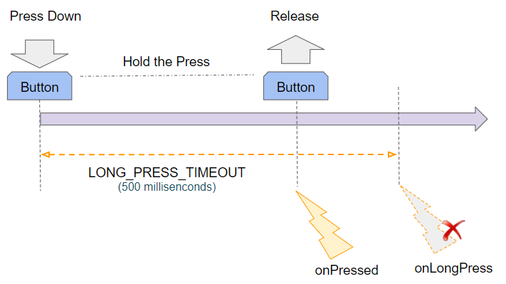
LONG_PRESS_TIMEOUT | 500 milliseconds |
If the user presses down and releases before the LONG_PRESS_TIMEOUT, only the onPressed event will occur.
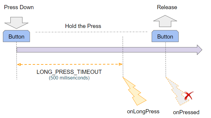
If the user presses down for a longer time than LONG_PRESS_TIMEOUT milliseconds, the onLongPress event will happen and Flutter will ignore the onPressed event that occurs after that.
main.dart (onLongPress ex1)
import 'package:flutter/material.dart';
void main() {
runApp(MyApp());
}
class MyApp extends StatelessWidget {
@override
Widget build(BuildContext context) {
return MaterialApp(
title: 'Title of Application',
theme: ThemeData(
primarySwatch: Colors.blue,
visualDensity: VisualDensity.adaptivePlatformDensity,
),
home: MyHomePage(),
);
}
}
class MyHomePage extends StatefulWidget {
MyHomePage({Key key}) : super(key: key);
@override
State<StatefulWidget> createState() {
return MyHomePageState();
}
}
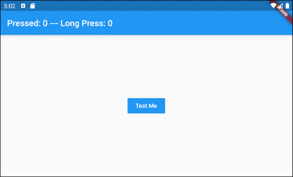
class MyHomePageState extends State<MyHomePage> {
int pressedCount = 0;
int longPressCount = 0;
@override
Widget build(BuildContext context) {
return Scaffold (
appBar: AppBar(
title: Text("Pressed: " + this.pressedCount.toString()
+" --- Long Press: " + this.longPressCount.toString()),
),
body: Center (
child: FlatButton (
child: Text("Test Me"),
color: Colors.blue,
textColor: Colors.white,
onPressed: onPressHander,
onLongPress: onLongPressHandler
),
)
);
}
onPressHander() {
this.setState(() {
this.pressedCount++;
});
}
onLongPressHandler() {
this.setState(() {
this.longPressCount++;
});
}
}6. onHighlightChanged
onHighlightChanged is a callback function that is called when the button starts and ends the button highlighting process. Thus, this function will be called twice every time the user interacts with the button.
Let's see the highlightColor property to learn more about the button highlighting process.
ValueChanged<bool> onHighlightChangedThe process of highlighting the button starts when the user presses down and ends after the HIGHLIGHT_TIMEOUT milliseconds or when the user releases it depending on which event comes first.
LONG_PRESS_TIMEOUT | 500 milliseconds |
HIGHLIGHT_TIMEOUT | 300 milliseconds |
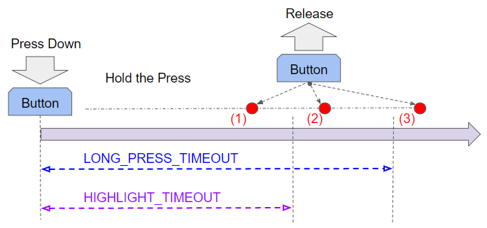
HIGHLIGHT_TIMEOUT is shorter than LONG_PRESS_TIMEOUT, so there are three possible cases:
Case 1: If the user releases the button before the HIGHLIGHT_TIMEOUT, the events will occur in the following order:
- onHighlightChanged(true)
- onHighlightChanged(false)
- onPressed
Case 2: If the user releases the button within the time after HIGHLIGHT_TIMEOUT and before LONG_PRESS_TIMEOUT, the events will occur in the following order:
- onHighlightChanged(true)
- onHighlightChanged(false)
- onPressed
Case 3: If the user releases the button after LONG_PRESS_TIMEOUT, the events will occur in the following order:
- onHighlightChanged(true)
- onHighlightChanged(false)
- onLongPress
onHighlightChanged (ex1)
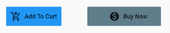
FlatButton.icon (
  icon: Icon(Icons.add_shopping_cart),
  label: Text("Add To Cart"),
  onPressed: () {
    print("onPressed");
  },
  onHighlightChanged: (valueChanged) {
    print("onHighlightChanged: " + valueChanged.toString());
  },
  onLongPress: () {
    print("onLongPress");
  },
)
7. shape
shape property is used to specify the shape of the FlatButton. Note: The flash that appears when the user presses it down is only spread within the area of shape.
ShapeBorder shape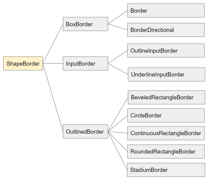
- Flutter ShapeBorder
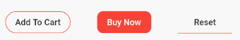
shape (ex1)
FlatButton (
  child: Text("Add To Cart"),
  onPressed: () {},
  shape: RoundedRectangleBorder(
      borderRadius: BorderRadius.circular(18.0),
      side: BorderSide(color: Colors.red)
  ),
)

FlatButton (
  child: Text("Buy Now"),
  onPressed: () {},
  color: Colors.red,
  textColor: Colors.white,
  shape: RoundedRectangleBorder(
      borderRadius: BorderRadius.circular(10.0),
      side: BorderSide(color: Colors.red)
  ),
)

FlatButton (
  child: Text("Reset"),
  onPressed: () {},
  shape: UnderlineInputBorder(
      borderSide: new BorderSide(
          color: Colors.red
      )
  ),
)10. materialTapTargetSize
MaterialTapTargetSize materialTapTargetSize

// Values:
MaterialTapTargetSize.padded
MaterialTapTargetSize.shrinkWrap- Flutter MaterialTapTargetSize
11. textTheme
textTheme property is used to define basic colors of the button and defaults for minimum sizes, padding and shapes.
ButtonTextTheme textTheme

// Values:
ButtonTextTheme.normal
ButtonTextTheme.accent
ButtonTextTheme.primary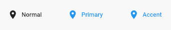
textTheme (ex1)
FlatButton.icon (
  icon: Icon(Icons.place),
  label: Text("Normal"),
  onPressed: () {},
  textTheme: ButtonTextTheme.normal,
)

FlatButton.icon (
  icon: Icon(Icons.place),
  label: Text("Primary"),
  onPressed: () {},
  textTheme: ButtonTextTheme.primary,
)

FlatButton.icon (
  icon: Icon(Icons.place),
  label: Text("Accent"),
  onPressed: () {},
  textTheme: ButtonTextTheme.accent,
)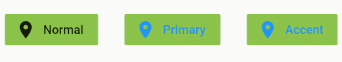
textTheme (ex2)
FlatButton.icon (
icon: Icon(Icons.place),
label: Text("Normal"),
onPressed: () {},
color: Colors.lightGreen,
textTheme: ButtonTextTheme.normal,
)
FlatButton.icon (
icon: Icon(Icons.place),
label: Text("Primary"),
onPressed: () {},
color: Colors.lightGreen,
textTheme: ButtonTextTheme.primary,
)
FlatButton.icon (
icon: Icon(Icons.place),
label: Text("Accent"),
onPressed: () {},
color: Colors.lightGreen,
textTheme: ButtonTextTheme.accent,
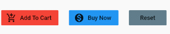
)12. textColor
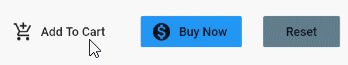
textColor property is used to specify the text color in FlatButton. It also works with Icons in FlatButton.
Color textColor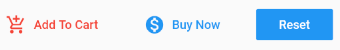
textColor (ex1)
FlatButton.icon (
  icon: Icon(Icons.add_shopping_cart),
  label: Text("Add To Cart"),
  onPressed: () {},
  textColor: Colors.red,
)


FlatButton.icon (
  icon: Icon(Icons.monetization_on),
  label: Text("Buy Now"),
  onPressed: () {},
  textColor: Colors.blue,
)


FlatButton (
  child: Text("Reset"),
  onPressed: () {},
  color: Colors.blue,
  textColor: Colors.white,
)
13. disabledTextColor
disabledTextColor property is used to specify the text color of FlatButton when FlatButton is disabled. It works with FlatButton Icons.
Note: A FlatButton will be disabled when both the onPressed and onLongPress properties are not specified or they have a null value.
Color disabledTextColor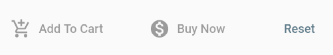
disabledTextColor (ex1)
FlatButton.icon (
  icon: Icon(Icons.add_shopping_cart),
  label: Text("Add To Cart"),
)


FlatButton.icon (
  icon: Icon(Icons.monetization_on),
  label: Text("Buy Now"),
  disabledTextColor: Colors.black38,
)


FlatButton (
  child: Text("Reset"),
  color: Colors.blue,
  textColor: Colors.white,
  disabledTextColor: Colors.blueGrey,
)
14. color
color property is used to specify the background color of FlatButton when FlatButton is in its normal state.
Color color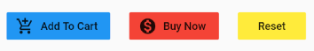
color (ex1)
FlatButton.icon (
    icon: Icon(Icons.add_shopping_cart),
    label: Text("Add To Cart"),
    onPressed: (){},
    color: Colors.blue
)

FlatButton.icon (
  icon: Icon(Icons.monetization_on),
  label: Text("Buy Now"),
  onPressed: (){},
  color: Colors.red,
)

FlatButton (
  child: Text("Reset"),
  onPressed: (){},
  color: Colors.yellow,
)
15. disabledColor
disabledColor property is used to specify the background color of FlatButton when FlatButton is disabled.
Note: A FlatButton will be disabled when both the onPressed and onLongPress properties are not specified or null.
Color disabledColor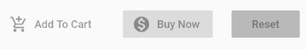
disabledColor (ex1)
FlatButton.icon (
icon: Icon(Icons.add_shopping_cart),
label: Text("Add To Cart"),
)
FlatButton.icon (
icon: Icon(Icons.monetization_on),
label: Text("Buy Now"),
disabledColor: Colors.black12,
)
FlatButton (
child: Text("Reset"),
disabledColor: Colors.black26,
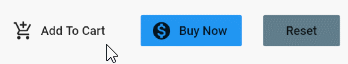
)16. focusColor
focusColor property is used to set the background color for FlatButton if this button has input focus.
Color focusColorYou may be familiar with the Windows operating system. To switch focus from one element to another, just press the TAB key. However, the Flutter app running on Android or iOS is not able to use that way. Instead, it uses a different principle that has been explained in the article below:
- Flutter change Focus
Here is an example of using the focusColor property. When you run this application on Android Emulator,you can still use the TAB key on your computer to switch the focus from one Widget to another Widget on the interface.
focusColor (ex1)
FlatButton.icon (
  icon: Icon(Icons.add_shopping_cart),
  label: Text("Add To Cart"),
  onPressed: () {},
  focusColor: Colors.red,
)


FlatButton.icon (
  icon: Icon(Icons.monetization_on),
  label: Text("Buy Now"),
  onPressed: () {},
  color: Colors.blue,
  focusColor: Colors.red,
)


FlatButton (
  child: Text("Reset"),
  onPressed: () {},
  color: Colors.blueGrey,
  focusColor: Colors.red,
)18. highlightColor
highlightColor property is used to specify the highlight color for the button.
Color highlightColorWhen the user presses it down, the background color of the button will gradually change from the current background color to the highlightColor, then it returns to its normal state when the user releases it.
If the duration from pressing down to releasing it is short, the background color of the button will not reach the highlightColor.
highlightColor (ex1)
FlatButton.icon (
    icon: Icon(Icons.add_shopping_cart),
    label: Text("Add To Cart"),
    onPressed: () {},
    highlightColor: Colors.red
)


FlatButton.icon (
    icon: Icon(Icons.monetization_on),
    label: Text("Buy Now"),
    onPressed: () {},
    color: Colors.blue,
    highlightColor: Colors.red
)


FlatButton (
    child: Text("Reset"),
    onPressed: () {},
    color: Colors.blueGrey,
    highlightColor: Colors.red
)
19. splashColor
splashColor property is used to specify the color of the flash surrounding the position where the user presses down.
Color splashColor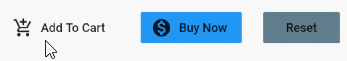
splashColor (ex1)
FlatButton.icon (
  icon: Icon(Icons.add_shopping_cart),
  label: Text("Add To Cart"),
  onPressed: () {},
  splashColor: Colors.lime,
)


FlatButton.icon (
  icon: Icon(Icons.monetization_on),
  label: Text("Buy Now"),
  onPressed: () {},
  color: Colors.blue,
  splashColor: Colors.lime,
)


FlatButton (
  child: Text("Reset"),
  onPressed: () {},
  color: Colors.blueGrey,
  splashColor: Colors.lime,
)
20. colorBrightness
colorBrightness property is used to recommend Flutter, which can take one of two values, Brightness.dart or Brightness.light.
- Use colorBrightness = Brightness.dark to tell Flutter that the button background color is dark, automatically select a suitable color for the text of the button.
- Use colorBrightness = Brightness.light to tell Flutter that the button background color is light, automatically select a suitable color for the text of the button.
Brightness colorBrightness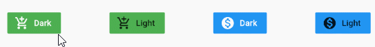
colorBrightness (ex1)
FlatButton.icon (
    icon: Icon(Icons.add_shopping_cart),
    label: Text("Dark"),
    onPressed: () {},
    color: Colors.green,
    colorBrightness: Brightness.dark
)

FlatButton.icon (
    icon: Icon(Icons.add_shopping_cart),
    label: Text("Light"),
    onPressed: () {},
    color: Colors.green,
    colorBrightness: Brightness.light
)

FlatButton.icon (
    icon: Icon(Icons.monetization_on),
    label: Text("Dark"),
    onPressed: () {},
    color: Colors.blue,
    colorBrightness: Brightness.dark
)

FlatButton.icon (
  icon: Icon(Icons.monetization_on),
  label: Text("Light"),
  onPressed: () {},
  color: Colors.blue,
    colorBrightness: Brightness.light
)
21. padding
The padding property is used to set the space within the border and around the button's content.
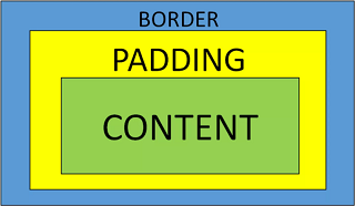
EdgeInsetsGeometry padding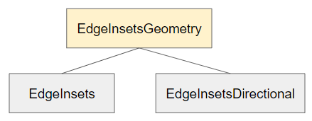
padding (ex1)
FlatButton.icon (
    icon: Icon(Icons.add_shopping_cart),
    label: Text("Add To Cart"),
    onPressed: () {},
    color: Colors.blue,
    padding: EdgeInsets.all(10)
)

FlatButton.icon (
    icon: Icon(Icons.monetization_on),
    label: Text("Buy Now"),
    onPressed: () {},
    color: Colors.blueGrey,
    padding: EdgeInsets.fromLTRB(50, 10, 30, 10)
)Flutter Programming Tutorials
- Flutter Column Tutorial with Examples
- Flutter Stack Tutorial with Examples
- Flutter IndexedStack Tutorial with Examples
- Flutter Spacer Tutorial with Examples
- Flutter Expanded Tutorial with Examples
- Flutter SizedBox Tutorial with Examples
- Flutter Tween Tutorial with Examples
- Install Flutter SDK on Windows
- Install Flutter Plugin for Android Studio
- Create your first Flutter app - Hello Flutter
- Flutter Scaffold Tutorial with Examples
- Flutter AppBar Tutorial with Examples
- Flutter BottomAppBar Tutorial with Examples
- Flutter TextButton Tutorial with Examples
- Flutter ElevatedButton Tutorial with Examples
- Flutter EdgeInsetsGeometry Tutorial with Examples
- Flutter EdgeInsets Tutorial with Examples
- Flutter CircularProgressIndicator Tutorial with Examples
- Flutter LinearProgressIndicator Tutorial with Examples
- Flutter Center Tutorial with Examples
- Flutter Align Tutorial with Examples
- Flutter Row Tutorial with Examples
- Flutter SplashScreen Tutorial with Examples
- Flutter Alignment Tutorial with Examples
- Flutter Positioned Tutorial with Examples
- Flutter SimpleDialog Tutorial with Examples
- Flutter AlertDialog Tutorial with Examples
- Flutter Navigation and Routing Tutorial with Examples
- Flutter TabBar Tutorial with Examples
- Flutter Banner Tutorial with Examples
- Flutter BottomNavigationBar Tutorial with Examples
- Flutter FancyBottomNavigation Tutorial with Examples
- Flutter Card Tutorial with Examples
- Flutter Border Tutorial with Examples
- Flutter ContinuousRectangleBorder Tutorial with Examples
- Flutter RoundedRectangleBorder Tutorial with Examples
- Flutter CircleBorder Tutorial with Examples
- Flutter StadiumBorder Tutorial with Examples
- Flutter Container Tutorial with Examples
- Flutter RotatedBox Tutorial with Examples
- Flutter CircleAvatar Tutorial with Examples
- Flutter IconButton Tutorial with Examples
- Flutter FlatButton Tutorial with Examples
- Flutter SnackBar Tutorial with Examples
Show More