Bootstrap Pagination Tutorial with Examples
1. Pagination
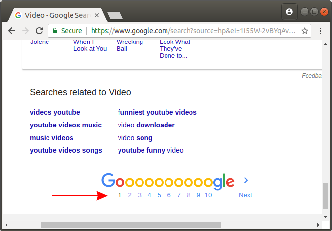
If you have a page with a lot of data (or something is the same). It is too long to be displayed on a single page. therefore, you have to divide it into many parts. Each part is a page. It displays only some data and you need a set of links for users to jump to the next page (or previous pages). Such set of links is referred to as a Pagination Component.
When you search something on Google, you can see a Pagination component:
In this lesson, we will learn about how to be able to create a Pagination component with Bootstrap.
pagination-example
<h4 class="mb-5">Pagination example:</h4>

<nav aria-label="Search results pages">
   <ul class="pagination">
      <li class="page-item disabled">
         <a class="page-link" href="#" tabindex="-1">Previous</a>
      </li>
      <li class="page-item">
         <a class="page-link" href="#">1</a>
      </li>
      <li class="page-item">
         <a class="page-link" href="#">2</a>
      </li>
      <li class="page-item">
         <a class="page-link" href="#">3</a>
      </li>
      <li class="page-item">
         <a class="page-link" href="#">Next</a>
      </li>
   </ul>
</nav>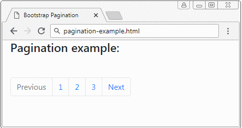
This is the structure of Bootstrap Pagination:
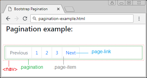
In fact, you can create a Bootstrap Pagination component without the <nav> element, but the advice is that there is it. The <nav> is the same as a hint that this is a navigation area and is useful for the devices such as Screen Reader. You may replace by <nav> by <div role = "nav"> to have similar meaning.
<nav aria-label="Search results pages">
   ...
</nav>


<div role="nav" aria-label="Search results pages">
  ...
</div>
Icon
For the "Next" or "Previous" elements you can replace them with icons but you should give hints for Screen Reader by using ".sr-only". This element is completely hidden for all devices except for the Screen Reader.
pagination-icon-example
<h4 class="mb-5">Pagination example:</h4>
<nav aria-label="Page navigation example">
<ul class="pagination">
<li class="page-item">
<a class="page-link" href="#" aria-label="Previous">
<span aria-hidden="true">«</span>
<span class="sr-only">Previous</span>
</a>
</li>
<li class="page-item">
<a class="page-link" href="#">1</a>
</li>
<li class="page-item">
<a class="page-link" href="#">2</a>
</li>
<li class="page-item">
<a class="page-link" href="#">3</a>
</li>
<li class="page-item">
<a class="page-link" href="#" aria-label="Next">
<span aria-hidden="true">»</span>
<span class="sr-only">Next</span>
</a>
</li>
</ul>
</nav>2. .disable & .active
Using the .active class for Pagination-item to highlight this item and emphasize that this is the page that the user is viewing (current page). And use the .disabled class for links (Link) if you want to disable it, users can not click on this link.
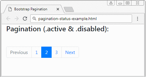
pagination-status-example
<h4 class="mb-5">Pagination (.active & .disabled):</h4>

<nav aria-label="Something..">
   <ul class="pagination">
      <li class="page-item disabled">
         <a class="page-link" href="#" tabindex="-1">Previous</a>
      </li>
      <li class="page-item">
         <a class="page-link" href="#">1</a>
      </li>
      <li class="page-item active">
         <a class="page-link" href="#">2 <span class="sr-only">(current)</span></a>
      </li>
      <li class="page-item"><a class="page-link" href="#">3</a></li>
      <li class="page-item">
         <a class="page-link" href="#">Next</a>
      </li>
   </ul>
</nav>
3. Sizing
If you want that the Pagination component is a little bit bigger, please use the .pagination-lg class:
.pagination .pagination-lg
<h5 class="mb-2">Pagination (.pagination .pagination-lg):</h5>

<nav aria-label="Something">
   <ul class="pagination pagination-lg">
      <li class="page-item disabled">
         <a class="page-link" href="#" tabindex="-1">1</a>
      </li>
      <li class="page-item"><a class="page-link" href="#">2</a></li>
      <li class="page-item"><a class="page-link" href="#">3</a></li>
   </ul>
</nav>
Or you want to have a a little bit smaller Pagination, please use the.pagination-sm class:
.pagination .pagination-sm
<h5 class="mb-2">Pagination (.pagination .pagination-sm):</h5>
<nav aria-label="Something">
<ul class="pagination pagination-sm">
<li class="page-item disabled">
<a class="page-link" href="#" tabindex="-1">1</a>
</li>
<li class="page-item"><a class="page-link" href="#">2</a></li>
<li class="page-item"><a class="page-link" href="#">3</a></li>
</ul>
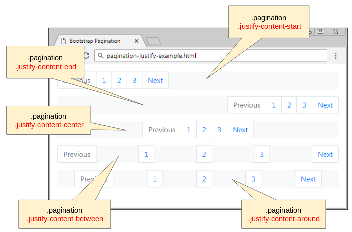
</nav>4. Justify
Bootstrap Pagination is essentially a Flex Container, because it is set up Css property {display: flex}. Therefore, some utility classes of the Bootstrap Flex can apply to the Pagination:
- justify-content-start
- justify-content-center
- justify-content-end
- justify-content-between
- justify-content-around
.pagination .justify-content-center
<h6 class="mb-3">.pagination .justify-content-center</h6>

<nav aria-label="Something">
   <ul class="pagination justify-content-center bg-light">
      <li class="page-item disabled">
         <a class="page-link" href="#" tabindex="-1">Previous</a>
      </li>
      <li class="page-item"><a class="page-link" href="#">1</a></li>
      <li class="page-item"><a class="page-link" href="#">2</a></li>
      <li class="page-item"><a class="page-link" href="#">3</a></li>
      <li class="page-item">
         <a class="page-link" href="#">Next</a>
      </li>
   </ul>
</nav>
.pagination .justify-content-end
<h6 class="mb-3">.pagination .justify-content-end</h6>

<nav aria-label="Something">
   <ul class="pagination justify-content-end bg-light">
      <li class="page-item disabled">
         <a class="page-link" href="#" tabindex="-1">Previous</a>
      </li>
      <li class="page-item"><a class="page-link" href="#">1</a></li>
      <li class="page-item"><a class="page-link" href="#">2</a></li>
      <li class="page-item"><a class="page-link" href="#">3</a></li>
      <li class="page-item">
         <a class="page-link" href="#">Next</a>
      </li>
   </ul>
</nav>
Bootstrap Tutorials
- Bootstrap Jumbotron Tutorial with Examples
- Bootstrap Dropdowns Tutorial with Examples
- Bootstrap Alerts Tutorial with Examples
- Bootstrap Buttons Tutorial with Examples
- Bootstrap Button Group Tutorial with Examples
- Bootstrap Popovers (Tooltips) Tutorial with Examples
- Bootstrap Spinners Tutorial with Examples
- Introduction to Bootstrap
- Bootstrap Grid System Tutorial with Examples
- Bootstrap Cards Tutorial with Examples
- Bootstrap Containers Tutorial with Examples
- Bootstrap Nav Tab/Pill Tutorial with Examples
- Bootstrap NavBars Tutorial with Examples
- Bootstrap Tables Tutorial with Examples
- Bootstrap Modal Tutorial with Examples
- Bootstrap Forms Tutorial with Examples
- Bootstrap Pagination Tutorial with Examples
- Bootstrap Badges Tutorial with Examples
- Bootstrap Input Group Tutorial with Examples
- Bootstrap List Groups Tutorial with Examples
- Bootstrap ProgressBars Tutorial with Examples
- Bootstrap Collapse and Accordion Tutorial with Examples
- Bootstrap Scrollspy Tutorial with Examples
- Bootstrap Breadcrumb Tutorial with Examples
- Bootstrap Carousel Tutorial with Examples
- Bootstrap Spacing Utilities Tutorial with Examples
- Bootstrap Border Utilities Tutorial with Examples
- Bootstrap Color Utilities Tutorial with Examples
- Bootstrap Text Utilities Tutorial with Examples
- Bootstrap Sizing Utilities Tutorial with Examples
- Bootstrap Position Utilities Tutorial with Examples
- Bootstrap Flex Utilities Tutorial with Examples
- Bootstrap Display Utilities Tutorial with Examples
- Bootstrap Visibility Utilities Tutorial with Examples
- Bootstrap Embed Utilities Tutorial with Examples
Show More