Bootstrap Badges Tutorial with Examples
1. Bootstrap Badge
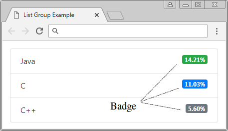
Badge (Huy hiệu) là một thành phần giao diện nhỏ, nó thường được sử dụng để trang trí cho một thành phần nào đó. Dưới đây là một vài hình ảnh minh họa Badge được sử dụng trong trang.

Bootstrap applies the .badge to a tage to create a Badge. A few additional classes such as .badge-primary, .badge-secondary, .badge-danger,.. help to create the background color of Badge, you can use them in the suitable context.
- badge-primary
- badge-secondary
- badge-success
- badge-danger
- badge-warning
- badge-info
- badge-light
- badge-dark
- badge-link
Example of using the Badge to decorate Links:
Link with Badge
<a href="#">News <span class="badge badge-primary">5</span></a><br>
<a href="#">Comments <span class="badge badge-secondary">10</span></a><br>
<a href="#">Updates <span class="badge badge-danger">2</span></a>
See the full example:
badge-link-example.html
<!DOCTYPE html>
<html>
   <head>
      <meta charset="utf-8">
      <title>Bootstrap Badge</title>
      <link rel="stylesheet" href="https://stackpath.bootstrapcdn.com/bootstrap/4.1.1/css/bootstrap.min.css">
   </head>
   <body>
      <div class="container">
         <h4 class="mb-3">Link with Badge</h4>

         <a href="#">News <span class="badge badge-primary">5</span></a><br>
         <a href="#">Comments <span class="badge badge-secondary">10</span></a><br>
         <a href="#">Updates <span class="badge badge-danger">2</span></a>

      </div>
      <script src="https://code.jquery.com/jquery-3.3.1.slim.min.js"></script>
      <script src="https://cdnjs.cloudflare.com/ajax/libs/popper.js/1.14.3/umd/popper.min.js"></script>
      <script src="https://stackpath.bootstrapcdn.com/bootstrap/4.1.1/js/bootstrap.min.js"></script>
   </body>
</html>
By default, the Badges are set up size front size equal to 75% of the Font size of parent element.
<h1>Example heading H1 <span class="badge badge-secondary">New</span></h1>
<h2>Example heading H2 <span class="badge badge-secondary">New</span></h2>
<h3>Example heading H3 <span class="badge badge-secondary">New</span></h3>
<h4>Example heading H4 <span class="badge badge-secondary">New</span></h4>
<h5>Example heading H5 <span class="badge badge-secondary">New</span></h5>
<h6>Example heading H6 <span class="badge badge-secondary">New</span></h6>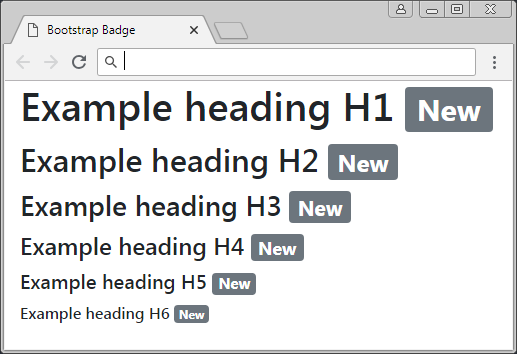
Badge is alsoe used to decorate Button. For example, for a Button, users click on this Button to download file. The Badge is used to display total times which the file is downloaded by users.
<button class="btn btn-primary">
  Download <span class="badge badge-light">5</span>
</button>
2. Badge (.badge-pill)
Use the .badge-pill class to help your Badge rounder in 4 angles. The following figures indicate difference between a normal Badge and a Badge using the .badge-pill class:

.badge .badge-pill
<h1>
   News
   <span class="badge badge-primary">100</span>
</h1>
<h1>
   Comments
   <span class="badge badge-pill badge-primary">20K</span>
</h1>
Bootstrap Tutorials
- Introduction to Bootstrap
- Bootstrap Containers Tutorial with Examples
- Bootstrap Grid System Tutorial with Examples
- Bootstrap Nav Tab/Pill Tutorial with Examples
- Bootstrap NavBars Tutorial with Examples
- Bootstrap Tables Tutorial with Examples
- Bootstrap Modal Tutorial with Examples
- Bootstrap Forms Tutorial with Examples
- Bootstrap Input Group Tutorial with Examples
- Bootstrap Pagination Tutorial with Examples
- Bootstrap Badges Tutorial with Examples
- Bootstrap Jumbotron Tutorial with Examples
- Bootstrap Dropdowns Tutorial with Examples
- Bootstrap Alerts Tutorial with Examples
- Bootstrap Buttons Tutorial with Examples
- Bootstrap Button Group Tutorial with Examples
- Bootstrap Popovers (Tooltips) Tutorial with Examples
- Bootstrap List Groups Tutorial with Examples
- Bootstrap ProgressBars Tutorial with Examples
- Bootstrap Spinners Tutorial with Examples
- Bootstrap Cards Tutorial with Examples
- Bootstrap Collapse and Accordion Tutorial with Examples
- Bootstrap Scrollspy Tutorial with Examples
- Bootstrap Breadcrumb Tutorial with Examples
- Bootstrap Carousel Tutorial with Examples
- Bootstrap Spacing Utilities Tutorial with Examples
- Bootstrap Border Utilities Tutorial with Examples
- Bootstrap Color Utilities Tutorial with Examples
- Bootstrap Text Utilities Tutorial with Examples
- Bootstrap Sizing Utilities Tutorial with Examples
- Bootstrap Position Utilities Tutorial with Examples
- Bootstrap Flex Utilities Tutorial with Examples
- Bootstrap Display Utilities Tutorial with Examples
- Bootstrap Visibility Utilities Tutorial with Examples
- Bootstrap Embed Utilities Tutorial with Examples
Show More