Bootstrap Flex Utilities Tutorial with Examples
1. Overview of Bootstrap Flex
Before learning about the Flex in Bootstrap, I will give a few concepts to be used in this lesson.
- An element applied the .d-flex class or .d-inline-flex class is refered to as "Flex Container".
- Direct Child elements of "Flex Container" is refered to as "Flex Item".
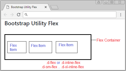
Basically, Flex Container can change its size, for example, when the size of browser changes, the Flex Items will grow or shrink their size to react the changes. Bootstrap provides Flex Utility Classes to help you control the acts of Flex Items.
2. Flex Container
An element applied one of the following classes will be called a Flex Container:
- .d-flex
- .d-inline-flex
- .d-sm-flex
- .d-sm-inline-flex
- .d-md-flex
- .d-md-inline-flex
- .d-lg-flex
- .d-lg-inline-flex
- .d-xl-flex
- .d-xl-inline-flex
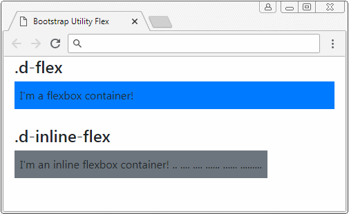
First of all, let's look at an example to see the difference between .d-flex and .d-inline-flex:
d-flex-d-line-flex-example.html
<!DOCTYPE html>
<html>
<head>
<meta charset="utf-8">
<title>Bootstrap Utility Flex</title>
<link rel="stylesheet"
href="https://stackpath.bootstrapcdn.com/bootstrap/4.1.1/css/bootstrap.min.css">
</head>
<body>
<div class="container-fluid">
<h4>.d-flex</h4>
<div class="d-flex p-2 bg-primary">
I'm a flexbox container!
</div>
<h4 class="mt-4">.d-inline-flex</h4>
<div class="d-inline-flex p-2 bg-secondary">
I'm an inline flexbox container!
.. .... .... ...... ...... .........
</div>
</div>
<script src="https://code.jquery.com/jquery-3.3.1.slim.min.js"></script>
<script src="https://cdnjs.cloudflare.com/ajax/libs/popper.js/1.14.3/umd/popper.min.js"></script>
<script src="https://stackpath.bootstrapcdn.com/bootstrap/4.1.1/js/bootstrap.min.js"></script>
</body>
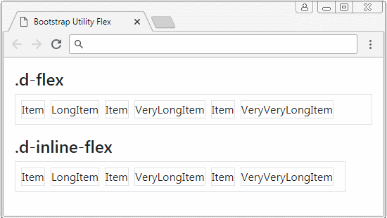
</html>Same Row
The Flex Container puts its direct sub-elements on a row.
<div class="container-fluid mt-3">
<h4>.d-flex</h4>
<div class="d-flex p-2 border">
<div class="mr-2 border">Item</div>
<div class="mr-2 border">LongItem</div>
<div class="mr-2 border">Item</div>
<div class="mr-2 border">VeryLongItem</div>
<div class="mr-2 border">Item</div>
<div class="mr-2 border">VeryVeryLongItem</div>
</div>
<h4 class="mt-3">.d-inline-flex</h4>
<div class="d-inline-flex p-2 border">
<div class="mr-2 border">Item</div>
<div class="mr-2 border">LongItem</div>
<div class="mr-2 border">Item</div>
<div class="mr-2 border">VeryLongItem</div>
<div class="mr-2 border">Item</div>
<div class="mr-2 border">VeryVeryLongItem</div>
</div>
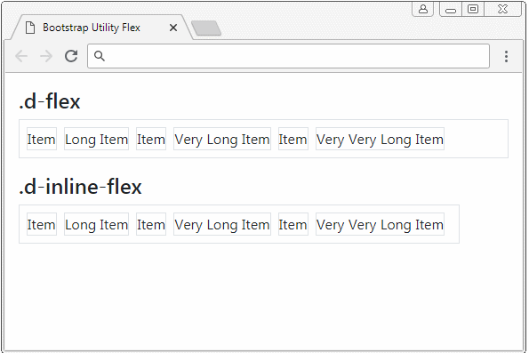
</div>Flex Item Height
The direct sub-elements of a Flex Container will have the same height:
flex-item-height-example.html
<div class="container-fluid mt-3">
   <h4>.d-flex</h4>
   <div class="d-flex p-2 border">
      <div class="mr-2 border">Item</div>
      <div class="mr-2 border">Long Item</div>
      <div class="mr-2 border">Item</div>
      <div class="mr-2 border">Very Long Item</div>
      <div class="mr-2 border">Item</div>
      <div class="mr-2 border">Very Very Long Item</div>
   </div>

   <h4 class="mt-3">.d-inline-flex</h4>
   <div class="d-inline-flex p-2 border">
      <div class="mr-2 border">Item</div>
      <div class="mr-2 border">Long Item</div>
      <div class="mr-2 border">Item</div>
      <div class="mr-2 border">Very Long Item</div>
      <div class="mr-2 border">Item</div>
      <div class="mr-2 border">Very Very Long Item</div>
   </div>
</div>
.d-(sm|md|lg|xl)-flex
Class | Description |
.d-sm-flex | .d-sm-flex is similar to .d-flex, but it works only if parent element has the width of >= 567px. |
.d-md-flex | .d-md-flex is similar to .d-flex, but it works only if parent element has the width of >= 768px. |
.d-lg-flex | .d-lg-flex is similar to .d-flex, but it works only if parent element has the width of >= 992px. |
.d-xl-flex | .d-xl-flex is similar to .d-flex, but it works only if parent element has the width of >= 1200px. |
.d-inline-(sm|md|lg|xl)-flex
Class | Description |
.d-sm-inline-flex | .d-sm-inline-flex is similar to .d-inline-flex, but it works only if parent element has the width of >= 567px. |
.d-md-inline-flex | .d-md-inline-flex is similar to .d-inline-flex, but it works only if parent element has the width of >= 768px. |
.d-lg-inline-flex | .d-lg-inline-flex is similar to .d-inline-flex, but it works only if parent element has the width of >= 992px. |
.d-xl-inline-flex | .d-xl-inline-flex is similar to .d-inline-flex, but it works only if parent element has the width of >= 1200px. |
You can combinate .d-flex, .d-(sm|md|lg|xl)-flex, .d-inline-flex, .d-(sm|md|lg|xl)-inline-flex to use for an element. They will work flexibly based on the size of screen.
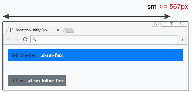
<div class="container-fluid mt-3">

   <div class="d-inline-flex d-sm-flex p-2 mb-5 bg-primary">
      .d-inline-flex <b class="ml-3 text-light">.d-sm-flex</b>
   </div>

   <div class="d-flex d-sm-inline-flex p-2 bg-secondary">
      .d-flex <b class="ml-3 text-light">.d-sm-inline-flex</b>
   </div>

</div>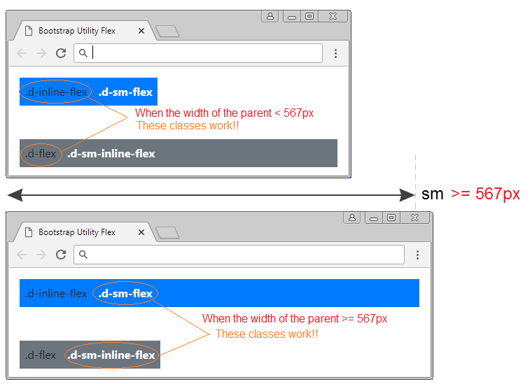
3. Flex Direction
.flex-row, .flex-row-reserve
By default, the Flex Container puts its direct sub- elements on a row in the default direction of browser (usually from left to right). However, you can use the .flex-row-reverse class to reverse the direction.
Class | Description |
.flex-row | (By default). Sub-elements are put on 1 row in the default direction of browser (usually from left to right). |
.flex-row-reverse | Sub-elements will be placed on 1 row, in the direction opposite to the default direction of the browser (usually from right to left). |
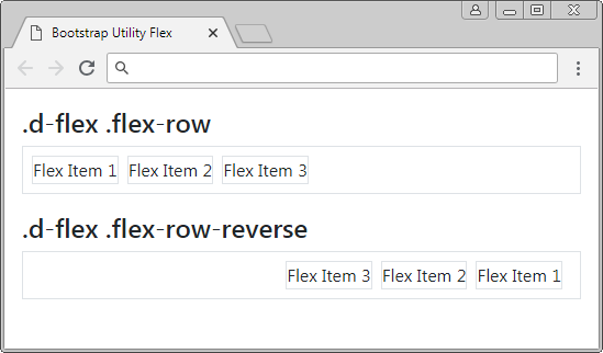
.d-flex .flex-row-reverse
<div class="container-fluid mt-3">

   <h4>.d-flex .flex-row</h4>

   <div class="d-flex flex-row p-2 border">
      <div class="mr-2 border">Flex Item 1</div>
      <div class="mr-2 border">Flex Item 2</div>
      <div class="mr-2 border">Flex Item 3</div>
   </div>

   <h4 class="mt-3">.d-flex .flex-row-reverse</h4>

   <div class="d-flex flex-row-reverse p-2 border">
      <div class="mr-2 border">Flex Item 1</div>
      <div class="mr-2 border">Flex Item 2</div>
      <div class="mr-2 border">Flex Item 3</div>
   </div>

</div>
.flex-column, .flex-column-reverse
By default, the Flex Container puts its sub-elements horizontally. However, it will put the sub-elements vertically if the .flex-column class or .flex-column-reverse class applies.
Class | Description |
.flex-column | Sub-elements are placed on 1 column, in the default direction of browser (usually from up to down). |
.flex-column-reverse | Sub-elements will be put on 1 column in the direction opposite to the default direction of the browser (usually from down to up). |
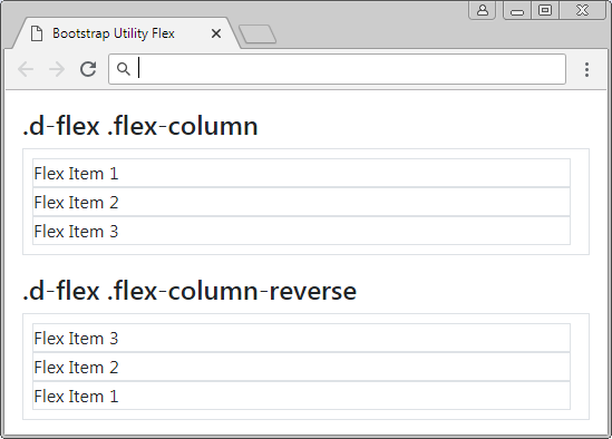
.flex-column, .flex-column-reverse
<div class="container-fluid mt-3">

   <h4>.d-flex .flex-column</h4>

   <div class="d-flex flex-column p-2 border">
      <div class="mr-2 border">Flex Item 1</div>
      <div class="mr-2 border">Flex Item 2</div>
      <div class="mr-2 border">Flex Item 3</div>
   </div>

   <h4 class="mt-3">.d-flex .flex-column-reverse</h4>

   <div class="d-flex flex-column-reverse p-2 border">
      <div class="mr-2 border">Flex Item 1</div>
      <div class="mr-2 border">Flex Item 2</div>
      <div class="mr-2 border">Flex Item 3</div>
   </div>

</div>
Responsive Flex
Bellow is a list of other classes that help set up the direction of the Flex Container. You can use them in combination to create an interface component that is compatible with devices with different screen widths.
- .flex-row
- .flex-row-reverse
- .flex-column
- .flex-column-reverse
- .flex-sm-row
- .flex-sm-row-reverse
- .flex-sm-column
- .flex-sm-column-reverse
- .flex-md-row
- .flex-md-row-reverse
- .flex-md-column
- .flex-md-column-reverse
- .flex-lg-row
- .flex-lg-row-reverse
- .flex-lg-column
- .flex-lg-column-reverse
- .flex-xl-row
- .flex-xl-row-reverse
- .flex-xl-column
- .flex-xl-column-reverse
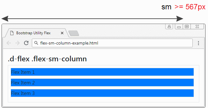
Example: Apply the .flex-sm-column class to a Flex Container, the sub-elements of the Flex Container will be located on one column if the width of Flex Container is >= 567px. On the contrary, the .flex-sm-column will not work. The Flex Container will put its sub-elements on 1 row.
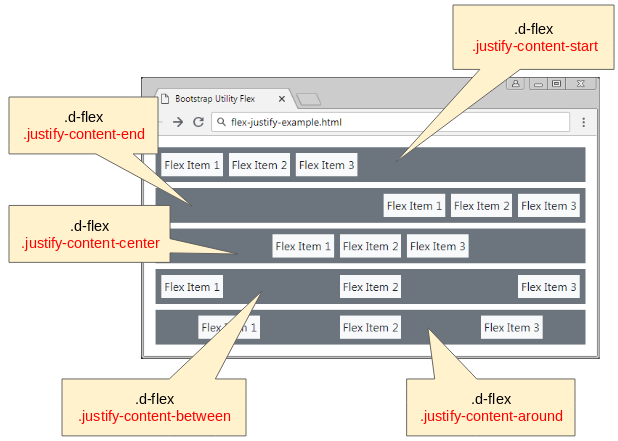
4. Justify content
Some classes help you justify the position of sub-elements of a Flex Container. Basically, there are 5 ways of justifying:
- .justify-content-start
- .justify-content-end
- .justify-content-center
- .justify-content-between
- .justify-content-around
<div class="container-fluid mt-3">

   <div class="d-flex justify-content-start p-1 mb-2 bg-secondary">
      <div class="m-1 p-1 bg-light">Flex Item 1</div>
      <div class="m-1 p-1 bg-light">Flex Item 2</div>
      <div class="m-1 p-1 bg-light">Flex Item 3</div>
   </div>

   <div class="d-flex justify-content-end p-1 mb-2 bg-secondary">
      <div class="m-1 p-1 bg-light">Flex Item 1</div>
      <div class="m-1 p-1 bg-light">Flex Item 2</div>
      <div class="m-1 p-1 bg-light">Flex Item 3</div>
   </div>

   <div class="d-flex justify-content-center p-1 mb-2 bg-secondary">
      <div class="m-1 p-1 bg-light">Flex Item 1</div>
      <div class="m-1 p-1 bg-light">Flex Item 2</div>
      <div class="m-1 p-1 bg-light">Flex Item 3</div>
   </div>

   <div class="d-flex justify-content-between p-1 mb-2 bg-secondary">
      <div class="m-1 p-1 bg-light">Flex Item 1</div>
      <div class="m-1 p-1 bg-light">Flex Item 2</div>
      <div class="m-1 p-1 bg-light">Flex Item 3</div>
   </div>

   <div class="d-flex justify-content-around p-1 mb-2 bg-secondary">
      <div class="m-1 p-1 bg-light">Flex Item 1</div>
      <div class="m-1 p-1 bg-light">Flex Item 2</div>
      <div class="m-1 p-1 bg-light">Flex Item 3</div>
   </div>

</div>
Below is the full list of classes helping you justify the position of sub-elements of Flex Container:
- .justify-content-start
- .justify-content-end
- .justify-content-center
- .justify-content-between
- .justify-content-around
- .justify-content-sm-start
- .justify-content-sm-end
- .justify-content-sm-center
- .justify-content-sm-between
- .justify-content-sm-around
- .justify-content-md-start
- .justify-content-md-end
- .justify-content-md-center
- .justify-content-md-between
- .justify-content-md-around
- .justify-content-lg-start
- .justify-content-lg-end
- .justify-content-lg-center
- .justify-content-lg-between
- .justify-content-lg-around
- .justify-content-xl-start
- .justify-content-xl-end
- .justify-content-xl-center
- .justify-content-xl-between
- .justify-content-xl-around
Example:
And now, I will take an example. I apply .justify-content-sm-center, .justify-content-md-end to a Flex Container. You can observe the change of the position of the Flex Container sub-elements when the width of the Flex Container changes.
- .justify-content-md-end works when the width of Flex Container is >= 768px.
- .justify-content-sm-center works when the width of Flex Container is >= 567px.
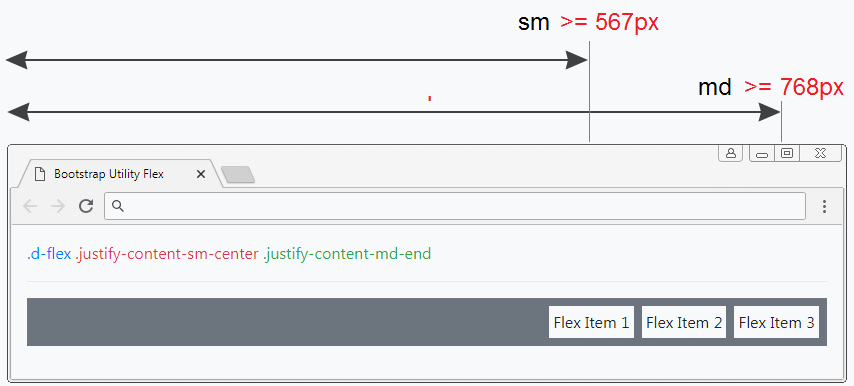
<div class="container-fluid mt-3">

   <span class="text-primary">.d-flex</span>
   <span class="text-danger">.justify-content-sm-center</span>
   <span class="text-success">.justify-content-md-end</span>
   <hr>

   <div class="d-flex justify-content-sm-center justify-content-md-end p-1 mb-2 bg-secondary">
      <div class="m-1 p-1 bg-light">Flex Item 1</div>
      <div class="m-1 p-1 bg-light">Flex Item 2</div>
      <div class="m-1 p-1 bg-light">Flex Item 3</div>
   </div>

</div>
5. Fill/ Equals Width
Applying the .flex-fill class to the direct sub-elements of Flex Container will help these elements have equal widths and fill the width of Flex Container (See the illustration).
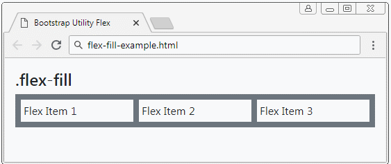
.flex-fill
<div class="d-flex p-1 mb-2 bg-secondary">
   <div class="flex-fill m-1 p-1 bg-light">Flex Item 1</div>
   <div class="flex-fill m-1 p-1 bg-light">Flex Item 2</div>
   <div class="flex-fill m-1 p-1 bg-light">Flex Item 3</div>
</div>
Some other classes:
- .flex-fill
- .flex-sm-fill
- .flex-md-fill
- .flex-lg-fill
- .flex-xl-fill
In the following example, we apply the .flex-sm-fill class to the direct sub-elements of the Flex Container. They will have the same width and fill the width of the Flex Container if the width of the Flex Container is> = 567px.
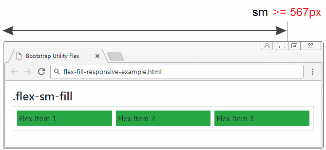
<div class="d-flex p-1 mb-2 border">
   <div class="flex-sm-fill m-1 p-1 bg-success">Flex Item 1</div>
   <div class="flex-sm-fill m-1 p-1 bg-success">Flex Item 2</div>
   <div class="flex-sm-fill m-1 p-1 bg-success">Flex Item 3</div>
</div>
6. Grow & shrink
Grow
The .flex-grow-1 class applies to Flex-Item to help this element grow its size to fill available space. Conversely, if the .flex-Grow-0 class applies to ther Flex-Item, this element will return to normal status.
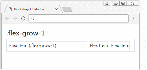
flex-grow-example
<div class="d-flex p-2 border">
   <div class="mr-2 flex-grow-1 border">Flex Item (.flex-grow-1)</div>
   <div class="mr-2 border">Flex Item</div>
   <div class="mr-2 border">Flex Item</div>
</div>
Some similar classes, applying in the "Responsive" situation:
- .flex-grow-0
- .flex-grow-1
- .flex-sm-grow-0
- .flex-sm-grow-1
- .flex-md-grow-0
- .flex-md-grow-1
- .flex-lg-grow-0
- .flex-lg-grow-1
- .flex-xl-grow-0
- .flex-xl-grow-1
Keywork | Description |
.flex-sm-grow-* | This class applies to Flex-Item. It works when the width of Flex Container >= 567px. |
.flex-md-grow-* | This class applies to Flex-Item, It works when the width of Flex Container >= 768px. |
.flex-lg-grow-* | This class applies to Flex-Item, It works when the width of Flex Container >= 992px. |
.flex-xl-grow-* | This class applies to Flex-Item, It works when the width of Flex Container >= 1200px. |
Below is an example of Responsive. A Flex Container with 3 Flex Item. You will see their change when the width of Flex Container >= 567px and when the width of Flex Container < 567px.
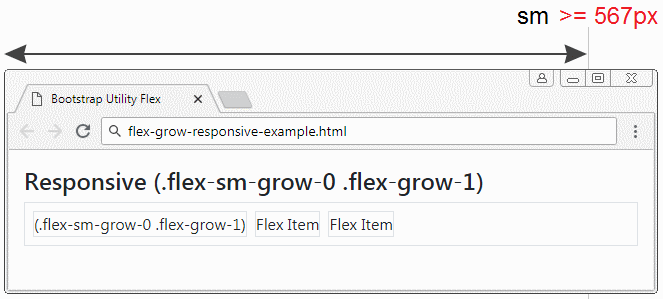
flex-grow-responsive-example
<h4>Responsive (.flex-sm-grow-0 .flex-grow-1)</h4>

<div class="d-flex p-2 border">
   <div class="mr-2 flex-sm-grow-0 flex-grow-1 border">(.flex-sm-grow-0 .flex-grow-1)</div>
   <div class="mr-2 border">Flex Item</div>
   <div class="mr-2 border">Flex Item</div>
</div>
Shrink
7. Auto Margin
The .mr-auto, .ml-auto (Margin right auto, Margin left auto) classes are also used for Flex Item to create auto right and left margin .
Below is an example of using .mr-auto, .ml-auto:
margin-auto-example
<h4>Margin Auto (.mr-auto, .ml-auto)</h4>

<div class="d-flex p-2 mb-2 border border-success">
   <div class="mr-auto border">Flex Item (.mr-auto)</div>
   <div class="mr-2 border">Flex Item</div>
   <div class="mr-2 border">Flex Item</div>
</div>

<div class="d-flex p-2 mb-2 border border-success">
   <div class="mr-2 border">Flex Item</div>
   <div class="mr-auto border">Flex Item (.mr-auto)</div>
   <div class="mr-2 border">Flex Item</div>
</div>

<div class="d-flex p-2 mb-2 border border-success">
   <div class="mr-2 border">Flex Item</div>
   <div class="mr-2 border">Flex Item</div>
   <div class="ml-auto border">Flex Item (.ml-auto)</div>
</div>

<div class="d-flex p-2 mb-2 border border-success">
   <div class="mr-auto border">Flex Item (.mr-auto)</div>
   <div class="mr-2 border">Flex Item</div>
   <div class="ml-auto border">Flex Item (.ml-auto)</div>
</div>
8. Wrap .flex-wrap, .flex-nowrap
Normally, Flex Containers will place Flex Items on a row, even when its width is too small, like the following illustration:
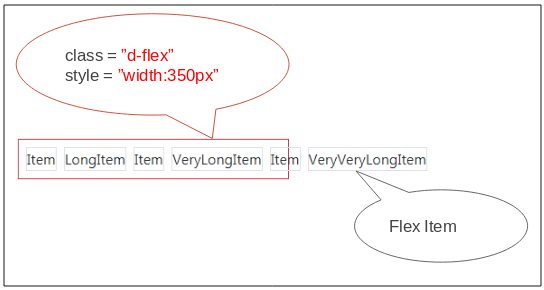
Apply the .flex-wrap class to the Flex Container, you can change its behavor. When the width of Flex Container become smaller, the Flex Items can be pushed down to rows below
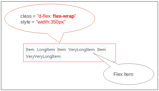
flex-wrap-example
<h4>.d-flex .flex-wrap</h4>

<div class="d-flex flex-wrap p-2 border border-danger" style="width:350px">

   <div class="mr-2 border">Item</div>
   <div class="mr-2 border">LongItem</div>
   <div class="mr-2 border">Item</div>
   <div class="mr-2 border">VeryLongItem</div>
   <div class="mr-2 border">Item</div>
   <div class="mr-2 border">VeryVeryLongItem</div>

</div>
.flex-wrap-reverse
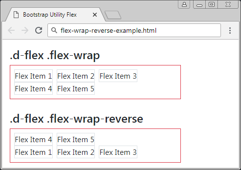
flex-wrap-reverse-example
<h4>.d-flex .flex-wrap</h4>

<div class="d-flex flex-wrap p-2 border border-danger" style="width:350px">
   <div class="mr-2 border">Flex Item 1</div>
   <div class="mr-2 border">Flex Item 2</div>
   <div class="mr-2 border">Flex Item 3</div>
   <div class="mr-2 border">Flex Item 4</div>
   <div class="mr-2 border">Flex Item 5</div>
</div>


<h4>.d-flex .flex-wrap-reverse</h4>

<div class="d-flex flex-wrap-reverse p-2 border border-danger" style="width:350px">
   <div class="mr-2 border">Flex Item 1</div>
   <div class="mr-2 border">Flex Item 2</div>
   <div class="mr-2 border">Flex Item 3</div>
   <div class="mr-2 border">Flex Item 4</div>
   <div class="mr-2 border">Flex Item 5</div>
</div>
.flex-nowrap
Apply the .flex-nowrap clas to Flex Container to make Flex Items be located on one row at all times (This is the default act of Flex Container). Sometimes, you need to use it in the"Responsive" situation.
Responsive:
Some similar classes, applying in the "Responsive" situations:
- .flex-nowrap
- .flex-wrap
- .flex-wrap-reverse
- .flex-sm-nowrap
- .flex-sm-wrap
- .flex-sm-wrap-reverse
- .flex-md-nowrap
- .flex-md-wrap
- .flex-md-wrap-reverse
- .flex-lg-nowrap
- .flex-lg-wrap
- .flex-lg-wrap-reverse
- .flex-xl-nowrap
- .flex-xl-wrap
- .flex-xl-wrap-reverse
9. Order
Bootstrap provides a few classes to apply to Flex Items helping specify their displaying order. These classes are .order-1, .order-2, ... , .order-12.
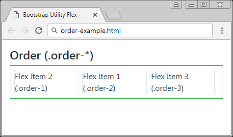
order-example
<h4>Order (.order-*)</h4>

<div class="d-flex p-2 mb-2 border border-success">
   <div class="order-2 mr-2 border">Flex Item 1 (.order-2)</div>
   <div class="order-1 mr-2 border">Flex Item 2 (.order-1)</div>
   <div class="order-3 mr-2 border">Flex Item 3 (.order-3)</div>
</div>
Other classes which are used in "Responsive" situation:
- .order-*
- .order-sm-*
- .order-md-*
- .order-lg-*
- .order-xl-*
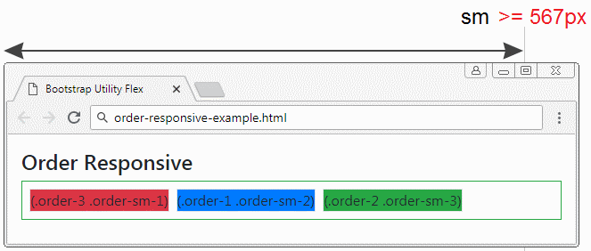
order-responsive-example
<h4>Order Responsive</h4>

<div class="d-flex p-2 mb-2 border border-success">
   <div class="order-2 order-sm-3 mr-2 border bg-success">(.order-2 .order-sm-3)</div>
   <div class="order-1 order-sm-2 mr-2 border bg-primary">(.order-1 .order-sm-2)</div>
   <div class="order-3 order-sm-1 mr-2 border bg-danger">(.order-3 .order-sm-1)</div>
</div>
Bootstrap Tutorials
- Introduction to Bootstrap
- Bootstrap Containers Tutorial with Examples
- Bootstrap Grid System Tutorial with Examples
- Bootstrap Nav Tab/Pill Tutorial with Examples
- Bootstrap NavBars Tutorial with Examples
- Bootstrap Tables Tutorial with Examples
- Bootstrap Modal Tutorial with Examples
- Bootstrap Forms Tutorial with Examples
- Bootstrap Input Group Tutorial with Examples
- Bootstrap Pagination Tutorial with Examples
- Bootstrap Badges Tutorial with Examples
- Bootstrap Jumbotron Tutorial with Examples
- Bootstrap Dropdowns Tutorial with Examples
- Bootstrap Alerts Tutorial with Examples
- Bootstrap Buttons Tutorial with Examples
- Bootstrap Button Group Tutorial with Examples
- Bootstrap Popovers (Tooltips) Tutorial with Examples
- Bootstrap List Groups Tutorial with Examples
- Bootstrap ProgressBars Tutorial with Examples
- Bootstrap Spinners Tutorial with Examples
- Bootstrap Cards Tutorial with Examples
- Bootstrap Collapse and Accordion Tutorial with Examples
- Bootstrap Scrollspy Tutorial with Examples
- Bootstrap Breadcrumb Tutorial with Examples
- Bootstrap Carousel Tutorial with Examples
- Bootstrap Spacing Utilities Tutorial with Examples
- Bootstrap Border Utilities Tutorial with Examples
- Bootstrap Color Utilities Tutorial with Examples
- Bootstrap Text Utilities Tutorial with Examples
- Bootstrap Sizing Utilities Tutorial with Examples
- Bootstrap Position Utilities Tutorial with Examples
- Bootstrap Flex Utilities Tutorial with Examples
- Bootstrap Display Utilities Tutorial with Examples
- Bootstrap Visibility Utilities Tutorial with Examples
- Bootstrap Embed Utilities Tutorial with Examples
Show More