Bootstrap Containers Tutorial with Examples
1. Bootstrap Container
In HTML, a container means an element that can contain other elements, for example <div>, <span>, .. The .container class or .container-fluid class may be used for these elements. OK, now, I will explain you the difference of the two above classes.
.container-fluid
The .container-fluid class will, when applying to an elememt make this element have width of 100%.
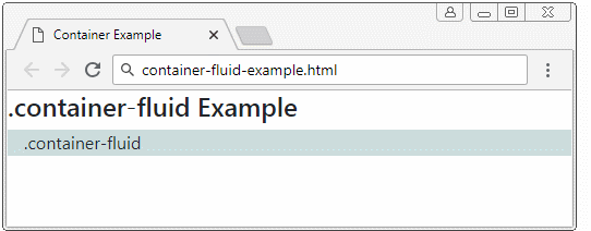
container-fluid-example.html
<!DOCTYPE html>
<html>
   <head>
      <meta charset="utf-8">
      <title>Container Example</title>
      <link rel="stylesheet" href="https://stackpath.bootstrapcdn.com/bootstrap/4.1.1/css/bootstrap.min.css">
   </head>
   <body>
      <h4>.container-fluid Example</h4>

      <div class="container-fluid" style="background: #cdd;">
           .container-fluid
      </div>

      <script src="https://code.jquery.com/jquery-3.3.1.slim.min.js"></script>
      <script src="https://cdnjs.cloudflare.com/ajax/libs/popper.js/1.14.3/umd/popper.min.js"></script>
      <script src="https://stackpath.bootstrapcdn.com/bootstrap/4.1.1/js/bootstrap.min.js"></script>
   </body>
</html>
.container
Based on the screen width size of devices, Bootstrap divides them into 5 classes:
- The devices that have their width of less than 567px are considered to be Extra Small (very small).
- The devices that have their width of greater than or equal to 567px are considered to be Small or referred to as sm equipment.
- The devices that have their width of greater than or equal to 768px are considered to be Medium , or referred to as md equipment.
- The devices that have their width of greater than or equal to 992px are considered to be Large , or referred to as lg equipment.
- The devices that have their width of greater than or equal to 1200px are considered to be Extra Large , or referred to as xl equipment.
When an element is applied the .container class, what will take place?
container-example
<h4 style="color:#ff9249">.container Example:</h4>

<div class="container" style="background: #cdd;">
   .container
</div>
Case 1: If the width of equipment is less than 567px, the element will have width of 100%.
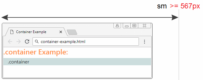
Case 2: If the width of equipment is more or equal to 567px and less than 768px then, the element will display in the center and have the width of 567px.

Case 3: If the width of equipment is more or equal to 768px and less than 992px, element will display in the center and have the width of 768px
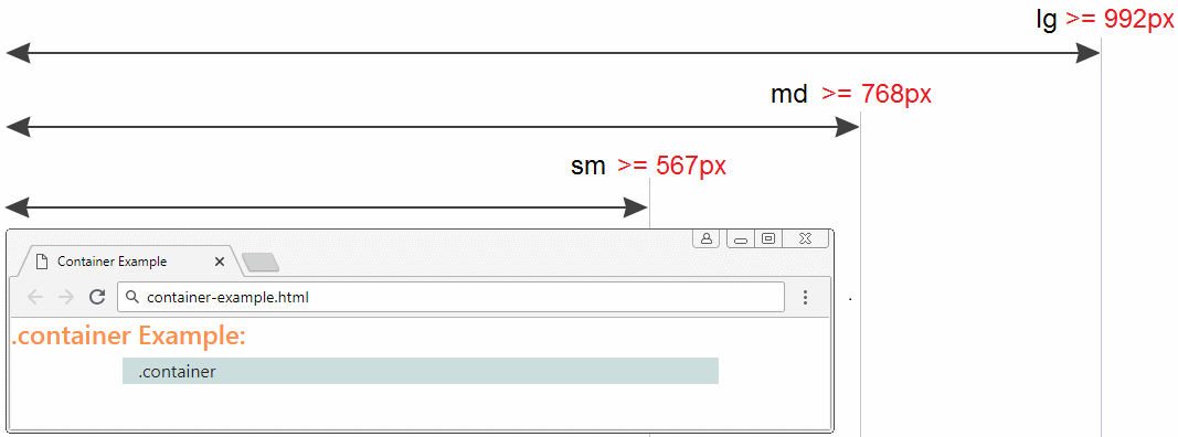
Case 4: If the width of equipment is more than or equal to 992px and less than 1200px, the element will display in the center and have width of 992px.
Case 5: If the width of equipment is more or equal to 1200px, the element will display in the center and have width of 1200px.
container-example.html
<!DOCTYPE html>
<html>
   <head>
      <meta charset="utf-8">
      <title>Container Example</title>
      <link rel="stylesheet" href="https://stackpath.bootstrapcdn.com/bootstrap/4.1.1/css/bootstrap.min.css">
   </head>
   <body>
      <h4 style="color:#ff9249">.container Example:</h4>

      <div class="container" style="background: #cdd;">
         .container
      </div>

      <script src="https://code.jquery.com/jquery-3.3.1.slim.min.js"></script>
      <script src="https://cdnjs.cloudflare.com/ajax/libs/popper.js/1.14.3/umd/popper.min.js"></script>
      <script src="https://stackpath.bootstrapcdn.com/bootstrap/4.1.1/js/bootstrap.min.js"></script>
   </body>
</html>
Bootstrap Tutorials
- Introduction to Bootstrap
- Bootstrap Containers Tutorial with Examples
- Bootstrap Grid System Tutorial with Examples
- Bootstrap Nav Tab/Pill Tutorial with Examples
- Bootstrap NavBars Tutorial with Examples
- Bootstrap Tables Tutorial with Examples
- Bootstrap Modal Tutorial with Examples
- Bootstrap Forms Tutorial with Examples
- Bootstrap Input Group Tutorial with Examples
- Bootstrap Pagination Tutorial with Examples
- Bootstrap Badges Tutorial with Examples
- Bootstrap Jumbotron Tutorial with Examples
- Bootstrap Dropdowns Tutorial with Examples
- Bootstrap Alerts Tutorial with Examples
- Bootstrap Buttons Tutorial with Examples
- Bootstrap Button Group Tutorial with Examples
- Bootstrap Popovers (Tooltips) Tutorial with Examples
- Bootstrap List Groups Tutorial with Examples
- Bootstrap ProgressBars Tutorial with Examples
- Bootstrap Spinners Tutorial with Examples
- Bootstrap Cards Tutorial with Examples
- Bootstrap Collapse and Accordion Tutorial with Examples
- Bootstrap Scrollspy Tutorial with Examples
- Bootstrap Breadcrumb Tutorial with Examples
- Bootstrap Carousel Tutorial with Examples
- Bootstrap Spacing Utilities Tutorial with Examples
- Bootstrap Border Utilities Tutorial with Examples
- Bootstrap Color Utilities Tutorial with Examples
- Bootstrap Text Utilities Tutorial with Examples
- Bootstrap Sizing Utilities Tutorial with Examples
- Bootstrap Position Utilities Tutorial with Examples
- Bootstrap Flex Utilities Tutorial with Examples
- Bootstrap Display Utilities Tutorial with Examples
- Bootstrap Visibility Utilities Tutorial with Examples
- Bootstrap Embed Utilities Tutorial with Examples
Show More