Bootstrap Position Utilities Tutorial with Examples
1. Overview of Bootstrap Position
The Bootstrap is built in some utility classes to set up a position for elements:
- .position-static
- .position-relative
- .position-absolute
- .position-fixed
- .position-sticky
Instead of using the above classes you can use the following Css property to obtain the same result:
- style="position:static"
- style="position:relative"
- style="position:absolute"
- style="position:fixed"
- style="position:sticky"
In addition, several other classes are also very useful, which you easily understand their purpose:
- .fixed-top
- .fixed-bottom
- .sticky-top
2. Class .position-static
The elements in HTML are positioned static by default, that means that their positions are determined by the common rules of the page. They are not affected by the Css property: left, right, top, bottom if you deliberately set up.
Note: Instead of using the .position-static class of the Bootstrap, you can use the Css property (position: static) to obtain the similar result.
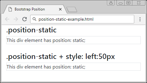
positon-static-example
<div class= "container-fluid">
   <h4>.position-static</h4>
   <div class="position-static border">
      This div element has position: static;
   </div>
   <br>
   <h4>.position-static + style: left:50px</h4>
   <div class="position-static border" style="left:50px">
      This div element has position: static;
   </div>
</div>
3. Class .position-relative
An element applied the .position-relative class is like it is applied the Css property (postion: relative), whichmeans it will be positioned relative to its normal position. In other words, you can use the Css property (left, right, top, bottom) to adjust the left, right, top, bottom position from its normal position.
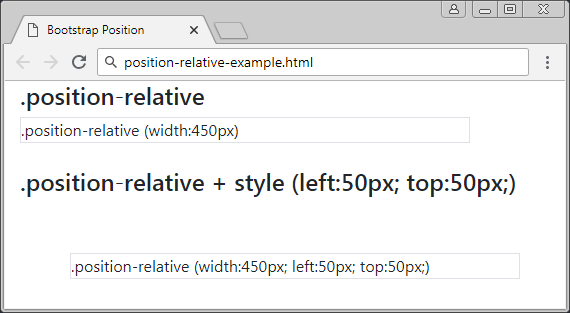
position-relative-example.html
<div class= "container-fluid">
   <h4>.position-relative</h4>
   <div class="position-relative border" style="width:450px;">
      .position-relative (width:450px)
   </div>
   <br>
   <h4>.position-relative + style (left:50px; top:50px;)</h4>
   <div class="position-relative border" style="left:50px; top:50px; width:450px;">
      .position-relative (width:450px; left:50px; top:50px;)
   </div>
</div>
4. Class .position-fixed
An element applied the .position-fixed class is like it is applied the Css property (position: fixed), that means it will be positioned relative to the viewport of the browser.
In the following example, an element is fixed to the bottom and the right of the viewport:
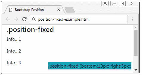
position-fixed-example
<div class= "container-fluid">
   <h4>.position-fixed</h4>
   <div class="position-fixed border bg-info" style="bottom:10px; right:5px;">
      .position-fixed (bottom:10px; right:5px;)
   </div>
   <p>Info.. 1</p>
   <p>Info.. 2</p>
   <p>Info.. 3</p>
   <p>Info.. 4</p>
   <p>Info.. 5</p>
</div>
A special characteristic of the element with {position: fixed} is that you can anchor its four sides with the four sides of your browser's viewport. In that case, if the size of the viewport changes, the size of this element changes accordingly. It looks like the following illustration:
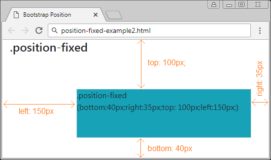
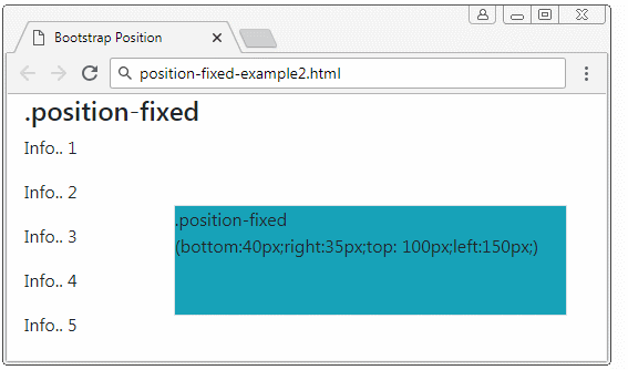
position-fixed-example2
<div class= "container-fluid">
   <h4>.position-fixed</h4>

   <div class="position-fixed border bg-info"
      style="bottom:40px;right:35px;top: 100px;left:150px;">
      .position-fixed <br>

      (bottom:40px;right:35px;top: 100px;left:150px;)
   </div>

   <p>Info.. 1</p>
   <p>Info.. 2</p>
   <p>Info.. 3</p>
   <p>Info.. 4</p>
   <p>Info.. 5</p>
</div>
5. Class .position-absolute
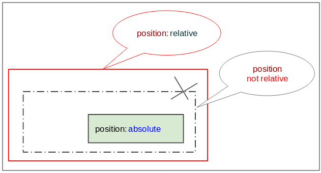
The element applied the .position-absolute class will seek its closest ancestor element (father, grandfather, ..), which has {position: relative}. Once found it will set the position relative to this element. If it is not found it will set the location relative to the viewport of the browser.
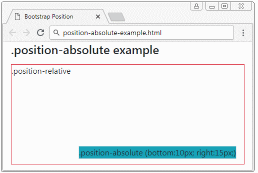
position-absolute-example
<div class= "container-fluid">
   <h4 class="mb-3">.position-absolute example</h4>

   <div class="position-relative border border-danger" style="height:200px;">
      .position-relative

      <div class="position-absolute border bg-info" style="bottom:10px; right:15px;">
         .position-absolute (bottom:10px; right:15px;)
      </div>

   </div>

</div>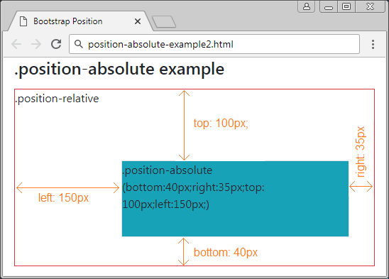
position-absolute-example2
<div class= "container-fluid">
   <h4 class="mb-3">.position-absolute example</h4>

   <div class="position-relative border border-danger" style="height:250px;">
      .position-relative
      <div class="position-absolute border bg-info"
         style="bottom:40px;right:35px;top: 100px;left:150px;">
         .position-absolute (bottom:40px;right:35px;top: 100px;left:150px;)
      </div>
   </div>

</div>
6. Class .position-sticky
An element applied the .position-sticky class is like it is applied the Css property (position: sticky). Its position is based on user's scoll position.
The Sticky element will be converted from "relative" to "fixed" or vice versa depending on the user's scroll position.
Note: The IE/Edge browser, version 15 or older doesn't support {position: sticky}.
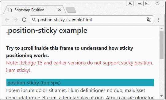
position-sticky-example.html
<!DOCTYPE html>
<html>
   <head>
      <meta charset="utf-8">
      <title>Bootstrap Position</title>
      <link rel="stylesheet" href="https://stackpath.bootstrapcdn.com/bootstrap/4.1.1/css/bootstrap.min.css">
   </head>
   <body>
      <div class= "container-fluid">
         <h4 class="mb-3">.position-sticky example</h4>
         <hr>
         <b>Try to scroll inside this frame to understand how sticky positioning works.</b>
         <p class="text-danger">
            Note: IE/Edge 15 and earlier versions do not support sticky position.
            I am sticky!
         </p>
         <div class="position-sticky border bg-info" style="top:5px;">
            .position-sticky (top:5px;)
         </div>

         <p>
            Lorem ipsum dolor sit amet, illum definitiones no quo, maluisset concludaturque et eum,
            altera fabulas ut quo. Atqui causae gloriatur ius te, id agam omnis evertitur eum.
            Affert laboramus repudiandae nec et. Inciderint efficiantur his ad. Eum no molestiae voluptatibus.
         </p>
      </div>
      <script src="https://code.jquery.com/jquery-3.3.1.slim.min.js"></script>
      <script src="https://cdnjs.cloudflare.com/ajax/libs/popper.js/1.14.3/umd/popper.min.js"></script>
      <script src="https://stackpath.bootstrapcdn.com/bootstrap/4.1.1/js/bootstrap.min.js"></script>
   </body>
</html>
7. Class .fixed-top, fixed-bottom, .sticky-top
The .fixed-top class applies to an element to fix it to the top of browser viewport. (See the explanation at the .position-fixed section)
.fixed-top (Bootstrap code)
.fixed-top {
    position: fixed;
    top: 0;
    right: 0;
    left: 0;
    z-index: 1030;
}
The .fixed-bottom class is used for the element to fix it to the bottom of the browser viewport. (See the explanation at the .position-fixed section)
.fixed-bottom (Bootstrap Code)
.fixed-bottom {
    position: fixed;
    right: 0;
    bottom: 0;
    left: 0;
    z-index: 1030;
}
.sticky-top
The .sticky-top class is quite like .position-sticky. You can see more explanation at .position-sticky.
.sticky-top (Bootstrap Code)
.sticky-top {
    position: -webkit-sticky; /* Safari Browser */
    position: sticky;
    top: 0;
    z-index: 1020;
}
Bootstrap Tutorials
- Introduction to Bootstrap
- Bootstrap Containers Tutorial with Examples
- Bootstrap Grid System Tutorial with Examples
- Bootstrap Nav Tab/Pill Tutorial with Examples
- Bootstrap NavBars Tutorial with Examples
- Bootstrap Tables Tutorial with Examples
- Bootstrap Modal Tutorial with Examples
- Bootstrap Forms Tutorial with Examples
- Bootstrap Input Group Tutorial with Examples
- Bootstrap Pagination Tutorial with Examples
- Bootstrap Badges Tutorial with Examples
- Bootstrap Jumbotron Tutorial with Examples
- Bootstrap Dropdowns Tutorial with Examples
- Bootstrap Alerts Tutorial with Examples
- Bootstrap Buttons Tutorial with Examples
- Bootstrap Button Group Tutorial with Examples
- Bootstrap Popovers (Tooltips) Tutorial with Examples
- Bootstrap List Groups Tutorial with Examples
- Bootstrap ProgressBars Tutorial with Examples
- Bootstrap Spinners Tutorial with Examples
- Bootstrap Cards Tutorial with Examples
- Bootstrap Collapse and Accordion Tutorial with Examples
- Bootstrap Scrollspy Tutorial with Examples
- Bootstrap Breadcrumb Tutorial with Examples
- Bootstrap Carousel Tutorial with Examples
- Bootstrap Spacing Utilities Tutorial with Examples
- Bootstrap Border Utilities Tutorial with Examples
- Bootstrap Color Utilities Tutorial with Examples
- Bootstrap Text Utilities Tutorial with Examples
- Bootstrap Sizing Utilities Tutorial with Examples
- Bootstrap Position Utilities Tutorial with Examples
- Bootstrap Flex Utilities Tutorial with Examples
- Bootstrap Display Utilities Tutorial with Examples
- Bootstrap Visibility Utilities Tutorial with Examples
- Bootstrap Embed Utilities Tutorial with Examples
Show More